🔥 Today Only: Save 30% on Premium — Offer Ends Soon! - Upgrade Now!
Line Graph

Band 7+: The graph below gives information from a 2008 report about consumption of energy in the US since 1980 with projections until 2030. Summarise the information by selecting and reporting the main features, and make comparisons where relevant

Image for topic: The graph below gives information from a 2008 report about consumption of energy in the US since 1980 with projections until 2030. Summarise the information by selecting and reporting the main features, and make comparisons where relevant
Our system will evaluate the answer based on this AI-generated description.
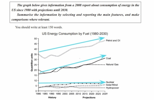
The image presents "US Energy Consumption by Fuel (1980-2030)" with quadrillion units on the y-axis and years 1980-2030 on the x-axis: Petrol and Oil: ~35 (1980), ~30 (1985), ~32 (1990), ~33 (1995), ~34 (2000), ~35 (2005), ~38 (2010), ~40 (2015), ~42 (2020), ~45 (2025), ~47 (2030); Coal: ~15 (1980), ~18 (1985), ~20 (1990), ~20 (1995), ~22 (2000), ~23 (2005), ~22 (2010), ~22 (2015), ~23 (2020), ~25 (2025), ~28 (2030); Natural Gas: ~20 (1980), ~20 (1985), ~22 (1990), ~23 (1995), ~24 (2000), ~25 (2005), ~25 (2010), ~25 (2015), ~25 (2020), ~26 (2025), ~30 (2030); Nuclear: ~3 (1980), ~4 (1985), ~5 (1990), ~6 (1995), ~7 (2000), ~7 (2005), ~7 (2010), ~5 (2015), ~5 (2020), ~5 (2025), ~5 (2030); Solar/Wind: ~0 (1980), ~0 (1985), ~0 (1990), ~0 (1995), ~2 (2000), ~2 (2005), ~3 (2010), ~3 (2015), ~3 (2020), ~4 (2025), ~5 (2030); Hydropower: ~5 (1980), <5 (1985), <5 (1990), <5 (1995), <5 (2000), ~3 (2005), ~3 (2010), ~3 (2015), ~3 (2020), ~3 (2025), ~3 (2030).
Given the complexity of the image, the above description may not be entirely accurate.
Note: Both the topic and the answer were created by one of our users.

The line graph illustrates the consumption of different energy sources in the USA since 1980 and predicted figures until 2030.

Overall, it is clear that natural gas, coal, petrol and oil despite some fluctuations will experience an upward trend overall, while hydropower, solar/wind and nuclear are expected to show minimal changes.

Petrol and oil which provided around 35 quadrillion units in 1980 are expected to reach nearly 50 quadrillion units by 2030 and become the dominant category. Starting at approximately 15 quadrillion units and 20 quadrillion units, the amount of coal and natural gas is forecasted to go up reaching about 30 quadrillion units and 25 quadrillion units, respectively by 2030.

Nuclear, solar/wind, and hydropower each produced less than 5 quadrillion units in 1980. Over the following decades, the gap between them widened, with nuclear overtaking the other two. By 2030, the figure for hydropower is expected to stabilize, while nuclear and solar/wind are projected to experience a slight rise, reaching nearly 7 quadrillion units and 5 quadrillion units, respectively.

Word Count: 170

Answers On The Same Topic:

The graph below gives information from a 2008 report about consumption of energy in the US since 1980 with projections until 2030. Summarise the information by selecting and reporting the main features, and make comparisons where relevant

The line graph illustrates consumption of energy in the USA from 2008 to 1980 with predictions of project until 2030. Overall,the energy usage have fluctuated over the period.Pertol and oil soared sharply.Nuclear,Solar and Hydropower have remained stable. The figure of petrol and oil climbed dramatically from 35 quadrillion in 1980 to 40 quadrillion in 2005. […]

The graph below gives information from a 2008 report about consumption of energy in the US since 1980 with projections until 2030. Summarise the information by selecting and reporting the main features, and make comparisons where relevant

The graph illustrates a 2008 report about the history and the projections for United States of America energy consumption by fuel from 1980 until 2030 Overall, the us for petrol and oil same as coal the consumption rose and predictions estimate similar trajectory upwords 2030, however nuclear solar/wind hydropower and natural gas use was steady […]

The graph below gives information from a 2008 report about consumption of energy in the US since 1980 with projections until 2030. Summarise the information by selecting and reporting the main features, and make comparisons where relevant

The line graph provides data from a 2008 report regarding the use of energy (coal, petrol and oil, natural gas, nuclear, solar and hydropower) ij the United State since 1980 and also the prediction of 2030. Units are measured in quadrillion. Overall, it is very clear that petrol was rulling in the beginning of the […]

See All

Other Topics:

You should spend about 20 minutes on this task. The graph below shows the percentage of money spent on advertising in five types of media in France from 2010 and projected spending to 2040. Summarise the information by selecting and reporting the main features, and make comparisons where relevant. You should write at least 150 words. Writing Task 1

The line graph illustrates the percentage shares of five different types of media on the total budget spent on advertizing in France from 2010 to predicted 2040. Overall, the figure for internet rose sharply and is predicted dominate by the end of the given period, while the television hit a peak by 2020, and projected […]

You should spend about 20 minutes on this task. The graph below shows the percentage of money spent on advertising in five types of media in France from 2010 and projected spending to 2040. Summarise the information by selecting and reporting the main features, and make comparisons where relevant. You should write at least 150 words. Writing Task 1

The graph shows the percentage of money spent on advertising in five types of media. The highest amount of money spent by the year of 2040 are internet, television, newspaper, radio and magazines. Television start from 35% in the beginning of the year, then increase by the next year 2020 by 45%, after that it […]

The graph below shows the number of immigrants to three countries from 1990 to 2001. Summarize the information by selecting and reporting the main features, and make comparisons where relevant.

The diagram illustrates the process of producing fabric from bamboo. Overall, it is clear that bamboo fabric is manufactured through a linear, multi-stage process that begins with the cultivation of bamboo plants and ends with the production of finished textile products. The procedure involves both mechanical and chemical treatments to transform raw bamboo into usable […]

The line graphs show the percentage of people using public transport and people using private cars in five cities of Australia from 2000 to 2010

The given grape is shown the percentage of people using public transportation and private transportation in five cities of Australia from 2000 to 2010. Firstly, the most city that using public transport in Australia is Sydney, which is around 18 percentage to 23 percentage. However, it seem to be decreased. Another top two is Perth, […]

the graph below shows the average CO2 emissions per person in 4 countries from 1967 to 2007

The line graph illustrates information about the changes in the average CO2 emissions per person in four different countries, namely United Kingdom, Sweden, Italy, and Portugal, over the period from 1967 to 2007. Overall, it is immediately apparent that Italy and Portugal experienced the most significant growth over the period, whereas United Kingdom showed a […]

The graph below shows the changes in production (millions)of three products in agarment factory from 1990 to 2010. Summarize the information by selecting andreporting the main features, and make comparisons where relevant.Write at least 150 words.

The given graph illustrates the changes in production of three products in a garment factory: suit, dress, and coat over a span of 20 years from 1990 to 2019. Overall, these figures showed an upward trend, with coat experienced the most significant change over the period. At the beginning of the period, the figure for […]

See All
We have detected unusual activity on your device.
Please verify your identity to continue.
Note: This verification step won't sign you in. If you have a premium account, please log in to access the service as usual.
Google/Gmail Verification
Or verify using Email/Code
We've sent a verification code to:
youremail@gmail.com (Not your email?)
Enter it below to complete the verification process.
Ensure your email address is correct, your inbox is not full, and you check your spam folder. If no email arrives, consider using an alternative email.
You will need a Premium plan to perform your action!
Note: If you already have a premium account, please log in to access our services as usual.

Plans & Pricing

Our mission is to make quality education accessible for everyone.
However, to keep our hardworking team running and this service alive, we genuinely need your support!
By opting for a premium plan, not only do you sustain us in achieving the mission, but you also unlock advanced features to enrich your learning experience.

Free

For learners who aren't pressed for time

What's included on Free
100+ Cambridge IELTS Tests
Instant IELTS Writing Task 1 & 2 Evaluation (2 times/month)
Instant IELTS Speaking Part 1, 2, & 3 Evaluation (5 times/month)
Instant IELTS Writing Task 1 & 2 Essay Generator (2 times/month)
500+ Dictation & Shadowing Exercises
100+ Pronunciation Exercises
Flashcards
Other Advanced Tools

Premium

For those serious about advancing their English proficiency, and for IELTS candidates aspiring to boost their band score by 1-2 points (especially in writing & speaking) in just 30 days or less

What's included on Premium
Save Your IELTS Test Progress
Unlock All Courses & IELTS Tests
Unlimited AI Conversations
Unlimited AI Writing Enhancement Exercises
Unlimited IELTS Writing Task 1 & 2 Evaluation
Unlimited IELTS Speaking Part 1, 2, & 3 Evaluation
Checked Answers Will Not Be Published
Unlimited IELTS Writing Task 1 & 2 Essay Generator
Unlimited IELTS Speaking Part 1, 2, & 3 Sample Generator
Unlimited Usage Of Advanced Tools
Priority Support within 24h (12-month plan only)

Due to the nature of our service and the provided free trials, payments are non-refundable.
Nếu bạn là người Việt Nam và không có hoặc không muốn trả bằng credit/debit cards, bạn có thể thanh toán bằng phương thức chuyển khoản:


Chọn gói:
419,000₫ 277,000 ₫ cho gói 1 tháng (chỉ 9,233₫/ngày)
1,239,000₫ 597,000 ₫ cho gói 3 tháng (chỉ 6,633₫/ngày)
2,469,000₫ 1,027,000 ₫ cho gói 6 tháng (chỉ 5,706₫/ngày)
4,929,000₫ 1,417,000 ₫ cho gói 12 tháng (chỉ 3,936₫/ngày)


Sau khi chuyển khoản, vui lòng đợi trình duyệt tự động điều hướng bạn trở lại Engnovate và bạn sẽ ngay lập tức nhận được mã kích hoạt tài khoản premium.
Nếu có lỗi xảy ra, bạn có thể liên hệ với team thông qua một trong các phương thức: email đến helloengnovate@gmail.com hoặc nhắn tin qua facebook.com/engnovate.
Vì toàn bộ công cụ trên website đều có thể sử dụng thử miễn phí, Engnovate không hỗ trợ hoàn tiền.