🔥 Today Only: Save 30% on Premium — Offer Ends Soon! - Upgrade Now!
Multiple Graphs

Band 5+: The graph below provide infornation on global population figures and figures for urban population in different world regions

Image for topic: The graph below provide infornation on global population figures and figures for urban population in different world regions
Our system will evaluate the answer based on this AI-generated description.
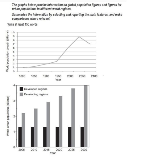
The image presents two visual data representations. The first graph illustrates world population growth from 1800 to 2100 in billions: 1 billion at 1800, 1 billion at 1850, 2 billion at 1900, 3 billion at 1950, 5 billion at 2000, a peak at 10 billion by 2050, and projected decline to 9 billion by 2100. The second graph is a bar chart showing world urban population in billions from 2005 to 2030 across developed and developing regions. In 2005, developed regions have approximately 1 billion, developing regions about 2 billion; in 2010, developed regions around 1.2 billion, developing regions roughly 2.5 billion; in 2015, developed regions about 1.4 billion, developing regions about 3 billion; in 2020, developed regions approximately 1.6 billion, developing regions around 3.5 billion; in 2025, developed regions about 1.8 billion, developing regions near 4 billion; in 2030, both regions collectively surpass the 6 billion mark, with developing regions significantly leading.
Given the complexity of the image, the above description may not be entirely accurate.
Note: Both the topic and the answer were created by one of our users.

The given graph demonstrates the increase in population number worldwide in 300-year period, while the chart depicts the changes number of people living in cities between 2005 and 2030.

Generally, the upward trend is noticed throughout the given period with sudden decline by last eighty years. The number of population gradually increased from 900 million un to 2,7 billion until 1950 then sharply reaching the peak of 9 billion in 2025. However, after 2025 up to 2100 the sudden decrease is demonstrated.

The population of urban areas, specifically in developing regions experienced moderate growth throughout the 25-year period. The number of population grew for 500 million each 5-year period, reaching 4 billion in 2030. In contrast, the number of population in developed regions remained the same in 25 years, comprising 1,5 billion people.

Word Count: 133

Answers On The Same Topic:

The graph below provide infornation on global population figures and figures for urban population in different world regions

The diagrams below provide information about world population trends in urbanization between developed and developing regions. Overall, developing countries have the highest figures and a rapid rise in urbanization; expected to peak around in 2035; however this trend may decline quickly. According to the line graph, the lowest figures recorded in 1800, when features of […]

The graph below provide infornation on global population figures and figures for urban population in different world regions

The given graph demonstrates the increase in population numbers worldwide over a 300-year period, while the chart depicts the changes in the number of people living in cities between 2005 and 2030. Generally, an upward trend is noticed throughout the given period, with a slight decline during the last eighty years. The global population gradually […]

The graph below provide infornation on global population figures and figures for urban population in different world regions

The two graphs provide information about global population growth and the urban populations in both developed and developing regions from the past to the future. Overall, the world population showed a steady increase between 1800 and 2050 and it is expected to decline slightly by 2100. The second graph shows that urban populations in developing […]

See All

Other Topics:

amounts of added sugar, saturated fat and sodium if 4 different meals

The three pie charts illustrate the average proportions of sodium, saturated fat and added sugar contained in four types of meals – breakfast, lunch, dinner and snacks – consumed in the USA. Overall, dinner accounts for the largest proportion of sodium and saturated fat, whereas snacks are by far the main source of added sugar. […]

The line graph shows the cost for watching films. The pie charts show the change in the percentage of market share represented by the three forms.

The line graph illustrates the cost in the market for watching a film in various formats, whereas pie charts show changes (in per cent) for three main shares between 2005 and 2011. Overall, all three formats increased in their cost, with cinema tickets having the most expensive price. However, almost all shares witnessed a downward […]

The line graph shows the cost for watching films. The pie charts show the change in the percentage of market share represented by the three forms.

The line graph illustrates the cost in the market for watching a film in various formats, whereas pie charts show changes (in per cent) for three main shares between 2005 and 2011. Overall, all three formats increased in their cost, with cinema tickets having the most expensive price. However, almost all shares witnessed a downward […]

The bar charts display the results from a 2009 survey regarding people's automobile in a European country.

The bar charts illustrate the car-buying behaviour of people in a European country. Overall, most respondents changed their cars relatively infrequently, with replacing a vehicle every five years or more being the most common response. In terms of purchasing preferences, second-hand cars were by far the most popular choice, whereas far fewer people bought new […]

The pie chart below illustrates the average commuting time of UK workers in 2009, while the bar chart compares the methods of travelling to work in London and the rest of the UK in the same year.

The charts provide a comparative analysis of time of UK workers and their methods of travel to work in 2009, units measured in percent. Overall, the figures for workers who need 1-15 and 16-30 minutes to commuting to work are largest number, while those for workers who spend 31-60+ minutes to travel to work are […]

The charts below show information about Japanese university students' use of English.

The charts demonstrate information about Japanese university students’ use of English. Units are given in percentages. Overall, it is clear that, in the both charts categories never allocated the largest proportion, while categories once a week or less and twice a week or more falls somewhere in between. It is also worth mentioning that everyday […]

See All
We have detected unusual activity on your device.
Please verify your identity to continue.
Note: This verification step won't sign you in. If you have a premium account, please log in to access the service as usual.
Google/Gmail Verification
Or verify using Email/Code
We've sent a verification code to:
youremail@gmail.com (Not your email?)
Enter it below to complete the verification process.
Ensure your email address is correct, your inbox is not full, and you check your spam folder. If no email arrives, consider using an alternative email.
You will need a Premium plan to perform your action!
Note: If you already have a premium account, please log in to access our services as usual.

Plans & Pricing

Our mission is to make quality education accessible for everyone.
However, to keep our hardworking team running and this service alive, we genuinely need your support!
By opting for a premium plan, not only do you sustain us in achieving the mission, but you also unlock advanced features to enrich your learning experience.

Free

For learners who aren't pressed for time

What's included on Free
100+ Cambridge IELTS Tests
Instant IELTS Writing Task 1 & 2 Evaluation (2 times/month)
Instant IELTS Speaking Part 1, 2, & 3 Evaluation (2 times/month)
Instant IELTS Writing Task 1 & 2 Essay Generator (2 times/month)
500+ Dictation & Shadowing Exercises
100+ Pronunciation Exercises
Flashcards
Other Advanced Tools

Premium

For those serious about advancing their English proficiency, and for IELTS candidates aspiring to boost their band score by 1-2 points (especially in writing & speaking) in just 30 days or less

What's included on Premium
Save Your IELTS Test Progress & Analyze Mistakes By Question Type
Save Your Own Flashcard Sets & Use Them On Any Device
Unlock All Courses, IELTS Tests, Section & Part Practice
Unlimited AI Conversations
Unlimited AI Writing Enhancement Exercises
Unlimited IELTS Writing Task 1 & 2 Evaluation
Unlimited IELTS Speaking Part 1, 2, & 3 Evaluation
Checked Answers Will Not Be Published
Unlimited IELTS Writing Task 1 & 2 Essay Generator
Unlimited IELTS Speaking Part 1, 2, & 3 Sample Generator
Unlimited Usage Of Advanced Tools & AI Features
Priority Support within 24h (12-month plan only)

Due to the nature of our service and the provided free trials, payments are non-refundable.