🔥 Today Only: Save 30% on Premium — Offer Ends Soon! - Upgrade Now!
Multiple Graphs

Band 8+: The graph below provide infornation on global population figures and figures for urban population in different world regions

Image for topic: The graph below provide infornation on global population figures and figures for urban population in different world regions
Our system will evaluate the answer based on this AI-generated description.
The image presents two visual data representations. The first graph illustrates world population growth from 1800 to 2100 in billions: 1 billion at 1800, 1 billion at 1850, 2 billion at 1900, 3 billion at 1950, 5 billion at 2000, a peak at 10 billion by 2050, and projected decline to 9 billion by 2100. The second graph is a bar chart showing world urban population in billions from 2005 to 2030 across developed and developing regions. In 2005, developed regions have approximately 1 billion, developing regions about 2 billion; in 2010, developed regions around 1.2 billion, developing regions roughly 2.5 billion; in 2015, developed regions about 1.4 billion, developing regions about 3 billion; in 2020, developed regions approximately 1.6 billion, developing regions around 3.5 billion; in 2025, developed regions about 1.8 billion, developing regions near 4 billion; in 2030, both regions collectively surpass the 6 billion mark, with developing regions significantly leading.
Given the complexity of the image, the above description may not be entirely accurate.
Note: Both the topic and the answer were created by one of our users.

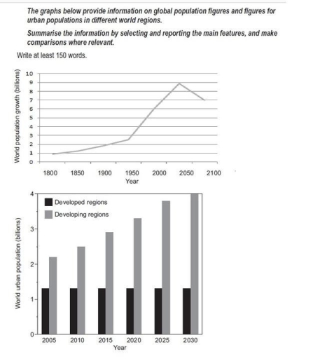
The given graph demonstrates the increase in population numbers worldwide over a 300-year period, while the chart depicts the changes in the number of people living in cities between 2005 and 2030.

Generally, an upward trend is noticed throughout the given period, with a slight decline during the last eighty years. The global population gradually increased from about 900 million to 2.7 billion by 1950, then rose sharply, reaching a peak of around 9 billion in 2025. However, after 2025, the number is projected to fall slightly towards 2100.

Regarding urban areas, the population in developing regions experienced continuous and significant growth throughout the 25-year period, while developed regions showed little or no change. In developing regions, the number of city dwellers grew steadily by roughly 500 million every five years, reaching 4 billion in 2030. In contrast, the population in developed regions remained stable at about 1.5 billion people.

Overall, while the global population and the number of urban residents in developing regions show strong upward trends, the figures for developed regions remain comparatively unchanged, highlighting a clear gap in urban growth between the two groups.

Word Count: 187

Answers On The Same Topic:

The graph below provide infornation on global population figures and figures for urban population in different world regions

The diagrams below provide information about world population trends in urbanization between developed and developing regions. Overall, developing countries have the highest figures and a rapid rise in urbanization; expected to peak around in 2035; however this trend may decline quickly. According to the line graph, the lowest figures recorded in 1800, when features of […]

The graph below provide infornation on global population figures and figures for urban population in different world regions

The given graph demonstrates the increase in population number worldwide in 300-year period, while the chart depicts the changes number of people living in cities between 2005 and 2030. Generally, the upward trend is noticed throughout the given period with sudden decline by last eighty years. The number of population gradually increased from 900 million […]

The graph below provide infornation on global population figures and figures for urban population in different world regions

The two graphs provide information about global population growth and the urban populations in both developed and developing regions from the past to the future. Overall, the world population showed a steady increase between 1800 and 2050 and it is expected to decline slightly by 2100. The second graph shows that urban populations in developing […]

See All

Other Topics:

The graph gives information about the number of yearly visits from France and North America for holiday and business. Summarise the information by selecting and reporting the main features, and make comparisons where relevant.

The two given line graphs compare the number of trips made to the UK for 2 different purposes from France and North America across the 12 months. Overall, what stand out from the two line is that the proportion for North America was consistently higher than that for France in both types of visits. Additionally, […]

The charts below show average age of men and women retired from work in seven countries in 2004 and 2008. Summarise the information by selecting and reporting the main features, and make comparisons where relevant

The bar charts compare the average retirement ages of men and women in seven countries in 2004 and 2008. Overall, Sweden recorded the highest retirement ages for both men and women, while France generally had the lowest figures. Men tended to retire at an older age than women in most countries. Most figures also increased […]

The bar chart below shows the percentages of New Zealand smokers in the age group 18 - 25 years, for the period 2014 - 2018. Summarise the information by selecting and reporting the main features, and make comparisons where relevant.

The bar char illustrates the proportion of smoker aged 18-25 who smoked different types of tobacco in New Zealand brtween 2014 and 2018. overall, the highest proportion for f smoker smoked Cegarattes, while the parcentage of smoker sho smoked Cigars were the lowest throughout the period. According to the bar chart, the higest proportion ow […]

Location of dance classes and types of dance classes by age group

The charts below shows information on the place and kinds of dance classes young people in a town in Australia are currently participating. The first one concentrates on location of dance classes and second one illustrates types of dances by age of group. Overall, most noticeably changes are in ballet classes, the amount of children […]

The chart below shows the reasons why people travel to work by bike or car.

The pie charts illustrate the main reasons why people travel to work by bicycle or by car. Overall, people mainly choose cycling for health and fitness, less pollution, while driving is mainly preferred because of comfort, distance to work. In addition, health and fitness and less pollution are equally the most common reasons for cycling, […]

The graphs below show the number of hours cancadians spend on watching tv from 1990 to 2000

The bar charts illustrate the average number of hours Canadians spent watching television per week from 1991 to 2001, as well as the average hours spent across different age groups. Overall, a marked trend towards lower viewing hours can be seen almost across the diagram, although minor fluctuations over a 10-year period are evident. Additionally, […]

See All
We have detected unusual activity on your device.
Please verify your identity to continue.
Note: This verification step won't sign you in. If you have a premium account, please log in to access the service as usual.
Google/Gmail Verification
Or verify using Email/Code
We've sent a verification code to:
youremail@gmail.com (Not your email?)
Enter it below to complete the verification process.
Ensure your email address is correct, your inbox is not full, and you check your spam folder. If no email arrives, consider using an alternative email.
You will need a Premium plan to perform your action!
Note: If you already have a premium account, please log in to access our services as usual.

Plans & Pricing

Our mission is to make quality education accessible for everyone.
However, to keep our hardworking team running and this service alive, we genuinely need your support!
By opting for a premium plan, not only do you sustain us in achieving the mission, but you also unlock advanced features to enrich your learning experience.

Free

For learners who aren't pressed for time

What's included on Free
100+ Cambridge IELTS Tests
Instant IELTS Writing Task 1 & 2 Evaluation (2 times/month)
Instant IELTS Speaking Part 1, 2, & 3 Evaluation (2 times/month)
Instant IELTS Writing Task 1 & 2 Essay Generator (2 times/month)
500+ Dictation & Shadowing Exercises
100+ Pronunciation Exercises
Flashcards
Other Advanced Tools

Premium

For those serious about advancing their English proficiency, and for IELTS candidates aspiring to boost their band score by 1-2 points (especially in writing & speaking) in just 30 days or less

What's included on Premium
Save Your IELTS Test Progress & Analyze Mistakes By Question Type
Save Your Own Flashcard Sets & Use Them On Any Device
Unlock All Courses, IELTS Tests, Section & Part Practice
Unlimited AI Conversations
Unlimited AI Writing Enhancement Exercises
Unlimited IELTS Writing Task 1 & 2 Evaluation
Unlimited IELTS Speaking Part 1, 2, & 3 Evaluation
Checked Answers Will Not Be Published
Unlimited IELTS Writing Task 1 & 2 Essay Generator
Unlimited IELTS Speaking Part 1, 2, & 3 Sample Generator
Unlimited Usage Of Advanced Tools & AI Features
Priority Support within 24h (12-month plan only)

Due to the nature of our service and the provided free trials, payments are non-refundable.