🔥 Today Only: Save 30% on Premium — Offer Ends Soon! - Upgrade Now!
Line Graph

Band 5+: The graph below shows average carbon dioxide emissions per person in the United Kingdom, Sweden, Italy and Portugal between 1967 and 2007.

Image for topic: The graph below shows average carbon dioxide emissions per person in the United Kingdom, Sweden, Italy and Portugal between 1967 and 2007.
Our system will evaluate the answer based on this AI-generated description.
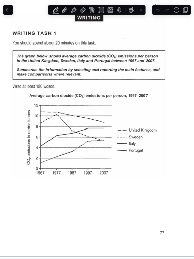
The image depicts average carbon dioxide emissions per person in metric tonnes in the United Kingdom, Sweden, Italy, and Portugal from 1967 to 2007. In 1967, emissions were highest in the United Kingdom at approximately 11 metric tonnes, followed by Sweden at around 9 metric tonnes, Italy at roughly 4 metric tonnes, and Portugal at about 1 metric tonne. By 1977, United Kingdom emissions decreased to around 10 metric tonnes, while Sweden’s emissions peaked at nearly 11 metric tonnes. Italy’s emissions rose to about 6 metric tonnes, and Portugal’s increased to around 2 metric tonnes. In 1987, the United Kingdom’s emissions were around 9.5 metric tonnes, Sweden’s dropped to approximately 7.5 metric tonnes, Italy’s continued to rise to about 7 metric tonnes, and Portugal’s grew to around 3.5 metric tonnes. By 1997, the United Kingdom’s emissions decreased further to around 9 metric tonnes, Sweden’s reduced significantly to about 5.5 metric tonnes, Italy’s plateaued at 8 metric tonnes, and Portugal’s increased to around 4.5 metric tonnes. In 2007, the United Kingdom’s emissions were approximately 8.5 metric tonnes, Sweden’s fell to around 6 metric tonnes, Italy’s emissions slightly decreased to about 7.75 metric tonnes, and Portugal’s emissions reached roughly 5 metric tonnes.
Given the complexity of the image, the above description may not be entirely accurate.
Note: Both the topic and the answer were created by one of our users.

The provided line graph gives us an information of an average carbon diokside emissions per peson in the United Kingdom, Sweden,Italy and Portugal between 1967 and 2007.

Overall, the emissions in United Kingdom had the most dramatic increase in 1967 around 11 metric tonnes compared to other countries.

Looking at the Portugal and Italy, both countries had a steady moderately slow increase of emissions in period of 1967 to 2007, comparing to Sweden where the emissions hit the peak in 1977 for approximately 11 metric tonnes,but the country had a drastic decrease by 2007 for having only 5 metric tonnes. While Portugal continued to rise in emissions,in 2007 Sweden and Portugal had the same amount of emmisions around 5,5 metric tonnes at the same time. Speaking of Italy, it reached its maximum of emissions to 7,8 metric tonnes by early 2007. Comparing all 4 countries, the most amount of emissions by 2007 were in United Kingdom and Italy

Word Count: 158

Answers On The Same Topic:

The graph below shows average carbon dioxide emissions per person in the United Kingdom, Sweden, Italy and Portugal between 1967 and 2007.

This graph shows avarege carbon dioxide emmisions for one person in the United Kingdom, Sweeden, Italy and Portugal from 1967 to 2007. Firstly, United Kingdom has started in the highest point in the chart. Then in 1997 it started to decrease and the emissions had a drop to 9. Sweeden had an increase to 10 […]

The graph below shows average carbon dioxide emissions per person in the United Kingdom, Sweden, Italy and Portugal between 1967 and 2007.

The given line graph illustrates the information of average amount of carbon dioxide releases for each person in four different countries (UK, Sweden, Italy and Portugal) – over the period from 1967 to 2007. Overall, it can be seen that the UK gradually decreased while Italy increased progressively. Meanwhile Sweden noticably declined whereas, Portugal showed […]

The graph below shows average carbon dioxide emissions per person in the United Kingdom, Sweden, Italy and Portugal between 1967 and 2007.

The line chart illustrates the amount of carbon dioxide emissions per person in four different countries—the UK, Sweden, Italy, and Portugal—during 1967 to 2007. Overall, the UK consistently dropped and had the highest amount of carbon dioxide emissions throughout the period, while Portugal saw a significant rise but still became the least release carbon dioxide […]

The graph below shows average carbon dioxide emissions per person in the United Kingdom, Sweden, Italy and Portugal between 1967 and 2007.

The line graph illustrates estimate carbon dioxide pollutants per individual in the United Kingdom, Sweden, Italy, in addition Portugal among 1967 to 2007. In an overview, average carbon dioxide emission of individuals in United Kingdom and Sweden gradually diminished , whereas carbon dioxide emission per person in Italy and Portugal dramatically spiked. In 1967 United […]

See All

Other Topics:

The graph below shows the usage of oil in four different countries between 1966 and 2006 as a percentage of total energy use within each nations.

The chart illustrates the oil usage in four countries from 1966 to 2006. Overall, oil usage declined significantly in Sweden and Italy over the period, while Turkey experienced a steady increase, from the bottom to the top. Italy consistently recorded the highest oil consumption percentage, although its figures fluctuated throughout the period. According to the […]

The line graoh shows the percentage of tourists to Scotland who visited four different attractions in Wdinburgh. Summarize the information by selecting and reporting the main features, and make comparisons where relevant.

The line graph illustrates the proportion of tourists who visited four different attractions in Scotland between 1980 and 2010. Overall, it is clear that while the castle experienced a significant rise in popularity to become the most visited attraction, the aquarium and the festival saw long-term declines. Meanwhile, the zoo showed a notable recovery in […]

The graph below shows radio and television audiences throughout the day in 1992. Summarise the information by selecting and reporting the main features, and make comparisons where relevant. Write at least 150 words.

The line graph illustrates the amount of people consuming radio and television all over the day in the period between October and December in UK in 1992. Overall, it could be seen that radio have been using bigger population among audiences in early morning hours, while the number of people who wached TV was considerably […]

Here is your line graph showing trends in two categories (A and B) from 2010 to 2020. You can now describe it for your IELTS Writing Task 1.

The line chart illustrates the value of trends in two categories (A and B) over a period of 10 years, starting from 2010. It can be seen from the graph, both categories witnessed an upward trend. The highest value experienced by group A, while the lowest reported by category B. With the respect of group […]

This line graph illustrates the participation levels for five different activities at a social centre in Melbourne from 2000 to 2020.

The line graph shows the number of participants for five different activities at one cosial centre in Melbourne,Australia between 2000 and 2020. Overall, we can see from the chart that ratio of people who participate for film club and martial arts showed almost steadily growth, while the number of amateur dramatics decreased over the given […]

The charts below show the number of visitors arriving in a particular country for a short trip, and the number of residents leaving that country for a short trip, from 2009 to 2011. Summarise the information by selecting and reporting the main features, and make comparisons where relevant. Write at least 150 words.

The charts illustrate the number of visitors on a short trip to a specific country and the number of indigenes moving out of the country for a short trip starting from 2009 to 2011. Overall, the number of departing residents from the country increased significantly over the years while the number of visitors to the […]

See All
We have detected unusual activity on your device.
Please verify your identity to continue.
Note: This verification step won't sign you in. If you have a premium account, please log in to access the service as usual.
Google/Gmail Verification
Or verify using Email/Code
We've sent a verification code to:
youremail@gmail.com (Not your email?)
Enter it below to complete the verification process.
Ensure your email address is correct, your inbox is not full, and you check your spam folder. If no email arrives, consider using an alternative email.
You will need a Premium plan to perform your action!
Note: If you already have a premium account, please log in to access our services as usual.

Plans & Pricing

Our mission is to make quality education accessible for everyone.
However, to keep our hardworking team running and this service alive, we genuinely need your support!
By opting for a premium plan, not only do you sustain us in achieving the mission, but you also unlock advanced features to enrich your learning experience.

Free

For learners who aren't pressed for time

What's included on Free
100+ Cambridge IELTS Tests
Instant IELTS Writing Task 1 & 2 Evaluation (2 times/month)
Instant IELTS Speaking Part 1, 2, & 3 Evaluation (5 times/month)
Instant IELTS Writing Task 1 & 2 Essay Generator (2 times/month)
500+ Dictation & Shadowing Exercises
100+ Pronunciation Exercises
Flashcards
Other Advanced Tools

Premium

For those serious about advancing their English proficiency, and for IELTS candidates aspiring to boost their band score by 1-2 points (especially in writing & speaking) in just 30 days or less

What's included on Premium
Save Your IELTS Test Progress
Unlock All Courses & IELTS Tests
Unlimited AI Conversations
Unlimited AI Writing Enhancement Exercises
Unlimited IELTS Writing Task 1 & 2 Evaluation
Unlimited IELTS Speaking Part 1, 2, & 3 Evaluation
Checked Answers Will Not Be Published
Unlimited IELTS Writing Task 1 & 2 Essay Generator
Unlimited IELTS Speaking Part 1, 2, & 3 Sample Generator
Unlimited Usage Of Advanced Tools
Priority Support within 24h (12-month plan only)

Due to the nature of our service and the provided free trials, payments are non-refundable.
Nếu bạn là người Việt Nam và không có hoặc không muốn trả bằng credit/debit cards, bạn có thể thanh toán bằng phương thức chuyển khoản:


Chọn gói:
419,000₫ 277,000 ₫ cho gói 1 tháng (chỉ 9,233₫/ngày)
1,239,000₫ 597,000 ₫ cho gói 3 tháng (chỉ 6,633₫/ngày)
2,469,000₫ 1,027,000 ₫ cho gói 6 tháng (chỉ 5,706₫/ngày)
4,929,000₫ 1,417,000 ₫ cho gói 12 tháng (chỉ 3,936₫/ngày)


Sau khi chuyển khoản, vui lòng đợi trình duyệt tự động điều hướng bạn trở lại Engnovate và bạn sẽ ngay lập tức nhận được mã kích hoạt tài khoản premium.
Nếu có lỗi xảy ra, bạn có thể liên hệ với team thông qua một trong các phương thức: email đến helloengnovate@gmail.com hoặc nhắn tin qua facebook.com/engnovate.
Vì toàn bộ công cụ trên website đều có thể sử dụng thử miễn phí, Engnovate không hỗ trợ hoàn tiền.