24 Hours Only: Get 39% OFF on Our Premium Plan - Check Out Now!
Line Graph

Band 8+: The graph below shows music sales by medium from 2011 to 2018.

Image for topic: The graph below shows music sales by medium from 2011 to 2018.
Our system will evaluate the answer based on this AI-generated description.
The image depicts U.S. music sales in billions of U.S. dollars from 2011-2018 for downloads, streaming, CD, and vinyl. In 2011, downloads were at 3.1, streaming at 0.6, CD at 3.6, and vinyl at 0.2. By 2012, downloads reached 3.5, streaming at 1.0, CD at 3.1, and vinyl remained at 0.2. In 2013, downloads decreased slightly to 3.4, streaming rose to 1.4, CD dropped to 2.7, and vinyl increased to 0.3. In 2014, downloads decreased to 3.0, streaming increased to 2.0, CD continued to drop to 2.2, and vinyl reached 0.4. In 2015, downloads fell to 2.3, streaming rose to 2.5, CD dropped to 2.0, and vinyl increased to 0.5. For 2016, downloads decreased to 1.8, streaming surpassed other mediums reaching 3.5, CD continued declining at 1.5, and vinyl climbed to 0.6. In 2017, downloads further decreased to 1.3, streaming at 4.3, CD at 1.1, and vinyl to 0.7. By 2018, downloads were at 0.9, streaming soared to 7.0, CD at 0.6, and vinyl at 0.8.
Given the complexity of the image, the above description may not be entirely accurate.
Note: Both the topic and the answer were created by one of our users.

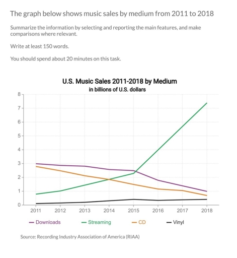
The line graph illustrates the disparities in music sales across various formats. Overall, music sales through streaming exhibited the most significant change, demonstrating a general upward trend until the end of the period, while downloads and CD sales followed an opposite trajectory.

Focusing first on streaming sales, this format experienced the most substantial growth. Starting from a mere $0 in 2011, the figure skyrocketed to $2.5 billion by 2015 and continued to rise, reaching a peak of $8 billion by the end of the period.

In contrast, the changes for vinyl sales were not as dramatic. Over the seven-year period, vinyl sales remained below $1 billion, showing no significant fluctuation. Meanwhile, CD sales experienced a decline, dropping to $1 billion by 2018. Downloads, which were valued at around $3 billion in 2013, fell to $2 billion just a year later, and continued to decrease slightly until the end of the period.

Word Count: 151

Answers On The Same Topic:

The graph below shows music sales by medium from 2011 to 2018.

The line graph illustrates track sales by medium between 2010 and 2018. Overall, initially streaming medium is become the lowest pattern, but then this was followed by increased sharply. The figure for the number of the vinyl medium sales witnessed remain unchanged. The download and cd mediums were become the highest sales figure, however, this […]

The graph below shows music sales by medium from 2011 to 2018.

The graph illustrates the trends in music sales across various mediums in the United States from 2011 to 2018. Overall, while the majority of music sales mediums experienced a decline, streaming demonstrated significant growth throughout the period. Initially, download sales began at 3.1 billion dollars in 2011, with a slight increase to 3.5 billion in […]

The graph below shows music sales by medium from 2011 to 2018.

The line graph illustrates the sales of music in the United States across four different mediums: downloads, streaming, CDs, and vinyl measured in billions of dollars. Overall, it is clear that streaming experienced a dramatic increase, becoming the dominant format by the end of the period, while both downloads and CD sales declined sharply. Vinyl […]

The graph below shows music sales by medium from 2011 to 2018.

The line graph presents changes in the amount of music sales via four different sources – measured in billions of dollars – by medium between 2011 and 2018. Overall, there was an upward trend for streaming and vinyl, with the former experiencing dramatic growth, while the reverse was true for downloads and CDs, which exhibited […]

See All

Other Topics:

The picture below shows the use of renewable energy accounting the total energy from 1971 to 2006. Summarize the information by selecting and reporting the main features and make comparisons where relevant.

The line graph gives information about how many percent renewable energy used to in Finland, Denmark, France, Germany, the US and the UK from totally energy spent between 1971 and 2011. Overall, the Franc, the Germany and the UK stably increased during the period while the Finland minimally decreased rather than fluctuation. However, the Denmark […]

The line graph demonstrated how many money were spend for books over the timespan of the next decade, from 1995 to 2005.

The line graph illustrates how much money was spent on books between the year 1995 to 2005. Overall, it can be concluded that the general trend leans to the more positive side, with all countries having upward tendencies from the year 2003. However, it is noticable that Austria is the only one showing large amount […]

line graph shows the changes in the use of internet for different activities in the future.

The line graph illustrates the usage of the Internet in different four activities namely downloading films, sending emails, shopping and studying online courses during the 15-year period from 2015 to 2025, with forecasts to 2030. Overall, it can be seen that there have almost been upward trends and will continue through 2030, whereas only downloading […]

The graph elow shows the umer o cell phoe suscriers i

This line graph compares the total of male and female who subscribe cell phone in one city In general this line graph shows a positive trend in both of categories untill 2005. In the following five years, the number of female customers were dropping and revealed a stastic trend. On the other hand, the number […]

The graph shows the value in US dollars (in millions of dollars) of investment in funds of four categories from 1988 to 2014.

The given chart illustrate the benefit the amount of money that put into assests in four types of investment including : the property , the gold , the fine art and the company shares between 1988 to 2014 Overall , it is clear that all four investment categories increased over time , with gold was […]

The table below gives information on UK acid rain emissions, measured in millions of tonnes, from four different sectors between 1990 and 2007. Write a report for a university lecturer describing the information shown below. Make comparisons where relevant.

The line graph presents data on UK acid rain emissions in four diverse of sections during the period 1990-2007. Generally speaking in four sectors was a gradually downward trend throughout the period. The most significant decrease had seen in section Electricity, Gas and Water Supply. At the beginning of the period the electricity, gas and […]

See All
We have detected unusual activity on your device.
Please verify your identity to continue.
Note: This verification step won't sign you in. If you have a premium account, please log in to access the service as usual.
Google/Gmail Verification
Or verify using Email/Code
We've sent a verification code to:
youremail@gmail.com (Not your email?)
Enter it below to complete the verification process.
Ensure your email address is correct, your inbox is not full, and you check your spam folder. If no email arrives, consider using an alternative email.
You will need a Premium plan to perform your action!
Note: If you already have a premium account, please log in to access our services as usual.

Plans & Pricing

Our mission is to make quality education accessible and free for everyone.
However, to keep our hardworking team running and this service alive, we genuinely need your support!
By opting for a premium plan, not only do you sustain us in achieving the mission, but you also unlock advanced features to enrich your learning experience.

Free

For learners who aren't pressed for time

What's included on Free
1000+ IELTS Tests & Samples
Instant IELTS Writing Task 1 & 2 Evaluation (2 times/month)
Instant IELTS Speaking Part 1, 2, & 3 Evaluation (5 times/month)
Instant IELTS Writing Task 1 & 2 Essay Generator (2 times/month)
500+ Dictation & Shadowing Exercises
100+ Pronunciation Exercises
Flashcards
Other Advanced Tools

Premium

For those serious about advancing their English proficiency, and for IELTS candidates aspiring to boost their band score by 1-2 points (especially in writing & speaking) in just 30 days or less

What's included on Premium
Save Your IELTS Test Progress
Unlock All Courses & Content
Unlimited AI Conversations
Unlimited AI Writing Enhancement Exercises
Unlimited IELTS Writing Task 1 & 2 Evaluation
Unlimited IELTS Speaking Part 1, 2, & 3 Evaluation
Checked Answers Will Not Be Published
Unlimited IELTS Writing Task 1 & 2 Essay Generator
Unlimited IELTS Speaking Part 1, 2, & 3 Sample Generator
Unlimited Usage Of Advanced Tools

Due to the nature of our service and the provided free trials, payments are non-refundable.
Nếu bạn là người Việt Nam và không có hoặc không muốn trả bằng credit/debit cards, bạn có thể thanh toán bằng phương thức chuyển khoản:


Chọn gói:
279,000₫ 157,000 ₫ cho gói 1 tháng (chỉ 5,233₫/ngày)
819,000₫ 397,000 ₫ cho gói 3 tháng (chỉ 4,411₫/ngày)
1,649,000₫ 667,000 ₫ cho gói 6 tháng (chỉ 3,706₫/ngày)
3,299,000₫ 857,000 ₫ cho gói 12 tháng (chỉ 2,381₫/ngày)


Sau khi chuyển khoản, vui lòng đợi trình duyệt tự động điều hướng bạn trở lại Engnovate và bạn sẽ ngay lập tức nhận được mã kích hoạt tài khoản premium.
Nếu có lỗi xảy ra, bạn có thể liên hệ với team thông qua một trong các phương thức: email đến helloengnovate@gmail.com hoặc nhắn tin qua facebook.com/engnovate.
Vì toàn bộ công cụ trên website đều có thể sử dụng thử miễn phí, Engnovate không hỗ trợ hoàn tiền.