🔥 Today Only: Save 30% on Premium — Offer Ends Soon! - Upgrade Now!
Line Graph

Band 5+: The graph below shows the average consumption of cheese per person in England, Scotland, Wales, and Northern Ireland between 1980 and 2020

Image for topic: The graph below shows the average consumption of cheese per person in England, Scotland, Wales, and Northern Ireland between 1980 and 2020
Our system will evaluate the answer based on this AI-generated description.
The image is a line graph titled Annual Cheese Consumption, it depicts the average cheese consumption in England, Scotland, Wales, and Northern Ireland between 1980 and 2020. Four lines represent each area, with data points at 1980, 1990, 2000, 2010, and 2020. England starts at 110 in 1980, increases to 125 in 1990, decreases to 100 in 2000, and remains at 100 in 2010 and 2020. Scotland begins at 50 in 1980, increases to 75 in 1990, drops to below 75 in 2000, rises to 75 in 2010, and decreases to just above 50 in 2020. Wales starts at 75 in 1980, decreases to 50 in 1990, increases to almost 100 in 2000, decreases to below 75 in 2010, and drops to 25 in 2020. Northern Ireland begins at 50 in 1980, increases to above 75 in 1990, decreases to 75 in 2000, remains at 75 in 2010, and slightly increases to above 75 in 2020. The vertical axis represents average cheese consumption in milligrams, ranging from 0 to 125, and the horizontal axis represents years from 1980 to 2020.
Given the complexity of the image, the above description may not be entirely accurate.
Note: Both the topic and the answer were created by one of our users.

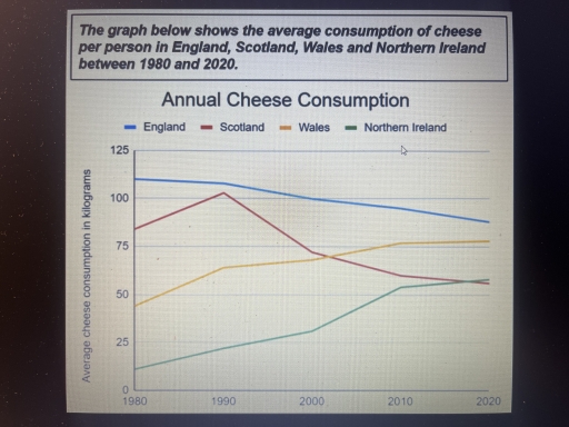
A glance at the graph depicts average consumption of cheese per person which was consumed in England, Scotland,Wales and Northern Ireland from 1980 to 2020. It is evident that consumption of cheese in both countries namely England and Scotland experienced moderate decline. Other two countries, however rose slightly.

Graph of Northern Ireland show an upward trend between 1980 and 2020. There was approximately 17 kilogrammes of cheese consumed in 1980. After this from 2000 to 2010 the figure rose considerably. Cheese consumption in Wales, meanwhile followed by a period of exponential growth. It was much higher than consumption of Northern Ireland during this period. Consumption of cheese in Wales growed moderately to somewhere in the vicinity of 40 kilos in 1980 to 77 kilos in 2020.

Consumption of other two countries, on the other hand show a downward trend. The figure of England was the highest one during this period. Consumption of England declined somewhere between 120 kilos in 1980 to 85 kilos in 2020. Cheese consumption in Scotland increased between 1980 and 1990, reached a peak of 105 kilos in the 1990s. Then it went down steadily from 1990 to 2020

Word Count: 192

Answers On The Same Topic:

The graph below shows the average consumption of cheese per person in England, Scotland, Wales, and Northern Ireland between 1980 and 2020

The line graph illustrates the average per capita cheese consumption across four regions of the United Kingdom – England, Scotland, Wales, and Northern Ireland – over a four-decade period from 1980 to 2020. Overall, England witnessed a gradual decline in cheese consumption, whereas Scotland experienced considerable fluctuations. In contrast, Wales and Northern Ireland exhibited a […]

The graph below shows the average consumption of cheese per person in England, Scotland, Wales, and Northern Ireland between 1980 and 2020

The line graph illustrates how much cheese was consumed in four countries – England, Scotland, Wales, and Northern Ireland – between 1980 and 2020. Overall, what stands out from the graph is that there were considerable upward trends in cheese consumption in both Wales and Northern Ireland, whereas the figures for England and Scotland showed […]

The graph below shows the average consumption of cheese per person in England, Scotland, Wales, and Northern Ireland between 1980 and 2020

The line graph gives the information about how much cheese per person consumed on average in kilograms (kg) in four different countries England, Scotland, Wales, and Northern Ireland from 1980 to 2020. Overall, the average cheese consumption in Wales and Northern Ireland experienced an upward trend, showing consistently growth over the period. Additionally, England and […]

The graph below shows the average consumption of cheese per person in England, Scotland, Wales, and Northern Ireland between 1980 and 2020

Given line graph presents the statistics of consumed cheese in four countries: England, Scotland, Wales and Northern Ireland between 1980 and 2020 years. Overall, Northern Ireland and Wales showed a steady rise throughout the whole time, conversely, England displayed opposite trend. Scotland managed to show sharp rise in the amount of eaten cheese, however experienced […]

The graph below shows the average consumption of cheese per person in England, Scotland, Wales, and Northern Ireland between 1980 and 2020

The given line graph illustrates the average consumption of cheese per person in four European countries from 1980 to 2012. Overall, it is clear that a rapid growth in the number of the cheese consumption was observed in Wales and Ireland. While, the number of it in England and Scotland decreased significantly. Focusing on ascending […]

See All

Other Topics:

The graph below shows the number of visitors to three different types of museums in a particular city between 2000 and 2015.

The line graph illustrates the changes in annual visitor numbers for three categories of museums – History, Science, and Art – over a fifteen-year period starting from 2000. Overall, the History museum remained the most popular destination throughout the period, despite some fluctuations. Conversely, while the Science museum saw a steady decline in attendance, the […]

The line graph below shows the unemployment rates in three countries (Japan, the United States, and Australia) between 1990 and 2010. Summarize the information by selecting and reporting the main features, and make comparisons where relevant.

The provided line graph illustrates the unemployment rates in three countries (Japan, the United States, and Australia) over a span of 20 years from 1990 to 2010. Overall, the US experienced an upward trend. In contrast, the data indicate a downward trend in Japan and Australia, with the figure of the United States showing the […]

The graph below gives information about U.S. government spending on research between 1980 and 2008.

The line graph illustrates the trends in US federal research and development expenditure across five distinct sectors between 1980 and 2008. All figures are calibrated in billions of dollars. Overall, the most striking feature is the dominance of Health spending, which experienced a substantial growth over the nearly 30-year period. While most categories showed an […]

The graph shows the number of people taking parts in 4 kinds of sports in a particular region between 1985 and 2005. Summarize the information by selecting and reporting the main features, and make comparisons where relevant

The data illustrates the percentage of individuals taking parts in four different kinds of sports in regions like the UK and Asia between 1985 and 2005. Overall, the change in Asia shows an increasing trend among the following years. On the other hand, the UK decreased rapidly making it the lowest country, and the other […]

The graph shows the percentage of UK adolescents following a vegetarian diet. Summarise the information by selecting and reporting the main features.

The chart demonstrates the proportion of teenagers restraining themselves from eating meat in the United Kingdom between the years 1960 and 2020. Overall, there is a noticeable increase, with the most noteworthy points being the fall off in the mid-eighties and some fluctuations going forward in the 1990s. To start off, in the first twenty […]

The graph below shows average carbon dioxide emissions per person in the United Kingdom, Sweden, Italy and Portugal between 1967 and 2007.

This graph shows avarege carbon dioxide emmisions for one person in the United Kingdom, Sweeden, Italy and Portugal from 1967 to 2007. Firstly, United Kingdom has started in the highest point in the chart. Then in 1997 it started to decrease and the emissions had a drop to 9. Sweeden had an increase to 10 […]

See All
We have detected unusual activity on your device.
Please verify your identity to continue.
Note: This verification step won't sign you in. If you have a premium account, please log in to access the service as usual.
Google/Gmail Verification
Or verify using Email/Code
We've sent a verification code to:
youremail@gmail.com (Not your email?)
Enter it below to complete the verification process.
Ensure your email address is correct, your inbox is not full, and you check your spam folder. If no email arrives, consider using an alternative email.
You will need a Premium plan to perform your action!
Note: If you already have a premium account, please log in to access our services as usual.

Plans & Pricing

Our mission is to make quality education accessible for everyone.
However, to keep our hardworking team running and this service alive, we genuinely need your support!
By opting for a premium plan, not only do you sustain us in achieving the mission, but you also unlock advanced features to enrich your learning experience.

Free

For learners who aren't pressed for time

What's included on Free
100+ Cambridge IELTS Tests
Instant IELTS Writing Task 1 & 2 Evaluation (2 times/month)
Instant IELTS Speaking Part 1, 2, & 3 Evaluation (5 times/month)
Instant IELTS Writing Task 1 & 2 Essay Generator (2 times/month)
500+ Dictation & Shadowing Exercises
100+ Pronunciation Exercises
Flashcards
Other Advanced Tools

Premium

For those serious about advancing their English proficiency, and for IELTS candidates aspiring to boost their band score by 1-2 points (especially in writing & speaking) in just 30 days or less

What's included on Premium
Save Your IELTS Test Progress
Unlock All Courses & IELTS Tests
Unlimited AI Conversations
Unlimited AI Writing Enhancement Exercises
Unlimited IELTS Writing Task 1 & 2 Evaluation
Unlimited IELTS Speaking Part 1, 2, & 3 Evaluation
Checked Answers Will Not Be Published
Unlimited IELTS Writing Task 1 & 2 Essay Generator
Unlimited IELTS Speaking Part 1, 2, & 3 Sample Generator
Unlimited Usage Of Advanced Tools
Priority Support within 24h (12-month plan only)

Due to the nature of our service and the provided free trials, payments are non-refundable.
Nếu bạn là người Việt Nam và không có hoặc không muốn trả bằng credit/debit cards, bạn có thể thanh toán bằng phương thức chuyển khoản:


Chọn gói:
419,000₫ 277,000 ₫ cho gói 1 tháng (chỉ 9,233₫/ngày)
1,239,000₫ 597,000 ₫ cho gói 3 tháng (chỉ 6,633₫/ngày)
2,469,000₫ 1,027,000 ₫ cho gói 6 tháng (chỉ 5,706₫/ngày)
4,929,000₫ 1,417,000 ₫ cho gói 12 tháng (chỉ 3,936₫/ngày)


Sau khi chuyển khoản, vui lòng đợi trình duyệt tự động điều hướng bạn trở lại Engnovate và bạn sẽ ngay lập tức nhận được mã kích hoạt tài khoản premium.
Nếu có lỗi xảy ra, bạn có thể liên hệ với team thông qua một trong các phương thức: email đến helloengnovate@gmail.com hoặc nhắn tin qua facebook.com/engnovate.
Vì toàn bộ công cụ trên website đều có thể sử dụng thử miễn phí, Engnovate không hỗ trợ hoàn tiền.