24 Hours Only: Get 39% OFF on Our Premium Plan - Check Out Now!
Line Graph

Band 6+: The graph below shows the average house in three countries between the years 1997 and 2014. Summarise the information by selecting and reporting the main features,and make comparison where relevant.

Image for topic: The graph below shows the average house in three countries between the years 1997 and 2014. Summarise the information by selecting and reporting the main features,and make comparison where relevant.
Our system will evaluate the answer based on this AI-generated description.
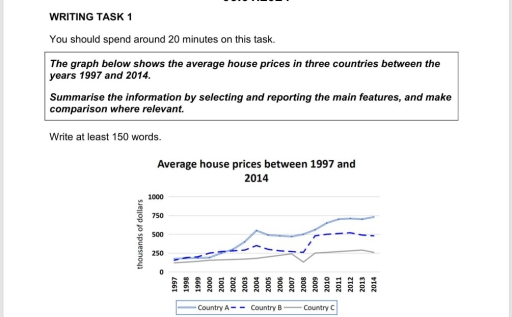
The image contains a line graph titled 'Average house prices between 1997 and 2014' with a vertical axis for 'thousands of dollars' ranging from 0 to 1000 and a horizontal axis for years from 1997 to 2014. For Country A, average prices in thousands of dollars were: 1997(150), 1998(175), 1999(200), 2000(250), 2001(275), 2002(300), 2003(400), 2004(575), 2005(500), 2006(500), 2007(450), 2008(500), 2009(600), 2010(660), 2011(700), 2012(700), 2013(725), 2014(725). For Country B, prices were: 1997(125), 1998(125), 1999(150), 2000(175), 2001(200), 2002(225), 2003(250), 2004(350), 2005(325), 2006(300), 2007(275), 2008(250), 2009(500), 2010(500), 2011(525), 2012(500), 2013(500), 2014(475). For Country C, prices were: 1997(100), 1998(100), 1999(125), 2000(150), 2001(175), 2002(200), 2003(200), 2004(225), 2005(240), 2006(250), 2007(225), 2008(125), 2009(200), 2010(250), 2011(275), 2012(300), 2013(300), 2014(275).
Given the complexity of the image, the above description may not be entirely accurate.
Note: Both the topic and the answer were created by one of our users.

The line graph demonstrate how the average house price changed between the years 1997 and 2014. We can notice that the three lines start from roughly the same point, ending up with an increase for the first two countries, while the third lasted with almost the same value through the years. The first nation had the most increasing trend with a great growth in 2014 and a slower one in 2011. However this line had the highest avarage price all long the graph, starting from 170 and ending up with 750 thousand of dollars in 2014.

Despite starting from a good situation, the second country was the least stable as the trend has a noticeble chrisis between 2005 and 2008, but also an exponential growth in 2009, achieving the second biggest value.

As I concern from the graph, the third context has the lowest price in almost every year, with the most stable line even though there was an important decrease in 2008, however this country ended with almost the same price as the first year.

Word Count: 176

Answers On The Same Topic:

The graph below shows the average house in three countries between the years 1997 and 2014. Summarise the information by selecting and reporting the main features,and make comparison where relevant.

The line graph illustrates the average house prices, measured in thousands of dollars, across three different countries from 1997 to 2014. Overall, it is evident that there were distinct trends in house prices among the three countries over the specified period, with Country A demonstrating significant growth, while Countries B and C exhibited fluctuating prices. […]

The graph below shows the average house in three countries between the years 1997 and 2014. Summarise the information by selecting and reporting the main features,and make comparison where relevant.

The average house prices, scaled in thousands of dollars, in three different countries are given in the diagram between 1997 and 2014. Overall, all three of these countries were the same in the beginning, and in the following years, their percentages fluctuated. In detail, from 1997 to 2002, countries A, B, and C were all […]

The graph below shows the average house in three countries between the years 1997 and 2014. Summarise the information by selecting and reporting the main features,and make comparison where relevant.

The average house prices, scaling as thousands of dollars, in three different countries are given in the diagram between 1997 and 2014. Overall, all of these three countries in the beggining were the same, and the following years their percentages were fluctuative. In detail, from 1997 to 2002, country A,B,C were all increasing slightly, started […]

The graph below shows the average house in three countries between the years 1997 and 2014. Summarise the information by selecting and reporting the main features,and make comparison where relevant.

The line graphs illustrate the average number of apparment costs among three different countries between 1997 and 2014s. Overall,the most significant features of drammatic incraese in prices had a country A and the lowest one was country C.Although,they started in the same level,country A and country C had a significant difference between each other.Additionally,among other […]

See All

Other Topics:

The graph below show the average number of people entering a museum the day, during summer and winter in 2003.

The line graph compares the average number of people daily visiting a museum during the summer and winter seasons in 2003. Overall, the museum saw a much higher volume of visitors during the summer, characterized by a dramatic midday surge. In contrast, winter visitation was lower and more stable, with the notable difference that visitors […]

The graph below shows the availability of various sweeteners in the USA from 1966 to 2012. Summarise the information by selecting and reporting the main features, and make comparisons where relevant.

The given line graph displays the availability of different types of sweeteners in the United States between 1966 and 2012. In total, it was noticed that the rise in the availability of the sweetener was from 1966 to around 2000. The amount of refined cane and beet sugars had fallen in 1986, but after that, […]

The line graph below shows the changes in the number of urban and rural dwellers since 1950 and the main trends for the future.

The line graph illustrates the size of population in rural and urban areas in the span of 100 years. Overall, it is apparent that the size of population grew significantly in less developed urban regions, while less developed rural and more developed urban regions showed a moderate rise, and more developed regional population declined. There […]

The graph shows changes in the proportion of Internet users in three different countries from 1999 to 2009. Summarize the information by selecting and reporting the main features and make comparisons where relevant. You should write at least 150 words.

The line graph illustrates the percentage of internet users in the USA, Canada, and Mexico between 1999 and 2009. Overall, all three countries showed an upward trend over the period. By the end of the period, Canada had the highest percentage of internet users among the three nations. In 1999, the USA had the highest […]

the number of goods transported by types of transportation in UK

The line graph illustrates the number of delivered cargo in the UK from 1974 to 2002 by four categories of transport. Overall, much transport increased over the period, especially road and water. Rail and water transport had the same number of tonnes at a certain point in time. Fortunately, none of them decreased overall by […]

the graph below shows the percentage of global music sales through three different methods from 2011 to 2018. summarise the information by selecting and reporting the main features and make comparisons where relevant

The graph illustrates data about the amount of music sales globally from 2011 to 2018. Overall, the persentage of CDs purchases dropped gradually, while the proportion of streaming soared over the period. Additionally, the persentage of downloads flactuated. In 2011, CD purchases reached a 60%. In contrast to streaming which had the lowest figure at […]

See All
We have detected unusual activity on your device.
Please verify your identity to continue.
Note: This verification step won't sign you in. If you have a premium account, please log in to access the service as usual.
Google/Gmail Verification
Or verify using Email/Code
We've sent a verification code to:
youremail@gmail.com (Not your email?)
Enter it below to complete the verification process.
Ensure your email address is correct, your inbox is not full, and you check your spam folder. If no email arrives, consider using an alternative email.
You will need a Premium plan to perform your action!
Note: If you already have a premium account, please log in to access our services as usual.

Plans & Pricing

Our mission is to make quality education accessible for everyone.
However, to keep our hardworking team running and this service alive, we genuinely need your support!
By opting for a premium plan, not only do you sustain us in achieving the mission, but you also unlock advanced features to enrich your learning experience.

Free

For learners who aren't pressed for time

What's included on Free
100+ Cambridge IELTS Tests
Instant IELTS Writing Task 1 & 2 Evaluation (2 times/month)
Instant IELTS Speaking Part 1, 2, & 3 Evaluation (5 times/month)
Instant IELTS Writing Task 1 & 2 Essay Generator (2 times/month)
500+ Dictation & Shadowing Exercises
100+ Pronunciation Exercises
Flashcards
Other Advanced Tools

Premium

For those serious about advancing their English proficiency, and for IELTS candidates aspiring to boost their band score by 1-2 points (especially in writing & speaking) in just 30 days or less

What's included on Premium
Save Your IELTS Test Progress
Unlock All Courses & IELTS Tests
Unlimited AI Conversations
Unlimited AI Writing Enhancement Exercises
Unlimited IELTS Writing Task 1 & 2 Evaluation
Unlimited IELTS Speaking Part 1, 2, & 3 Evaluation
Checked Answers Will Not Be Published
Unlimited IELTS Writing Task 1 & 2 Essay Generator
Unlimited IELTS Speaking Part 1, 2, & 3 Sample Generator
Unlimited Usage Of Advanced Tools

Due to the nature of our service and the provided free trials, payments are non-refundable.
Nếu bạn là người Việt Nam và không có hoặc không muốn trả bằng credit/debit cards, bạn có thể thanh toán bằng phương thức chuyển khoản:


Chọn gói:
279,000₫ 157,000 ₫ cho gói 1 tháng (chỉ 5,233₫/ngày)
819,000₫ 397,000 ₫ cho gói 3 tháng (chỉ 4,411₫/ngày)
1,649,000₫ 667,000 ₫ cho gói 6 tháng (chỉ 3,706₫/ngày)
3,299,000₫ 857,000 ₫ cho gói 12 tháng (chỉ 2,381₫/ngày)


Sau khi chuyển khoản, vui lòng đợi trình duyệt tự động điều hướng bạn trở lại Engnovate và bạn sẽ ngay lập tức nhận được mã kích hoạt tài khoản premium.
Nếu có lỗi xảy ra, bạn có thể liên hệ với team thông qua một trong các phương thức: email đến helloengnovate@gmail.com hoặc nhắn tin qua facebook.com/engnovate.
Vì toàn bộ công cụ trên website đều có thể sử dụng thử miễn phí, Engnovate không hỗ trợ hoàn tiền.