🔥 Today Only: Save 30% on Premium — Offer Ends Soon! - Upgrade Now!
Line Graph

Band 5+: The graph below shows the average house prices in three countries between the years 1997 and 2014. Summarise the information by selecting and reporting the main features, and make comparison where relevant.

Image for topic: The graph below shows the average house prices in three countries between the years 1997 and 2014. Summarise the information by selecting and reporting the main features, and make comparison where relevant.
Our system will evaluate the answer based on this AI-generated description.
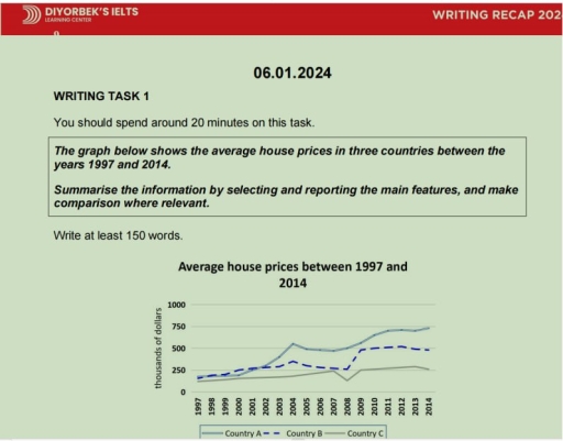
The image depicts a line graph charting average house prices from 1997 to 2014, classified by Country A, Country B, and Country C. In 1997, Country A starts at around 175,000 dollars, gradually rising to approximately 200,000 dollars by 2001, peaking in 2007 at roughly 350,000 dollars, dipping to around 275,000 dollars by 2008, and recovering to about 300,000 dollars by 2014. Country B commences near 50,000 dollars in 1997, increasing progressively, touching 75,000 dollars by 2001, 100,000 dollars by 2005, slightly above 125,000 dollars by 2007, drops to around 100,000 dollars in 2008, steadying near 125,000 dollars by 2014. Country C's starting point is slightly under 150,000 dollars in 1997, increasing moderately to nearly 200,000 dollars by 2007, plunging to just above 125,000 dollars in 2008, and ending close to 140,000 dollars in 2014.
Given the complexity of the image, the above description may not be entirely accurate.
Note: Both the topic and the answer were created by one of our users.

We can see from the chart how the price of the houses have been change over the years caused for differences factors which have made prices higher for the last decade.

One thing that clearly stands out is, the stability that the real state market had in the 90s and the early 2000s. The countries handle almost the same costs between 250.000 and 500.000 thounsands of dollars with small differences making the real state bubble porfitable.

Howrever they have a interesting change by 2008, when there is a big droop in the prices, this was caused for the recession that affect a large part of economy world, the imagen show us the same situation in the three nations, but despite this the market managed to recover little y little and achieved a certain stability until 2014, but with higher prices, revealing the consequences of the crisis and the change due to global inflation.

Word Count: 153

Answers On The Same Topic:

The graph below shows the average house prices in three countries between the years 1997 and 2014. Summarise the information by selecting and reporting the main features, and make comparison where relevant.

The graph describes the average house prices between 1997 and 2014 in three differnt contries. Overall, it is obvious that the statics in all three countries is pretty similar. The line grapgh tends to increase during all 17 years. However all three lines depict a clrear fall in terms of 2008 crisis and due to […]

The graph below shows the average house prices in three countries between the years 1997 and 2014. Summarise the information by selecting and reporting the main features, and make comparison where relevant.

The graph illustrates the standard costs of house in three countries from 1997 to 2014. The average costs of house was almost the same in all given countries from 1997 and it had been lusted until 1999. The average costs in these years consisted approximately 150 thousands of dollars. After that, in 2000, the standard […]

The graph below shows the average house prices in three countries between the years 1997 and 2014. Summarise the information by selecting and reporting the main features, and make comparison where relevant.

The graph illustrates the average house prices in three countries (A,B,C) between 1997 and 2014 , Units are measured in thousands of dollars. Overall the house prices has increased from 1997 to 2014 , except country C all the countries have fluctuated throughout the period, with country A dominates them. The prices in countries A […]

The graph below shows the average house prices in three countries between the years 1997 and 2014. Summarise the information by selecting and reporting the main features, and make comparison where relevant.

The graph illustrates the Average house prices in 3 countries ( A , B , C ) between 1997 and 2014 ,Units are measured with thousands of dollars Overall the prices in country A increased from 2000 to 2004, country B’s has decreased a bit from 2004 to 2008 , and country C’s has been […]

See All

Other Topics:

The graph shows the language options selected by 13-year-old students in a school in England

The line chart compares the number of 13-year-old students in a school in England choosing the two different languages, namely French and Mandarin from 2000 to 2010. What is most striking when looking at the data is that French remained the dominant language throughout the period, despite a downward trend in student enrolment , whereas […]

The line graph shows the number of single-family houses built in four different areas in the United States between 2006 and 2012. Summarize the information by selecting and Reporting the main features and make comparisons where relevant.

The line graph reveals the construction figures for single-family houses across various regions in the United States over a six-year span. At a glance, it is clear that the lowest number of new constructions was in the Northeast region of the country. Overall, it is evident that the number of newly constructed single-family homes across […]

The line graph below shows the number of serious crimes that occurred in London between 2003 and 2012. Summarise the information by selecting and reporting the main features and make comparisons where relevant.

The line chart displays information on armed robbery, assault and murder crimes that happened in London from 2003 to 2012. Overall, the cases of armed robbery decreased significantly, while assault witnessed a gradual increase over the entire time period. As for murder crimes, the numbers remained relatively stable. In 2003, the figure for armed robbery […]

the graph below shows the percentage of global music sales through three different methods from 2011 to 2018. summarise the information by selecting and reporting the main features and make comparisons where relevant

The line graph illustrates the percentage of global music sales through three various methods between 2011 and 2018. Overall, most of the music from downloads and CDs purchased dropped in earnings, except for streams, which increased to the highest level. While for downloads and CDs, both of them had a significant slump in the last […]

The graph below shows radio and television audiences throughout the day in 1992. Summarise the information by selecting and reporting the main features, and make comparisons where relevant. Write at least 150 words.

The line graph shows the percentege of the people in UK who watched and listened TV and radio over a day in 1992. Overall, while the radio was popular in the morning, TV was in the evening. An interesting point is that, the percentage of radio and TV audiences was nearly the same in the […]

The chart illustrates consumption of four kinds of fast food by teenagers in Morocco from 2000 to 2015.

The line chart provides a key information about the number of times fast foods were eaten by Moroccan teenagers between 2000 and 2015 . The unit is measured in numbers . It is clear from the chart that taco had the highest number , whereas pizza had the lowest number . In addition , fried […]

See All
We have detected unusual activity on your device.
Please verify your identity to continue.
Note: This verification step won't sign you in. If you have a premium account, please log in to access the service as usual.
Google/Gmail Verification
Or verify using Email/Code
We've sent a verification code to:
youremail@gmail.com (Not your email?)
Enter it below to complete the verification process.
Ensure your email address is correct, your inbox is not full, and you check your spam folder. If no email arrives, consider using an alternative email.
You will need a Premium plan to perform your action!
Note: If you already have a premium account, please log in to access our services as usual.

Plans & Pricing

Our mission is to make quality education accessible for everyone.
However, to keep our hardworking team running and this service alive, we genuinely need your support!
By opting for a premium plan, not only do you sustain us in achieving the mission, but you also unlock advanced features to enrich your learning experience.

Free

For learners who aren't pressed for time

What's included on Free
100+ Cambridge IELTS Tests
Instant IELTS Writing Task 1 & 2 Evaluation (2 times/month)
Instant IELTS Speaking Part 1, 2, & 3 Evaluation (5 times/month)
Instant IELTS Writing Task 1 & 2 Essay Generator (2 times/month)
500+ Dictation & Shadowing Exercises
100+ Pronunciation Exercises
Flashcards
Other Advanced Tools

Premium

For those serious about advancing their English proficiency, and for IELTS candidates aspiring to boost their band score by 1-2 points (especially in writing & speaking) in just 30 days or less

What's included on Premium
Save Your IELTS Test Progress
Unlock All Courses & IELTS Tests
Unlimited AI Conversations
Unlimited AI Writing Enhancement Exercises
Unlimited IELTS Writing Task 1 & 2 Evaluation
Unlimited IELTS Speaking Part 1, 2, & 3 Evaluation
Checked Answers Will Not Be Published
Unlimited IELTS Writing Task 1 & 2 Essay Generator
Unlimited IELTS Speaking Part 1, 2, & 3 Sample Generator
Unlimited Usage Of Advanced Tools
Priority Support within 24h (12-month plan only)

Due to the nature of our service and the provided free trials, payments are non-refundable.
Nếu bạn là người Việt Nam và không có hoặc không muốn trả bằng credit/debit cards, bạn có thể thanh toán bằng phương thức chuyển khoản:


Chọn gói:
419,000₫ 277,000 ₫ cho gói 1 tháng (chỉ 9,233₫/ngày)
1,239,000₫ 597,000 ₫ cho gói 3 tháng (chỉ 6,633₫/ngày)
2,469,000₫ 1,027,000 ₫ cho gói 6 tháng (chỉ 5,706₫/ngày)
4,929,000₫ 1,417,000 ₫ cho gói 12 tháng (chỉ 3,936₫/ngày)


Sau khi chuyển khoản, vui lòng đợi trình duyệt tự động điều hướng bạn trở lại Engnovate và bạn sẽ ngay lập tức nhận được mã kích hoạt tài khoản premium.
Nếu có lỗi xảy ra, bạn có thể liên hệ với team thông qua một trong các phương thức: email đến helloengnovate@gmail.com hoặc nhắn tin qua facebook.com/engnovate.
Vì toàn bộ công cụ trên website đều có thể sử dụng thử miễn phí, Engnovate không hỗ trợ hoàn tiền.