🔥 Today Only: Save 30% on Premium — Offer Ends Soon! - Upgrade Now!
Line Graph

Band 7+: The graph below shows the average length of stay last year (in days) for serious injuries for different age groups in private and public hospitals in Queensland in Australia

Image for topic: The graph below shows the average length of stay last year (in days) for serious injuries for different age groups in private and public hospitals in Queensland in Australia
Our system will evaluate the answer based on this AI-generated description.
The image shows a line graph titled "Last Year's Average Length of Stay at Private and Public Hospitals for Serious Injuries – Queensland, Australia" with two lines representing 'PUBLIC' and 'PRIVATE' hospitals. The X-axis lists age groups: 00-05, 06-10, 11-15, 20-25, 30-35, 40-45, 50-55, 60-65, 70-74, 75-80, 85+; with corresponding years below each group: 04, 09, 14, 19, 24, 29, 34, 39, 44, 49, 54, 59, 64, 69, 74, 79, 84. The Y-axis measures the average length of stay (days), ranging from 0 to 60 in increments of 10. For Public hospitals, the data points for age groups are as follows: 00-05: 35 days, 06-10: 25, 11-15: 25, 20-25: 15, 30-35: 35, 40-45: 52, 50-55: 40, 60-65: 42, 70-74: 20, 75-80: 18, 85+: 18. For Private hospitals, the data points are: 00-05: 20 days, 06-10: 16, 11-15: 20, 20-25: 14, 30-35: 15, 40-45: 20, 50-55: 20, 60-65: 25, 70-74: 18, 75-80: 14, 85+: 14. There are no data points for the 16-19 and 26-29 age groups.
Given the complexity of the image, the above description may not be entirely accurate.
Note: Both the topic and the answer were created by one of our users.

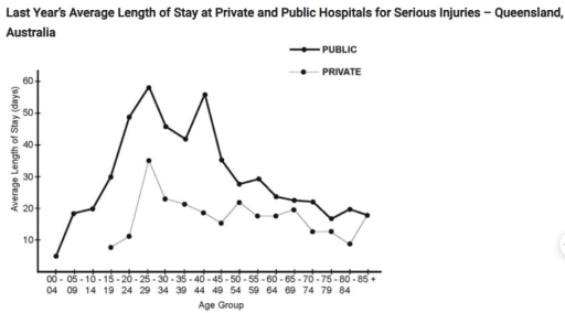
The chart compares the average number of days that patients from various age groups spent in private and public hospitals in Queensland, Australia, due to severe injuries over the past year.

Overall, public hospitals consistently had longer patient stays than private hospitals across all age groups. Hospitalization durations were highest among younger adults, particularly those in their late 20s, and gradually declined with age in both hospital types.

Public hospitals reported the longest stays for the 25–29 age group, averaging around 60 days, while private hospitals saw an average stay of approximately 25 days for the same demographic. Similarly, patients aged 15–34 in public hospitals stayed for an average of 45–60 days, whereas private hospitals recorded stable durations of 20–25 days. For children aged 0–14, public hospitals had an average stay of around 15 days, while private hospitals recorded fewer than 10 days.

For individuals aged 35 and older, the average length of stay steadily decreased in both sectors. By the age of 70 and above, public hospital stays averaged around 10–15 days, while private hospital stays dropped below 10 days. Notably, the gap between the two types of hospitals narrowed significantly in the older age groups.

Word Count: 197

Answers On The Same Topic:

The graph below shows the average length of stay last year (in days) for serious injuries for different age groups in private and public hospitals in Queensland in Australia

The data reports the difference between private and public hostpitals in relation to days staying in each type of hostpitals for serious injuries collected in Queenlands, Australia. Overall, serious injured patients of public hospitals spent longer time staying in hospital in every age groups, compared to the private hospitals’ patients. The groups who spent the […]

The graph below shows the average length of stay last year (in days) for serious injuries for different age groups in private and public hospitals in Queensland in Australia

The line graph compares the average hospital stay for serious injuries in public and private hospitals across different age groups in Queensland, Australia. Overall, patients in public hospitals stayed much longer than those in private facilities. In both sectors, the length of stay rose sharply in early adulthood, then fluctuated before gradually declining in later […]

The graph below shows the average length of stay last year (in days) for serious injuries for different age groups in private and public hospitals in Queensland in Australia

The illustration indicates that te standered period of stay recorded in the previous year for certain age group of people in independent and state run hospital in Queensland , Australia. In general the chart reveals that cases of injured patient rose considerably in both Government run and Private hospitals accross Australia In public hospitals, the […]

The graph below shows the average length of stay last year (in days) for serious injuries for different age groups in private and public hospitals in Queensland in Australia

The line graph illustrates the average length of stay for major injuries for different age groups in private and public hospitals in Queensland, Australia, over the past year. Overall, there is a significant trend for most age groups to spend more time in public hospitals than in private hospitals. In particular, people aged 25-29 years […]

The graph below shows the average length of stay last year (in days) for serious injuries for different age groups in private and public hospitals in Queensland in Australia

The graph illustrates the average duration of hospital stays, measured in days, for individuals with serious injuries across various age groups in private and public hospitals in Queensland, Australia, over the past year. Overall, public hospitals consistently recorded significantly longer stays compared to private hospitals across all age groups. Additionally, the length of hospital stays […]

See All

Other Topics:

The graph below shows the crime rate in England & wales from 1970 to 2005.

The line graph compares crime rates across three categories, namely car theft, house burglary and street robbery in England and Wales over a 35-year period. Overall, car theft and house burglary, despite experiencing steady growth initially, both ended the period with a decline between 1995 and 2005. In contrast, street robbery remained stagnant for the […]

The line chart below shows the employment in the agricultural sector in four African countries (Nigeria, Kenya, South Africa, and Algeria) from 1985 to 2019. Summarise the information by selecting and reporting the main features and make comparisons where relevant.

The graph illustrates the proportion of people employed in the agricultural sector in four African countries(Nigeria, Kenya, South Africa, and Algeria) between 1985 and 2019. Overall, it is clear that Nigera and Kenya was the leader one by one before Nigeria reach absolute peak in 2000, while Algeria showed the lowest outcome. South Africa increased […]

The graph below shows the number of shops that closed and the number of new shops that opened in one country between 2011 and 2018. Summarise the information by selecting and reporting the main features, and make comparisons where relevant. Write at least 150 words.

The line graph illustrates the amount of stores that closed and the amount of new stores that opened in a country around 2011 and 2018. Overall, there was a fluctuation for the opening stores with a decreased trend. On the other hand, there was a remain steady trend with one rocket drop on one year […]

The graph below shows the population of particular coutry by age group starting in 1960 and including a forecast to 2040

The graph depicts the population of a nation in three age groups from 0 up to 65 years old between 1960 and including a forecast to 2040. Overall, the young from 0 to 14 years old a decline among 80 years, while the older groups who are over 65 years old experiencing a significant increased. […]

The graph below shows the results of a survey among online adults on their use of various social media in the USA between 2012 and 201 5.

In today’s fast – paced world, there are many various social medias. This allows them to choose that they really need. This essay is about line graph, that shows us the usage websites in the USA between 2012 and 2015. Overall, the data reveals that users in all social networks generally increased. The Facebook consistently […]

The line graph shows the percentage of spending in a European country from 1960 to 2000. Summarise the information by selecting and reporting the main features, and make comparisons where relevant.

The graph illustrates the proportion of household expenditure on food, leisure, clothing, transport, and energy in a distinct European country from 1960 to 2000. Overall, the figure for energy, clothing, leisure, and food decreased gradually, while that for transport increased consistently. Notably, the gap between several expenditure categories became much smaller by the end of […]

See All
We have detected unusual activity on your device.
Please verify your identity to continue.
Note: This verification step won't sign you in. If you have a premium account, please log in to access the service as usual.
Google/Gmail Verification
Or verify using Email/Code
We've sent a verification code to:
youremail@gmail.com (Not your email?)
Enter it below to complete the verification process.
Ensure your email address is correct, your inbox is not full, and you check your spam folder. If no email arrives, consider using an alternative email.
You will need a Premium plan to perform your action!
Note: If you already have a premium account, please log in to access our services as usual.

Plans & Pricing

Our mission is to make quality education accessible for everyone.
However, to keep our hardworking team running and this service alive, we genuinely need your support!
By opting for a premium plan, not only do you sustain us in achieving the mission, but you also unlock advanced features to enrich your learning experience.

Free

For learners who aren't pressed for time

What's included on Free
100+ Cambridge IELTS Tests
Instant IELTS Writing Task 1 & 2 Evaluation (2 times/month)
Instant IELTS Speaking Part 1, 2, & 3 Evaluation (5 times/month)
Instant IELTS Writing Task 1 & 2 Essay Generator (2 times/month)
500+ Dictation & Shadowing Exercises
100+ Pronunciation Exercises
Flashcards
Other Advanced Tools

Premium

For those serious about advancing their English proficiency, and for IELTS candidates aspiring to boost their band score by 1-2 points (especially in writing & speaking) in just 30 days or less

What's included on Premium
Save Your IELTS Test Progress
Unlock All Courses & IELTS Tests
Unlimited AI Conversations
Unlimited AI Writing Enhancement Exercises
Unlimited IELTS Writing Task 1 & 2 Evaluation
Unlimited IELTS Speaking Part 1, 2, & 3 Evaluation
Checked Answers Will Not Be Published
Unlimited IELTS Writing Task 1 & 2 Essay Generator
Unlimited IELTS Speaking Part 1, 2, & 3 Sample Generator
Unlimited Usage Of Advanced Tools
Priority Support within 24h (12-month plan only)

Due to the nature of our service and the provided free trials, payments are non-refundable.
Nếu bạn là người Việt Nam và không có hoặc không muốn trả bằng credit/debit cards, bạn có thể thanh toán bằng phương thức chuyển khoản:


Chọn gói:
419,000₫ 277,000 ₫ cho gói 1 tháng (chỉ 9,233₫/ngày)
1,239,000₫ 597,000 ₫ cho gói 3 tháng (chỉ 6,633₫/ngày)
2,469,000₫ 1,027,000 ₫ cho gói 6 tháng (chỉ 5,706₫/ngày)
4,929,000₫ 1,417,000 ₫ cho gói 12 tháng (chỉ 3,936₫/ngày)


Sau khi chuyển khoản, vui lòng đợi trình duyệt tự động điều hướng bạn trở lại Engnovate và bạn sẽ ngay lập tức nhận được mã kích hoạt tài khoản premium.
Nếu có lỗi xảy ra, bạn có thể liên hệ với team thông qua một trong các phương thức: email đến helloengnovate@gmail.com hoặc nhắn tin qua facebook.com/engnovate.
Vì toàn bộ công cụ trên website đều có thể sử dụng thử miễn phí, Engnovate không hỗ trợ hoàn tiền.