24 Hours Only: Get 20% OFF on Our Premium Plan - Upgrade Now!
Line Graph

Band 6+: The graph below shows the changes in food consumption by Chinese people between 1985 and 2010.

Image for topic: The graph below shows the changes in food consumption by Chinese people between 1985 and 2010.
Our system will evaluate the answer based on this AI-generated description.
The image depicts a line graph titled 'Food Consumption in China, 1985-2010 (grams/person/week)'. There are three lines representing Meat, Salt, and Fish. In 1985, Meat starts just above 200g, Salt at roughly 500g, and Fish near 300g. By 1990, Meat increases to nearly 300g, Salt decreases to slightly below 500g, and Fish remains near 300g. In 1995, Meat rises above 400g, Salt drops to around 400g, and Fish stays constant. By 2000, Meat exceeds 600g, Salt continues descent to 350g, and Fish maintains around 300g. In 2005, Meat approaches 800g, Salt falls below 300g, and Fish shows a minor increase. Lastly, in 2010, Meat remains close to 800g, Salt levels off slightly above 200g, and Fish climbs to approximately 350g. The horizontal axis ranges from 1985 to 2010 in increments of 5 years, and the vertical axis measures consumption from 0 to 900 grams in increments of 100 grams.
Given the complexity of the image, the above description may not be entirely accurate.
Note: Both the topic and the answer were created by one of our users.

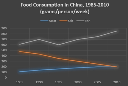
The given line graph illustrates how much food was consumed in China over a period of 25 years between 1985 and 2010. Units are measured in grams per person per week.

Overall, it can clearly be seen that the consumption of all foods rose throughout the given period, with the exception of salt. Moreover, fish was the most consumed food over the years.

In terms of the food with the highest consumption at the start, fish consumption stood at precisely 600. In the following five years, the amount rose slightly by exactly 100 before it declining to its original level. From this point onwards, it increased gradually and peaked at roughly 850 in the final year.

Regarding the other two foods with lower levels, salt and meat started at just below 500 and 100, respectively. Thereafter, the consumption of salt witnessed a drastic decrease by almost 300 between 1985 and 2010. In contrast, the consumption of meat climbed steadily by approximately 100 in the same period. As a result, both converged at 200 in the final year.

Word Count: 177

Answers On The Same Topic:

The graph below shows the changes in food consumption by Chinese people between 1985 and 2010.

The line graph illustrates the main information about three types of food ate by Chinese people between 1985 and 2010. Overall, fish and meat figures experienced upward trend while salt witnessed the decline. All years, the most common food was fish wheras meat represented the least one. In 1985, 600 grams fish ate by per […]

The graph below shows the changes in food consumption by Chinese people between 1985 and 2010.

The graph illustrates the changes in food consumption by Chinese people between 1985 and 2010. Overall, fish was fluctuating but in the middle it has dramatically increased from 600 to almost 900, followed distantly by meat which was growing slowly from 100 slightly increased to 200. However salt has shown a noticeable decrease from 500 […]

The graph below shows the changes in food consumption by Chinese people between 1985 and 2010.

The chart gives information about number of food eaten by the Chinese people from 1985 to 2010.The figures are given in grams per person per week. Overall, rise in numbers was not always steady.More fish than meat eaten between 1985 and 2010. Salt eating has decreased significantly. A more detailed look reveals that in 1985 […]

The graph below shows the changes in food consumption by Chinese people between 1985 and 2010.

The line graph illustrates the trends in food consumption among the Chinese population over a span of 25 years, specifically from 1985 to 2010. Overall, meat and fish consumption demonstrated a marked increase, while salt consumption exhibited a significant decline throughout the observed period. In 1985, meat consumption commenced at just above 200 grams per […]

The graph below shows the changes in food consumption by Chinese people between 1985 and 2010.

The line graph presents a comprehensive analysis of food consumption patterns in China from 1985 to 2010, specifically focusing on the weekly consumption of meat, salt, and fish measured in grams per person. It is evident that there were significant fluctuations across the categories over the given period, with a notable decline in salt consumption […]

See All

Other Topics:

the line chart shows the number of people who used different communication services in the world

The line graph illustrates the the numer of people who consumed various different types of communication services betwen 1998 and 2008. Overall, at the beginnig of the year all services faced slightly increase, despite the fluctuation, at the end of the year, all services rose exit the landline service, which fall end of the year. […]

The graph below shows the number of international tourists visiting three different regions (Asia, Europe, and America) between 2000 and 2020. Summarize the information by selecting and reporting the main features, and make comparisons where relevant.

The number of international visitors to Asia, Europe, and America between 2000 and 2020 is depicted in the line graph. Overall, there was an upward trend in the number of tourists visiting the three regions, and America saw the most significant growth. Additionally, Asia led the chart while Europe was taken over by America in […]

The graph below shows the number of international tourists visiting three different regions (Asia, Europe, and America) between 2000 and 2020. Summarize the information by selecting and reporting the main features, and make comparisons where relevant.

The number of international visitors to Asia, Europe, and America between 2000 and 2020 is depicted in the line graph. Overall, although Asia and Europe witnessed fluctuations, there was an upward trend in the amount of tourists visiting three countries, and American saw the most significant growth. Additionally, Asia lead the chart while Europe was […]

the graph below shows how much money was spent on tourist infrastructure in four different european countries from 1980 to 1992 summarise the information by selecting and reporting the main features and make comparisons where relevant.

The chart illustrates informaton regarding the amount of money spent on tourist developments in Britain, France, Spain, and Germany over a 12-year period from 1980 to 1992. Overall, what stands out from the chart is that Britain and France experienced the raising invesment during the period. Spain witnessed a fall invesment until 1990 before recovering […]

The graph below shows the percentage of tourists visiting four different attractions in a European city between 1980 and 2010.

The line graph provides an information about travelers visit to four different attractions in European city with 30 year duration from 1980 to 2010. Overall, percentage of tourists in Theme Park increased considerably, becoming the leader in visits among all other attractions while visits of historic building decreased giving way to another type of attraction. […]

The line graph shows the number of people visiting a cinema in three different countries in a month between 2000 and 2020.

The line graph provides data on the monthly cinema attendance in the USA, China, and the UK from 2000 to 2020 Overall, every single country witnessed a consistent upward trajectory over a 20-year period. The UK which registered a considerably lower share initially surpassed the remaining countries by the end of the timeframe. Notably, during […]

See All
We have detected unusual activity on your device.
Please verify your identity to continue.
Note: This verification step won't sign you in. If you have a premium account, please log in to access the service as usual.
Google/Gmail Verification
Or verify using Email/Code
We've sent a verification code to:
youremail@gmail.com (Not your email?)
Enter it below to complete the verification process.
Ensure your email address is correct, your inbox is not full, and you check your spam folder. If no email arrives, consider using an alternative email.
You will need a Premium plan to perform your action!
Note: If you already have a premium account, please log in to access our services as usual.

Plans & Pricing

Our mission is to make quality education accessible for everyone.
However, to keep our hardworking team running and this service alive, we genuinely need your support!
By opting for a premium plan, not only do you sustain us in achieving the mission, but you also unlock advanced features to enrich your learning experience.

Free

For learners who aren't pressed for time

What's included on Free
100+ Cambridge IELTS Tests
Instant IELTS Writing Task 1 & 2 Evaluation (2 times/month)
Instant IELTS Speaking Part 1, 2, & 3 Evaluation (5 times/month)
Instant IELTS Writing Task 1 & 2 Essay Generator (2 times/month)
500+ Dictation & Shadowing Exercises
100+ Pronunciation Exercises
Flashcards
Other Advanced Tools

Premium

For those serious about advancing their English proficiency, and for IELTS candidates aspiring to boost their band score by 1-2 points (especially in writing & speaking) in just 30 days or less

What's included on Premium
Save Your IELTS Test Progress
Unlock All Courses & IELTS Tests
Unlimited AI Conversations
Unlimited AI Writing Enhancement Exercises
Unlimited IELTS Writing Task 1 & 2 Evaluation
Unlimited IELTS Speaking Part 1, 2, & 3 Evaluation
Checked Answers Will Not Be Published
Unlimited IELTS Writing Task 1 & 2 Essay Generator
Unlimited IELTS Speaking Part 1, 2, & 3 Sample Generator
Unlimited Usage Of Advanced Tools
Priority Support within 24h (12-month plan only)

Due to the nature of our service and the provided free trials, payments are non-refundable.
Nếu bạn là người Việt Nam và không có hoặc không muốn trả bằng credit/debit cards, bạn có thể thanh toán bằng phương thức chuyển khoản:


Chọn gói:
459,000₫ 347,000 ₫ cho gói 1 tháng (chỉ 11,567₫/ngày)
1,359,000₫ 797,000 ₫ cho gói 3 tháng (chỉ 8,856₫/ngày)
2,699,000₫ 1,367,000 ₫ cho gói 6 tháng (chỉ 7,594₫/ngày)
5,399,000₫ 1,997,000 ₫ cho gói 12 tháng (chỉ 5,547₫/ngày)


Sau khi chuyển khoản, vui lòng đợi trình duyệt tự động điều hướng bạn trở lại Engnovate và bạn sẽ ngay lập tức nhận được mã kích hoạt tài khoản premium.
Nếu có lỗi xảy ra, bạn có thể liên hệ với team thông qua một trong các phương thức: email đến helloengnovate@gmail.com hoặc nhắn tin qua facebook.com/engnovate.
Vì toàn bộ công cụ trên website đều có thể sử dụng thử miễn phí, Engnovate không hỗ trợ hoàn tiền.