🔥 Today Only: Save 30% on Premium — Offer Ends Soon! - Upgrade Now!
Line Graph

Band 4+: The graph below shows the consumption of fish and different kinds of meat in a European country between 1979 and 2004. Summarise the information by selecting and reporting the main features and make comparisons where relevant.

Image for topic: The graph below shows the consumption of fish and different kinds of meat in a European country between 1979 and 2004. Summarise the information by selecting and reporting the main features and make comparisons where relevant.
Our system will evaluate the answer based on this AI-generated description.
The image displays a line graph with x-axis representing years from 1979 to 2004 and y-axis representing grams per person per week from 0 to 300. There are four lines representing different types of meat. The line representing chicken shows an increasing trend starting at around 50 grams per person per week in 1979 and reaching approximately 250 grams per person per week in 2004. The line representing beef shows a decreasing trend starting at approximately 220 grams per person per week in 1979 and decreasing to around 100 grams per person per week in 2004. The line representing lamb shows a sharp decrease from approximately 150 grams per person per week in 1979 to around 50 grams per person per week in 1994 and then plateauing. The line representing fish shows a relatively stable trend with a slight increase, starting and ending at around 50 grams per person per week.
Given the complexity of the image, the above description may not be entirely accurate.
Note: Both the topic and the answer were created by one of our users.

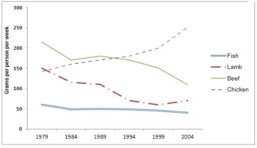
The line graph illustrates the consumption of fish and three types of meat in a European country between 1979 and 2004, measured in grams per person per week.

In 1979 , the least grams per person per week meat was a fish and the most was beef. graph shows that not very stable and too different from 2004.

By contrast , chicken consumption showed a dramtic rise , beginning with 150 grams then ending with 250. that look like approximately increased about 100 grams. Some of them are rising and some of them are decreasing . in 1979 beef was the highest grams per person week but that statistic not the same one’s at the end

in addition, Fish consumption was consistently the lowest among the four categories. It began at just over 60 grams in 1979 and declined slightly to around 45 grams by 2004, showing minimal variation throughout the period.

Word Count: 152

Answers On The Same Topic:

The graph below shows the consumption of fish and different kinds of meat in a European country between 1979 and 2004. Summarise the information by selecting and reporting the main features and make comparisons where relevant.

The given line graph demonstrates how much fish and three different kinds of meat were consumed in a European country during the years 1979-2004. Overall, it can be seen that chicken consumption increased rapidly over the period, while beef and lamb had a gradual downward trend. Meanwhile, fish remained relatively stable at the lowest point, […]

The graph below shows the consumption of fish and different kinds of meat in a European country between 1979 and 2004. Summarise the information by selecting and reporting the main features and make comparisons where relevant.

The line graph depicts the weekly consumption patterns of fish and various types of meat among individuals in a European country over a 25-year period, from 1979 to 2004. Overall, it is evident that while chicken consumption exhibited a significant upward trajectory, the other varieties of meat, particularly beef and lamb, experienced notable declines in […]

The graph below shows the consumption of fish and different kinds of meat in a European country between 1979 and 2004. Summarise the information by selecting and reporting the main features and make comparisons where relevant.

The line graph illustrates the weekly consumption patterns of fish and various meat types in a European nation from 1979 to 2004. Overall, the graph reveals significant fluctuations in the consumption of different meats, with chicken witnessing a marked increase, whereas beef and lamb demonstrated a downward trajectory. Fish consumption remained relatively stable throughout the […]

The graph below shows the consumption of fish and different kinds of meat in a European country between 1979 and 2004. Summarise the information by selecting and reporting the main features and make comparisons where relevant.

The line graph compares the amount of fish, chicken, beef and lamb people in a European country consumed weekly per person over a period of 25 years. From 1979 to 2004, the consumption of fish in this European country had always been far less than meat with a steady amount of approximately 50 grammes per […]

See All

Other Topics:

You should spend about 20 minutes on this task. The graph below shows the percentage of money spent on advertising in five types of media in France from 2010 and projected spending to 2040. Summarise the information by selecting and reporting the main features, and make comparisons where relevant. You should write at least 150 words. Writing Task 1

The line graph compares the proportion of money spent on advertising through five different types of media in France between 2010 and 2040. Overall, Internet advertising is expected to experience a dramatic increase over the period and become the dominant form of advertising by 2040. In contrast, expenditure on newspapers, magazines and radio is projected […]

The charts shows the sales of five different kinds of jam from 2009 to 2014

the line graph illustrates the sales of five different kinds of jam from 2009 to 2014.Overall,the figure for strawberry and grape increase a dramatically without any actions.Raspberry and charry aslo rose a sharply before the slight deline.while,the trajectory of plums declined significantly over of the period and it was as a lowest figure by given […]

The graph below shows the amount of goods transported in the United Kingdom by four different types of transport between 1980 and 2008. Summarise the information by selecting and reporting the main features, and make comparisons

The line graph illustrates the quantity of goods transported in the UK by four different modes of transport: road, water, rail and pipeline from 1980 to 2008. Overall, all types of transport experienced upward trends with fluctuations, though to varying degrees. Additionally, road remained the dominant mode throughout the period, while pipeline consistently recorded the […]

the line graph illustrates the proportion of total expenditure in a certain European country between 1960 and 2000.

The line graph shows the consuming of total expenditure in a certain Europian country in percentage from 1960 to 2000. Overall it can be clearly seen that there is a 5 things for humanization facilities namely: food, leisure, clothing, transport, energy. According to the data food and clothing has the most changes during this 4 […]

The graph below shows UK air pollutants in millions of tonnes, from three different sources, between 1990 and 2005.

The presented line chart compares and contrasts the amount of air pollutants, measured in millions of tonnes, originating from 3 different sources, including industry, transport and households over the course of 15 years. Overall, it is obvious that there was a decline in almost all categories, while the opposite is true for transport. Additionally, the […]

The chart below shows the market size of mobile and QR sales in the USA in billions of US dollars.

The chart presents the mobile and QR sales of the market size in the USA in billions of US dollars. Overall, the market size of mobile and QR sales increased from steadily 2017 to 2023. Between 2017 and 2019, the market size considerably raised from approximately 1 billion to 2 billion dollars. From 2019 to […]

See All
We have detected unusual activity on your device.
Please verify your identity to continue.
Note: This verification step won't sign you in. If you have a premium account, please log in to access the service as usual.
Google/Gmail Verification
Or verify using Email/Code
We've sent a verification code to:
youremail@gmail.com (Not your email?)
Enter it below to complete the verification process.
Ensure your email address is correct, your inbox is not full, and you check your spam folder. If no email arrives, consider using an alternative email.
You will need a Premium plan to perform your action!
Note: If you already have a premium account, please log in to access our services as usual.

Plans & Pricing

Our mission is to make quality education accessible for everyone.
However, to keep our hardworking team running and this service alive, we genuinely need your support!
By opting for a premium plan, not only do you sustain us in achieving the mission, but you also unlock advanced features to enrich your learning experience.

Free

For learners who aren't pressed for time

What's included on Free
100+ Cambridge IELTS Tests
Instant IELTS Writing Task 1 & 2 Evaluation (2 times/month)
Instant IELTS Speaking Part 1, 2, & 3 Evaluation (5 times/month)
Instant IELTS Writing Task 1 & 2 Essay Generator (2 times/month)
500+ Dictation & Shadowing Exercises
100+ Pronunciation Exercises
Flashcards
Other Advanced Tools

Premium

For those serious about advancing their English proficiency, and for IELTS candidates aspiring to boost their band score by 1-2 points (especially in writing & speaking) in just 30 days or less

What's included on Premium
Save Your IELTS Test Progress
Unlock All Courses & IELTS Tests
Unlimited AI Conversations
Unlimited AI Writing Enhancement Exercises
Unlimited IELTS Writing Task 1 & 2 Evaluation
Unlimited IELTS Speaking Part 1, 2, & 3 Evaluation
Checked Answers Will Not Be Published
Unlimited IELTS Writing Task 1 & 2 Essay Generator
Unlimited IELTS Speaking Part 1, 2, & 3 Sample Generator
Unlimited Usage Of Advanced Tools
Priority Support within 24h (12-month plan only)

Due to the nature of our service and the provided free trials, payments are non-refundable.
Nếu bạn là người Việt Nam và không có hoặc không muốn trả bằng credit/debit cards, bạn có thể thanh toán bằng phương thức chuyển khoản:


Chọn gói:
419,000₫ 277,000 ₫ cho gói 1 tháng (chỉ 9,233₫/ngày)
1,239,000₫ 597,000 ₫ cho gói 3 tháng (chỉ 6,633₫/ngày)
2,469,000₫ 1,027,000 ₫ cho gói 6 tháng (chỉ 5,706₫/ngày)
4,929,000₫ 1,417,000 ₫ cho gói 12 tháng (chỉ 3,936₫/ngày)


Sau khi chuyển khoản, vui lòng đợi trình duyệt tự động điều hướng bạn trở lại Engnovate và bạn sẽ ngay lập tức nhận được mã kích hoạt tài khoản premium.
Nếu có lỗi xảy ra, bạn có thể liên hệ với team thông qua một trong các phương thức: email đến helloengnovate@gmail.com hoặc nhắn tin qua facebook.com/engnovate.
Vì toàn bộ công cụ trên website đều có thể sử dụng thử miễn phí, Engnovate không hỗ trợ hoàn tiền.