🔥 Today Only: Save 30% on Premium — Offer Ends Soon! - Upgrade Now!
Line Graph

Band 8+: The graph below shows the consumption of fish and different kinds of meat in a European country between 1979 and 2004. Summarise the information by selecting and reporting the main features and make comparisons where relevant.

Image for topic: The graph below shows the consumption of fish and different kinds of meat in a European country between 1979 and 2004. Summarise the information by selecting and reporting the main features and make comparisons where relevant.
Our system will evaluate the answer based on this AI-generated description.
The image displays a line graph with x-axis representing years from 1979 to 2004 and y-axis representing grams per person per week from 0 to 300. There are four lines representing different types of meat. The line representing chicken shows an increasing trend starting at around 50 grams per person per week in 1979 and reaching approximately 250 grams per person per week in 2004. The line representing beef shows a decreasing trend starting at approximately 220 grams per person per week in 1979 and decreasing to around 100 grams per person per week in 2004. The line representing lamb shows a sharp decrease from approximately 150 grams per person per week in 1979 to around 50 grams per person per week in 1994 and then plateauing. The line representing fish shows a relatively stable trend with a slight increase, starting and ending at around 50 grams per person per week.
Given the complexity of the image, the above description may not be entirely accurate.
Note: Both the topic and the answer were created by one of our users.

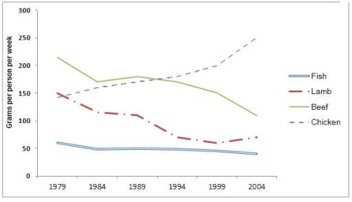
The given line graph demonstrates how much fish and three different kinds of meat were consumed in a European country during the years 1979-2004.

Overall, it can be seen that chicken consumption increased rapidly over the period, while beef and lamb had a gradual downward trend. Meanwhile, fish remained relatively stable at the lowest point, but it also had fallen off slightly.

It is interesting to note that chicken consumption started at just under 150 grams a week per person in 1979, and doubled to about 250 by the final year reaching the highest point. However, the data for fish intake indicates a minimal decrease to approximately 50 grams.

Turning to the rest of the categories, although the figure for beef was the most popular food, over 200 grams in the first year, it began a noticeable decline to about 100 in 2004. Likewise, a moderate decrease can be observed in the line of lamb, which showed a regress from 150 to just over 50 over the given years.

Word Count: 169

Answers On The Same Topic:

The graph below shows the consumption of fish and different kinds of meat in a European country between 1979 and 2004. Summarise the information by selecting and reporting the main features and make comparisons where relevant.

The line graph illustrates the consumption of fish and three types of meat in a European country between 1979 and 2004, measured in grams per person per week. In 1979 , the least grams per person per week meat was a fish and the most was beef. graph shows that not very stable and too […]

The graph below shows the consumption of fish and different kinds of meat in a European country between 1979 and 2004. Summarise the information by selecting and reporting the main features and make comparisons where relevant.

The line graph depicts the weekly consumption patterns of fish and various types of meat among individuals in a European country over a 25-year period, from 1979 to 2004. Overall, it is evident that while chicken consumption exhibited a significant upward trajectory, the other varieties of meat, particularly beef and lamb, experienced notable declines in […]

The graph below shows the consumption of fish and different kinds of meat in a European country between 1979 and 2004. Summarise the information by selecting and reporting the main features and make comparisons where relevant.

The line graph illustrates the weekly consumption patterns of fish and various meat types in a European nation from 1979 to 2004. Overall, the graph reveals significant fluctuations in the consumption of different meats, with chicken witnessing a marked increase, whereas beef and lamb demonstrated a downward trajectory. Fish consumption remained relatively stable throughout the […]

The graph below shows the consumption of fish and different kinds of meat in a European country between 1979 and 2004. Summarise the information by selecting and reporting the main features and make comparisons where relevant.

The line graph compares the amount of fish, chicken, beef and lamb people in a European country consumed weekly per person over a period of 25 years. From 1979 to 2004, the consumption of fish in this European country had always been far less than meat with a steady amount of approximately 50 grammes per […]

See All

Other Topics:

The line chart below shows information on fast food consumption in the UK. rite a report describing the information given

The line graph illustrates the amount of three kinds of fast food (hamburger, fish and chips pizza), wich were consumed from 1970 to 1990 in United Kingdom, the data is given in grams. Overall, the consumption of pizza decreased over the period, while the amount of hamburger and fish and chips increased. In 1970, pizza […]

line graph shows the changes in the use of internet for different activities in the future.

This line graph depicts the changes in the use of internet for different activities in the future. It is clear from the graph that there is a lot of differences of how people are going to use the internet in the future. According to what is shown in the graph it is clear that using […]

You should spend about 20 minutes on this task. The graph below shows the percentage of money spent on advertising in five types of media in France from 2010 and projected spending to 2040. Summarise the information by selecting and reporting the main features, and make comparisons where relevant. You should write at least 150 words. Writing Task 1

The provided graph illustrates the distribution of advertising expenditure across five media types in France from 2010, with projections reaching 2040. Overall, the most significant trend is the dramatic rise of Internet advertising, which is expected to become the dominant medium. Conversely, traditional media like Newspapers, Magazines, and Radio show a steady decline, while Television […]

The graph below show the population size of four different types of wild birds in canada between 1992 and 2006

The line graph presents data on the population four distinct of wild birds in canda from 1992 to 2006. Overall, Canda goose of breeds increased throughout the given period. In contrast, America black duck and blue-winged teal showed gradually decreased, while mallard the most fluctuation over years and reached of peak off. In 1992, both […]

The graph illustrates the percentage of materials recycled from 1982 to 2010 in a particular country.

The line chart illustrates the percentage of selected materials that were recycled in several countries. It shows four materials, represented in different colors and shapes, during the period from 1982 to 2010. Paper and cardboard showed the highest percentage of recycling rates throughout all of the years and reached the peak of 80%. Glass container […]

the graph below shows the number of overseas visitors who went to the uj for different putposes

The line graph gives information about how many foreigners visited the UK with 3 kinds of reasons over a period of 20 years, from 1989 to 2009. Overall, it is clear that there was a substantial increase in the number of tourists, who visited the country for all 3 reasons, namely business, holiday, and meeting […]

See All
We have detected unusual activity on your device.
Please verify your identity to continue.
Note: This verification step won't sign you in. If you have a premium account, please log in to access the service as usual.
Google/Gmail Verification
Or verify using Email/Code
We've sent a verification code to:
youremail@gmail.com (Not your email?)
Enter it below to complete the verification process.
Ensure your email address is correct, your inbox is not full, and you check your spam folder. If no email arrives, consider using an alternative email.
You will need a Premium plan to perform your action!
Note: If you already have a premium account, please log in to access our services as usual.

Plans & Pricing

Our mission is to make quality education accessible for everyone.
However, to keep our hardworking team running and this service alive, we genuinely need your support!
By opting for a premium plan, not only do you sustain us in achieving the mission, but you also unlock advanced features to enrich your learning experience.

Free

For learners who aren't pressed for time

What's included on Free
100+ Cambridge IELTS Tests
Instant IELTS Writing Task 1 & 2 Evaluation (2 times/month)
Instant IELTS Speaking Part 1, 2, & 3 Evaluation (5 times/month)
Instant IELTS Writing Task 1 & 2 Essay Generator (2 times/month)
500+ Dictation & Shadowing Exercises
100+ Pronunciation Exercises
Flashcards
Other Advanced Tools

Premium

For those serious about advancing their English proficiency, and for IELTS candidates aspiring to boost their band score by 1-2 points (especially in writing & speaking) in just 30 days or less

What's included on Premium
Save Your IELTS Test Progress
Unlock All Courses & IELTS Tests
Unlimited AI Conversations
Unlimited AI Writing Enhancement Exercises
Unlimited IELTS Writing Task 1 & 2 Evaluation
Unlimited IELTS Speaking Part 1, 2, & 3 Evaluation
Checked Answers Will Not Be Published
Unlimited IELTS Writing Task 1 & 2 Essay Generator
Unlimited IELTS Speaking Part 1, 2, & 3 Sample Generator
Unlimited Usage Of Advanced Tools
Priority Support within 24h (12-month plan only)

Due to the nature of our service and the provided free trials, payments are non-refundable.
Nếu bạn là người Việt Nam và không có hoặc không muốn trả bằng credit/debit cards, bạn có thể thanh toán bằng phương thức chuyển khoản:


Chọn gói:
419,000₫ 277,000 ₫ cho gói 1 tháng (chỉ 9,233₫/ngày)
1,239,000₫ 597,000 ₫ cho gói 3 tháng (chỉ 6,633₫/ngày)
2,469,000₫ 1,027,000 ₫ cho gói 6 tháng (chỉ 5,706₫/ngày)
4,929,000₫ 1,417,000 ₫ cho gói 12 tháng (chỉ 3,936₫/ngày)


Sau khi chuyển khoản, vui lòng đợi trình duyệt tự động điều hướng bạn trở lại Engnovate và bạn sẽ ngay lập tức nhận được mã kích hoạt tài khoản premium.
Nếu có lỗi xảy ra, bạn có thể liên hệ với team thông qua một trong các phương thức: email đến helloengnovate@gmail.com hoặc nhắn tin qua facebook.com/engnovate.
Vì toàn bộ công cụ trên website đều có thể sử dụng thử miễn phí, Engnovate không hỗ trợ hoàn tiền.