🔥 Today Only: Save 30% on Premium — Offer Ends Soon! - Upgrade Now!
Line Graph

Band 4+: The graph below shows the daily consumption of three spreads per person from 1981 to 2007 in a country.

Image for topic: The graph below shows the daily consumption of three spreads per person from 1981 to 2007 in a country.
Our system will evaluate the answer based on this AI-generated description.
The image shows a line graph with three different lines representing Margarine, Low fat & reduced spreads, and Butter; X-axis ranges from 1981 to 2007 in intervals of 5 years except for the last interval which is 6 years, Y-axis measures grams from 0 to 180 in intervals of 20; In 1981, Margarine has the highest grams at 160, Low fat & reduced spreads start at 0, Butter at 140; In 1986, Margarine decreases to 100, Low fat & reduced spreads rise to 80, Butter drops to 120; In 1991, Margarine and Butter intersect at 80 grams while Low fat & reduced spreads peak at 160; In 1996, Margarine rises to 100, Low fat & reduced spreads slightly dip to 140, Butter falls to 40; In 2001, Margarine drops to 60, Low fat & reduced spreads decrease to 100, Butter remains at 40; In 2007, Margarine remains at 60, Low fat & reduced spreads fall to 80, and Butter increases to 60 grams.
Given the complexity of the image, the above description may not be entirely accurate.
Note: Both the topic and the answer were created by one of our users.

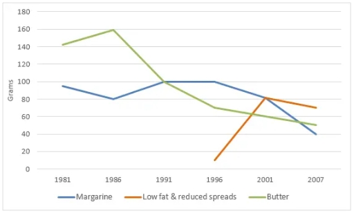
The given line graph highlights the daily consumption of spreads three spreads per person between 1981 and 2001 in a country.

Overall, The consumption of all spreads dramatically decreased from 1981-2007 excepting of Low fat & reduced spreads. It is clear from the given line graph that the butter increase steadily by 20 grams while popularity of margarine spreads went down met at the same record in 1991.

In 1996 Low fat & reduced spreads were a remarkable upsurge whereas butter slumbed gradually. Additionally low fat & reduced spreads and margarine encountered same log in 2001. Over the following 5 years, consumption of margarine improved progressively while a minimal dive.

Finally, In the period from 2001 to 2007 consumption of butter and margarine met at the same record to just over 40 grams. In 2001 low fat & reduced spreads record reached a peak over a five years period. Consumption of margarine was a constant decrease rest of the year.

Word Count: 160

Answers On The Same Topic:

The graph below shows the daily consumption of three spreads per person from 1981 to 2007 in a country.

The line graph illustrates the daily consumption (in grams per person) of three types of spreads — margarine, low fat & reduced spreads, and butter — in a certain country over the period from 1981 to 2007. Overall, butter was the most consumed spread in 1981, but its popularity declined steadily throughout the period. Margarine […]

The graph below shows the daily consumption of three spreads per person from 1981 to 2007 in a country.

The given line graph highlights the daily consumption of three spreads per person between 1981 and 2001 in a country. Overall, the consumption of all spreads dramatically decreased from 1981 to 2007 except for low-fat and reduced spreads. It is clear from the given line graph that butter consumption increased steadily by 20 grams, while […]

The graph below shows the daily consumption of three spreads per person from 1981 to 2007 in a country.

this graph illustrates the information about consumption of spreads over 26 year from 1981 to 2007. 1981 butter had main souce and it demand was very high which was around 140 grams after that it demand signifant growth till 1986 which was nearly 160 grams. But upcoming years it declined steadily and reach nearly 50 […]

The graph below shows the daily consumption of three spreads per person from 1981 to 2007 in a country.

The line graph presents the data concerning consuming low fat spreads , margarine and butter during the day per capita over 25 year period . Overall, what stands out from the graph is that using butter and margarine dramatically declined, while popularity of low fat and reduced spreads increased sharply despite the fact of starting […]

See All

Other Topics:

The graph illustrates the percentage of materials recycled from 1982 to 2010 in a particular country.

The line chart illustrates the percentage of selected materials that were recycled in several countries. It shows four materials, represented in different colors and shapes, during the period from 1982 to 2010. Paper and cardboard showed the highest percentage of recycling rates throughout all of the years and reached the peak of 80%. Glass container […]

the graph below shows the number of overseas visitors who went to the uj for different putposes

The line graph gives information about how many foreigners visited the UK with 3 kinds of reasons over a period of 20 years, from 1989 to 2009. Overall, it is clear that there was a substantial increase in the number of tourists, who visited the country for all 3 reasons, namely business, holiday, and meeting […]

the graph below shows the number of overseas visitors who went to the uj for different putposes

The line graph gives information about how many foreigners visited the UK with 3 kinds of reasons over a period of 20 years, from 1989 to 2009. Overall, it is clear that there was a substantial increase in the number of tourists, who visited the country for all 3 reasons, namely, business, holiday and meeting […]

The number of international conferences in three cities (City A, City B, City C) from 1965 to 2010. Summarise the information by selecting and reporting the main features, and make comparisons where relevant. The number of international conferences in three cities

The line chart illustrates the information about the number of international conferences in three different cities, city A, city B, city C from 1965 to 2010. Overall, it is clearly evident that city C had recorded the highest number of conferences despite all the fluctuation while, city A and city B were accounted for the […]

Percentage of car ownership in Great Britain according to household

The line graph illustrates the proportion of car ownership among households in Great Britain from 1961 to 2001. Overall, over time, the percentage of households without cars fell dramatically, while ownership of one car increased slightly and ownership of two or more cars showed a significant rise. In 1961, households without cars had the highest […]

Percentage of car ownership in Great Britain according to household

The given line graph illustrates the proportion of owning cars in Great Britain based on household between 1961 and 2001. Overall, overtime no car ownership fell dramatically, while 1 car and 2+ cars ownership increased slightly. In the year of 1961, households with no cars was the first in the rate with the percentage of […]

See All
We have detected unusual activity on your device.
Please verify your identity to continue.
Note: This verification step won't sign you in. If you have a premium account, please log in to access the service as usual.
Google/Gmail Verification
Or verify using Email/Code
We've sent a verification code to:
youremail@gmail.com (Not your email?)
Enter it below to complete the verification process.
Ensure your email address is correct, your inbox is not full, and you check your spam folder. If no email arrives, consider using an alternative email.
You will need a Premium plan to perform your action!
Note: If you already have a premium account, please log in to access our services as usual.

Plans & Pricing

Our mission is to make quality education accessible for everyone.
However, to keep our hardworking team running and this service alive, we genuinely need your support!
By opting for a premium plan, not only do you sustain us in achieving the mission, but you also unlock advanced features to enrich your learning experience.

Free

For learners who aren't pressed for time

What's included on Free
100+ Cambridge IELTS Tests
Instant IELTS Writing Task 1 & 2 Evaluation (2 times/month)
Instant IELTS Speaking Part 1, 2, & 3 Evaluation (5 times/month)
Instant IELTS Writing Task 1 & 2 Essay Generator (2 times/month)
500+ Dictation & Shadowing Exercises
100+ Pronunciation Exercises
Flashcards
Other Advanced Tools

Premium

For those serious about advancing their English proficiency, and for IELTS candidates aspiring to boost their band score by 1-2 points (especially in writing & speaking) in just 30 days or less

What's included on Premium
Save Your IELTS Test Progress
Unlock All Courses & IELTS Tests
Unlimited AI Conversations
Unlimited AI Writing Enhancement Exercises
Unlimited IELTS Writing Task 1 & 2 Evaluation
Unlimited IELTS Speaking Part 1, 2, & 3 Evaluation
Checked Answers Will Not Be Published
Unlimited IELTS Writing Task 1 & 2 Essay Generator
Unlimited IELTS Speaking Part 1, 2, & 3 Sample Generator
Unlimited Usage Of Advanced Tools
Priority Support within 24h (12-month plan only)

Due to the nature of our service and the provided free trials, payments are non-refundable.
Nếu bạn là người Việt Nam và không có hoặc không muốn trả bằng credit/debit cards, bạn có thể thanh toán bằng phương thức chuyển khoản:


Chọn gói:
419,000₫ 277,000 ₫ cho gói 1 tháng (chỉ 9,233₫/ngày)
1,239,000₫ 597,000 ₫ cho gói 3 tháng (chỉ 6,633₫/ngày)
2,469,000₫ 1,027,000 ₫ cho gói 6 tháng (chỉ 5,706₫/ngày)
4,929,000₫ 1,417,000 ₫ cho gói 12 tháng (chỉ 3,936₫/ngày)


Sau khi chuyển khoản, vui lòng đợi trình duyệt tự động điều hướng bạn trở lại Engnovate và bạn sẽ ngay lập tức nhận được mã kích hoạt tài khoản premium.
Nếu có lỗi xảy ra, bạn có thể liên hệ với team thông qua một trong các phương thức: email đến helloengnovate@gmail.com hoặc nhắn tin qua facebook.com/engnovate.
Vì toàn bộ công cụ trên website đều có thể sử dụng thử miễn phí, Engnovate không hỗ trợ hoàn tiền.