🔥 Today Only: Save 30% on Premium — Offer Ends Soon! - Upgrade Now!
Line Graph

Band 4+: The graph below shows the number of enquiries received by the Tourist Information Office in one city over a six-month period in 2011.

Image for topic: The graph below shows the number of enquiries received by the Tourist Information Office in one city over a six-month period in 2011.
Our system will evaluate the answer based on this AI-generated description.
The image shows a line graph comparing the number of contacts made through different methods (in-person, letter/email, and telephone) over a six-month period. In January, in-person contacts were the highest at 800, letter/email were at 200, and telephone at 600. In February, in-person contacts slightly decreased to 700, letter/email increased to 400, and telephone remained the same. In March, in-person contacts jumped to 1,600, letter/email decreased to 200, and telephone increased to 1,000. In April, in-person contacts reached 1,800, letter/email stayed at 200, and telephone increased to 1,200. In May, in-person contacts remained at 1,800, letter/email increased to 400, and telephone reached 1,400. In June, in-person contacts rose to 1,900, letter/email stayed at 400, and telephone peaked at 1,700. The graph has a Y-axis labeled from 0 to 2000 at intervals of 200 and an X-axis labeled with the months January to June.
Given the complexity of the image, the above description may not be entirely accurate.
Note: Both the topic and the answer were created by one of our users.

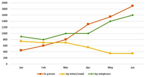
The line graph displays information on quantity of inquires sent to the tourist information office from January to Jun of 2011

Overall, inquires taken by face to face visit and phone call increased significantly and the first one took dominant position. However, letter or email way lost their figures.

With start of just above 400, the amount of personal inquires rose gradually up to exact 800 by March and then incremented dramatically, reaching it peak with approximately 1900. The phone call method experienced fluctuation at the start of a period and then leveled on exact 1000 by April, with subsequent rise up to 1600.

In contrast, the number of letters and emails received by office of tourist information showed an insignificant dip from nearly 800 to about 700 by March. Up to May, the figures declined by twice and leveled in Jun with nearly 400 finishing value.

Word Count: 147

Answers On The Same Topic:

The graph below shows the number of enquiries received by the Tourist Information Office in one city over a six-month period in 2011.

The provided line graph illustrates the volume of enquiries received by the Tourist Information Office in a specific city over a six-month period in 2011. Overall, it is evident that in-person enquiries dominated the total number of contacts throughout the observed timeframe, while correspondence via letter/email exhibited a declining trend. In January, the graph reveals […]

The graph below shows the number of enquiries received by the Tourist Information Office in one city over a six-month period in 2011.

The line chart gives information about how many people sent enquiries to a city’s Tourist Information Office via three methods from January to June 2011. Overall, there was an increase in the number of enquiries sent directly and by telephone, while those sent by letter or email decreased. Additionally, at the end of the period, […]

The graph below shows the number of enquiries received by the Tourist Information Office in one city over a six-month period in 2011.

The line graph illustrates the volume of enquiries received by the Tourist Information Office in a specific city during a six-month interval in 2011. Overall, in-person enquiries exhibited a remarkable upward trajectory throughout the period, ultimately surpassing all other methods of communication and reaching its zenith in June. Initially, in January, in-person enquiries were notably […]

The graph below shows the number of enquiries received by the Tourist Information Office in one city over a six-month period in 2011.

The graph illustrates the amount of enquiries sent to tourist information office via three different means of communication from January to June in 2011. Overall, the number of enquiries made using letter or email decreased, whereas the amount of enquiries received by telephone or in person meetings increased. During the initial month, the most popular […]

The graph below shows the number of enquiries received by the Tourist Information Office in one city over a six-month period in 2011.

The figure illustrates how many inquiries are obtained by different delivery systems, such as in person, by letter or email, and by telephone, by the Tourist Information Office in a particular city over the course of a half year (2011). Overall, it is clear that visitors to the city are more likely to make inquiries […]

See All

Other Topics:

The chart shows the percentage of tourists to Scotland who visited four different types of attractions from 1980 to 2010.

The given line graph illustrates the fraction of foreign visitors in attractions in different sites such as aquarium, castle, zoo and festival in Edinburgh, Scotland. In overall, there is sligh increment and decrement of visitors in attractions. In two places, visitors increased throughout the year whereas decreased in two. Aquarium and castle shows the most […]

The line graph below shows the population size, birth rate and the death rate of England and Wales from 1700 to 2000. Summarise the information by selecting and reporting the main features and make comparisons where relevant.

The line graph illustrates the information about three demographics (population size, the birth rate and death rate) of English and Wales between 1700 and 2000. Overall, it can be clearly seen that throughout the given period the birth was more than death rate. Also, the population size rose with time, while the death rate and […]

the line graph below gives informTION BOUT THE NUMBER OF JOBS IN FOUR SECTORS OF THE ECONOMY IN THE US BETWEEN 1960 AND 2020

The given line graph illustrates the number of professions in four sectors of the economy in the US from 1960 to 2020. Overall, it can be clearly observed that healthcare and retail indicated the highest rate while agriculture represented the lowest level. According to the given data, at the beginning of the period manufacturing showed […]

The graph below gives information about the number of jobs in four sectors of the economy in the US between 1960 and 2020. Summarise the information by selecting and reporting the main features, and make comparisons where relevant.

The given line graph demonstrates the details about the amount of career opportunities in four sectors of the economy in United States from 1960 to 2020. Overall, while two trends had the highest figures over the given period, the number of jobs in manufacturing and agriculture recorded the lowest proportion throughout the period. In addition, […]

The graph shows monthly trends of three product of tablets, laptop, desktop.

The figure shows monthly trends of three product of tablets, laptop, desktop. Overall, the highest level among the products were tablets over the five-month period. They rose consistently without any decline. The lowest figure is the desktop, it was showed a continuous downward trend. Looking at the diagram, the sales of tablets commenced in January […]

The graph below shows the gross domestic products (GDP) in four selected countries between 2010 and 2015

the graph provides the gross domestic products among four countries over a 5 years of period, from 2010 to 2015. Overall, it is evident that the USA experienced the highest amount of products, while the UK recorded the lowest figures. It witnessed that the USA and China showed a significant upward trend throughout the period. […]

See All
We have detected unusual activity on your device.
Please verify your identity to continue.
Note: This verification step won't sign you in. If you have a premium account, please log in to access the service as usual.
Google/Gmail Verification
Or verify using Email/Code
We've sent a verification code to:
youremail@gmail.com (Not your email?)
Enter it below to complete the verification process.
Ensure your email address is correct, your inbox is not full, and you check your spam folder. If no email arrives, consider using an alternative email.
You will need a Premium plan to perform your action!
Note: If you already have a premium account, please log in to access our services as usual.

Plans & Pricing

Our mission is to make quality education accessible for everyone.
However, to keep our hardworking team running and this service alive, we genuinely need your support!
By opting for a premium plan, not only do you sustain us in achieving the mission, but you also unlock advanced features to enrich your learning experience.

Free

For learners who aren't pressed for time

What's included on Free
100+ Cambridge IELTS Tests
Instant IELTS Writing Task 1 & 2 Evaluation (2 times/month)
Instant IELTS Speaking Part 1, 2, & 3 Evaluation (5 times/month)
Instant IELTS Writing Task 1 & 2 Essay Generator (2 times/month)
500+ Dictation & Shadowing Exercises
100+ Pronunciation Exercises
Flashcards
Other Advanced Tools

Premium

For those serious about advancing their English proficiency, and for IELTS candidates aspiring to boost their band score by 1-2 points (especially in writing & speaking) in just 30 days or less

What's included on Premium
Save Your IELTS Test Progress
Unlock All Courses & IELTS Tests
Unlimited AI Conversations
Unlimited AI Writing Enhancement Exercises
Unlimited IELTS Writing Task 1 & 2 Evaluation
Unlimited IELTS Speaking Part 1, 2, & 3 Evaluation
Checked Answers Will Not Be Published
Unlimited IELTS Writing Task 1 & 2 Essay Generator
Unlimited IELTS Speaking Part 1, 2, & 3 Sample Generator
Unlimited Usage Of Advanced Tools
Priority Support within 24h (12-month plan only)

Due to the nature of our service and the provided free trials, payments are non-refundable.
Nếu bạn là người Việt Nam và không có hoặc không muốn trả bằng credit/debit cards, bạn có thể thanh toán bằng phương thức chuyển khoản:


Chọn gói:
419,000₫ 277,000 ₫ cho gói 1 tháng (chỉ 9,233₫/ngày)
1,239,000₫ 597,000 ₫ cho gói 3 tháng (chỉ 6,633₫/ngày)
2,469,000₫ 1,027,000 ₫ cho gói 6 tháng (chỉ 5,706₫/ngày)
4,929,000₫ 1,417,000 ₫ cho gói 12 tháng (chỉ 3,936₫/ngày)


Sau khi chuyển khoản, vui lòng đợi trình duyệt tự động điều hướng bạn trở lại Engnovate và bạn sẽ ngay lập tức nhận được mã kích hoạt tài khoản premium.
Nếu có lỗi xảy ra, bạn có thể liên hệ với team thông qua một trong các phương thức: email đến helloengnovate@gmail.com hoặc nhắn tin qua facebook.com/engnovate.
Vì toàn bộ công cụ trên website đều có thể sử dụng thử miễn phí, Engnovate không hỗ trợ hoàn tiền.