Our system will evaluate the answer based on this AI-generated description.
The image shows a line graph comparing the number of contacts made through different methods (in-person, letter/email, and telephone) over a six-month period. In January, in-person contacts were the highest at 800, letter/email were at 200, and telephone at 600. In February, in-person contacts slightly decreased to 700, letter/email increased to 400, and telephone remained the same. In March, in-person contacts jumped to 1,600, letter/email decreased to 200, and telephone increased to 1,000. In April, in-person contacts reached 1,800, letter/email stayed at 200, and telephone increased to 1,200. In May, in-person contacts remained at 1,800, letter/email increased to 400, and telephone reached 1,400. In June, in-person contacts rose to 1,900, letter/email stayed at 400, and telephone peaked at 1,700. The graph has a Y-axis labeled from 0 to 2000 at intervals of 200 and an X-axis labeled with the months January to June.
Given the complexity of the image, the above description may not be entirely accurate.
Skyrocket your IELTS band score by 1-2 points in under a month with our premium plan!
Note: Both the topic and the answer were created by one of our users.
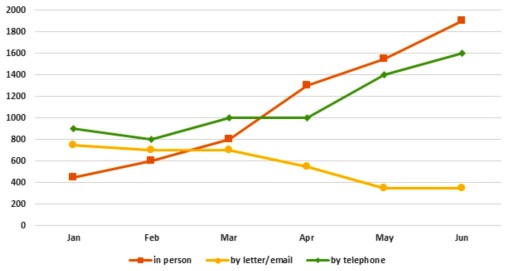
The line graph illustrates the number of enquiries collected by the Travel Information office through in-person, email, and telephone channels during a six-month period from January to June in 2011.
At a glance, in the last month, the number of enquiries by in-person and phone was at the peak point. In January, the complaints sent by email or letter were at the lowest point. Throughout the line graph, the number of in-person enquiries continuously increased over time, whereas the trend for email inquiries consistently declined.
On the one hand, in the first two months, the number of questions rose from 400 to around 800 points; following the graph, a large surge in enquiries, reaching approximately 1300, was noticed in the fourth month.
Word Count: 122
