🔥 Today Only: Save 30% on Premium — Offer Ends Soon! - Upgrade Now!
Line Graph

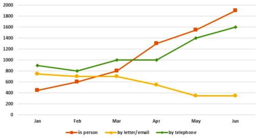
Band 7+: The graph below shows the number of enquiries received by the Tourist Information Office in one city over a six-month period in 2011.

Image for topic: The graph below shows the number of enquiries received by the Tourist Information Office in one city over a six-month period in 2011.
Our system will evaluate the answer based on this AI-generated description.
The image shows a line graph comparing the number of contacts made through different methods (in-person, letter/email, and telephone) over a six-month period. In January, in-person contacts were the highest at 800, letter/email were at 200, and telephone at 600. In February, in-person contacts slightly decreased to 700, letter/email increased to 400, and telephone remained the same. In March, in-person contacts jumped to 1,600, letter/email decreased to 200, and telephone increased to 1,000. In April, in-person contacts reached 1,800, letter/email stayed at 200, and telephone increased to 1,200. In May, in-person contacts remained at 1,800, letter/email increased to 400, and telephone reached 1,400. In June, in-person contacts rose to 1,900, letter/email stayed at 400, and telephone peaked at 1,700. The graph has a Y-axis labeled from 0 to 2000 at intervals of 200 and an X-axis labeled with the months January to June.
Given the complexity of the image, the above description may not be entirely accurate.
Note: Both the topic and the answer were created by one of our users.

The provided line graph illustrates the variations in the number of inquiries received by the Tourist Information Office in a particular city over a six-month duration in 2011.

Overall, the data indicates a substantial increase in inquiries made through face-to-face visits and telephone calls, with the former being the most preferred method. Conversely, the number of inquiries via letters or emails declined noticeably during the period.

Commencing slightly above 400 in January, the quantity of face-to-face inquiries gradually surged to exactly 800 by March, followed by a remarkable escalation, peaking at approximately 1900. Meanwhile, the phone inquiry method experienced fluctuations initially, stabilizing at precisely 1000 by April, and then rising to 1600 subsequenIn contrast, the number of inquiries received through letters and emails at the Tourist Information Office exhibited a slight decrease from nearly 800 to around 700 by March. Subsequently, the figures declined further, dropping to about 400 by June.

Word Count: 152tly.

Word Count: 154

Answers On The Same Topic:

The graph below shows the number of enquiries received by the Tourist Information Office in one city over a six-month period in 2011.

The provided line graph illustrates the volume of enquiries received by the Tourist Information Office in a specific city over a six-month period in 2011. Overall, it is evident that in-person enquiries dominated the total number of contacts throughout the observed timeframe, while correspondence via letter/email exhibited a declining trend. In January, the graph reveals […]

The graph below shows the number of enquiries received by the Tourist Information Office in one city over a six-month period in 2011.

The line chart gives information about how many people sent enquiries to a city’s Tourist Information Office via three methods from January to June 2011. Overall, there was an increase in the number of enquiries sent directly and by telephone, while those sent by letter or email decreased. Additionally, at the end of the period, […]

The graph below shows the number of enquiries received by the Tourist Information Office in one city over a six-month period in 2011.

The line graph illustrates the volume of enquiries received by the Tourist Information Office in a specific city during a six-month interval in 2011. Overall, in-person enquiries exhibited a remarkable upward trajectory throughout the period, ultimately surpassing all other methods of communication and reaching its zenith in June. Initially, in January, in-person enquiries were notably […]

The graph below shows the number of enquiries received by the Tourist Information Office in one city over a six-month period in 2011.

The graph illustrates the amount of enquiries sent to tourist information office via three different means of communication from January to June in 2011. Overall, the number of enquiries made using letter or email decreased, whereas the amount of enquiries received by telephone or in person meetings increased. During the initial month, the most popular […]

The graph below shows the number of enquiries received by the Tourist Information Office in one city over a six-month period in 2011.

The figure illustrates how many inquiries are obtained by different delivery systems, such as in person, by letter or email, and by telephone, by the Tourist Information Office in a particular city over the course of a half year (2011). Overall, it is clear that visitors to the city are more likely to make inquiries […]

See All

Other Topics:

The graph below shows the number of overseas visitors to three different areas in a European country between 1987 and 2007. Summarise the information by selecting and reporting the main features, and make comparisons where relevant.

The line graph illustrates changes in the number of foreign tourists visiting three different places in a European nation from 1987 to 2007. In general, it is noticeable that different trends were observed all the given categories. While the coast recorded the highest number of visitors for the whole period, by contrast, mountains changed the […]

The graph below shows percengtage of people visiting gym once a month or more between 1990 to 2010

The line graph compares the proportion of people visiting the gym between 1990 and 2010, categorized into four groups according to their ages. Overall, all age groups recorded an upward trend throughout, with the youngest group overtaking the 25-34 years old visitors, while the oldest group remained the lowest during the timeframe. Focusing on the […]

The line chart shows trends in terms of employment in the USA in millions and predictions for the future.

The line chart illustrates number of employments in the USA and prediction for the future. The figure was calibrated in million. Overall, it is clear that employment in agriculture was decreased sharply while employment in service was increased over a time. In addition, employment in service showed increase but fall over the period. Looking at […]

The graph below shows the percentages of tourists who used different types of transport to travel within a particular nation between 1989 and 2009. Each tourist may have used more than one type of transport.Summarise the information by selecting and reporting the main features, and make comparisons where relevant.Write at least 150 words.

The graph illustrates the propotion distribution between diffenent tourists who used different types of vehicles in a country in a span of 20 years from 1989 to 2009. Overall, cars and rails remained the most popular type of transport throughout the period. While the percentage of tourists travel by train increased consistently, cars and air […]

The graph below shows different sources of air pollotantsin the UK from 1990 to 2005

The line graph illustrates the amount of air pollution generated by three distinct sectors (industry, transport, and households) alongside the total emissions in the United Kingdom over a 15-year period, from 1990 to 2005. Overall, it is clear that the total amount of air pollutants in the UK decreased substantially over the given timeframe. This […]

The nomber of people who go to the museum in summer and winter in 2003

The linegraph illustrates the number of people who go to museum in UK between summer and winter in 2003. Overall, the highest figure was observed in summer. Nevertheless, the line graph also shows that these figures decresed. Over the winter visitors entering a museum number dramatically decreased. In summer , the number of visitors started […]

See All
We have detected unusual activity on your device.
Please verify your identity to continue.
Note: This verification step won't sign you in. If you have a premium account, please log in to access the service as usual.
Google/Gmail Verification
Or verify using Email/Code
We've sent a verification code to:
youremail@gmail.com (Not your email?)
Enter it below to complete the verification process.
Ensure your email address is correct, your inbox is not full, and you check your spam folder. If no email arrives, consider using an alternative email.
You will need a Premium plan to perform your action!
Note: If you already have a premium account, please log in to access our services as usual.

Plans & Pricing

Our mission is to make quality education accessible for everyone.
However, to keep our hardworking team running and this service alive, we genuinely need your support!
By opting for a premium plan, not only do you sustain us in achieving the mission, but you also unlock advanced features to enrich your learning experience.

Free

For learners who aren't pressed for time

What's included on Free
100+ Cambridge IELTS Tests
Instant IELTS Writing Task 1 & 2 Evaluation (2 times/month)
Instant IELTS Speaking Part 1, 2, & 3 Evaluation (5 times/month)
Instant IELTS Writing Task 1 & 2 Essay Generator (2 times/month)
500+ Dictation & Shadowing Exercises
100+ Pronunciation Exercises
Flashcards
Other Advanced Tools

Premium

For those serious about advancing their English proficiency, and for IELTS candidates aspiring to boost their band score by 1-2 points (especially in writing & speaking) in just 30 days or less

What's included on Premium
Save Your IELTS Test Progress
Unlock All Courses & IELTS Tests
Unlimited AI Conversations
Unlimited AI Writing Enhancement Exercises
Unlimited IELTS Writing Task 1 & 2 Evaluation
Unlimited IELTS Speaking Part 1, 2, & 3 Evaluation
Checked Answers Will Not Be Published
Unlimited IELTS Writing Task 1 & 2 Essay Generator
Unlimited IELTS Speaking Part 1, 2, & 3 Sample Generator
Unlimited Usage Of Advanced Tools
Priority Support within 24h (12-month plan only)

Due to the nature of our service and the provided free trials, payments are non-refundable.
Nếu bạn là người Việt Nam và không có hoặc không muốn trả bằng credit/debit cards, bạn có thể thanh toán bằng phương thức chuyển khoản:


Chọn gói:
419,000₫ 277,000 ₫ cho gói 1 tháng (chỉ 9,233₫/ngày)
1,239,000₫ 597,000 ₫ cho gói 3 tháng (chỉ 6,633₫/ngày)
2,469,000₫ 1,027,000 ₫ cho gói 6 tháng (chỉ 5,706₫/ngày)
4,929,000₫ 1,417,000 ₫ cho gói 12 tháng (chỉ 3,936₫/ngày)


Sau khi chuyển khoản, vui lòng đợi trình duyệt tự động điều hướng bạn trở lại Engnovate và bạn sẽ ngay lập tức nhận được mã kích hoạt tài khoản premium.
Nếu có lỗi xảy ra, bạn có thể liên hệ với team thông qua một trong các phương thức: email đến helloengnovate@gmail.com hoặc nhắn tin qua facebook.com/engnovate.
Vì toàn bộ công cụ trên website đều có thể sử dụng thử miễn phí, Engnovate không hỗ trợ hoàn tiền.