🔥 Today Only: Save 30% on Premium — Offer Ends Soon! - Upgrade Now!
Line Graph

Band 4+: The graph below shows the number of enquiries received by the Tourist Information Office in one city over a six-month period in 2011.

Image for topic: The graph below shows the number of enquiries received by the Tourist Information Office in one city over a six-month period in 2011.
Our system will evaluate the answer based on this AI-generated description.
The image contains a line graph depicting the number of enquiries received by the Tourist Information Office in one city over a six-month period in 2011. The graph displays three lines representing enquiries made in-person, by letter/email, and by telephone. The x-axis spans from January to June, while the y-axis represents the number of enquiries, ranging from 0 to 2000 in increments of 200. In January, enquiries made in person and by telephone start at 200, while enquiries by letter/email start at 400. By February, in-person enquiries increase to 600, letter/email decrease to 200, and telephone enquiries remain the same. In March, in-person and letter/email enquiries both rise to 800, and telephone enquiries increase to 600. April shows in-person enquiries at 1200, letter/email at 400, and telephone at 1400. In May, in-person jumps to 1600, letter/email decreases again to 300, and telephone rises to 1600. Finally, by June, in-person enquiries are at 1800, letter/email are at 200, and telephone enquiries peak at 1800.
Given the complexity of the image, the above description may not be entirely accurate.
Note: Both the topic and the answer were created by one of our users.

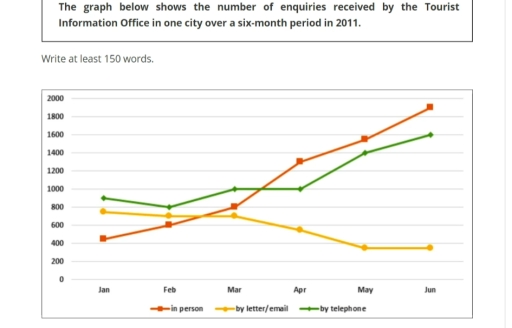
The line graph illustrates how many enquiries received by the tourist data office in just one city from january to jun in 2011 .In initial impresson , in person had the lowest number of little above 400 in the january while telephone had the highest number with more than 8000.

As can be seen, telephone began the decline in janaury that reached 800 and after that in march experiened a steady constant ,but surprisingly the line rose sharply untill jun with exactly1600.

Acoording to the graph, letter and email started with the approxiately 800 in january and had a slightly decrease untill march and following by that had the dramatically down ward trend untill may but substantially from may to jun remained stable with roughly 400, while in person started very weak comparing with others , but rose gradually from january to march that cause the umber 800 and after that soard untill jun that had the highest number with nearly 2000.

Word Count: 162

Answers On The Same Topic:

The graph below shows the number of enquiries received by the Tourist Information Office in one city over a six-month period in 2011.

The line chart provides key information about figures of enquiries collected by the tourist information office in one city over a six month period in 2011. The unit are measured by numbers. Overall, it is clear from the graph that tourist in person had more increased through the months. In addition tourist by telephone had […]

The graph below shows the number of enquiries received by the Tourist Information Office in one city over a six-month period in 2011.

The line graph illustrates how many number of of enquiries are received by the tourist information office in one particular city in 2011 between six months, from January to June. Overall, number of questions reached the office in person and by telephone significantly increased, while sending letter/email showed dramatic fall over the period. In person […]

The graph below shows the number of enquiries received by the Tourist Information Office in one city over a six-month period in 2011.

The chart illustrates the number of inquiries (in hundreds/thousands) received by the Visitor Information Station, which were delivered through three different methods of inquiry in an area over a six-month term in 2011. In general, it appears that more inquiries were delivered in person compared to other methods. In addition, in almost all methods of […]

The graph below shows the number of enquiries received by the Tourist Information Office in one city over a six-month period in 2011.

The line graph compares the amount of information requests that have been received by the Tourist Information Office in one city during the period of the first semester in 2011. Overall, it is clear that enquiries received by tourists in person represent an important part over the period shown. Requests acquired by letter/email shows the […]

The graph below shows the number of enquiries received by the Tourist Information Office in one city over a six-month period in 2011.

he line graph provides data on quantities of surveys taken from the Tourist Information Office in certain region from January to June in 2011. Throughout the timeframe in question, the surveys were received personally, through letter or email, and by telephone. While figures for one-to-one contact and telephone experienced a significant surge in given timeframe, […]

See All

Other Topics:

The graph shows average annual expenditures on cell phone and residential phone services between 2001 and 2010. Summarize the information by selecting and reporting the main features, and make comparisons where relevant.

The given chart illustrates the anual money spending tendecy on services of cell phones, marked with the red line and residential phones, represented in green, from 2001 to 2010. For starters, in the first analized year it is clearly visible that the difference between residential and cell phones services si almost 500 dollers. Residential phones […]

the graph below gives information on the number of participants for different activities at one social centre.

The line graph demonstrate the information on the number of people participating in different activities at a particular social centre in two cities from 2000 to 2020. Overall, the graph reflects the participants of the people from the year 2000 to 2020, where it can be clearly visible that people are more likely to involve […]

The graph below shows the percentage of people in one country who accessed the news from four sources between 1995 and the present, with projections to 2025.

The line graph provides information about the proportion of citizens in a country who using several media such as TV, Radio, Newspaper, and Internet for accessed news between 1995 and 2020, with predictions for 2025. Units are measured in percentage. Overall, the percentage of people who used radio and newspaper generally decrease within the period, […]

The graph below shows the percentage of electricity generated from different sources in the world from 1987 to 2019.

The given figure illustrates the electricity percentage produced by various resources between the years of 1987 and 2019. Among these 7 sectors, only 2 of them, red and purple, could increase their percentage at the end of the period, while the rest of them have declined in their production. The purple line stayed constant in […]

The chart below shows the changes that took place in three different areas of crime in Newport city centre from 2003 - 2012. Summarise the information by selecting and reporting the main features, and make comparisons where relevant.

The line graph illustrates the changes in three types of crime in burglary, car theft, and robbery in Newport city centre between 2003 and 2012. Overall, burglary showed a significant decline over the period, while car theft fluctuated but ended as the most common crime. Robbery remained the least frequent type throughout the years, with […]

The chart below shows the changes that took place in three different areas of crime in Newport city centre from 2003 - 2012. Summarise the information by selecting and reporting the main features, and make comparisons where relevant.

The line graph illustrate the changes in three types of crime in burglary , car theft and robbery in new port city from 2003 to 2012 Overall Bulgaria showed a significant decline over the period, while car theft slightly increased . Robbery remained the least throughout the year with slight changes. In2003 Bulagary was the […]

See All
We have detected unusual activity on your device.
Please verify your identity to continue.
Note: This verification step won't sign you in. If you have a premium account, please log in to access the service as usual.
Google/Gmail Verification
Or verify using Email/Code
We've sent a verification code to:
youremail@gmail.com (Not your email?)
Enter it below to complete the verification process.
Ensure your email address is correct, your inbox is not full, and you check your spam folder. If no email arrives, consider using an alternative email.
You will need a Premium plan to perform your action!
Note: If you already have a premium account, please log in to access our services as usual.

Plans & Pricing

Our mission is to make quality education accessible for everyone.
However, to keep our hardworking team running and this service alive, we genuinely need your support!
By opting for a premium plan, not only do you sustain us in achieving the mission, but you also unlock advanced features to enrich your learning experience.

Free

For learners who aren't pressed for time

What's included on Free
100+ Cambridge IELTS Tests
Instant IELTS Writing Task 1 & 2 Evaluation (2 times/month)
Instant IELTS Speaking Part 1, 2, & 3 Evaluation (5 times/month)
Instant IELTS Writing Task 1 & 2 Essay Generator (2 times/month)
500+ Dictation & Shadowing Exercises
100+ Pronunciation Exercises
Flashcards
Other Advanced Tools

Premium

For those serious about advancing their English proficiency, and for IELTS candidates aspiring to boost their band score by 1-2 points (especially in writing & speaking) in just 30 days or less

What's included on Premium
Save Your IELTS Test Progress
Unlock All Courses & IELTS Tests
Unlimited AI Conversations
Unlimited AI Writing Enhancement Exercises
Unlimited IELTS Writing Task 1 & 2 Evaluation
Unlimited IELTS Speaking Part 1, 2, & 3 Evaluation
Checked Answers Will Not Be Published
Unlimited IELTS Writing Task 1 & 2 Essay Generator
Unlimited IELTS Speaking Part 1, 2, & 3 Sample Generator
Unlimited Usage Of Advanced Tools
Priority Support within 24h (12-month plan only)

Due to the nature of our service and the provided free trials, payments are non-refundable.
Nếu bạn là người Việt Nam và không có hoặc không muốn trả bằng credit/debit cards, bạn có thể thanh toán bằng phương thức chuyển khoản:


Chọn gói:
419,000₫ 277,000 ₫ cho gói 1 tháng (chỉ 9,233₫/ngày)
1,239,000₫ 597,000 ₫ cho gói 3 tháng (chỉ 6,633₫/ngày)
2,469,000₫ 1,027,000 ₫ cho gói 6 tháng (chỉ 5,706₫/ngày)
4,929,000₫ 1,417,000 ₫ cho gói 12 tháng (chỉ 3,936₫/ngày)


Sau khi chuyển khoản, vui lòng đợi trình duyệt tự động điều hướng bạn trở lại Engnovate và bạn sẽ ngay lập tức nhận được mã kích hoạt tài khoản premium.
Nếu có lỗi xảy ra, bạn có thể liên hệ với team thông qua một trong các phương thức: email đến helloengnovate@gmail.com hoặc nhắn tin qua facebook.com/engnovate.
Vì toàn bộ công cụ trên website đều có thể sử dụng thử miễn phí, Engnovate không hỗ trợ hoàn tiền.