🔥 Today Only: Save 30% on Premium — Offer Ends Soon! - Upgrade Now!
Line Graph

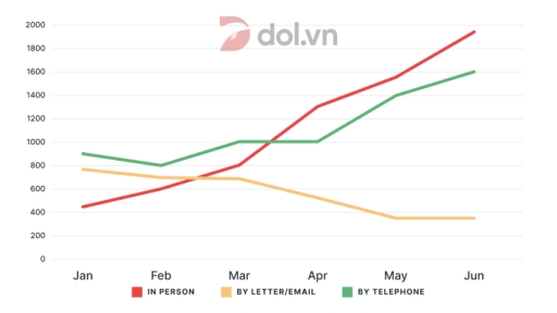
Band 7+: The graph below shows the number of inquiries received by the Tourist Information Office in one city over six months in 2011.

Image for topic: The graph below shows the number of inquiries received by the Tourist Information Office in one city over six months in 2011.
Our system will evaluate the answer based on this AI-generated description.
The image is a line graph with horizontal x-axis labeled with months from Jan to Jun, and a vertical y-axis with values ranging from 0 to 2000 in increments of 200. There are three lines representing different modes of communication; "IN PERSON" starts around 600 in Jan, rises to approximately 800 in Feb, dips slightly below 600 in Mar, increases to roughly 1000 in Apr, and continues to rise steeply to just above 1800 by Jun. "BY LETTER/EMAIL" begins just above 200 in Jan, gradually ascends to nearly 400 in Feb, surpasses 600 in Mar, climbs above 800 in Apr, and reaches nearly 1400 by Jun. "BY TELEPHONE" commences around 1200 in Jan, slightly declines to around 1100 in Feb, drops to about 1000 in Mar, remains stable in April, then mildly increases to just above 1000 in May and continues to just below 1200 in Jun. There are no numerical data points or percentages explicitly shown on the graph, only approximate values can be inferred from the positions of the lines relative to the y-axis.
Given the complexity of the image, the above description may not be entirely accurate.
Note: Both the topic and the answer were created by one of our users.

The line chart illustrates how many enquiries the Tourist Information Office received in one city during 6 months in 2011. Overall, the number of enquiries made in person and by telephone tended to increase, while those sent by letter or email decreased.

A closer look at the diagram reveals that from January to March 2011, telephone inquiries fluctuated slightly, from 900 in January to 1000 in March. However, in-person inquiries increased considerably, exceeding the figure for email or letter with 800 emails in March.

From March to June, face-to-face inquiries skyrocketed, reaching a high peak of under 2000 after a rise of more than 1000 in just four months. During the same period, a significant increase was recorded in telephone enquiries, ending at around 1600 in June. In contrast, there are fewer people who sent emails or letters, and the number plumbered to under 400, which is the lowest point of the period.

In conclusion, the data indicates that visitors increasingly preferred making inquiries in person or via telephone, whereas contacting the Office through letter or email became less popular overtime.

Word Count: 181

Answers On The Same Topic:

The graph below shows the number of inquiries received by the Tourist Information Office in one city over six months in 2011.

The line graph illustrates the information about the changes in the number of inquiries received by the tourist information office in a particular city over six months in 2011. Overall, it is immediately apparent that in person and by telephone experienced the most significant growth, whereas by letter showed a noticeable decline throughout the period. […]

The graph below shows the number of inquiries received by the Tourist Information Office in one city over six months in 2011.

The line graph illustrates how many inquiries were received by a Tourist Information Office in a specific city through three different methods over a six-month period in 2011. Overall, it is clear that inquiries made in person and by telephone showed a significant upward trend, while the number of people sending letters or emails declined […]

The graph below shows the number of inquiries received by the Tourist Information Office in one city over six months in 2011.

The give graph illustrates that the amount of inquiries that Tourist Information Office recieved in one specific city in early 6 month of 2011, categorized by the method of inquiries-in person, by letter/email, or telephone. Overall, an steadily increasing trend can be seen on the Tourist Information Office’s inquries through physical visit and telephone, while […]

The graph below shows the number of inquiries received by the Tourist Information Office in one city over six months in 2011.

The graph depicts the number of inquiries recieved by the tourist information office in one city over six months in 2011. Overall, the number of people questioning the office increase over time by using telephone, or visiting in person. However, the number of people using letter, and email is droping from january to june. With […]

The graph below shows the number of inquiries received by the Tourist Information Office in one city over six months in 2011.

The line graph illustrates the number of questions recorded by the tourist information in a specific city over six months in 2011, starting from January. Looking from an overall perspective, it is readily apparent that all sectors witnessed upward trajectories, except for the inquiries by letter or email. Furthermore, the statistics for enquiries in person […]

See All

Other Topics:

The line graph shows average motnhly temperatures in three cities in 2024

The line graph illustrates the overall of temperatures in London, New York, Sydney by the year of 2024. Overall, the temperatures in New York and London increase sharply, however, those cities become plunge slightly on the degrees over the year. Besides that Sydney shows that the temperatures decreased slightly, but not took a long time, […]

The graph below gives information about car ownership in Britain from 1971 to 2007. Summarize the information by selecting and reporting the main features, and make comparisons where relevant.

The given line chart illustrates the proportion of car ownership between 1971 and 2007 in Britian. Overall, one car ownership dramatically decreased throughout this period, whereas the percentage of two cars increased. Furthermore, the ‘no car’ figures remained steady over time. Looking first at the beginning of the period, the ‘one car’ category declined from […]

The graph shows the income of four restaurants in Cambridge in 2016. Summarize the information by selecting and reporting the main features, and make comparisons where relevant.

The given graph shows the monthly profits of four diners- The grosvenor, the old hall, the pizza house and the taj mahal in cambridge during the year 2016. Overall, The grosvernor had the highest income initially but during the last few months, it decreased to a point below the other. The rest three restraunts saw […]

The line graph shows the average number of hours Ukrainian teenagers spent on four selected free time activities per week from 2000 to 2015.

The line graph illustrates how much time teenagers in Ujraine spend on leisure activities over a 20-years period. The figures are given in thousands. Overall, some activities decrease throughout the period,while the amount of tine soend on social media climb, in contrast, the figure for reading remained unchanged. In 2000 hours in week for tv […]

The graph below shows the number of tourists visiting a particular country from four different regions between 1990 and 2020. Summarise the information by selecting and reporting the main features, and make comparisons where relevant.

The line graph illustrates the number of tourists visiting a particular country from four different regions from 1990 to 2020 Overall, the proposions of tourists from Asia, North America and other regions increased, whereas the opposite trend of Europe was seen, despite this, a number of tourists from Europe is one of the most popular […]

The graph below shows the use of renewable energy as a percentage of total energy use by six countries from 1971 to 2006.

The given graph illustrates the consumption of renewable energy as proportion of total energy usage by six different countries: Finland, Denmark, France, and Germany, US and UK over the period between 1971 and 2011. Overall, it is clear that figures increased significantly across almost all categories, with Finland being the exception. Although Finland did not […]

See All
We have detected unusual activity on your device.
Please verify your identity to continue.
Note: This verification step won't sign you in. If you have a premium account, please log in to access the service as usual.
Google/Gmail Verification
Or verify using Email/Code
We've sent a verification code to:
youremail@gmail.com (Not your email?)
Enter it below to complete the verification process.
Ensure your email address is correct, your inbox is not full, and you check your spam folder. If no email arrives, consider using an alternative email.
You will need a Premium plan to perform your action!
Note: If you already have a premium account, please log in to access our services as usual.

Plans & Pricing

Our mission is to make quality education accessible for everyone.
However, to keep our hardworking team running and this service alive, we genuinely need your support!
By opting for a premium plan, not only do you sustain us in achieving the mission, but you also unlock advanced features to enrich your learning experience.

Free

For learners who aren't pressed for time

What's included on Free
100+ Cambridge IELTS Tests
Instant IELTS Writing Task 1 & 2 Evaluation (2 times/month)
Instant IELTS Speaking Part 1, 2, & 3 Evaluation (2 times/month)
Instant IELTS Writing Task 1 & 2 Essay Generator (2 times/month)
500+ Dictation & Shadowing Exercises
100+ Pronunciation Exercises
Flashcards
Other Advanced Tools

Premium

For those serious about advancing their English proficiency, and for IELTS candidates aspiring to boost their band score by 1-2 points (especially in writing & speaking) in just 30 days or less

What's included on Premium
Save Your IELTS Test Progress & Analyze Mistakes By Question Type
Save Your Own Flashcard Sets & Use Them On Any Device
Unlock All Courses, IELTS Tests, Section & Part Practice
Unlimited AI Conversations
Unlimited AI Writing Enhancement Exercises
Unlimited IELTS Writing Task 1 & 2 Evaluation
Unlimited IELTS Speaking Part 1, 2, & 3 Evaluation
Checked Answers Will Not Be Published
Unlimited IELTS Writing Task 1 & 2 Essay Generator
Unlimited IELTS Speaking Part 1, 2, & 3 Sample Generator
Unlimited Usage Of Advanced Tools & AI Features
Priority Support within 24h (12-month plan only)

Due to the nature of our service and the provided free trials, payments are non-refundable.