🔥 Today Only: Save 30% on Premium — Offer Ends Soon! - Upgrade Now!
Line Graph

Band 5+: The graph below shows the number of international tourists visiting three different countries between 2000 and 2020. Summarize the information by selecting and reporting the main features, and make comparisons where relevant.

Image for topic: The graph below shows the number of international tourists visiting three different countries between 2000 and 2020. Summarize the information by selecting and reporting the main features, and make comparisons where relevant.
Our system will evaluate the answer based on this AI-generated description.
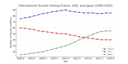
The image displays a line graph illustrating international tourists in millions visiting France, USA, and Japan from 2000 to 2020. France's data: 2000 (77), 2001 (79), 2002 (81), 2003 (83), 2004 (82), 2005 (83), 2006 (84), 2007 (86), 2008 (88), 2009 (87), 2010 (85), 2011 (86), 2012 (86), 2013 (84), 2014 (85), 2015 (87), 2016 (86), 2017 (88), 2018 (89), 2019 (90), 2020 (91). USA's data: 2000 (51), 2001 (52), 2002 (53), 2003 (54), 2004 (55), 2005 (56), 2006 (57), 2007 (57), 2008 (56), 2009 (55), 2010 (54), 2011 (53), 2012 (52), 2013 (51), 2014 (50), 2015 (49), 2016 (47), 2017 (45), 2018 (44), 2019 (42), 2020 (42). Japan's data: 2000 (15), 2001 (15), 2002 (16), 2003 (17), 2004 (17), 2005 (19), 2006 (20), 2007 (21), 2008 (23), 2009 (24), 2010 (25), 2011 (27), 2012 (28), 2013 (30), 2014 (33), 2015 (36), 2016 (41), 2017 (47), 2018 (52), 2019 (54), 2020 (50).
Given the complexity of the image, the above description may not be entirely accurate.
Note: Both the topic and the answer were created by one of our users.

The line graph illustrate the number of foreign tourists visited in France, America and Japan from 2000 to 2020.

Overall, france remains the most visited country of tourist. Whereas , japan shows increase in tourism wich surpasses America at the end of the survey.

At the start of the survey, france remains the most visited nation in tourism by 75 million, followed by America which remains in second place by 15 million then France. Whereas, japan remains the least visited country which is 13 million. After that, France start showing increased in number by reaching maximum potential at 90 million at 2010. In contrast, america shows decline in number reaching up to 50 million, where japan start showing increased in number up to 30 millions at 2010.

After certain increase in France it slightly decline but it stills remain the most visited country by 85 million at the end of 2020. Whereas, japan keep increasing in tourism and remain in second spot by 55 million. America keeps declining throught the year and reach its value up to 40 million throughout the survey.

Word Count: 182

Answers On The Same Topic:

The graph below shows the number of international tourists visiting three different countries between 2000 and 2020. Summarize the information by selecting and reporting the main features, and make comparisons where relevant.

The line graph illustrates the number of international tourists visiting France, the USA, and Japan between 2000 and 2020. Overall, France consistently attracted the highest number of tourists throughout the period, despite a slight decline after 2010. In contrast, the USA experienced a gradual decrease in visitor numbers, while Japan saw a significant and steady […]

The graph below shows the number of international tourists visiting three different countries between 2000 and 2020. Summarize the information by selecting and reporting the main features, and make comparisons where relevant.

The graph illustrates the number of tourists visiting various countries including France, USA, and Japan. Overall, the three lines indicates a massive number of tourists estimated to be (20-90) million individual. France shows a constant number of visitors from 2000 to 2020. At 2010, the numbers of visitiors to France reached to the peack having […]

The graph below shows the number of international tourists visiting three different countries between 2000 and 2020. Summarize the information by selecting and reporting the main features, and make comparisons where relevant.

– The line graph illustrates the number of international tourists visiting France, the United States, and Japan between 2000 and 2020. Overall, France consistently recorded the highest numbers of visitors throughout the period, despite the fluctuations, while the United States experienced a decline in tourist numbers. In contrast, Japan saw a steady increase surpassing the […]

The graph below shows the number of international tourists visiting three different countries between 2000 and 2020. Summarize the information by selecting and reporting the main features, and make comparisons where relevant.

The line graph illustrates the number of international tourists visiting France, the United States, and Japan between 2000 and 2020. Overall, France consistently recorded the highest numbers of visitors throughout the period, despite the fluctuations, while the United States experienced a decline in tourist numbers. In contrast, Japan saw a steady increase surpassing the United […]

See All

Other Topics:

The graph shows the percantage of visiting the cinema once a month or more bewtweem 1984 to 2003

Overall, the graphs shows percentage of people with different age groups visiting the cinema once or several times in month between 1984 to 2003. The most low percent of visiting cinema have adults 35 years old and over, from 1984 to 2003 it’s grow only to 10%. And the most high percent of cinema lovers […]

the line graph which i wrote when i get bored

The supplied illustration of line graph demonstrates common carbon dioxide emmissions per person across 4 regions, such as the UK, Sweden, Italy, and Portugal from 1967 to 2007. Overall, it is obvious that the Sweden individuals produced carbon emmissions fewer than other countries, while the rate of the italians increased. With regards to Italy and […]

The graph below shows Twitter use by age group in the USA between November 2010 and May 2013. Summarise the information by selecting and reporting the main features, and make comparisons where relevant.

The multiple line graph encapsulates Twitter use divided into various group according to age in the US measured in percentages from November 2010 to May 2013. The overall information depicted in the collection of data is that, most of the mention Twitter users increase for all groupings over the given period of time. Taking a […]

The chart below shows spending on health among three different countries between 1990 to 2010. Summarize the information by selecting and reporting the main features, and make comparisons where relevant. Write at least 150 words.

The line grapgh illustrates the healthcare spending in billions in three different countries during the year 1990-2010. Grapgh delineates the analytical data of money spending in billions is taken from japan, italy and frence in the year 1990-2010. Japan shows significant growth throughout the years whereas, italy presents minor variations respectively. As whole Japan presents […]

The graph shows the language options selected by 13-year-old students in a school in England

The line chart compares the number of 13-year-old students in a school in England choosing the two different languages, namely French and Mandarin from 2000 to 2010. What is most striking when looking at the data is that French remained the dominant language throughout the period, despite a downward trend in student enrolment , whereas […]

The graph below gives information about international migration to Canada, 2005-2015. Summarise the information by selecting and reporting the main features and make comparisons where relevant.

The given line graph highlights the details regarding about international migration during the year of 2005 to 2015 in canada. Overall, it can be observed that the international immigration increased rapidly while the net migrations and emigration was fluctuated given the time period. To start with, in 2005 the net migrations was started in 2005 […]

See All
We have detected unusual activity on your device.
Please verify your identity to continue.
Note: This verification step won't sign you in. If you have a premium account, please log in to access the service as usual.
Google/Gmail Verification
Or verify using Email/Code
We've sent a verification code to:
youremail@gmail.com (Not your email?)
Enter it below to complete the verification process.
Ensure your email address is correct, your inbox is not full, and you check your spam folder. If no email arrives, consider using an alternative email.
You will need a Premium plan to perform your action!
Note: If you already have a premium account, please log in to access our services as usual.

Plans & Pricing

Our mission is to make quality education accessible for everyone.
However, to keep our hardworking team running and this service alive, we genuinely need your support!
By opting for a premium plan, not only do you sustain us in achieving the mission, but you also unlock advanced features to enrich your learning experience.

Free

For learners who aren't pressed for time

What's included on Free
100+ Cambridge IELTS Tests
Instant IELTS Writing Task 1 & 2 Evaluation (2 times/month)
Instant IELTS Speaking Part 1, 2, & 3 Evaluation (5 times/month)
Instant IELTS Writing Task 1 & 2 Essay Generator (2 times/month)
500+ Dictation & Shadowing Exercises
100+ Pronunciation Exercises
Flashcards
Other Advanced Tools

Premium

For those serious about advancing their English proficiency, and for IELTS candidates aspiring to boost their band score by 1-2 points (especially in writing & speaking) in just 30 days or less

What's included on Premium
Save Your IELTS Test Progress
Unlock All Courses & IELTS Tests
Unlimited AI Conversations
Unlimited AI Writing Enhancement Exercises
Unlimited IELTS Writing Task 1 & 2 Evaluation
Unlimited IELTS Speaking Part 1, 2, & 3 Evaluation
Checked Answers Will Not Be Published
Unlimited IELTS Writing Task 1 & 2 Essay Generator
Unlimited IELTS Speaking Part 1, 2, & 3 Sample Generator
Unlimited Usage Of Advanced Tools
Priority Support within 24h (12-month plan only)

Due to the nature of our service and the provided free trials, payments are non-refundable.
Nếu bạn là người Việt Nam và không có hoặc không muốn trả bằng credit/debit cards, bạn có thể thanh toán bằng phương thức chuyển khoản:


Chọn gói:
419,000₫ 277,000 ₫ cho gói 1 tháng (chỉ 9,233₫/ngày)
1,239,000₫ 597,000 ₫ cho gói 3 tháng (chỉ 6,633₫/ngày)
2,469,000₫ 1,027,000 ₫ cho gói 6 tháng (chỉ 5,706₫/ngày)
4,929,000₫ 1,417,000 ₫ cho gói 12 tháng (chỉ 3,936₫/ngày)


Sau khi chuyển khoản, vui lòng đợi trình duyệt tự động điều hướng bạn trở lại Engnovate và bạn sẽ ngay lập tức nhận được mã kích hoạt tài khoản premium.
Nếu có lỗi xảy ra, bạn có thể liên hệ với team thông qua một trong các phương thức: email đến helloengnovate@gmail.com hoặc nhắn tin qua facebook.com/engnovate.
Vì toàn bộ công cụ trên website đều có thể sử dụng thử miễn phí, Engnovate không hỗ trợ hoàn tiền.