🔥 Today Only: Save 30% on Premium — Offer Ends Soon! - Upgrade Now!
Line Graph

Band 6+: The graph below shows the population figures of different types of wild birds in the united kingdom between 1970 and 2004. summarse the information by selecting and reporting the main features, and make comparisons where relevant.

Image for topic: The graph below shows the population figures of different types of wild birds in the united kingdom between 1970 and 2004. summarse the information by selecting and reporting the main features, and make comparisons where relevant.
Our system will evaluate the answer based on this AI-generated description.
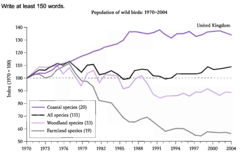
The image features a line graph titled "Population of wild birds: 1970-2004" focusing on the United Kingdom, plotting indices for four bird population categories, depicted over the years 1970 to 2004. The vertical axis ranges from 50 to 140 (index = 1970 = 100), and the horizontal axis represents time. Each category's bird population is represented by a specific line: Coastal species (20 species), All species (111 species), Woodland species (33 species), and Farmland species (19 species). Initially, in 1970, all categories start at an index of 100. Patterns vary distinctly among categories through years: 1. Coastal species index shows a fairly steady increase, starting at 100 in 1970, dipping slightly in the early 1970s, then climbing gradually, reaching around 120 in 2004. 2. All species index begins at 100 in 1970, decreases slightly to below 100 by 1976, fluctuates mildly around this range, and ends near 100 again in 2004. 3. Woodland species index starts at 100 in 1970, exhibits some fluctuation, dipping to approximately 90 by mid-1970s, recovering to 100 by 1980, with slight rises and falls, ending just below 100 by 2004. 4. Farmland species index begins at 100, shows a sharp decline to about 60 by mid-1980s, and maintains a relatively flat trend but slightly recuperates, closing near 70 in 2004.
Given the complexity of the image, the above description may not be entirely accurate.
Note: Both the topic and the answer were created by one of our users.

The graph illustrates the percentage of the number of three types of birds: coastal, woodland and farmland and their total sum, that inhabited the UK over a thirty-four year period between 1970 and 2004.

Overall, the initial impression from the graph is that only the coastal species followed an upward direction, while the other species showed a significant decrease.

The most considerable growth was in the coastal population. In general, there was a gradual rise over the first half of the given period, however, from 1997 to 2004, the level fluctuated. The figure peaked at approximately 140 percent, but fell to 135 in 2004.

By contrast, the opposite downward trend was shown by the farmland and the woodland species. The total sum of farmland birds had decreased by almost 2 times by 2004. The amount of woodland species had changed the least, with approximately 85 percent by 2004.

Despite the fluctuated tendency the total number of the birds had increased in comparison to 1970.

Word Count: 164

Answers On The Same Topic:

The graph below shows the population figures of different types of wild birds in the united kingdom between 1970 and 2004. summarse the information by selecting and reporting the main features, and make comparisons where relevant.

The line graph illustrates the number of population of four distinct types of birds in the UK, over 34 year-period, spanning from 1970 to 2004. Overall, all kind of birds saw fluctuations in numbers and were of the same figures at the starting of the period. Figures for coastal species outnumbered the remaining categories throughout […]

The graph below shows the population figures of different types of wild birds in the united kingdom between 1970 and 2004. summarse the information by selecting and reporting the main features, and make comparisons where relevant.

The line graph illustrates the changes in population of various bird types beetween the years 1970 and 2004 in the UK. The starting figure is considered to be 100 for all 4 types. Generally speaking, it can be clearly seen that the numbers of coastal and farmland species experienced significantly larger alterations than the other […]

The graph below shows the population figures of different types of wild birds in the united kingdom between 1970 and 2004. summarse the information by selecting and reporting the main features, and make comparisons where relevant.

The given line graph demonstrates the population figures of four various types of wild birds: Coastal species, Woodland species, Farmland Species and All species in the United Kingdom.The share is measured in specific index and data is provided between 1970 and 2004. Overall, Coastal species illustrate the upward trend, while all species, woodland species and […]

The graph below shows the population figures of different types of wild birds in the united kingdom between 1970 and 2004. summarse the information by selecting and reporting the main features, and make comparisons where relevant.

The line graph illustrates the population trends of four different types of wild birds in the United Kingdom between 1970 and 2004. Overall, all bird species started with a population index of 100 in 1970. While the populations of all species and woodland species remained relatively stable, coastal and farmland species showed much greater variation […]

The graph below shows the population figures of different types of wild birds in the united kingdom between 1970 and 2004. summarse the information by selecting and reporting the main features, and make comparisons where relevant.

The graph illustrates the population figures of different types of wild birds in the United Kingdom between 1970 to 2004. Overall, it is clear to seen that two species grew with the the one grew rapidly ratherthan, other species faced fall with the decades. In first, in 1970 all species were on 100 with the […]

See All

Other Topics:

The graph below gives information about the number of jobs in four sectors of the economy in the US between 1960 and 2020. Summarise the information by selecting and reporting the main features, and make comparisons where relevant.

The diagram ilusstrates details of amount offers between Manufacturing, Retail, Agriculture, and Healthcare economics in US from the period 1960 to 2020. Overall, Healthcare with Retail had increased at the end of a period, However Mnufacturing and Agricalture had decreased. Firstly in 1960 Manufacturing was the highest economy than others, it had 15 millions. At […]

The chart gives information on average monthly temperatures in Paris, Boston, and Melbourne.

Overall, Paris and Boston had an upward trend in the first half of the period, and a decline in the second part, whereas Melbourne followed an opposite trend. At the beginning of the period, Melbourne was the leader at 25, while Paris and Boston were at around 8 and 4 respectively. By April, Boston at […]

.The line chart shows average attendance at the cinema among various age groups in the US from 2000 to 2011.

The line graph compares the percentage of four age brackets who visited the cinema in the USA between 2000 and 2011. What is most striking when looking at the data is the significant growth in cinema attendance across all age groups over the given period. Notably, the 15-24 age group tended to watch movies more […]

The line graph below shows the number of overseas tourists in millions who visited France, Japan, and Spain between 1990 and 2020.

The diagram illustrate alters in the amount of international tourists, who visited three different countries, such as France, Spain and Japan between 1990 and 2020. Overall, the data indicate a significant increase in the number of France and Spain over the period, whereas Japan experienced a gradual decline, following a completely different trend from the […]

The chart below shows the average monthly cost of contracts for four different mobile (cell) phones in a European country from January to September 2002, measured in euros.

The line graph witnesses an information about the average price of contracts for four types of cell phones per month in a certain European country between January and September in 2002. Overall, we can see that almost all sort of mobile phones showed an upward trend except for alpha, which contract increased gradually, but at […]

The line graph shows the energy consumption in Country X between 2000 and 2018.

The line graph shows the proportion of energy consumed from renewable and non-renewable sources in country X over an 18-year timeframe between 2000 and 2018. Overall, non-renewable energy consistently accounted for the vast majority of total consumption throughout the period, despite experiencing a steady decline. Conversely, the proportion/share of renewable energy demonstrated a sustained growth, […]

See All
We have detected unusual activity on your device.
Please verify your identity to continue.
Note: This verification step won't sign you in. If you have a premium account, please log in to access the service as usual.
Google/Gmail Verification
Or verify using Email/Code
We've sent a verification code to:
youremail@gmail.com (Not your email?)
Enter it below to complete the verification process.
Ensure your email address is correct, your inbox is not full, and you check your spam folder. If no email arrives, consider using an alternative email.
You will need a Premium plan to perform your action!
Note: If you already have a premium account, please log in to access our services as usual.

Plans & Pricing

Our mission is to make quality education accessible for everyone.
However, to keep our hardworking team running and this service alive, we genuinely need your support!
By opting for a premium plan, not only do you sustain us in achieving the mission, but you also unlock advanced features to enrich your learning experience.

Free

For learners who aren't pressed for time

What's included on Free
100+ Cambridge IELTS Tests
Instant IELTS Writing Task 1 & 2 Evaluation (2 times/month)
Instant IELTS Speaking Part 1, 2, & 3 Evaluation (2 times/month)
Instant IELTS Writing Task 1 & 2 Essay Generator (2 times/month)
500+ Dictation & Shadowing Exercises
100+ Pronunciation Exercises
Flashcards
Other Advanced Tools

Premium

For those serious about advancing their English proficiency, and for IELTS candidates aspiring to boost their band score by 1-2 points (especially in writing & speaking) in just 30 days or less

What's included on Premium
Save Your IELTS Test Progress & Analyze Mistakes By Question Type
Save Your Own Flashcard Sets & Use Them On Any Device
Unlock All Courses, IELTS Tests, Section & Part Practice
Unlimited AI Conversations
Unlimited AI Writing Enhancement Exercises
Unlimited IELTS Writing Task 1 & 2 Evaluation
Unlimited IELTS Speaking Part 1, 2, & 3 Evaluation
Checked Answers Will Not Be Published
Unlimited IELTS Writing Task 1 & 2 Essay Generator
Unlimited IELTS Speaking Part 1, 2, & 3 Sample Generator
Unlimited Usage Of Advanced Tools & AI Features
Priority Support within 24h (12-month plan only)

Due to the nature of our service and the provided free trials, payments are non-refundable.