🔥 Today Only: Save 30% on Premium — Offer Ends Soon! - Upgrade Now!
Multiple Graphs

Band 6+: The graph below shows the proportion of the population aged 65 and over between 1940 and 2040 in three different countries. Summarize the information by selecting and reporting the main feature and make comparisons where relevant.

Image for topic: The graph below shows the proportion of the population aged 65 and over between 1940 and 2040 in three different countries. Summarize the information by selecting and reporting the main feature and make comparisons where relevant.
Our system will evaluate the answer based on this AI-generated description.
The image features two visuals: a line graph and a bar chart. The line graph depicts the proportion of the population aged 65 years and over from 1940 to 2040 for three countries. For the USA, figures are approximately 9% in 1940, 10% in 1960, 12% in 1980, 13% in 2000, 20% in 2020, 22% projected in 2020, and 23% by 2040. Sweden shows about 7% in 1940, 10% in 1960, 17% in 1980, 17% in 2000, 18% in 2020, projected at 19% in 2020, and 25% by 2040. Japan starts with around 5% in 1940, 8% in 1960, 10% in 1980, 17% in 2000, elevating to 27% by 2020-2040. The bar chart highlights the percentage of the population in urban areas across different regions for 1950, 2007, and 2030. Globally, urban population percentage is 29% in 1950, 49% in 2007, 60% in 2030. In Africa, it's 15% in 1950, 37% in 2007, 51% in 2030. For Asia, 17% in 1950, 41% in 2007, 55% in 2030. Europe's values are 51% in 1950, 72% in 2007, 78% in 2030. Latin America is at 42% in 1950, 76% in 2007, 84% in 2030. In North America, values are 64% in 1950, 79% in 2007, 87% in 2030.
Given the complexity of the image, the above description may not be entirely accurate.
Note: Both the topic and the answer were created by one of our users.

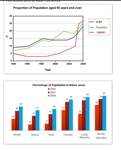
The line chart illustrates the proportion of population aged 65 years and older in three countries (the USA, Sweden and Japan) from 1940 and its predictions until 2040 while the bar chart indicates the percentage of population in urban areas in the world, Africa, Asia, Europe, Latin America and North America between 1950 and its anticipations until 2030.

Overall, an upward trend will be recorded in all countries with the striking changes in Japan. As can be clearly seen, Africa will account for the lowest figure in all years.

In detail, Japan will witness a gradual decrease from 5% to 4% between 1940 and 1960, followed by no change until 1990 and a dramatic increase to 26% in 2040. Like wise, China’s and Sweden’s population aged 65 years and older will significantly rise by 14% and 18% to 24% and 25% in 100 years.

Regarding, 64% of North American people lived in urban areas at the beginning, which indicated a disparity of 13%, 22%, 35% and over 48% in Europe, Latin America, the world, Asia and Africa. After that, there will be a marked growth to 87% and 78% in North America and Europe as opposed to a remarkable by 42%, 31%, 35% and 37% in Latin America, the world, Asia and Africa respectively in the final year.

Word Count: 218

Answers On The Same Topic:

The graph below shows the proportion of the population aged 65 and over between 1940 and 2040 in three different countries. Summarize the information by selecting and reporting the main feature and make comparisons where relevant.

The line chart delineates the rate of the population aged 65 and over between 1940 and 2040 across three distinct countries; all data have been calibrated in percentage. Overall, the percentage of Japanese adults aged 65 and over was lower than two others countries, USA and Sweden, in majority periods of time. Dispite this, the […]

See All

Other Topics:

The graph and the chart below show the number of students choosing different kinds of courses in a university in 2012. Summarise the information by selecting and reporting the main features, and make comparisons where relevant.

The line graph illustrates how many students enrolled in six different programs offered by a university in 2012. Overall, social sciences had the largest number of students, while the converse was true of agriculture. Furthermore, women’s enrollment exceeded that of men in humanities, health and also social sciences, whereas the other two were male-dominated. The […]

Part 1: The graph below shows the weekly working hours or men and women omen in in government institutions and private institutions.

The pie charts illustrate the amount of time men and women work each week in both private and governmental organizations. Overall, men tend to work more hours than women in both sectors. While the distribution of women’s working hours is fairly consistent across both sectors, a greater percentage of men work longer hours in the […]

Part 1: The graph below shows the weekly working hours or men and women omen in in government institutions and private institutions.

The pie charts illustrate how much time men and women work every week in private and governmental organizations. Overall, men usually work more than women in both governmental and private sectors. Meanwhile, the share of women working different hours is almost the same in both sectors; however, the share of men working longer hours is […]

Part 1: The graph below shows the weekly working hours or men and women omen in in government institutions and private institutions.

The pie charts illustrate how much time men and women work every week in private and governmental organizations. Overall, men usually work more than women in both governmental and private sectors. Meanwhile, the share of women working different hours is almost the same in both sectors, the share of men working longer hours is higher […]

line graphs show the size of the ozone hole in Antarctic and three types of damaging gases that damage the Antarctic ozone from 1980 to 2000.

The line graphs illustrate the damage to the Antarctic ozone layer with reference to the ozone hole in Antarctica by size and three types of harmful gases (Freon, NO2, and H2O2) from 1980 to 2000. Overall, Freon gas caused more damage in 1985 compared to both NO2 and H2O2. By 2000, the size of the […]

line graphs show the size of the ozone hole in Antarctic and three types of damaging gases that damage the Antarctic ozone from 1980 to 2000.

The line graphs illustrates the damange of Antarctic ozone with reference of the ozone hole in Antarctic by size and 3 types ( Freon, NO2 & H2O2) of dangerous gases ( from 1980 to 2000. Overall, the freon gas in 1985 had done more damage contrast to both NO2 and H2O2. In 2000, the size […]

See All
We have detected unusual activity on your device.
Please verify your identity to continue.
Note: This verification step won't sign you in. If you have a premium account, please log in to access the service as usual.
Google/Gmail Verification
Or verify using Email/Code
We've sent a verification code to:
youremail@gmail.com (Not your email?)
Enter it below to complete the verification process.
Ensure your email address is correct, your inbox is not full, and you check your spam folder. If no email arrives, consider using an alternative email.
You will need a Premium plan to perform your action!
Note: If you already have a premium account, please log in to access our services as usual.

Plans & Pricing

Our mission is to make quality education accessible for everyone.
However, to keep our hardworking team running and this service alive, we genuinely need your support!
By opting for a premium plan, not only do you sustain us in achieving the mission, but you also unlock advanced features to enrich your learning experience.

Free

For learners who aren't pressed for time

What's included on Free
100+ Cambridge IELTS Tests
Instant IELTS Writing Task 1 & 2 Evaluation (2 times/month)
Instant IELTS Speaking Part 1, 2, & 3 Evaluation (5 times/month)
Instant IELTS Writing Task 1 & 2 Essay Generator (2 times/month)
500+ Dictation & Shadowing Exercises
100+ Pronunciation Exercises
Flashcards
Other Advanced Tools

Premium

For those serious about advancing their English proficiency, and for IELTS candidates aspiring to boost their band score by 1-2 points (especially in writing & speaking) in just 30 days or less

What's included on Premium
Save Your IELTS Test Progress
Unlock All Courses & IELTS Tests
Unlimited AI Conversations
Unlimited AI Writing Enhancement Exercises
Unlimited IELTS Writing Task 1 & 2 Evaluation
Unlimited IELTS Speaking Part 1, 2, & 3 Evaluation
Checked Answers Will Not Be Published
Unlimited IELTS Writing Task 1 & 2 Essay Generator
Unlimited IELTS Speaking Part 1, 2, & 3 Sample Generator
Unlimited Usage Of Advanced Tools
Priority Support within 24h (12-month plan only)

Due to the nature of our service and the provided free trials, payments are non-refundable.
Nếu bạn là người Việt Nam và không có hoặc không muốn trả bằng credit/debit cards, bạn có thể thanh toán bằng phương thức chuyển khoản:


Chọn gói:
419,000₫ 277,000 ₫ cho gói 1 tháng (chỉ 9,233₫/ngày)
1,239,000₫ 597,000 ₫ cho gói 3 tháng (chỉ 6,633₫/ngày)
2,469,000₫ 1,027,000 ₫ cho gói 6 tháng (chỉ 5,706₫/ngày)
4,929,000₫ 1,417,000 ₫ cho gói 12 tháng (chỉ 3,936₫/ngày)


Sau khi chuyển khoản, vui lòng đợi trình duyệt tự động điều hướng bạn trở lại Engnovate và bạn sẽ ngay lập tức nhận được mã kích hoạt tài khoản premium.
Nếu có lỗi xảy ra, bạn có thể liên hệ với team thông qua một trong các phương thức: email đến helloengnovate@gmail.com hoặc nhắn tin qua facebook.com/engnovate.
Vì toàn bộ công cụ trên website đều có thể sử dụng thử miễn phí, Engnovate không hỗ trợ hoàn tiền.