🔥 Today Only: Save 30% on Premium — Offer Ends Soon! - Upgrade Now!
Multiple Graphs

Band 6+: The graph below shows the proportion of the population aged 65 and over between 1940 and 2040 in three different countries. Summarize the information by selecting and reporting the main feature and make comparisons where relevant.

Image for topic: The graph below shows the proportion of the population aged 65 and over between 1940 and 2040 in three different countries. Summarize the information by selecting and reporting the main feature and make comparisons where relevant.
Our system will evaluate the answer based on this AI-generated description.
The image features two visuals: a line graph and a bar chart. The line graph depicts the proportion of the population aged 65 years and over from 1940 to 2040 for three countries. For the USA, figures are approximately 9% in 1940, 10% in 1960, 12% in 1980, 13% in 2000, 20% in 2020, 22% projected in 2020, and 23% by 2040. Sweden shows about 7% in 1940, 10% in 1960, 17% in 1980, 17% in 2000, 18% in 2020, projected at 19% in 2020, and 25% by 2040. Japan starts with around 5% in 1940, 8% in 1960, 10% in 1980, 17% in 2000, elevating to 27% by 2020-2040. The bar chart highlights the percentage of the population in urban areas across different regions for 1950, 2007, and 2030. Globally, urban population percentage is 29% in 1950, 49% in 2007, 60% in 2030. In Africa, it's 15% in 1950, 37% in 2007, 51% in 2030. For Asia, 17% in 1950, 41% in 2007, 55% in 2030. Europe's values are 51% in 1950, 72% in 2007, 78% in 2030. Latin America is at 42% in 1950, 76% in 2007, 84% in 2030. In North America, values are 64% in 1950, 79% in 2007, 87% in 2030.
Given the complexity of the image, the above description may not be entirely accurate.
Note: Both the topic and the answer were created by one of our users.

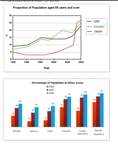
The line chart delineates the rate of the population aged 65 and over between 1940 and 2040 across three distinct countries; all data have been calibrated in percentage.

Overall, the percentage of Japanese adults aged 65 and over was lower than two others countries, USA and Sweden, in majority periods of time. Dispite this, the percentage of 65 and over years old adults increased throughout the years.

In 1940, the rate of population aged 65 and over stood around 5%. This figure slightly decline into approximately 3% in 1960 and ramained stable in the following two decades. The proportion adults aged 65 and over started to increased in approximately 2008. This trend occurred until present; a massive growth is predicted to happen in 2040.

The trend of the proportion of adults aged 65 and over from 1940 to 1995 in United States is similar to Sweden; though the percentage of United States slightly bigger. In 2000 to 2020, the rates 65 years and older people in Sweden rapidly increase and bigger than United States. The percentage of Sweden and United States is predicted to incline into approximately 25% and 23% respectively.

Word Count: 191

Answers On The Same Topic:

The graph below shows the proportion of the population aged 65 and over between 1940 and 2040 in three different countries. Summarize the information by selecting and reporting the main feature and make comparisons where relevant.

The line chart illustrates the proportion of population aged 65 years and older in three countries (the USA, Sweden and Japan) from 1940 and its predictions until 2040 while the bar chart indicates the percentage of population in urban areas in the world, Africa, Asia, Europe, Latin America and North America between 1950 and its […]

See All

Other Topics:

The charts below show the percentage of time used for different activities in the office in the US in 1980 and 2000.

The table compares one development country [ US ] in terms of their time used for kind of activities seven various of sectors [ computer, paper document, meeting, phone, other activities, email, face-to-face communication] in the office 1980 and 2000. Units are measured in percentages. Overall, it is a clear that computer and phone showed […]

The chart below show the percentage of their food budget the average family spent on restaurant meals in different years. The graph shows the number of meals eaten in fast food restaurants and sit-down restaurants. Summarize the information by selecting and reporting the main features, and make comparisons where relevant.

The pie chart provides data regarding the percentages of food budget spent by the average household on restaurant or homemade meals from 1979 to 2000. Overall, it is clear that at the beginning of the period, the vast majority of families cooked at home, while at the end, the proportions for home and restaurant meals […]

The pie charts below show the amount of electricity generated by energy source in Scotland for 20 years ago and last year.Summarise the information by selecting and reporting the main features, and make somparisons where relevant.

The pie charts compare the proportions of electricity generated from different energy sources in Scotland 20 years ago and last year. Overall, coal remained the largest source of electricity in both years, although its share declined significantly. In contrast, nuclear power and other renewable sources increased, while gas and hydro natural flow changed only slightly. […]

The charts show the proportion of male and female employees in different job categories of engineering

The charts illustrate the proportion of woman and man employees in several job categories of engineering companies from 2005 to 2015. In general, it is evident that female administrators were at the top of the chart in both years, while male administrators gained the lowest percentage initially. In 2005, women’s preferences were mainly in administration […]

The charts below show the main reasons for study among art students of different ages and the level of satisfaction they reported after they began their new course. Summarize the information by selecting and reporting the main features, and make comparisons where relevant. Write at least 150 words.

The bar charts illustrate the primary motivations for art students of various age groups to pursue their studies and the proportion of the students who expressed high levels of satisfaction with their course. It is clear from the chart that people under 26 study for their career progression, while people over 49 study for their […]

The charts show the proportion of male and female employees in different job categories of engineering

The charts illustrate the proportion of woman and man employees in several job categories of engineering companies from 2005 to 2015. In general, it is evident that female administrators were at the top of the chart in both years, while male administrators gained the lowest percentage initially. In 2005, women’s preferences were mainly in administration […]

See All
We have detected unusual activity on your device.
Please verify your identity to continue.
Note: This verification step won't sign you in. If you have a premium account, please log in to access the service as usual.
Google/Gmail Verification
Or verify using Email/Code
We've sent a verification code to:
youremail@gmail.com (Not your email?)
Enter it below to complete the verification process.
Ensure your email address is correct, your inbox is not full, and you check your spam folder. If no email arrives, consider using an alternative email.
You will need a Premium plan to perform your action!
Note: If you already have a premium account, please log in to access our services as usual.

Plans & Pricing

Our mission is to make quality education accessible for everyone.
However, to keep our hardworking team running and this service alive, we genuinely need your support!
By opting for a premium plan, not only do you sustain us in achieving the mission, but you also unlock advanced features to enrich your learning experience.

Free

For learners who aren't pressed for time

What's included on Free
100+ Cambridge IELTS Tests
Instant IELTS Writing Task 1 & 2 Evaluation (2 times/month)
Instant IELTS Speaking Part 1, 2, & 3 Evaluation (5 times/month)
Instant IELTS Writing Task 1 & 2 Essay Generator (2 times/month)
500+ Dictation & Shadowing Exercises
100+ Pronunciation Exercises
Flashcards
Other Advanced Tools

Premium

For those serious about advancing their English proficiency, and for IELTS candidates aspiring to boost their band score by 1-2 points (especially in writing & speaking) in just 30 days or less

What's included on Premium
Save Your IELTS Test Progress
Unlock All Courses & IELTS Tests
Unlimited AI Conversations
Unlimited AI Writing Enhancement Exercises
Unlimited IELTS Writing Task 1 & 2 Evaluation
Unlimited IELTS Speaking Part 1, 2, & 3 Evaluation
Checked Answers Will Not Be Published
Unlimited IELTS Writing Task 1 & 2 Essay Generator
Unlimited IELTS Speaking Part 1, 2, & 3 Sample Generator
Unlimited Usage Of Advanced Tools
Priority Support within 24h (12-month plan only)

Due to the nature of our service and the provided free trials, payments are non-refundable.
Nếu bạn là người Việt Nam và không có hoặc không muốn trả bằng credit/debit cards, bạn có thể thanh toán bằng phương thức chuyển khoản:


Chọn gói:
419,000₫ 277,000 ₫ cho gói 1 tháng (chỉ 9,233₫/ngày)
1,239,000₫ 597,000 ₫ cho gói 3 tháng (chỉ 6,633₫/ngày)
2,469,000₫ 1,027,000 ₫ cho gói 6 tháng (chỉ 5,706₫/ngày)
4,929,000₫ 1,417,000 ₫ cho gói 12 tháng (chỉ 3,936₫/ngày)


Sau khi chuyển khoản, vui lòng đợi trình duyệt tự động điều hướng bạn trở lại Engnovate và bạn sẽ ngay lập tức nhận được mã kích hoạt tài khoản premium.
Nếu có lỗi xảy ra, bạn có thể liên hệ với team thông qua một trong các phương thức: email đến helloengnovate@gmail.com hoặc nhắn tin qua facebook.com/engnovate.
Vì toàn bộ công cụ trên website đều có thể sử dụng thử miễn phí, Engnovate không hỗ trợ hoàn tiền.