🔥 Today Only: Save 30% on Premium — Offer Ends Soon! - Upgrade Now!
Bar Chart

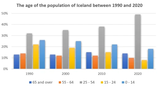
Band 6+: The graph gives information about the age of the population of Iceland between 1990 and 2020.

Image for topic: The graph gives information about the age of the population of Iceland between 1990 and 2020.
Our system will evaluate the answer based on this AI-generated description.
The image displays a bar graph demonstrating the age distribution of Iceland's population from 1990 to 2020 in five-year increments, with five age ranges represented by distinct colors. In 1990, ages 0-14 accounted for approximately 30%, ages 15-24 constituted about 15-20%, ages 25-54 comprised around 45%, ages 55-64 made up roughly 8%, and ages 65 and over occupied about 10%. In 2000, ages 0-14 decreased to about 25%, ages 15-24 remained around 15-20%, ages 25-54 increased to almost 50%, ages 55-64 stayed at 8%, and ages 65 and over rose to nearly 12%. In 2010, ages 0-14 further dropped to approximately 20%, ages 15-24 stayed around 15-20%, ages 25-54 decreased to about 45%, ages 55-64 increased to nearly 10%, and ages 65 and over climbed to almost 15%. Lastly, in 2020, ages 0-14 stayed at 20%, ages 15-24 remained around 15-20%, ages 25-54 decreased to roughly 40%, ages 55-64 increased to around 12%, and ages 65 and over rose to roughly 20%.
Given the complexity of the image, the above description may not be entirely accurate.
Note: Both the topic and the answer were created by one of our users.

Looking from the overall perspective, each year shown in the picture has a common predominating age fraction – adults about 25-54 years old. In addition, there were some unimportant fluctuations of several portions (for example, 65 and over and 55-56 age groups). In terms of children and teenagers, they had significant changes over a thirty year period.

The gray figure (25-54) had the largest proportion in every shown year and increased steadily. It reached the peak in 2020 (from about 32% to approximately half). However there was a dramatic plunge in the percentage of children and young people (from a quarter and 22% to 18% and 8% respectively).

According to the 55-64 and 65 and over categories, this situation looked more stable as opposed to more young people. In 1990, the percentage of 55-64 group exceeded elderly cityzens (this difference constituted about mere 1 percent). However, from 2000 to 2020, there appeared a trend of decrease of 55-64 fraction (in the beginning it was about 13% and became one tenth), while the second elder group grew unimportantly (from 12% to about 14% in the end of the period.

Word Count: 188

Answers On The Same Topic:

The graph gives information about the age of the population of Iceland between 1990 and 2020.

The bar chart illustrates the percentage distribution of Iceland’s population across five age groups (0–14, 15–24, 25–54, 55–64, and 65 and over) in 1990, 2000, 2010, and 2020. Overall, there was a noticeable decline in the younger age groups, significant growth in the older age groups, and the working-age population remained the largest category throughout […]

The graph gives information about the age of the population of Iceland between 1990 and 2020.

The bar chart provides information on the age demographics of Iceland’s population over a 30-year period, from 1990 to 2020. What is most striking when looking at the data is that the age group of 25-54 continues to be the largest demographic in the population of Iceland, whereas the number of people aged 0-24 experiences […]

The graph gives information about the age of the population of Iceland between 1990 and 2020.

The bar chart illustrates a survey on the range of population in Iceland by age from 1990 to 2020. The measurement was conducted in percentage. Overall, it is evident from the chart that the number for age group of 25-54 years was the most dominant among other age categories. In detail, the population of 25-54 […]

The graph gives information about the age of the population of Iceland between 1990 and 2020.

The graph illustrates the age distribution of Iceland’s population from 1990 to 2020, divided into five distinct age ranges. Overall, the population trend shows a shift towards an ageing population. In general, the graph highlights a noticeable decline in the proportion of younger ages, accompanied by a steady increase in the proportion of older ages. […]

The graph gives information about the age of the population of Iceland between 1990 and 2020.

The bar chart illustrates the distribution of age groups among the population in Iceland from 1990 to 2020. Overall, the largest growth was seen in the 25-54 age group during this period, while the two younger age groups experienced slight decreases. The number of individuals in the two older age groups remained relatively stable. The […]

See All

Other Topics:

The bar chart illustrates the percentage of household spending on different categories (food, transport, leisure, and education) in four countries in 2015.

The bar chart illustrates the proportion of money spent on five types of household spending (food, transport, leisure, and education) in the UK, France, Japan, and Brazil in 2015. Overall, three countries (Brazil, Japan, and France) spent most of their money on food, compared to the UK, where the leisure was the highest, whereas the […]

The bar chart illustrates the percentage of household spending on different categories (food, transport, leisure, and education) in four countries in 2015.

The bar chart illustrates the proportion of money spent on five types of household spending (food, transport, leisure, and education) in UK, France, Japan, and Brazil in 2015. Overall, three countries (Brazil, Japan, and France) spent most of their money on food compared to UK in leisure, whereas the least percentage of expenditure was on […]

The bar graphs shows the shares of expenditure in five categories

The bar chart depicts expenditures for five huge categories in four countries: the USA, Canada, the UK and Japan in 2009. Overall, generally all four countries had the highest percentage shares in first three categories ( food, housing and transportation), while those of health care and clothing were the lowest throughout the period. Starting with […]

the chart below shows the most visited museums in pakistan in 2024. summarise all the information in the chart below

The bar graph compares the most visited museums in Pakistan in 2024. Overall, the number of the visitors was highest in August while, June recorded the lowest number of visitors, in contrast July and September had the same figure. In June, 300 people visited the Maritime Museum, similarly 300 visitors visited the Maritime Museum in […]

The chart below shows the expenditure of two countries on customer goods in 2010.

The provided bar chart illustrates the amount of money France and the UK spent on consumer goods, such as cars, computers, books, perfume, and cameras in 2010. Units measured in pounds sterling. Overall, the UK spent more money on consumer goods than France in the period given. Both coutries spent most of money on cars. […]

The chart below shows how people travelled to work in three cities in 2023. Summarise the information by selecting and reporting the main features, and make comparisons where relevant.

The bar chart compares several transports which people used to commute in three different cities labelled as city A, B, C in 2023. Overall, cars were the main transport vehicle to travel to the work, while the reverse was true for on foot. Additionally, workers in city C used all four vehicles in balance. Focusing […]

See All
We have detected unusual activity on your device.
Please verify your identity to continue.
Note: This verification step won't sign you in. If you have a premium account, please log in to access the service as usual.
Google/Gmail Verification
Or verify using Email/Code
We've sent a verification code to:
youremail@gmail.com (Not your email?)
Enter it below to complete the verification process.
Ensure your email address is correct, your inbox is not full, and you check your spam folder. If no email arrives, consider using an alternative email.
You will need a Premium plan to perform your action!
Note: If you already have a premium account, please log in to access our services as usual.

Plans & Pricing

Our mission is to make quality education accessible for everyone.
However, to keep our hardworking team running and this service alive, we genuinely need your support!
By opting for a premium plan, not only do you sustain us in achieving the mission, but you also unlock advanced features to enrich your learning experience.

Free

For learners who aren't pressed for time

What's included on Free
100+ Cambridge IELTS Tests
Instant IELTS Writing Task 1 & 2 Evaluation (2 times/month)
Instant IELTS Speaking Part 1, 2, & 3 Evaluation (2 times/month)
Instant IELTS Writing Task 1 & 2 Essay Generator (2 times/month)
500+ Dictation & Shadowing Exercises
100+ Pronunciation Exercises
Flashcards
Other Advanced Tools

Premium

For those serious about advancing their English proficiency, and for IELTS candidates aspiring to boost their band score by 1-2 points (especially in writing & speaking) in just 30 days or less

What's included on Premium
Save Your IELTS Test Progress & Analyze Mistakes By Question Type
Save Your Own Flashcard Sets & Use Them On Any Device
Unlock All Courses, IELTS Tests, Section & Part Practice
Unlimited AI Conversations
Unlimited AI Writing Enhancement Exercises
Unlimited IELTS Writing Task 1 & 2 Evaluation
Unlimited IELTS Speaking Part 1, 2, & 3 Evaluation
Checked Answers Will Not Be Published
Unlimited IELTS Writing Task 1 & 2 Essay Generator
Unlimited IELTS Speaking Part 1, 2, & 3 Sample Generator
Unlimited Usage Of Advanced Tools & AI Features
Priority Support within 24h (12-month plan only)

Due to the nature of our service and the provided free trials, payments are non-refundable.