🔥 Today Only: Save 30% on Premium — Offer Ends Soon! - Upgrade Now!
Bar Chart

Band 9: The graph gives information about the age of the population of Iceland between 1990 and 2020.

Image for topic: The graph gives information about the age of the population of Iceland between 1990 and 2020.
Our system will evaluate the answer based on this AI-generated description.
The image displays a bar graph demonstrating the age distribution of Iceland's population from 1990 to 2020 in five-year increments, with five age ranges represented by distinct colors. In 1990, ages 0-14 accounted for approximately 30%, ages 15-24 constituted about 15-20%, ages 25-54 comprised around 45%, ages 55-64 made up roughly 8%, and ages 65 and over occupied about 10%. In 2000, ages 0-14 decreased to about 25%, ages 15-24 remained around 15-20%, ages 25-54 increased to almost 50%, ages 55-64 stayed at 8%, and ages 65 and over rose to nearly 12%. In 2010, ages 0-14 further dropped to approximately 20%, ages 15-24 stayed around 15-20%, ages 25-54 decreased to about 45%, ages 55-64 increased to nearly 10%, and ages 65 and over climbed to almost 15%. Lastly, in 2020, ages 0-14 stayed at 20%, ages 15-24 remained around 15-20%, ages 25-54 decreased to roughly 40%, ages 55-64 increased to around 12%, and ages 65 and over rose to roughly 20%.
Given the complexity of the image, the above description may not be entirely accurate.
Note: Both the topic and the answer were created by one of our users.

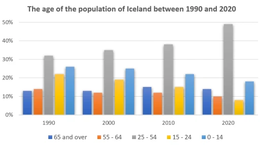
The graph illustrates the age distribution of Iceland’s population from 1990 to 2020, divided into five distinct age ranges. Overall, the population trend shows a shift towards an ageing population.

In general, the graph highlights a noticeable decline in the proportion of younger ages, accompanied by a steady increase in the proportion of older ages.

On the one hand, the proportion of children and teenagers (ages 0-14) decreased steadily over the period, from approximately 30% in 1990 to around 20% in 2020. In contrast, the proportion of elderly citizens (ages 65 and over) more than doubled, from around 10% in 1990 to nearly 20% in 2020.

On the other hand, the proportion of the working-age population (ages 25-54) remained relatively stable, with some fluctuations. In 1990, this age group comprised around 45% of the population, increasing to almost 50% in 2000, before decreasing to roughly 40% in 2020. Meanwhile, the proportion of middle-aged citizens (ages 55-64) gradually increased, from approximately 8% in 1990 to around 12% in 2020.

Word Count: 168

Answers On The Same Topic:

The graph gives information about the age of the population of Iceland between 1990 and 2020.

The bar chart illustrates the percentage distribution of Iceland’s population across five age groups (0–14, 15–24, 25–54, 55–64, and 65 and over) in 1990, 2000, 2010, and 2020. Overall, there was a noticeable decline in the younger age groups, significant growth in the older age groups, and the working-age population remained the largest category throughout […]

The graph gives information about the age of the population of Iceland between 1990 and 2020.

The bar chart provides information on the age demographics of Iceland’s population over a 30-year period, from 1990 to 2020. What is most striking when looking at the data is that the age group of 25-54 continues to be the largest demographic in the population of Iceland, whereas the number of people aged 0-24 experiences […]

The graph gives information about the age of the population of Iceland between 1990 and 2020.

The bar chart illustrates a survey on the range of population in Iceland by age from 1990 to 2020. The measurement was conducted in percentage. Overall, it is evident from the chart that the number for age group of 25-54 years was the most dominant among other age categories. In detail, the population of 25-54 […]

The graph gives information about the age of the population of Iceland between 1990 and 2020.

The bar chart illustrates the distribution of age groups among the population in Iceland from 1990 to 2020. Overall, the largest growth was seen in the 25-54 age group during this period, while the two younger age groups experienced slight decreases. The number of individuals in the two older age groups remained relatively stable. The […]

See All

Other Topics:

The bar chart below shows the number of people employed in five different sectors (sales, accounting, computing, nursing, and farming) in a region of Australia in 2001 and 2008. Summarise the information by selecting and reporting the main features, and make comparisons where relevant.

The bar chart compares the number of people employed in five different sectors – sales, accounting, computing, nursing and farming – in a region of Australia in 2001 and 2008. Overall, sales remained the largest employment sector throughout the period, whereas farming had the fewest employees. Computing experienced the most significant growth, while accounting and […]

The chart below shows the results of a survey about people's coffee and tea buying and drinking habits in five Australian cities. Summarize the information by selecting and reporting the main features, and make comparisons where relevant. Write at least 150 words.

The bar chart shows the coffee and tea buying and drinking habits of people in five Australian cities: Sydney, Melbourne, Brisbane, Adelade, and Hobart. Around 61% of people in Sydney went to a cafe in the last four weeks. The figure was slightly higher in Melbourne at about 63%, which was the highest among all […]

The graph shows the number of Internet connections in five countries between 2001and 2002 and the table shows the rate of growth during the same period.Summarise the information by selecting and reporting the main features and make comparisons where relevant.

The graph and table demonstrate the number of Internet connections and the growth in five different countries during the period of time from 2001 to 2002. In general, it is crystal clear that the leader of the number of Internet Connection was South Korea which overtook other countries during a period of a 1 year. […]

The chart below shows the number of films produced five countries in three years.

The given bar chart indicated the amount of films produced in 4 countries in 3 consegutive years between 2007 and 2009. While some countries had remarkable changes, others experienced slight deviations from initial values. The graph starts with Portugal. This is a leading country in our list and it produced nearly 85 films in first […]

The chart below shows the favourite leisure activities among girls and boys

The bar chart illustrates the beloved free time tasks of boys and girls in Canada in one particular year. Overall, the highest proportion of activity in shopping which spend by boys, while on shopping girls is the lowest in the given period. In terms of spending, at the first stage, boys is expenditure their leisure […]

The chart below shows the number of travellers using three major airports in New York City between 1995 and 2000. Summarise the information by selecting and reporting the main features, and make comparisons where relevant.

The bar chart illustrates the amount of visitors who are using three major airports in New York City from 1995 to 2000. Units are measured in millions. Overall, it is clear that most of the visitors used LaGuardia airport and it experienced the highest amount of travellers in 2000. However, other airports experienced a fluctuation […]

See All
We have detected unusual activity on your device.
Please verify your identity to continue.
Note: This verification step won't sign you in. If you have a premium account, please log in to access the service as usual.
Google/Gmail Verification
Or verify using Email/Code
We've sent a verification code to:
youremail@gmail.com (Not your email?)
Enter it below to complete the verification process.
Ensure your email address is correct, your inbox is not full, and you check your spam folder. If no email arrives, consider using an alternative email.
You will need a Premium plan to perform your action!
Note: If you already have a premium account, please log in to access our services as usual.

Plans & Pricing

Our mission is to make quality education accessible for everyone.
However, to keep our hardworking team running and this service alive, we genuinely need your support!
By opting for a premium plan, not only do you sustain us in achieving the mission, but you also unlock advanced features to enrich your learning experience.

Free

For learners who aren't pressed for time

What's included on Free
100+ Cambridge IELTS Tests
Instant IELTS Writing Task 1 & 2 Evaluation (2 times/month)
Instant IELTS Speaking Part 1, 2, & 3 Evaluation (5 times/month)
Instant IELTS Writing Task 1 & 2 Essay Generator (2 times/month)
500+ Dictation & Shadowing Exercises
100+ Pronunciation Exercises
Flashcards
Other Advanced Tools

Premium

For those serious about advancing their English proficiency, and for IELTS candidates aspiring to boost their band score by 1-2 points (especially in writing & speaking) in just 30 days or less

What's included on Premium
Save Your IELTS Test Progress
Unlock All Courses & IELTS Tests
Unlimited AI Conversations
Unlimited AI Writing Enhancement Exercises
Unlimited IELTS Writing Task 1 & 2 Evaluation
Unlimited IELTS Speaking Part 1, 2, & 3 Evaluation
Checked Answers Will Not Be Published
Unlimited IELTS Writing Task 1 & 2 Essay Generator
Unlimited IELTS Speaking Part 1, 2, & 3 Sample Generator
Unlimited Usage Of Advanced Tools
Priority Support within 24h (12-month plan only)

Due to the nature of our service and the provided free trials, payments are non-refundable.
Nếu bạn là người Việt Nam và không có hoặc không muốn trả bằng credit/debit cards, bạn có thể thanh toán bằng phương thức chuyển khoản:


Chọn gói:
419,000₫ 277,000 ₫ cho gói 1 tháng (chỉ 9,233₫/ngày)
1,239,000₫ 597,000 ₫ cho gói 3 tháng (chỉ 6,633₫/ngày)
2,469,000₫ 1,027,000 ₫ cho gói 6 tháng (chỉ 5,706₫/ngày)
4,929,000₫ 1,417,000 ₫ cho gói 12 tháng (chỉ 3,936₫/ngày)


Sau khi chuyển khoản, vui lòng đợi trình duyệt tự động điều hướng bạn trở lại Engnovate và bạn sẽ ngay lập tức nhận được mã kích hoạt tài khoản premium.
Nếu có lỗi xảy ra, bạn có thể liên hệ với team thông qua một trong các phương thức: email đến helloengnovate@gmail.com hoặc nhắn tin qua facebook.com/engnovate.
Vì toàn bộ công cụ trên website đều có thể sử dụng thử miễn phí, Engnovate không hỗ trợ hoàn tiền.