🔥 Today Only: Save 30% on Premium — Offer Ends Soon! - Upgrade Now!
Line Graph

Band 7+: The graph shows data about the annual earnings of three bakeries in Calgary, 2000-2010.

Image for topic: The graph shows data about the annual earnings of three bakeries in Calgary, 2000-2010.
Our system will evaluate the answer based on this AI-generated description.
The image depicts a line graph showing the yearly income of three different bakeries from 2000 to 2010. Amandine Bakery is represented by a green line, Mari Bakeshop by a blue line, and Bolo Cakery by a yellow line. Amandine Bakery's income starts at around $55,000 in 2000, decreases slightly to around $53,000 in 2001, jumps to around $85,000 in 2002, remains steady until 2005, dips to around $83,000 in 2006, then steadily increases to reach its peak of around $105,000 in 2009 before dipping to around $100,000 in 2010. Mari Bakeshop's income starts at around $45,000 in 2000, steadily increases to around $50,000 in 2002, drops to around $45,000 in 2003, jumps to around $65,000 in 2004, decreases to around $63,000 in 2005, then steadily increases to reach its peak of around $85,000 in 2009 before decreasing slightly to around $80,000 in 2010. Bolo Cakery's income starts at around $30,000 in 2000, steadily increases to around $40,000 in 2004, jumps to around $50,000 in 2005, then steadily increases to reach its peak of around $70,000 in 2009 before decreasing slightly to around $68,000 in 2010.
Given the complexity of the image, the above description may not be entirely accurate.
Note: Both the topic and the answer were created by one of our users.

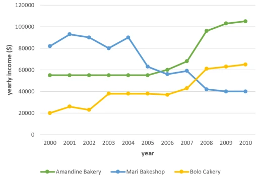
The graph shows information about the amount of money which was earned by three bakeries in Calgary,over a ten-year period between 2000 and 2010.

Overall, what stands out from the graph is that there were considerable upward trends in the income of both Bolo Cakery and Amandine Bakery, while the earnings of Mari Bakeshop saw a considerable fall over the period in question. Another interesting point is that Mari Bakeshop was the most popular bakery in 2000, but in 2010, Amandine Bakery earned more money than the others. Looking at the details, as regards Bolo Cakery, income started at $20,000 in 2000, then there was a fluctuation over the next three years, at which point it levelled off at just under $40,000 until 2006. Then the figure went up significantly, finishing at around $65,000 in 2010. If we look at Amandine Bakery, the trend was similar. Having remained stable at approximately $55,000 in the first half of the decade, income then rose sharply, reaching nearly $100,000 in 2008. There was then a gradual rise to around $105,000 in 2010.

By contrast, the income of Mari Bakeshop went in the opposite direction. Takings fluctuated around $90,000 until 2004. After That despite falling sharply to just over $40,000 in 2008, the figure then levelled off in the last two years.

Word Count: 218

Answers On The Same Topic:

The graph shows data about the annual earnings of three bakeries in Calgary, 2000-2010.

The line graph presented details the annual revenues of three distinct bakeries in Calgary from 2000 to 2010, specifically Amandine Bakery, Mari Bakeshop, and Bolo Cakery. Overall, Amandine Bakery and Bolo Cakery demonstrated a consistent upward trend in annual income, while Mari Bakeshop experienced fluctuations, culminating in a notable decrease by the end of the […]

The graph shows data about the annual earnings of three bakeries in Calgary, 2000-2010.

The graph illustrates the earnings of three bakeries in Calgary over a ten-year period from 2000 to 2010. Overall, it is evident from the graph that both Bolo Cakery and Amandine Bakery experienced significant upward trends in their income, while Mari Bakeshop saw a substantial decline during the same period. Interestingly, Mari Bakeshop was the […]

The graph shows data about the annual earnings of three bakeries in Calgary, 2000-2010.

The line graph illustrates the yearly profits of three bakeries in Calgary—Amandine, Bolo, and Mari—from 2000 to 2010. Overall, Amandine Bakery experienced a significant increase in profit, Bolo Bakery showed steady growth, and Mari Bakeshop saw a downturn over the decade. In 2000, Mari Bakeshop had the highest earnings at approximately $81,000, followed by Amandine […]

The graph shows data about the annual earnings of three bakeries in Calgary, 2000-2010.

The line graph presents the data about the amount of money which was earned by three bakeries in Calgary, over a ten-year period between 2000 and 2010. Overall, Mari Bakeshop experienced the most significant variability in yearly income. Amandine Bakery, in the other hand, commenced with minor variants, but ended the year with the highest […]

The graph shows data about the annual earnings of three bakeries in Calgary, 2000-2010.

The line chart illustrates the yearly revenue of three bakeries in Calgary between 2000 and 2010. Overall, Amandine Bakery and Bolo Cakery showed a gradual increase in their revenue, while Mari Bakeshop experienced a significant decline during this period. Although Mari Bakeshop was the most popular at the beginning of 2000, Amandine Bakery eventually surpassed […]

See All

Other Topics:

The graph below shows the number of shops that closed and the number of new shops that opened in one country between 2011 and 2018.

The line graph illustrates how many shops that closed and the amount of new shops that opned in one nation from 2011 to 2018. Overall, the number of shops that closed more than the number of openings during the giving period . The both of the amount of closures and openings had decrease by the […]

You should spend about 20 minutes on this task. The graph below shows the percentage of money spent on advertising in five types of media in France from 2010 and projected spending to 2040. Summarise the information by selecting and reporting the main features, and make comparisons where relevant. You should write at least 150 words. Writing Task 1

Advertising in the media has changed in the world in the last decade. Nowadays, the way people consume ads is more innovative and technological. In Europe, the service and commercial sectors offer their products in different ways. The graph below shows the percentage of money spent on advertising in five types of media between 2010 […]

the graph below shows the consumption of fish and some different kinds of meat in a european country between 1979 and 2004summarise the information by selectinf and reporting the main features, and make comparisons where relevant

The diagram shows how much different kinds of meat and fish was consumed in a country in Europe from 1979 to 2004. Overall, although beef was the most popular type of meat at first, it was replaced by chicken towards the end of the survey. In contrast, fish remained the least significant throughout the period. […]

The line graph shows the information average number of visitors entering a museum in summer and winter in 2003. Write a report for a university lecturer describing the information shown below.

The line chart illustrates comparision in average number of people visiting a museum in the UK, in summer and winter throughout the day-time in 2003. Overall, it is clear that both figures fluctuated, but reached the same point at the end of the day. Another significant feature is that more people tend to visit museums […]

The chart below shows the changes that took place in three different areas of crime in Newport city centre from 2003 - 2012. Summarise the information by selecting and reporting the main features, and make comparisons where relevant.

The Line graph delinates the trends in three different categories of crime namely car theft, burglary, robbery in Newport city between 2003 to 2012. Overall, burglary experienced significant drop over the period whereas car theft observed some fluctuations but remained as most common crime. However robbery showed minor changes throughout period and remained comparatively low. […]

You should spend about 20 minutes on this task. The graph below shows the production levels of the main kinds of fuel in the UK between 1981 and 2000. Summarize the formation by selecting and reporting the main features and make comparisons where relevant. You should write at least 150 words.

The line graph illustrates about production stages of the essentcial kinds of gases (Petroleum, Coal and Natural Gas) in the United kingdom between 1981 to 2000, And the Energy units measures in One energy equals to 1M Tonnes of quantity of Feul. Overall, The huge prodution in petroleum in contrast of all, However Natural Gas […]

See All
We have detected unusual activity on your device.
Please verify your identity to continue.
Note: This verification step won't sign you in. If you have a premium account, please log in to access the service as usual.
Google/Gmail Verification
Or verify using Email/Code
We've sent a verification code to:
youremail@gmail.com (Not your email?)
Enter it below to complete the verification process.
Ensure your email address is correct, your inbox is not full, and you check your spam folder. If no email arrives, consider using an alternative email.
You will need a Premium plan to perform your action!
Note: If you already have a premium account, please log in to access our services as usual.

Plans & Pricing

Our mission is to make quality education accessible for everyone.
However, to keep our hardworking team running and this service alive, we genuinely need your support!
By opting for a premium plan, not only do you sustain us in achieving the mission, but you also unlock advanced features to enrich your learning experience.

Free

For learners who aren't pressed for time

What's included on Free
100+ Cambridge IELTS Tests
Instant IELTS Writing Task 1 & 2 Evaluation (2 times/month)
Instant IELTS Speaking Part 1, 2, & 3 Evaluation (5 times/month)
Instant IELTS Writing Task 1 & 2 Essay Generator (2 times/month)
500+ Dictation & Shadowing Exercises
100+ Pronunciation Exercises
Flashcards
Other Advanced Tools

Premium

For those serious about advancing their English proficiency, and for IELTS candidates aspiring to boost their band score by 1-2 points (especially in writing & speaking) in just 30 days or less

What's included on Premium
Save Your IELTS Test Progress
Unlock All Courses & IELTS Tests
Unlimited AI Conversations
Unlimited AI Writing Enhancement Exercises
Unlimited IELTS Writing Task 1 & 2 Evaluation
Unlimited IELTS Speaking Part 1, 2, & 3 Evaluation
Checked Answers Will Not Be Published
Unlimited IELTS Writing Task 1 & 2 Essay Generator
Unlimited IELTS Speaking Part 1, 2, & 3 Sample Generator
Unlimited Usage Of Advanced Tools
Priority Support within 24h (12-month plan only)

Due to the nature of our service and the provided free trials, payments are non-refundable.
Nếu bạn là người Việt Nam và không có hoặc không muốn trả bằng credit/debit cards, bạn có thể thanh toán bằng phương thức chuyển khoản:


Chọn gói:
419,000₫ 277,000 ₫ cho gói 1 tháng (chỉ 9,233₫/ngày)
1,239,000₫ 597,000 ₫ cho gói 3 tháng (chỉ 6,633₫/ngày)
2,469,000₫ 1,027,000 ₫ cho gói 6 tháng (chỉ 5,706₫/ngày)
4,929,000₫ 1,417,000 ₫ cho gói 12 tháng (chỉ 3,936₫/ngày)


Sau khi chuyển khoản, vui lòng đợi trình duyệt tự động điều hướng bạn trở lại Engnovate và bạn sẽ ngay lập tức nhận được mã kích hoạt tài khoản premium.
Nếu có lỗi xảy ra, bạn có thể liên hệ với team thông qua một trong các phương thức: email đến helloengnovate@gmail.com hoặc nhắn tin qua facebook.com/engnovate.
Vì toàn bộ công cụ trên website đều có thể sử dụng thử miễn phí, Engnovate không hỗ trợ hoàn tiền.