🔥 Today Only: Save 30% on Premium — Offer Ends Soon! - Upgrade Now!
Line Graph

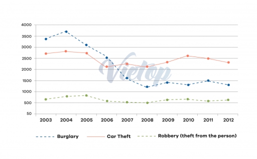
Band 5+: The graph shows he changing rates of crime in the New Port city from 2003-2012

Image for topic: The graph shows he changing rates of crime in the New Port city from 2003-2012
Our system will evaluate the answer based on this AI-generated description.
The image presents a line graph showing the trend of three different types of thefts over a period of 10 years from 2003 to 2012. Burglary is represented by a dashed line, with figures starting at 3500 in 2003, reducing to 3000 in 2004, 2500 in 2005, unchanged in 2006, dropping to 2000 in 2007, climbing to 2500 in 2008, dropping back to 2000 in 2009, up to 2500 in 2010, and maintaining at 2500 in 2011 and 2012. Car theft is shown with a solid line, beginning at 3000 in 2003, decreasing to 2500 in 2004, 2000 in 2005, 1500 in 2006, picking up to 2000 in 2007, dropping to 1500 in 2008, rising to 2000 in 2009, declining to 1500 in 2010, and remaining at 1500 in 2011 and 2012. Robbery (theft from the person) is depicted with a dotted line, starting at 500 in 2003, rising to 1000 in 2004, maintaining at 1000 in 2005, increasing to 1500 in 2006, holding at 1500 in 2007, dropping to 1000 in 2008, spiking to 1500 in 2009, and staying at 1500 in 2010, 2011, and 2012.
Given the complexity of the image, the above description may not be entirely accurate.
Note: Both the topic and the answer were created by one of our users.

The given line graph depicts the changing rates of crime in the Newport city center from 2003 to 2012.

In 2004, the crime which was highest at its peak is burglary, approximately 3800 incidents, then it fell down to approximately 1200 incidents in 2008. In contrast, the number of robbery incidents was 800 approximately, however, it decreased to 500 in 2008, but remained almost stable till 2012. In addition, robbery was lowest among other two crimes from 2004 to 2012.

Moreover, the car theft was second highest crime from 2003 till 2006, then the number of car theft cases rose from 2007 to 2012 than burglary. The car theft came at first place, whereas burglary was in second position. There was equal in the number of cases of burglary and car theft in the middle of the year 2006.

To summarize, the burglary and car theft were fluctuating from 2003 to 2012, whereas robbery remained consistent throughout the period.

Word Count: 159

Answers On The Same Topic:

The graph shows he changing rates of crime in the New Port city from 2003-2012

This line graph illustrates of differet direction of crime in the New Yourk city between 2003 and 2012 years. Overall, we can clearly see that burglary decresed throughout the period. Additionly Car theft was flucuated over the 9 year, this is the evudent thatrobbery had the lowest crime over time. By observing this lines,there ia […]

The graph shows he changing rates of crime in the New Port city from 2003-2012

The line chart illustrates 3 types of crimes – burglary, car theft and robbery – that happened in New Port city center between 2003 and 2012. Overall, burglary showed a decline during the period while car theft experienced fluctuations. On the other hand, robbery incidents stayed stable. In terms of the number of crime in […]

The graph shows he changing rates of crime in the New Port city from 2003-2012

The line graph compares the trends in three types of theft – burglary, car theft, and robbery – over a ten-year period from 2003 to 2012. Overall, burglary experienced a sharp downward trend, becoming far less common by the end of the period. In contrast, car theft remained relatively stable despite fluctuations, while robbery showed […]

The graph shows he changing rates of crime in the New Port city from 2003-2012

The line graph illustrates the trends in three categories of crime-burglary, car theft and robbery in Newport city centre from 2003-2012 Burglary was consistently the most frequent crime, while robbery remained the least frequent throughout the decade.The overall trend for burglary was a significant decrease , whereas the number of incidents for car theft and […]

The graph shows he changing rates of crime in the New Port city from 2003-2012

The graph illustrate alteration of commitet crime levels in New Port between 2003 and 2012 year. Generaly, the nuber of burglary had a significant down trend. The robbery crimes staed at the same level from all over, and the car theft had a smal fluctuations, remained at appoximatle at the same level, but below than […]

See All

Other Topics:

The graph shows the number of shops that closed and the number of new shops that opened in 2018 in one country between 2011 and 2018.

The line graph illustrates the number of shop closures and new shop openings in a particular country over the period from 2011 to 2018. Overall, it can be clearly seen that both shop openings and closures showed an erratic pattern over the period, whereas shop closure experienced a dramatic drop in the middle before recovering.In […]

The graph below compares changes in the birth rates of China and the USA between 1920 and 2000. Summarise the information by selecting and reporting the main features, and make comparisons where relevant

The line graph shows the birth rates of China and the US over the period from 1920 to 2000 changed. Overall, the birth rates in both countries declined over the 80-year period. The two trends are quite similar in terms of their overall decline. In most years, although there was an overall decline in both […]

The graph below shows the number of international tourists visiting three different countries between 2000 and 2010.

The line chart illustrates the number of international tourist arrivals in three countries between 2000 and 2010. Overall, all three countries followed a similar rising trend, especially France, which experienced a surge to become the country holding the leading position in the volume of incoming travelers. Regarding the USA, this country maintained an upward trajectory. […]

The graph below compares changes in the birth rates of China and the USA between 1920 and 2000. Summarise the information by selecting and reporting the main features, and make comparisons where relevant

The line graph shows the birth rates of China and the US over the period from 1920 to 2000 changed. Overall, the birth rates in both countries declined over the 80-year period. The two trends are quite similar in terms of their overall decline. In most years, although there was an overall decline in both […]

The line graph illustrates the amount of spreads consumed from 1981 to 2007, in grams

The shown line graph illustrates the information on the consumption of 3 spreads: butter, lowfat and reduced spreads, and margarine over the period between 1981 and 2007. The data presented in grams. Overall, it can be seen that the consumption of lowfat and reduced spreads experienced a significant growth over the years, while the consumption […]

The chart below gives information about car ownership in the UK from 1975 to 2005

The line graph compares car ownership among UK household from 1975 to 2005. Overall, one-car ownership increased throughout the period, while the proportion of without car declined. The remaining two graphs growing up at the end of the year. In 1975, household of one-car showed considerable decrease of approximately 37%. Consequently, it increases by the […]

See All
We have detected unusual activity on your device.
Please verify your identity to continue.
Note: This verification step won't sign you in. If you have a premium account, please log in to access the service as usual.
Google/Gmail Verification
Or verify using Email/Code
We've sent a verification code to:
youremail@gmail.com (Not your email?)
Enter it below to complete the verification process.
Ensure your email address is correct, your inbox is not full, and you check your spam folder. If no email arrives, consider using an alternative email.
You will need a Premium plan to perform your action!
Note: If you already have a premium account, please log in to access our services as usual.

Plans & Pricing

Our mission is to make quality education accessible for everyone.
However, to keep our hardworking team running and this service alive, we genuinely need your support!
By opting for a premium plan, not only do you sustain us in achieving the mission, but you also unlock advanced features to enrich your learning experience.

Free

For learners who aren't pressed for time

What's included on Free
100+ Cambridge IELTS Tests
Instant IELTS Writing Task 1 & 2 Evaluation (2 times/month)
Instant IELTS Speaking Part 1, 2, & 3 Evaluation (2 times/month)
Instant IELTS Writing Task 1 & 2 Essay Generator (2 times/month)
500+ Dictation & Shadowing Exercises
100+ Pronunciation Exercises
Flashcards
Other Advanced Tools

Premium

For those serious about advancing their English proficiency, and for IELTS candidates aspiring to boost their band score by 1-2 points (especially in writing & speaking) in just 30 days or less

What's included on Premium
Save Your IELTS Test Progress & Analyze Mistakes By Question Type
Save Your Own Flashcard Sets & Use Them On Any Device
Unlock All Courses, IELTS Tests, Section & Part Practice
Unlimited AI Conversations
Unlimited AI Writing Enhancement Exercises
Unlimited IELTS Writing Task 1 & 2 Evaluation
Unlimited IELTS Speaking Part 1, 2, & 3 Evaluation
Checked Answers Will Not Be Published
Unlimited IELTS Writing Task 1 & 2 Essay Generator
Unlimited IELTS Speaking Part 1, 2, & 3 Sample Generator
Unlimited Usage Of Advanced Tools & AI Features
Priority Support within 24h (12-month plan only)

Due to the nature of our service and the provided free trials, payments are non-refundable.