🔥 Today Only: Save 30% on Premium — Offer Ends Soon! - Upgrade Now!
Line Graph

Band 6+: the graph shows the average trip length(in miles) in US children aged 5 to 15 years old.

Image for topic: the graph shows the average trip length(in miles) in US children aged 5 to 15 years old.
Our system will evaluate the answer based on this AI-generated description.
The image displays a line graph illustrating the average trip length in miles for U.S. children aged 5 to 15 over a period from 1970 to 2020, with measurements every decade. Data points for walking start from about 0.5 miles in 1970, peaking near 1 mile in 2010, and slightly decreasing to around 0.8 miles by 2020. Cycling begins at approximately 1.5 miles in 1970, rises to just below 2 miles in 1990, and maintains that length through 2020. The bus line starts around 10 miles in 1970, increases to roughly 15 miles by 1990, peaking at 20 miles in 2000, before it ends near 17 miles in 2020. Car travel starts near 3 miles in 1970, steadily climbs to just above 15 miles in 2000, and maintains this distance through 2020. The train line shows a starting point around 25 miles in 1970, falls to 20 miles in 1980, recovers to about 25 miles in 2000, decreases to slightly below 20 miles in 2010, before reaching almost 30 miles by 2020. Lastly, taxi usage begins around 3 miles in 1970, demonstrating a peak at approximately 10 miles in 2000 before slightly decreasing to 8 miles in 2020.
Given the complexity of the image, the above description may not be entirely accurate.
Note: Both the topic and the answer were created by one of our users.

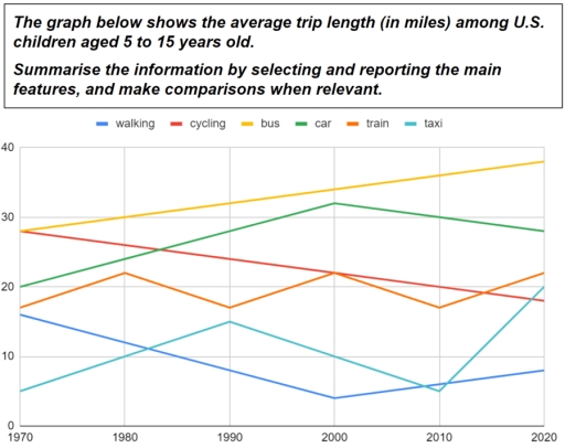
The chart illustrates the average journey distance of 5 to 15-year-olds in the United States from 1970 until 2020.

Overall, distance travelled by bus, car and taxi increased over this period while by cycling and walking significantly decreased.

In the first year, distance travelled by bus and cycling were quit equally, by around 28 miles, and were the highest, but trip length by walking, at approximately 6 miles, was the least. Distance moved by bus had a steady upward trend and reached to a high of about 38 miles in the final year. In contrast cycling experienced a moderate fall in average trip length and reached to around 18 miles. Distance travelled by car showed a considerable increase from 1970 to 2000 and reached from 20 to 32 miles and then reduced slightly, at 28 miles. Trip length by train experienced a regularly fluctuation between 17 and 22 miles every 10 years and reached at 18 miles in the first year to 22 miles in last year. Walking distance dropped rapidly over the three decades from at the first of the period and reached to about 4 miles in 2000 year and then slightly rose to 8 miles in 2020. Trip length by taxi fluctuated over this period and reached from the last place in first year to the third place in final year.

Word Count: 224

Answers On The Same Topic:

the graph shows the average trip length(in miles) in US children aged 5 to 15 years old.

The provided chart illustrates the average length of trip (in miles) among teenagers in the United States for twenty years old). Overall, It can be seen that there is a difference between the standard of long travels in the United States in which the bus becomes the highest trend and walking is the lowest one. […]

the graph shows the average trip length(in miles) in US children aged 5 to 15 years old.

The line graph demonstrates the average travel length in lilws in US children aged 5 to 15 years old. Overall, bus and car rose over the period while, cycling walking dropped. Taxi and train had fluctuated throughout the time. In 1970 bus and cycling had the same miles at around 30 miles and were the […]

the graph shows the average trip length(in miles) in US children aged 5 to 15 years old.

The data outlines the average trip length among American children of different ages, particularly from 5 to 15 years old. Overall, every kind of trip had declines and increases except journeys by bus and bike. Firstly, travelling by bus dramatically started to increase from more than 30 miles to approximately 47 miles. In addition, this […]

the graph shows the average trip length(in miles) in US children aged 5 to 15 years old.

The line graph compares the average distance (in miles) travelled by U.S. children aged 5-15 using four different modes of transport – walking, cycling, bus and car – between 1970 and 2020. Overall, car and bus trips became longer over the period, whereas the average distance for walking and cycling declined. By 2020, the bus […]

the graph shows the average trip length(in miles) in US children aged 5 to 15 years old.

The line graph illustrates the average trip among US children aged 5 to 15 years old between 1970 and 2020. Overall, bus showed an upward trend during the period, whereas cycling experienced downward trend. Car, train and taxi, walking fluctuated throughout the years. Firstly, bus started at nearly 30 miles at the beginning of the […]

See All

Other Topics:

The graph below shows the number of enquiries received by the Tourist Information Office in one city over a six-month period in 2011. Summarise the information by selecting and reporting the main features, and make comparisons where relevant.

The line graph illustrates the number of inquiries received by the Tourist Information Office in a single city over six months in 2011. Overall, the number of inquiries received by two methods (‘in person’ and ‘by telephone’) generally increased throughout the period. However, the number of inquiries via letter and email declined. In-person inquiries surpassed […]

The line graph illustrates the amount of spreads consumed from 1981 to 2007, in grams

The line graph illustrates changes in the amount of three types of spreads consumption – margarine, reduced – fat reduced spreads, and butter – between 1981 and 2007. Overall, all the figures showed a downward trend over the given period. It is also clear that although the consumption of butter was the highest at first, […]

The line graph shows the change in population of 5 countries from 1800 to 2020.

The given line graph provides data regarding 5 countries’ change in population between 1800 and 2020. Overall, what stands out from the graph is that there was a significant increase in population of China ad India, whereas the population of United States, Indonesia and Brazil saw a considerable upward trend too, but they had far […]

The graph shows average annual expenditures on cell phone and residential phone services between 2001 and 2010. Summarize the information by selecting and reporting the main features, and make comparisons where relevant.

The given chart illustrates the anual money spending tendecy on services of cell phones, marked with the red line and residential phones, represented in green, from 2001 to 2010. For starters, in the first analized year it is clearly visible that the difference between residential and cell phones services si almost 500 dollers. Residential phones […]

the graph below gives information on the number of participants for different activities at one social centre.

The line graph demonstrate the information on the number of people participating in different activities at a particular social centre in two cities from 2000 to 2020. Overall, the graph reflects the participants of the people from the year 2000 to 2020, where it can be clearly visible that people are more likely to involve […]

The graph below shows the percentage of people in one country who accessed the news from four sources between 1995 and the present, with projections to 2025.

The line graph provides information about the proportion of citizens in a country who using several media such as TV, Radio, Newspaper, and Internet for accessed news between 1995 and 2020, with predictions for 2025. Units are measured in percentage. Overall, the percentage of people who used radio and newspaper generally decrease within the period, […]

See All
We have detected unusual activity on your device.
Please verify your identity to continue.
Note: This verification step won't sign you in. If you have a premium account, please log in to access the service as usual.
Google/Gmail Verification
Or verify using Email/Code
We've sent a verification code to:
youremail@gmail.com (Not your email?)
Enter it below to complete the verification process.
Ensure your email address is correct, your inbox is not full, and you check your spam folder. If no email arrives, consider using an alternative email.
You will need a Premium plan to perform your action!
Note: If you already have a premium account, please log in to access our services as usual.

Plans & Pricing

Our mission is to make quality education accessible for everyone.
However, to keep our hardworking team running and this service alive, we genuinely need your support!
By opting for a premium plan, not only do you sustain us in achieving the mission, but you also unlock advanced features to enrich your learning experience.

Free

For learners who aren't pressed for time

What's included on Free
100+ Cambridge IELTS Tests
Instant IELTS Writing Task 1 & 2 Evaluation (2 times/month)
Instant IELTS Speaking Part 1, 2, & 3 Evaluation (5 times/month)
Instant IELTS Writing Task 1 & 2 Essay Generator (2 times/month)
500+ Dictation & Shadowing Exercises
100+ Pronunciation Exercises
Flashcards
Other Advanced Tools

Premium

For those serious about advancing their English proficiency, and for IELTS candidates aspiring to boost their band score by 1-2 points (especially in writing & speaking) in just 30 days or less

What's included on Premium
Save Your IELTS Test Progress
Unlock All Courses & IELTS Tests
Unlimited AI Conversations
Unlimited AI Writing Enhancement Exercises
Unlimited IELTS Writing Task 1 & 2 Evaluation
Unlimited IELTS Speaking Part 1, 2, & 3 Evaluation
Checked Answers Will Not Be Published
Unlimited IELTS Writing Task 1 & 2 Essay Generator
Unlimited IELTS Speaking Part 1, 2, & 3 Sample Generator
Unlimited Usage Of Advanced Tools
Priority Support within 24h (12-month plan only)

Due to the nature of our service and the provided free trials, payments are non-refundable.
Nếu bạn là người Việt Nam và không có hoặc không muốn trả bằng credit/debit cards, bạn có thể thanh toán bằng phương thức chuyển khoản:


Chọn gói:
419,000₫ 277,000 ₫ cho gói 1 tháng (chỉ 9,233₫/ngày)
1,239,000₫ 597,000 ₫ cho gói 3 tháng (chỉ 6,633₫/ngày)
2,469,000₫ 1,027,000 ₫ cho gói 6 tháng (chỉ 5,706₫/ngày)
4,929,000₫ 1,417,000 ₫ cho gói 12 tháng (chỉ 3,936₫/ngày)


Sau khi chuyển khoản, vui lòng đợi trình duyệt tự động điều hướng bạn trở lại Engnovate và bạn sẽ ngay lập tức nhận được mã kích hoạt tài khoản premium.
Nếu có lỗi xảy ra, bạn có thể liên hệ với team thông qua một trong các phương thức: email đến helloengnovate@gmail.com hoặc nhắn tin qua facebook.com/engnovate.
Vì toàn bộ công cụ trên website đều có thể sử dụng thử miễn phí, Engnovate không hỗ trợ hoàn tiền.