🔥 Today Only: Save 30% on Premium — Offer Ends Soon! - Upgrade Now!
Line Graph

Band 7+: The graph shows the favourite sport of people from Canada between 1985 and 2015

Image for topic: The graph shows the favourite sport of people from Canada between 1985 and 2015
Our system will evaluate the answer based on this AI-generated description.
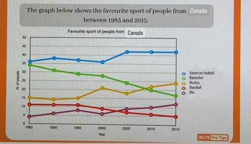
The image illustrates a graph marking the favorite sports in Canada from 1985 to 2015 across American football, basketball, hockey, baseball, and boxing. Hockey witnessed a consistent lead over other sports, starting at 35% in 1985, then 35% in 1990, rising to 40% in 1995, holding at 40% in 2000, further climbing to 45% in 2005, maintaining 45% in 2010, and retaining 45% in 2015. Basketball displayed increases and fluctuations: 30% in 1985, rising to 35% in 1990, dipping to 25% in 1995, rising again to 30% in 2000, fluctuating between 30% in 2005, then dropping to 20% in 2010 before ascending to 25% in 2015. American football depicted a steady upward trajectory: starting at 10% in 1985, then 15% in 1990, increasing slightly to 20% in 1995, reaching 25% in 2000 and 2005, followed by a jump to 35% in 2010, rising sharply to 40% in 2015. Baseball maintained relatively constant proportions, illustrating 15% in 1985, hesitating between 10% in 1990, then climbing back to 15% in 1995 and 2000, further dipping to 10% in 2005, reaching its lowest at 5% in both 2010 and 2015. Boxing remained primarily stagnant with minimal fluctuations: initiated at 5% in 1985, retaining 5% in 1990, descending to 5% in 1995, staying constant at 5% up till 2005, experiencing mild uplift to 10% in 2010, before equaling 5% again in 2015.
Given the complexity of the image, the above description may not be entirely accurate.
Note: Both the topic and the answer were created by one of our users.

The following graph illustrates the individuals’ preferred sports among 5 types in Canada between 1985 and 2015.

Overall, favourite sport varieties have changed over the given period. American football showed the greatest increase, whereas basketball faced a dramatic fall in the 2000s.

In 1995, American football and basketball were the most popular sports among residents. Together, two categories accounted for 70% of the total. Hockey, baseball, and boxing contributed a smaller share, making up 15%, 10%, and almost 5% respectively.

While American football remained unchanged until the 2000s, it saw a rise between 2000 and 2015. In contrast, basketball experienced a significant decrease by 2015. Hockey reached its peak in the 2000s, sharing over 20%, and by 2015, it had risen almost to 25%. The percentage of voters for boxing grew from almost 5% to almost 10% until 1995, and in the next few years gradually rose.

Baseball accounted for the smallest proportion of participants. Participation levels were initially flat, but then showed a marked downward trend.

Word Count: 167

Answers On The Same Topic:

The graph shows the favourite sport of people from Canada between 1985 and 2015

The line graph illustrates the proportion of US citizens who considered five different sports to be their favourite between 1985 and 2015. Overall, American Football consistently held the top position, while Basketball and Other Sports increased in popularity over the period. In contrast, Baseball and Hockey experienced a decline, with Basketball surpassing Baseball to become […]

The graph shows the favourite sport of people from Canada between 1985 and 2015

The following graph illustrate the individuals’ preferred sports among of 5 types in Canada between 1985 and 2015. Overall, favourite sport varities has changed over the given period. American football challenged the greatest increase whereareas basketball faced dramatic fall in 2000s. In 1995, American football and basketball were the most popular sports among residents. Together, […]

The graph shows the favourite sport of people from Canada between 1985 and 2015

The graph illustrates information about the favourite sport of people from Canada over the period from 1985 to 2015. Overall, it is clear that American football is the most trendy. In addition, baseball decreased in 2015. At the beginning of the period, American football was played by 36% of people. However it increased and reached […]

The graph shows the favourite sport of people from Canada between 1985 and 2015

The line graph illustrates the favourite sport of Canadian citizens over a 30-year period from 1985 to 2015. Overall, it is clear that the popularity of some sports increased, while others declined. Over the period shown, there was a general upward trend in American football, whereas basketball remained relatively stable. American football grew significantly, reaching […]

See All

Other Topics:

The line graph shows the percentages of travels by 4 transportsin one country between 1985 and 2015

The line graph illustrates the percentages of travels by 4 transportsin one country such as Bus, Car, Rail and Others over a period from 1985 to 2015. Overall, it is clear that the ‘Car’ category was the highest in the chart over a period, while the ‘Others’ was the lowest figure in comparison with ‘Bus’ […]

The graph below shows the average number of American commuters travelling each day by car, bus or train between 1980 and 2040

The figure represents transportation by Americans communters each day throughout 1980 to 2040. And it also illustrates the average number of transport by car, bus and train. Overall, bus transportation has declined steadily whereas car and train travel have dropped, peaked and increased over the years. In the year 1980, four million Amercians depended on […]

The line graph shows the number of first marriages, remarriages, and all marriages in thousands from 1951 to 2001.

The line graph illustrates the number of first marriages, remarriages and total marriages, measured in thousands, between 1951 and 2001. Overall, all three figures increased steadily until 1981 before declining afterwards. First marriages consistently made up the largest proportion, whereas remarriages remained the least common throughout the period. In 1951, there were about 450 thousand […]

The chart below shows the price in Euros of 800 grams of four types of bread in one European country from 2001 to 2006

The line graph shows the price fluctuations of four different types of bread – wholegrain bread, brown bread, white bread, and rye bread – calculated per 800-gram serving in a European country from 2001 to 2005. Overall, the prices of brown bread and white bread tended to increase significantly, while wholegrain bread experienced considerable volatility. […]

Summarize the formation by selecting and reporting the main feature and make comparisons where relevant.

The provided line graph compares a production rate of various fuels in UK between 1981 and 2000 Overall, what stands out is that the amount of production Petroleum and Natural gas are increased through out given perod. While reverse could be said about Coal. Of paricular note is that petroleum remained the most produced fuel […]

The line graph shows the average monthly temperature in 3 cities between January and December summarise information by selecting and reporting the main features and make comparison where relevant

The provided linear chart illustrates the temperature of Dubai, London and New York during all months. Moving towards the detail of chart, Dubai temperature is highest from January to December, which accounts as 20°C in January. Afterwards the temperature surges rapidly and is on its peak in July at 38°C. However, after this period significant […]

See All
We have detected unusual activity on your device.
Please verify your identity to continue.
Note: This verification step won't sign you in. If you have a premium account, please log in to access the service as usual.
Google/Gmail Verification
Or verify using Email/Code
We've sent a verification code to:
youremail@gmail.com (Not your email?)
Enter it below to complete the verification process.
Ensure your email address is correct, your inbox is not full, and you check your spam folder. If no email arrives, consider using an alternative email.
You will need a Premium plan to perform your action!
Note: If you already have a premium account, please log in to access our services as usual.

Plans & Pricing

Our mission is to make quality education accessible for everyone.
However, to keep our hardworking team running and this service alive, we genuinely need your support!
By opting for a premium plan, not only do you sustain us in achieving the mission, but you also unlock advanced features to enrich your learning experience.

Free

For learners who aren't pressed for time

What's included on Free
100+ Cambridge IELTS Tests
Instant IELTS Writing Task 1 & 2 Evaluation (2 times/month)
Instant IELTS Speaking Part 1, 2, & 3 Evaluation (5 times/month)
Instant IELTS Writing Task 1 & 2 Essay Generator (2 times/month)
500+ Dictation & Shadowing Exercises
100+ Pronunciation Exercises
Flashcards
Other Advanced Tools

Premium

For those serious about advancing their English proficiency, and for IELTS candidates aspiring to boost their band score by 1-2 points (especially in writing & speaking) in just 30 days or less

What's included on Premium
Save Your IELTS Test Progress
Unlock All Courses & IELTS Tests
Unlimited AI Conversations
Unlimited AI Writing Enhancement Exercises
Unlimited IELTS Writing Task 1 & 2 Evaluation
Unlimited IELTS Speaking Part 1, 2, & 3 Evaluation
Checked Answers Will Not Be Published
Unlimited IELTS Writing Task 1 & 2 Essay Generator
Unlimited IELTS Speaking Part 1, 2, & 3 Sample Generator
Unlimited Usage Of Advanced Tools
Priority Support within 24h (12-month plan only)

Due to the nature of our service and the provided free trials, payments are non-refundable.
Nếu bạn là người Việt Nam và không có hoặc không muốn trả bằng credit/debit cards, bạn có thể thanh toán bằng phương thức chuyển khoản:


Chọn gói:
419,000₫ 277,000 ₫ cho gói 1 tháng (chỉ 9,233₫/ngày)
1,239,000₫ 597,000 ₫ cho gói 3 tháng (chỉ 6,633₫/ngày)
2,469,000₫ 1,027,000 ₫ cho gói 6 tháng (chỉ 5,706₫/ngày)
4,929,000₫ 1,417,000 ₫ cho gói 12 tháng (chỉ 3,936₫/ngày)


Sau khi chuyển khoản, vui lòng đợi trình duyệt tự động điều hướng bạn trở lại Engnovate và bạn sẽ ngay lập tức nhận được mã kích hoạt tài khoản premium.
Nếu có lỗi xảy ra, bạn có thể liên hệ với team thông qua một trong các phương thức: email đến helloengnovate@gmail.com hoặc nhắn tin qua facebook.com/engnovate.
Vì toàn bộ công cụ trên website đều có thể sử dụng thử miễn phí, Engnovate không hỗ trợ hoàn tiền.