🔥 Today Only: Save 30% on Premium — Offer Ends Soon! - Upgrade Now!
Line Graph

Band 6+: The graph shows the life expectancy of people living in Asian regions from 1950 and predicts life expectancy until 2300. Summarize the information by selecting and reporting the main features, and make comparisons where relevant.

Image for topic: The graph shows the life expectancy of people living in Asian regions from 1950 and predicts life expectancy until 2300. Summarize the information by selecting and reporting the main features, and make comparisons where relevant.
Our system will evaluate the answer based on this AI-generated description.
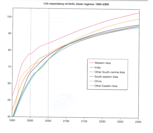
The image shows a line graph displaying the life expectancy at birth for various Asian regions from 1950 to 2300. The y-axis represents life expectancy in years, ranging from 40 to 100, and the x-axis represents the years from 1950 to 2300 in increments of 50 years. There are six colored lines representing Western Asia (blue), India (red), Other South-central Asia (orange), China (green), South-eastern Asia (purple), and Other Eastern Asia (yellow). Each line starts at different points in 1950, with Western Asia having the highest life expectancy around 67 years, and Other South-central Asia having the lowest at approximately 41 years. All lines show an upward trend, with Western Asia maintaining the highest life expectancy throughout the years, reaching close to 100 years by 2300. The other regions show varying degrees of increase, with India and Other Eastern Asia reaching around 95 years, Other South-central Asia and South-eastern Asia reaching around 90 years, and China having a slightly lower life expectancy around 87 years by 2300.
Given the complexity of the image, the above description may not be entirely accurate.
Note: Both the topic and the answer were created by one of our users.

The graph illustrates life expectancy as birth in Asian regions from 1950 to nowadays and predicts its development from nowadays to 2300.

First of all, we should underline that all of the demonstrated trends are upward, it means that life expectancy has increased (and is predicted to grow) in every of the 6 Asian regions. The biggest life expectancy of people was in Other Eastern Asia regions: from 1950 to 2024 it climbed approximately in 1,5 times (from about 50 to 80 years old). As for other trends, they are deemed to be similar to each other and they have less dramatic changes compared with Other Eastern Asia. Life expectancy in Western Asia, India, Other South-central Asia, South-eastern Asia, China was gradually changing from about 40-45 to approximately 65-74 years old. To speak about predictions in these Asian regions, we can underline a growth from 65-74 to 92-98 years old.

Generally, we can conclude that life expectancy as birth in the Asian regions has risen and likely will grow.

Word Count: 169

Answers On The Same Topic:

The graph shows the life expectancy of people living in Asian regions from 1950 and predicts life expectancy until 2300. Summarize the information by selecting and reporting the main features, and make comparisons where relevant.

The graph above showes the expectancy age for people who living in Asia from the year 1950 until the year 2300. Overall, the expectancy age of people in Asia is increasing steadily with the past of the time. In the first period that was between 1950 and 2000, the average age of people increased significantly […]

The graph shows the life expectancy of people living in Asian regions from 1950 and predicts life expectancy until 2300. Summarize the information by selecting and reporting the main features, and make comparisons where relevant.

The line graph illustrates the changes in life expectancy at birth in various Asian regions from 1950 and provides predictions up to the year 2300. Overall, it is clear that life expectancy in all regions is expected to rise significantly over the entire period. While there were noticeable differences between the regions in the past, […]

The graph shows the life expectancy of people living in Asian regions from 1950 and predicts life expectancy until 2300. Summarize the information by selecting and reporting the main features, and make comparisons where relevant.

The graph illustrates the life expectancy at birth in different Asian regions from 1950-2300. Overall, the life expectancy shows a rise in every asian region as the years go on, with other eastern asia being the highest region and south central asia being the lowest. In 1950, South-Central Asia, India, South-eastern Asia, and China had […]

The graph shows the life expectancy of people living in Asian regions from 1950 and predicts life expectancy until 2300. Summarize the information by selecting and reporting the main features, and make comparisons where relevant.

The line graph illustrates the life perdiction of people living in Asian regions from 1950 and projections life expectancy until 2300. Overall, it is clear that life expectancy at birth in six different countries India, china and other regions of Asia increased during the given period from 1950 and 2300. In 1950, the birth ratio […]

The graph shows the life expectancy of people living in Asian regions from 1950 and predicts life expectancy until 2300. Summarize the information by selecting and reporting the main features, and make comparisons where relevant.

The graph illustrates the lifespan of Asian people in different regions from 1950 and gives projections until 2300. Overall, Asian people’s life expectancy tends to follow an upward trend from 1950 to 2300. People in other Eastern Asia are predicted to have the most significant increase in lifespan. In contrast, those in other South-central Asia […]

See All

Other Topics:

The graph below shows how people in one city in Australia buy music from 2015 to 2020.

The line graph illustrates how individual in one city bought music in Australia from 2015 between 2020 Overall, it is clear percentage of total music sales by method, there are three percentage it is streams, downloads, CDs purchased. Leader was streams it have highly increased line by the follow downloads line was flactuating and CDs […]

The given chart shows the proportion of residents of America (in millions) living in different regions between 2015 and 2020.Summarize the information by selecting and reporting the main features and make comparisons where relevant. Write at least 150 words.

The given chart illustrates the proportion of residents in America, measured in millions, who lived in different regions from 2015 to 2020. Overall, the population of all regions experienced some changes during the period. While certain regions showed a steady increase in the number of residents, others witnessed slight fluctuations. It is clear that one […]

The chart below shows the percentage of households in one country that owned a car, a computer, and a mobile phone from 1995 to 2015. Summarise the information by selecting and reporting the main features, and make comparisons where relevant. Write at least 150 words.

The line graph compares three different types of households’ properties (a car, a computer and a mobile phone) in one country between 1995 and 2015. Units are measured in percentages. Overall, it is noticeable that all categories only upward trend were observed over the period, albeit wity varying levels. Of particular note is mobile phones, […]

The graph below shows the production of three forest industry products in a European country, namely timber, pulp, and paper, from 1980 to 2000. Summarise the information by selecting and reporting the main features, and make Icomparison where relevant. Write at least 150 words.

The chart illustrates the development of forest industry production for the period 1980-2000, focusing on the processing of pulp, timber and paper. Overall, the amount of produced paper demonstrates almost linear improvement throughout the years, whilst pulp and timber appear rather wavery as significant ups and downs are evident in the production rate. What is […]

how teenagers (aged 12-19) in one state in the United States communicated with each other.

The line graph provides comprehensive data about what types of communication teenagers used throughout 3 years. Overall, it is notable that text messages were the most common way to communicate. However, interacting through email showed the lowest interest. To begin with, text messages started at 30% of all teenagers and increased slightly between 2006 and […]

The graph shows data about the annual earnings of three bakeries in London, 2000-2010. Summarize the information by selecting and reporting the main features, and make comparisons where relevant.

The line graph illustrates the annual net income of three bakeries in London between 2000 and 2010. Overall, Robbie’s Bakery experienced a substantial increase in revenue and became the most profitable bakery by the end of the period. By contrast, Bernie’s Buns fluctuated considerably and finished with the lowest income, while Lovely Loaves rose steadily […]

See All
We have detected unusual activity on your device.
Please verify your identity to continue.
Note: This verification step won't sign you in. If you have a premium account, please log in to access the service as usual.
Google/Gmail Verification
Or verify using Email/Code
We've sent a verification code to:
youremail@gmail.com (Not your email?)
Enter it below to complete the verification process.
Ensure your email address is correct, your inbox is not full, and you check your spam folder. If no email arrives, consider using an alternative email.
You will need a Premium plan to perform your action!
Note: If you already have a premium account, please log in to access our services as usual.

Plans & Pricing

Our mission is to make quality education accessible for everyone.
However, to keep our hardworking team running and this service alive, we genuinely need your support!
By opting for a premium plan, not only do you sustain us in achieving the mission, but you also unlock advanced features to enrich your learning experience.

Free

For learners who aren't pressed for time

What's included on Free
100+ Cambridge IELTS Tests
Instant IELTS Writing Task 1 & 2 Evaluation (2 times/month)
Instant IELTS Speaking Part 1, 2, & 3 Evaluation (5 times/month)
Instant IELTS Writing Task 1 & 2 Essay Generator (2 times/month)
500+ Dictation & Shadowing Exercises
100+ Pronunciation Exercises
Flashcards
Other Advanced Tools

Premium

For those serious about advancing their English proficiency, and for IELTS candidates aspiring to boost their band score by 1-2 points (especially in writing & speaking) in just 30 days or less

What's included on Premium
Save Your IELTS Test Progress
Unlock All Courses & IELTS Tests
Unlimited AI Conversations
Unlimited AI Writing Enhancement Exercises
Unlimited IELTS Writing Task 1 & 2 Evaluation
Unlimited IELTS Speaking Part 1, 2, & 3 Evaluation
Checked Answers Will Not Be Published
Unlimited IELTS Writing Task 1 & 2 Essay Generator
Unlimited IELTS Speaking Part 1, 2, & 3 Sample Generator
Unlimited Usage Of Advanced Tools
Priority Support within 24h (12-month plan only)

Due to the nature of our service and the provided free trials, payments are non-refundable.
Nếu bạn là người Việt Nam và không có hoặc không muốn trả bằng credit/debit cards, bạn có thể thanh toán bằng phương thức chuyển khoản:


Chọn gói:
419,000₫ 277,000 ₫ cho gói 1 tháng (chỉ 9,233₫/ngày)
1,239,000₫ 597,000 ₫ cho gói 3 tháng (chỉ 6,633₫/ngày)
2,469,000₫ 1,027,000 ₫ cho gói 6 tháng (chỉ 5,706₫/ngày)
4,929,000₫ 1,417,000 ₫ cho gói 12 tháng (chỉ 3,936₫/ngày)


Sau khi chuyển khoản, vui lòng đợi trình duyệt tự động điều hướng bạn trở lại Engnovate và bạn sẽ ngay lập tức nhận được mã kích hoạt tài khoản premium.
Nếu có lỗi xảy ra, bạn có thể liên hệ với team thông qua một trong các phương thức: email đến helloengnovate@gmail.com hoặc nhắn tin qua facebook.com/engnovate.
Vì toàn bộ công cụ trên website đều có thể sử dụng thử miễn phí, Engnovate không hỗ trợ hoàn tiền.