🔥 Today Only: Save 30% on Premium — Offer Ends Soon! - Upgrade Now!
Line Graph

Band 6+: THE GRAPH SHOWS THE NUMBER OF MARRIAGES AND DIVORCES IN THE UK BETWEEN 1975 AND 2000. SUMMARISE THE INFORMATION BY REPORTING AND SELECTING THE MAIN FEATURES AND MAKE COMPARISONS WHERE RELEVANT.

Image for topic: THE GRAPH SHOWS THE NUMBER OF MARRIAGES AND DIVORCES IN THE UK BETWEEN 1975 AND 2000. SUMMARISE THE INFORMATION BY REPORTING AND SELECTING THE MAIN FEATURES AND MAKE COMPARISONS WHERE RELEVANT.
Our system will evaluate the answer based on this AI-generated description.
The image features a line graph detailing the number of total marriages, first marriages, second marriages, and divorces in the UK from 1975 to 2000. For 1975, total marriages stand at 400,000, first marriages at 340,000, second marriages at approximately 60,000, and divorces around 130,000. In 1980, total marriages rise to about 480,000, first marriages to around 400,000, second marriages remain near 60,000, and divorces increase slightly to about 140,000. By 1985, total marriages decrease to approximately 380,000, first marriages drop to around 290,000, second marriages increase to about 80,000, and divorces rise to 160,000. In 1990, total marriages are around 340,000, first marriages at 250,000, second marriages rise again to 90,000, and divorces reduce marginally to 150,000. For 1995, the figures are 280,000 for total marriages, 230,000 for first marriages, nearly 95,000 second marriages, and divorces drop to about 140,000. In the year 2000, total marriages continue to decrease to 260,000, first marriages to 200,000, second marriages slightly decrease to about 90,000, and divorces settle around 140,000.
Given the complexity of the image, the above description may not be entirely accurate.
Note: Both the topic and the answer were created by one of our users.

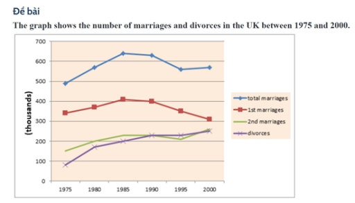
The line chart illustrates the number of information nuptials and dissolutions in the UK from 1975 to 2000. Overall, the total number of marriages increased from 1975 to 1985, but decreased in 1990 to 2000. 1st Marriages had the same graphics with total number of marriages but 2nd maariages

In 1975, the were arround 490,000 total marriages and 340,000 1st marriages. Both increased until 1985, reaching approximately 640,000 and 410,000 respectively. Afterward, total and first marriages gradually declined, with first marriages dropping to about 310,000 by 2000.

Second marriages and divorces followed a similar upward trend, starting at around 150,000 and 80,000 in 1975, and both reaching approximately 240,000 by 2000. Notably, divorces overtook second marriages in the early 1990s and maintained a slightly higher level by the end of the period

Word Count: 132

Answers On The Same Topic:

THE GRAPH SHOWS THE NUMBER OF MARRIAGES AND DIVORCES IN THE UK BETWEEN 1975 AND 2000. SUMMARISE THE INFORMATION BY REPORTING AND SELECTING THE MAIN FEATURES AND MAKE COMPARISONS WHERE RELEVANT.

The line graph illustrates information about the number of marriages and divorces, measured in thousands, in the UK from 1975 to 2000. Overall, while the number of marriages witnessed an upward trend over the period, the number of first marriages decreased. In addition, the figure for divorces rose steadily. Looking at the details, the total […]

THE GRAPH SHOWS THE NUMBER OF MARRIAGES AND DIVORCES IN THE UK BETWEEN 1975 AND 2000. SUMMARISE THE INFORMATION BY REPORTING AND SELECTING THE MAIN FEATURES AND MAKE COMPARISONS WHERE RELEVANT.

The graph illustrates information about the number of people who had marriages and divorces in the UK, over a twenty-five-year period between 1975 and 2000 Overall, what stands out from the graph is that there was considerable upward trends in the number of divorces and 2nd marriages, except for 1st marriages. Another interesting point is […]

THE GRAPH SHOWS THE NUMBER OF MARRIAGES AND DIVORCES IN THE UK BETWEEN 1975 AND 2000. SUMMARISE THE INFORMATION BY REPORTING AND SELECTING THE MAIN FEATURES AND MAKE COMPARISONS WHERE RELEVANT.

The line graph illustrates information about the number of marriages and divorces in the UK over a twenty-five-year period between 1975 and 2000. Overall, what stands out from the graph is that there were significant upward trends in both divorces and 2nd marriages, while the total marriages and 1st marriages saw a considerable fluctuation over […]

THE GRAPH SHOWS THE NUMBER OF MARRIAGES AND DIVORCES IN THE UK BETWEEN 1975 AND 2000. SUMMARISE THE INFORMATION BY REPORTING AND SELECTING THE MAIN FEATURES AND MAKE COMPARISONS WHERE RELEVANT.

The data presents the quantity of marital formations and dissolutions in the UK From 1975 to 2000. Overall, the total number of marriages is the highest, and people who married once are also substantial. Individuals that engaged twice and number of divorces seemed equal last year. In terms of divorces, In 1975 the number of […]

THE GRAPH SHOWS THE NUMBER OF MARRIAGES AND DIVORCES IN THE UK BETWEEN 1975 AND 2000. SUMMARISE THE INFORMATION BY REPORTING AND SELECTING THE MAIN FEATURES AND MAKE COMPARISONS WHERE RELEVANT.

The line graph illustrates the number of marriages and divorces in the UK between 1975 and 2000. Generalizing the diagram from an overall perspective, it is clear that the total number of marriages increased, but the data for divorces rose steadily. Firstly, the graph shows that total marriages started with 490 thousand in 1975 and […]

See All

Other Topics:

The graph below shows the number of immigrants to three countries from 1990 to 2001. Summarize the information by selecting and reporting the main features, and make comparisons where relevant.

The diagram illustrates the process of producing fabric from bamboo. Overall, it is clear that bamboo fabric is manufactured through a linear, multi-stage process that begins with the cultivation of bamboo plants and ends with the production of finished textile products. The procedure involves both mechanical and chemical treatments to transform raw bamboo into usable […]

The line graphs show the percentage of people using public transport and people using private cars in five cities of Australia from 2000 to 2010

The given grape is shown the percentage of people using public transportation and private transportation in five cities of Australia from 2000 to 2010. Firstly, the most city that using public transport in Australia is Sydney, which is around 18 percentage to 23 percentage. However, it seem to be decreased. Another top two is Perth, […]

the graph below shows the average CO2 emissions per person in 4 countries from 1967 to 2007

The line graph illustrates information about the changes in the average CO2 emissions per person in four different countries, namely United Kingdom, Sweden, Italy, and Portugal, over the period from 1967 to 2007. Overall, it is immediately apparent that Italy and Portugal experienced the most significant growth over the period, whereas United Kingdom showed a […]

The graph below shows the changes in production (millions)of three products in agarment factory from 1990 to 2010. Summarize the information by selecting andreporting the main features, and make comparisons where relevant.Write at least 150 words.

The given graph illustrates the changes in production of three products in a garment factory: suit, dress, and coat over a span of 20 years from 1990 to 2019. Overall, these figures showed an upward trend, with coat experienced the most significant change over the period. At the beginning of the period, the figure for […]

The line graph shows changes in the number of people using public transport in Cambodia between 2023 and 2024.

The changes a group of individuals using digital public transport in Cambodia has been illustrated by the line chart from 2023 to 2024. It is clear from the chart that, overall, there are significant changes over the period. However, both years increased over the period. The most useing public transport in 2024. Looking at chart […]

You should spend about 20 minutes on this task. The graph below shows the percentage of money spent on advertising in five types of media in France from 2010 and projected spending to 2040. Summarise the information by selecting and reporting the main features, and make comparisons where relevant. You should write at least 150 words. Writing Task 1

the line chart illustrates the percentage of money on adversiting in five differents types of media between 2010 and 2040. Overall, it highlights the main downwards and upward trends key differences among the given data. It is obvious that the three types namely, Newspapers, magazines, radio, had many fluctuations over the years. The percentage of […]

See All
We have detected unusual activity on your device.
Please verify your identity to continue.
Note: This verification step won't sign you in. If you have a premium account, please log in to access the service as usual.
Google/Gmail Verification
Or verify using Email/Code
We've sent a verification code to:
youremail@gmail.com (Not your email?)
Enter it below to complete the verification process.
Ensure your email address is correct, your inbox is not full, and you check your spam folder. If no email arrives, consider using an alternative email.
You will need a Premium plan to perform your action!
Note: If you already have a premium account, please log in to access our services as usual.

Plans & Pricing

Our mission is to make quality education accessible for everyone.
However, to keep our hardworking team running and this service alive, we genuinely need your support!
By opting for a premium plan, not only do you sustain us in achieving the mission, but you also unlock advanced features to enrich your learning experience.

Free

For learners who aren't pressed for time

What's included on Free
100+ Cambridge IELTS Tests
Instant IELTS Writing Task 1 & 2 Evaluation (2 times/month)
Instant IELTS Speaking Part 1, 2, & 3 Evaluation (5 times/month)
Instant IELTS Writing Task 1 & 2 Essay Generator (2 times/month)
500+ Dictation & Shadowing Exercises
100+ Pronunciation Exercises
Flashcards
Other Advanced Tools

Premium

For those serious about advancing their English proficiency, and for IELTS candidates aspiring to boost their band score by 1-2 points (especially in writing & speaking) in just 30 days or less

What's included on Premium
Save Your IELTS Test Progress
Unlock All Courses & IELTS Tests
Unlimited AI Conversations
Unlimited AI Writing Enhancement Exercises
Unlimited IELTS Writing Task 1 & 2 Evaluation
Unlimited IELTS Speaking Part 1, 2, & 3 Evaluation
Checked Answers Will Not Be Published
Unlimited IELTS Writing Task 1 & 2 Essay Generator
Unlimited IELTS Speaking Part 1, 2, & 3 Sample Generator
Unlimited Usage Of Advanced Tools
Priority Support within 24h (12-month plan only)

Due to the nature of our service and the provided free trials, payments are non-refundable.
Nếu bạn là người Việt Nam và không có hoặc không muốn trả bằng credit/debit cards, bạn có thể thanh toán bằng phương thức chuyển khoản:


Chọn gói:
419,000₫ 277,000 ₫ cho gói 1 tháng (chỉ 9,233₫/ngày)
1,239,000₫ 597,000 ₫ cho gói 3 tháng (chỉ 6,633₫/ngày)
2,469,000₫ 1,027,000 ₫ cho gói 6 tháng (chỉ 5,706₫/ngày)
4,929,000₫ 1,417,000 ₫ cho gói 12 tháng (chỉ 3,936₫/ngày)


Sau khi chuyển khoản, vui lòng đợi trình duyệt tự động điều hướng bạn trở lại Engnovate và bạn sẽ ngay lập tức nhận được mã kích hoạt tài khoản premium.
Nếu có lỗi xảy ra, bạn có thể liên hệ với team thông qua một trong các phương thức: email đến helloengnovate@gmail.com hoặc nhắn tin qua facebook.com/engnovate.
Vì toàn bộ công cụ trên website đều có thể sử dụng thử miễn phí, Engnovate không hỗ trợ hoàn tiền.