24 Hours Only: Get 39% OFF on Our Premium Plan - Check Out Now!
Line Graph

Band 4+: The graph shows the spending on education, medical care and pension in a particular country from 2001 to 2051

Image for topic: The graph shows the spending on education, medical care and pension in a particular country from 2001 to 2051
Our system will evaluate the answer based on this AI-generated description.
The image is a line graph representing percentages over time, from 2001 to 2051, of three categories: Education, Medical care, and Pension. In 2001, Education starts at approximately 10%, Medical care at 14%, and Pension at 6%; by 2011, Education decreases to below 6%, Medical care increases to nearly 16%, and Pension to over 8%; in 2021, Education is at 4%, Medical care at 18%, and Pension at 10%; by 2031, Education remains at 4%, Medical care approaches 20%, and Pension increases to 12%; in 2041, Education slightly increases to 6%, Medical care exceeds 20%, and Pension reaches approximately 14%; finally, in 2051, Education continues at 6%, Medical care is above 22%, and Pension is at 16%. The lines for Education and Medical care intersect between 2001 and 2011, while the Pension line gradually increases without intersection.
Given the complexity of the image, the above description may not be entirely accurate.
Note: Both the topic and the answer were created by one of our users.

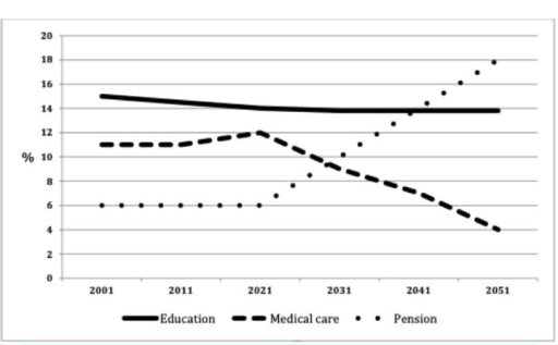
The line grap illustrates spending on educationm medical care and pension in particular country between 2001 and 2051. It is clear that spending medical care and pension were totally opposition trend in this graph.

In 2001,the spending on education sector was 15%, after that, there was a slight fall between 2001 and 2021 around 14%.There was a semelar trend from 2021 to 2051, with around 14%.

The proporton of medical care were spending on 11% in 2001, then there was a slight increase from 2001 to 2021, with around 12%. The spending on medical care decreased respectebly between 2021 to 2051. The figure of pensinon started at 6% in 2001 and the proportion was equal from 2001 to 2021. It is interesting to note that the pension incresased gradually, almost 16%.

Overall, the spending on medical care and pension were opposite tread following this year but education sector was almost equal trend in this graph.

Word Count: 155

Answers On The Same Topic:

The graph shows the spending on education, medical care and pension in a particular country from 2001 to 2051

The graph illustrate spending on some sectors rates in the country between 2001 and 2051. Overall, medical care and pension fluctuated troughout the period while education showed a steady line. In comprasion, at the end of the period pension spending percentage was the highest and medical care became the lowest rates of spending. At the […]

The graph shows the spending on education, medical care and pension in a particular country from 2001 to 2051

The given line graph represents the comparison between the governments expenditure on three sectors, namely education, medical care and pension from the year 2001 to the present and future predictions till 2051. It can be noted that in the year 2001, expenditure on education was the highest, with about 15% being spent on this sector. […]

The graph shows the spending on education, medical care and pension in a particular country from 2001 to 2051

The line graph illustrates the expenditure on education, medical care, and pensions in a certain region from 2001, with projections until 2051. Overall, pensions had the lowest expenditure at the beginning of the period, but they are expected to surpass the other two categories after 2021, becoming the highest by 2051. Meanwhile, spending on education […]

The graph shows the spending on education, medical care and pension in a particular country from 2001 to 2051

The line graph illustrates the percentage of government spending on education, medical care and pension in a particular country from 2001 to 2051. Overall, education sees a steady decline, while medical care remains relatively stable with slight growth, and pension spending experiences the most significant increase. These trends indicate a shift in financial priorities over […]

See All

Other Topics:

The graph below shows trends in US per capita fruit consumption from 1950 to 2010. Summarise the information by selecting and report in the main features and make comparsions where relevant.

The line grapf shows some fluctuations in US per capita fruit consumption from 1950 to 2010. Overall,while apples remained the most costumed fruit for most of the period,bananas is dramatically increase. In contrast oranges remained relitively stable,and pears were consistently the least popular. in detail,in 1950 apples consumption started at 50 pounds,then experienced a sharp […]

The line graph below shows the land used for organic crops in two countries between 1985 and 2010. Summarise the information by selecting and reporting the main features and make comparisons where relevant.

The line graph illustrates the amount of land used for organic farming in two countries, namely Country A and Country B, over the period from 1985 to 2010, measured in thousands of hectares. Overall, both countries experienced significant growth in the area of land used for organic crops until around 2000, after which the trends […]

The graph below shows changes in the share of vehicle registrations of the three most common types of commercial vehicles in the US between 1970 and 2010. Summarise the information by selecting and reporting the main features, and make comparisons where relevant.

The graph shows the proportion of three vehicle registration in US in the period from 1970 to 2010. Overall the registration for trunk vehicle was the highest percentage during the period, and the buses registration were the lowest number. Trunk registration started at 48 percent, but then decreased sharply in the next ten years until […]

The diagram below gives information about thenumber of parcels delivered by two major mall services companies from 1920 to 2000.

The chart illustrates a comparative number of parcels between two major mail services companies. As can be seen, in the horizontal axis goes from 1920 to 2000 which overlaps with the technological revolution. Overall, it can be seen a growth tendency of TNT Mail Services over the years, contrary to the Federal Express Services which […]

The line graph illustrates the number of visitors to three different museums (the British Museum, the Science Museum and the Natural History Museum) over a four-month period in the summer of 2013, measured in thousands

The line graph show how the number of visitors transformed to three different exceptional museums( the British Museum, the Science Museum, and the Natural History Museum) over a month period in the summer of 2013. The lowest level shows Science Museum downward visitors were showing 400 people on June but this rating gradually decrease on […]

The graph below shows the consumption of fish and different kinds of meat in European country between 1979 and 2004.

The gragh shows the consumption of fish, lamb, beef and chicken in a European country between 1979 and 2004. In 1979, fish had the lowest population of the four different kind of meat, at around 60. This is compared with about 150 of lamb, 140 of chicken and approximately 220 of beef. The greatest real […]

See All
We have detected unusual activity on your device.
Please verify your identity to continue.
Note: This verification step won't sign you in. If you have a premium account, please log in to access the service as usual.
Google/Gmail Verification
Or verify using Email/Code
We've sent a verification code to:
youremail@gmail.com (Not your email?)
Enter it below to complete the verification process.
Ensure your email address is correct, your inbox is not full, and you check your spam folder. If no email arrives, consider using an alternative email.
You will need a Premium plan to perform your action!
Note: If you already have a premium account, please log in to access our services as usual.

Plans & Pricing

Our mission is to make quality education accessible and free for everyone.
However, to keep our hardworking team running and this service alive, we genuinely need your support!
By opting for a premium plan, not only do you sustain us in achieving the mission, but you also unlock advanced features to enrich your learning experience.

Free

For learners who aren't pressed for time

What's included on Free
1000+ IELTS Tests & Samples
Instant IELTS Writing Task 1 & 2 Evaluation (2 times/month)
Instant IELTS Speaking Part 1, 2, & 3 Evaluation (5 times/month)
Instant IELTS Writing Task 1 & 2 Essay Generator (2 times/month)
500+ Dictation & Shadowing Exercises
100+ Pronunciation Exercises
Flashcards
Other Advanced Tools

Premium

For those serious about advancing their English proficiency, and for IELTS candidates aspiring to boost their band score by 1-2 points (especially in writing & speaking) in just 30 days or less

What's included on Premium
Save Your IELTS Test Progress
Unlock All Courses & Content
Unlimited AI Conversations
Unlimited AI Writing Enhancement Exercises
Unlimited IELTS Writing Task 1 & 2 Evaluation
Unlimited IELTS Speaking Part 1, 2, & 3 Evaluation
Checked Answers Will Not Be Published
Unlimited IELTS Writing Task 1 & 2 Essay Generator
Unlimited IELTS Speaking Part 1, 2, & 3 Sample Generator
Unlimited Usage Of Advanced Tools

Due to the nature of our service and the provided free trials, payments are non-refundable.
Nếu bạn là người Việt Nam và không có hoặc không muốn trả bằng credit/debit cards, bạn có thể thanh toán bằng phương thức chuyển khoản:


Chọn gói:
279,000₫ 157,000 ₫ cho gói 1 tháng (chỉ 5,233₫/ngày)
819,000₫ 397,000 ₫ cho gói 3 tháng (chỉ 4,411₫/ngày)
1,649,000₫ 667,000 ₫ cho gói 6 tháng (chỉ 3,706₫/ngày)
3,299,000₫ 857,000 ₫ cho gói 12 tháng (chỉ 2,381₫/ngày)


Sau khi chuyển khoản, vui lòng đợi trình duyệt tự động điều hướng bạn trở lại Engnovate và bạn sẽ ngay lập tức nhận được mã kích hoạt tài khoản premium.
Nếu có lỗi xảy ra, bạn có thể liên hệ với team thông qua một trong các phương thức: email đến helloengnovate@gmail.com hoặc nhắn tin qua facebook.com/engnovate.
Vì toàn bộ công cụ trên website đều có thể sử dụng thử miễn phí, Engnovate không hỗ trợ hoàn tiền.