🔥 Today Only: Save 30% on Premium — Offer Ends Soon! - Upgrade Now!
Multiple Graphs

Band 5+: The graphs below show average monthly temperature and rainfall in two places in South Africa. Summarise the information by selecting and reporting the main features, and make comparisons where relevant

Image for topic: The graphs below show average monthly temperature and rainfall in two places in South Africa. Summarise the information by selecting and reporting the main features, and make comparisons where relevant
Our system will evaluate the answer based on this AI-generated description.
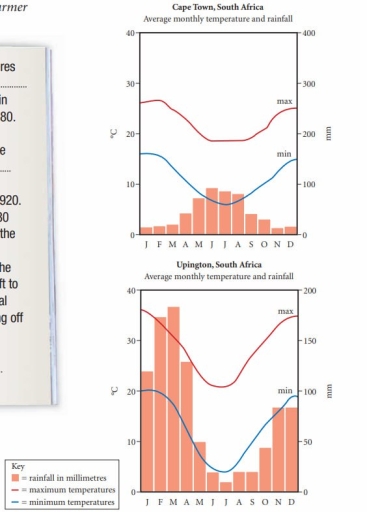
The image shows two line-bar graphs detailing average monthly temperature and rainfall for Cape Town, South Africa and Upington, South Africa. For Cape Town: Max temperature Jan 26°C, Feb 26°C, Mar 25°C, Apr 23°C, May 20°C, Jun 18°C, Jul 17°C, Aug 18°C, Sep 20°C, Oct 21°C, Nov 23°C, Dec 25°C; Min temperature Jan 16°C, Feb 16°C, Mar 15°C, Apr 13°C, May 11°C, Jun 9°C, Jul 8°C, Aug 9°C, Sep 11°C, Oct 12°C, Nov 14°C, Dec 15°C; Rainfall Jan 15mm, Feb 20mm, Mar 20mm, Apr 45mm, May 75mm, Jun 110mm, Jul 95mm, Aug 95mm, Sep 45mm, Oct 35mm, Nov 20mm, Dec 17mm. For Upington: Max temperature Jan 36°C, Feb 34°C, Mar 31°C, Apr 26°C, May 22°C, Jun 19°C, Jul 20°C, Aug 23°C, Sep 28°C, Oct 30°C, Nov 32°C, Dec 35°C; Min temperature Jan 20°C, Feb 19°C, Mar 16°C, Apr 11°C, May 6°C, Jun 3°C, Jul 3°C, Aug 6°C, Sep 11°C, Oct 15°C, Nov 17°C, Dec 19°C; Rainfall Jan 19mm, Feb 25mm, Mar 23mm, Apr 20mm, May 9mm, Jun 4mm, Jul 2mm, Aug 2mm, Sep 6mm, Oct 11mm, Nov 13mm, Dec 14mm.
Given the complexity of the image, the above description may not be entirely accurate.
Note: Both the topic and the answer were created by one of our users.

The diagrams demonstrate average monthly temperature and rainfall of two distinct towns of south Africa.

Overall, the line graph represents maximum and minimum temperature in Celsius for both Cape and Upington town whereas the bar chart demonstrates average monthly rainfall in millimeter.

Specifically speaking, in cape town, in first three months there were merely rainfall before rising significantly from the month of April and reaching highest in the month of June which is 100mm. However, after that it slowly started to fall from July before dropping constantly from September and reaching lowest in November. Whereas, as for climate the maximum was 28 degree Celsius and minimum was 18 degree Celsius.

In contrast, Upington experienced highest rainfall occurring in the beginning months almost reaching 200mm and there is then dropping below drastically in mid months before rising again at the end of the months. Similarly like rainfall temperature is also fluctuating maximum recorded was 37 degree Celsius and lowest was 20 degree Celsius.

Word Count: 162

Answers On The Same Topic:

The graphs below show average monthly temperature and rainfall in two places in South Africa. Summarise the information by selecting and reporting the main features, and make comparisons where relevant

the graphs are showing temperature and rainfall difference between two places in South Africa. In Cape Town the maximul temperature is 28 degree in comparison with Upington it is extremelly lower,because the highest degree in the second city is 37.But the minimul temperature almost similiar, here is a little difference. The first city on the […]

The graphs below show average monthly temperature and rainfall in two places in South Africa. Summarise the information by selecting and reporting the main features, and make comparisons where relevant

The bar charts illustrate the monthly averages for Cape town and Upington in terms of temperature and rainfall. Overall, Cape Town experiences very cold weather, while Upington has the highest rainfall along with high temperatures. To begin with, in Cape Town there is a stable movement with some ups and downs in the rainfall in […]

The graphs below show average monthly temperature and rainfall in two places in South Africa. Summarise the information by selecting and reporting the main features, and make comparisons where relevant

The bar charts illustrate about the monthly average of Cape town and Upington in the terms of temperature and rainfall. Overall, Cape town experiences very cold weather with, while Upington has highest rainfall along with high temperature. To begin with, in Cape town there is a stable movement with some up and downs in the […]

The graphs below show average monthly temperature and rainfall in two places in South Africa. Summarise the information by selecting and reporting the main features, and make comparisons where relevant

The provided bar and line graph indicates temperature and rainfall average for two different regions of South Africa. The units are measured in millimeters and degree in Celsius. Overall, graph represents the figures of temperature and rainstorm of two town which are Cape town and Upington. However, Upington had highest number of temperature and rain […]

See All

Other Topics:

IELTS Writing Task 1 Sample Answer: Percentages of Sodium, Saturated Fats, Sugars in Meals The charts below show the average percentages in typical meals of three types of nutrients, all of which may be unhealthy if eaten too much. Summarise the information by selecting and reporting the main features, and make comparisons where relevant.

The pie charts depict the average percentages of sodium, saturated fats and added sugars in the typical meals consumed in the USA, and there is a notion that these may prove unhealthy when consumed in unlimited quantities. Looking from an overall perspective, it is apparent that sodium and saturated fats constituted a major portion of […]

The charts below show changes in the proportion of energy produced from different resources in the country in 1985 and 2003. Summarise the information by selecting and reporting the main features and comparison where relevant.

There are two charts depicting the proportion of energy produced from different sources. Both charts belong to the same country but represent different years. When comparing the years 1985 and 2003, it is evident that the percentage of energy derived from natural gas was consistently the highest, while hydrogen usage was the lowest. However, it […]

The table below shows how many people visited the Memphis Museum during the year before and the year after its refurbishment. The charts illustrate survey results on how visitors experienced their visit to the museum during those two periods. Summarise the information by selecting and reporting the main features, and make comparisons where relevant.

The table compares the number of visitors to the Memphis Museum in the year before and after its refurbishment, while the charts illustrate how visitors rated their experience during these two periods. Overall, the refurbishment appears to have had a positive impact on both visitor numbers and satisfaction levels. The total number of visitors increased […]

The chart and table below give information about tourists at a particular holiday resort in Australia. Summarize the information by selecting and reporting the main features, and make comparisons where relevant.

The graph and table provide information about tourists at a peculiar holiday resort in Australia. Overall, the pie chart illustrates that Europe and US were leading figures. Additionally, European tourists preferred to stay longer but simply, while the reverse was true for Asian tourists. Looking at tourists from Europe, they show the highest interest in […]

The chart and table below give information about tourists at a particular holiday resort in Australia. Summarize the information by selecting and reporting the main features, and make comparisons where relevant.

The pie chart illustrates the tourist information regarding the origin region, and the table gives details about the visitor stay including average length of stay, accommodation, and activities they partook in. Overall, it is clear that the highest percentage of visitors is from Europe, followed by the US. Additionally, most visitors engage in various activities […]

The graph and the chart below show the number of students choosing different kinds of courses in a university in 2012. Summarise the information by selecting and reporting the main features, and make comparisons where relevant.

The graph and the chart illustrates the number of students choosing different types of courses in a university in 2012. Overall, total number of students dramatically decrease while amount of female and male students changed significantly, depending on the faculty. Social sciences recorded the highest figure of female and male learners, with 4000 and 2900 […]

See All
We have detected unusual activity on your device.
Please verify your identity to continue.
Note: This verification step won't sign you in. If you have a premium account, please log in to access the service as usual.
Google/Gmail Verification
Or verify using Email/Code
We've sent a verification code to:
youremail@gmail.com (Not your email?)
Enter it below to complete the verification process.
Ensure your email address is correct, your inbox is not full, and you check your spam folder. If no email arrives, consider using an alternative email.
You will need a Premium plan to perform your action!
Note: If you already have a premium account, please log in to access our services as usual.

Plans & Pricing

Our mission is to make quality education accessible for everyone.
However, to keep our hardworking team running and this service alive, we genuinely need your support!
By opting for a premium plan, not only do you sustain us in achieving the mission, but you also unlock advanced features to enrich your learning experience.

Free

For learners who aren't pressed for time

What's included on Free
100+ Cambridge IELTS Tests
Instant IELTS Writing Task 1 & 2 Evaluation (2 times/month)
Instant IELTS Speaking Part 1, 2, & 3 Evaluation (5 times/month)
Instant IELTS Writing Task 1 & 2 Essay Generator (2 times/month)
500+ Dictation & Shadowing Exercises
100+ Pronunciation Exercises
Flashcards
Other Advanced Tools

Premium

For those serious about advancing their English proficiency, and for IELTS candidates aspiring to boost their band score by 1-2 points (especially in writing & speaking) in just 30 days or less

What's included on Premium
Save Your IELTS Test Progress
Unlock All Courses & IELTS Tests
Unlimited AI Conversations
Unlimited AI Writing Enhancement Exercises
Unlimited IELTS Writing Task 1 & 2 Evaluation
Unlimited IELTS Speaking Part 1, 2, & 3 Evaluation
Checked Answers Will Not Be Published
Unlimited IELTS Writing Task 1 & 2 Essay Generator
Unlimited IELTS Speaking Part 1, 2, & 3 Sample Generator
Unlimited Usage Of Advanced Tools
Priority Support within 24h (12-month plan only)

Due to the nature of our service and the provided free trials, payments are non-refundable.
Nếu bạn là người Việt Nam và không có hoặc không muốn trả bằng credit/debit cards, bạn có thể thanh toán bằng phương thức chuyển khoản:


Chọn gói:
419,000₫ 277,000 ₫ cho gói 1 tháng (chỉ 9,233₫/ngày)
1,239,000₫ 597,000 ₫ cho gói 3 tháng (chỉ 6,633₫/ngày)
2,469,000₫ 1,027,000 ₫ cho gói 6 tháng (chỉ 5,706₫/ngày)
4,929,000₫ 1,417,000 ₫ cho gói 12 tháng (chỉ 3,936₫/ngày)


Sau khi chuyển khoản, vui lòng đợi trình duyệt tự động điều hướng bạn trở lại Engnovate và bạn sẽ ngay lập tức nhận được mã kích hoạt tài khoản premium.
Nếu có lỗi xảy ra, bạn có thể liên hệ với team thông qua một trong các phương thức: email đến helloengnovate@gmail.com hoặc nhắn tin qua facebook.com/engnovate.
Vì toàn bộ công cụ trên website đều có thể sử dụng thử miễn phí, Engnovate không hỗ trợ hoàn tiền.