🔥 Today Only: Save 30% on Premium — Offer Ends Soon! - Upgrade Now!
Multiple Graphs

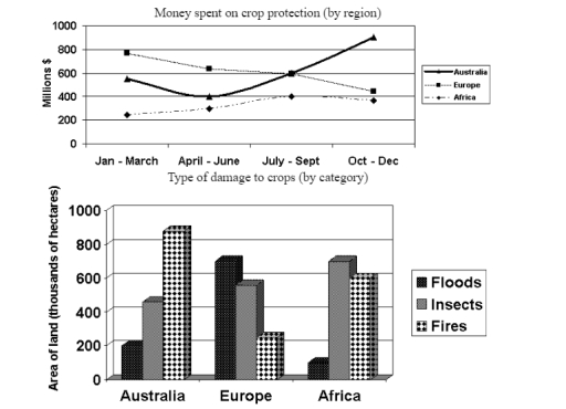
Band 6+: The graphs below show the amount of money spent on protecting crops and how crops are damaged in three different regions of the world in 2005. Summarise the information by selecting and reporting the main features and make comparisons where relevant.

Image for topic: The graphs below show the amount of money spent on protecting crops and how crops are damaged in three different regions of the world in 2005. Summarise the information by selecting and reporting the main features and make comparisons where relevant.
Our system will evaluate the answer based on this AI-generated description.
The image contains two visuals: a line graph showing "Money spent on crop protection" by region and a bar chart detailing the "Area of land" affected by different types of damage to crops. In the line graph, for Australia, expenditures are 200 million in Jan-Mar, about 300 million in Apr-Jun, 350 million in Jul-Sep, and nearly 800 million in Oct-Dec. In Europe, expenditures are 600 million in Jan-Mar, 550 million in Apr-Jun, 450 million in Jul-Sep, and 400 million in Oct-Dec. In Africa, expenditures are 250 million in Jan-Mar, 350 million in Apr-Jun, 200 million in Jul-Sep, and 200 million in Oct-Dec. In the bar chart, floods impact 800 thousand hectares in Australia, 600 thousand in Europe, and 400 thousand in Africa. Insects affect 600 thousand hectares in Australia, 400 thousand in Europe, and 300 thousand in Africa. Fires affect 300 thousand hectares in Australia, 200 thousand in Europe, and 100 thousand in Africa.
Given the complexity of the image, the above description may not be entirely accurate.
Note: Both the topic and the answer were created by one of our users.

The line graph demonstrates the overall spending on crop protection, whereas the bar graph shows further catagorized the damage into Flood, Insects and Fire in Australia, Europe, and Africa in 2005. Overall, there is a fluctuation in the money spent on harvest protection, whereas the majority damage to crops is caused by fire in Australia, and the least damaged by floods in Africa.

The line graph showed fluctuation in the amount of money spent on protecting harvests. In Australia, there was a slight dip in the spending and spiked by the the of the year to around 8000 million dollars. Oppositely, the amount of money spent in Europe decreased gradually from approximately 800 to 410 million dollars. Similar to Australia, there was an incline in the total spending from January to September and slightly declined to almost 400 dollars.

Additionaly, the total damage caused by fires is around 800 hectares in Australia, making it the highest in the list followed by insects, and fire. On the other hand, floods cause the most destruction in Europe’s harvests at around 700 hectares. Conversely, insects had caused the most crops damage in Africa at approximately 700 hectares.

Word Count: 194

Answers On The Same Topic:

The graphs below show the amount of money spent on protecting crops and how crops are damaged in three different regions of the world in 2005. Summarise the information by selecting and reporting the main features and make comparisons where relevant.

The line graph illustrates the amount of money spent on crop preservation and how harvests were damaged in three different regions of the world in 2005. Overall, it can be seen that Australia is generally the biggest investor in crop protection, ending the year with the highest expenditure , whereas Europe saw a steady decline. […]

The graphs below show the amount of money spent on protecting crops and how crops are damaged in three different regions of the world in 2005. Summarise the information by selecting and reporting the main features and make comparisons where relevant.

The line chart expressed how much money was spent on three regions protecting the crops while the bar graph showed how these places were affected by floods, insects and fires the year 2005. Overall, it was clear to see that among the three areas, Australia was the only one that showed a large increase in […]

The graphs below show the amount of money spent on protecting crops and how crops are damaged in three different regions of the world in 2005. Summarise the information by selecting and reporting the main features and make comparisons where relevant.

The charts illustrate the amount of spending on crops protection per months and the sources of damages (floods, insects and fires) inflicted to crops, categorized by three regions (Australia, Europe and Africa) in 2005. Overall, the dominant region in its investment on protecting crops differs between Australia and Europe, depending on months, whereas Africa utilized […]

The graphs below show the amount of money spent on protecting crops and how crops are damaged in three different regions of the world in 2005. Summarise the information by selecting and reporting the main features and make comparisons where relevant.

The pie chart and bar graph illustrate the amount of money spent to protecting crops and crops are destroyed in three various parts of the world which are Australia, Europe and Africa in 2005. Overall, it is evident that the highest amount of money spend on protecting crop by Africa in the starting period of […]

See All

Other Topics:

The line graph below shows the average high and low temperatures in Glasgow, Scotland, over the course of a year, while the table provides information on the average monthly rainfall and sunshine hours. Summarise the information by selecting and reporting the main features, and make comparisons where relevant.

The provided line graph illustrates the average monthly maximum and minimum temperatures (°C) in Glasgow. Meanwhile, the table depicts the average monthly rainfall and daily sunshine’s hours in the same city. Overall, it is observed that in the line graph, the temperature’s maximum and minimum numbers both bottom out by the January before experiencing a […]

The chart below shows the changes in ownership of electrical appliances and amount of time spend doing homework in households in one country between 1920 and 2019 in one country.

The graph indicates the changes of proprietorship of electronic machines and spend much hours and minutes in housework in family unit in one state between 1920 to 2019. Overall , the number of hours spend doing work in house is raised without electric devices like washing machines , vaccum cleaner and refrigerators but rising over […]

The provided charts illustrate the different types of courses, which were followed by the students during the years of 1984, 1994 and 2004.

The pie charts illustrate various types of courses that students undertook in the years of 1984, 1994, and 2004. Overall, the majority of the students took face to face courses while the online courses contained the least part of their course percentage in all three periods. Additionally, the percentage rate for 1994 and 2004 remained […]

The pie chart below illustrates the average commuting time of UK workers in 2009, while the bar chart compares the methods of travelling to work in London and the rest of the UK in the same year.

The pie chart depicts how much time the UK population allocated to commuting to work, while the bar one illustrates how they traveled to work in 2009. Overall, it is clear that most UK commuters spent under 30 minutes on their daily travel. Additionally, people of both London and the other areas of the UK […]

You should spend about 20 minutes on this task. The charts below show the number of Japanese tourists travelling abroad between 1985 and 1995 and Australia's share of the Japanese tourist market. Write a report for a university lecturer describing the information shown below. You should write at least 150 words.

The bar chart illustrates the total number of Japanese tourists travelling overseas between 1985 and 1995, while the line graph shows the percentage of these tourists who chose Australia as their destination over the same ten-year period. Overall, both the total number of Japanese outbound travellers and Australia’s share of this tourist market experienced a […]

The chart below show the proportion of holiday-makers using four different types of accommodations in three different years

The given three pie charts compare the percentage of holidaymakers using four different types of accommodation in 1988, 1998, and 2008. Overall, it is clear that rented apartment showed an upward trajectory throughout the period, whereas camping experienced a decline by the given years. It is also evident that staying with family had the highest […]

See All
We have detected unusual activity on your device.
Please verify your identity to continue.
Note: This verification step won't sign you in. If you have a premium account, please log in to access the service as usual.
Google/Gmail Verification
Or verify using Email/Code
We've sent a verification code to:
youremail@gmail.com (Not your email?)
Enter it below to complete the verification process.
Ensure your email address is correct, your inbox is not full, and you check your spam folder. If no email arrives, consider using an alternative email.
You will need a Premium plan to perform your action!
Note: If you already have a premium account, please log in to access our services as usual.

Plans & Pricing

Our mission is to make quality education accessible for everyone.
However, to keep our hardworking team running and this service alive, we genuinely need your support!
By opting for a premium plan, not only do you sustain us in achieving the mission, but you also unlock advanced features to enrich your learning experience.

Free

For learners who aren't pressed for time

What's included on Free
100+ Cambridge IELTS Tests
Instant IELTS Writing Task 1 & 2 Evaluation (2 times/month)
Instant IELTS Speaking Part 1, 2, & 3 Evaluation (2 times/month)
Instant IELTS Writing Task 1 & 2 Essay Generator (2 times/month)
500+ Dictation & Shadowing Exercises
100+ Pronunciation Exercises
Flashcards
Other Advanced Tools

Premium

For those serious about advancing their English proficiency, and for IELTS candidates aspiring to boost their band score by 1-2 points (especially in writing & speaking) in just 30 days or less

What's included on Premium
Save Your IELTS Test Progress & Analyze Mistakes By Question Type
Save Your Own Flashcard Sets & Use Them On Any Device
Unlock All Courses, IELTS Tests, Section & Part Practice
Unlimited AI Conversations
Unlimited AI Writing Enhancement Exercises
Unlimited IELTS Writing Task 1 & 2 Evaluation
Unlimited IELTS Speaking Part 1, 2, & 3 Evaluation
Checked Answers Will Not Be Published
Unlimited IELTS Writing Task 1 & 2 Essay Generator
Unlimited IELTS Speaking Part 1, 2, & 3 Sample Generator
Unlimited Usage Of Advanced Tools & AI Features
Priority Support within 24h (12-month plan only)

Due to the nature of our service and the provided free trials, payments are non-refundable.