🔥 Today Only: Save 30% on Premium — Offer Ends Soon! - Upgrade Now!
Multiple Graphs

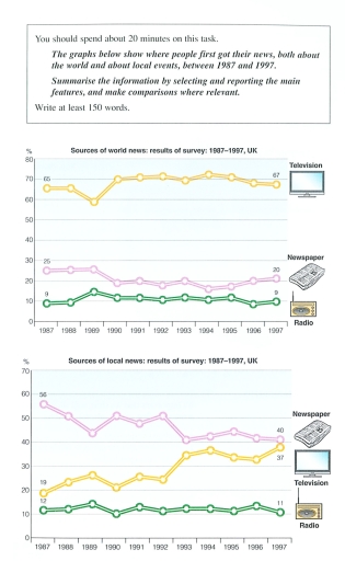
Band 6+: The graphs below show where people first got their news, both about the world and about local events, between 1987 and 1997.

Image for topic: The graphs below show where people first got their news, both about the world and about local events, between 1987 and 1997.
Our system will evaluate the answer based on this AI-generated description.
The image presents two line graphs detailing survey results from 1987 to 1997: the first graph shows sources of world news, with television starting at 68% in 1987, fluctuating closely around 67% from 1987 to 1995, peaking at 72% in 1990 and ending at 70% in 1997; newspapers at 38% in 1987, with a low of 35% in 1991, consistently at 37% until a slight dip to 35% in 1994 and finishing at 38% in 1997; radio commencing at 15% in 1987, with consistent minor variations maintaining an overall increase to 20% by 1997. The second graph focuses on sources of local news: newspapers start at 58% in 1987, peaking at 61% in 1989, a sudden fall to 58% in 1991, then descending more sharply to 37% by 1997; television begins at 47% in 1987, minor fluctuations during the period, with a closing value at 37% in 1997; radio portrays consistent stability from 19% to 17% throughout the depicted years.
Given the complexity of the image, the above description may not be entirely accurate.
Note: Both the topic and the answer were created by one of our users.

Both charts depict data on the sources of information from which people from the UK received updates about both local and global affairs in 1987-1997, measured in percentage.

Overall, it can be noted that throughout the whole period of 10 years, radio was the least popular source of getting news, while television was the only one that showed growth, being a leader in world updates and narrowing the gap with newspapers in local ones.

The first graph shows that in 1987 television was used by approximately two-thirds (65%) of people as a tool to get acquainted with global affairs and remained stable even by the end of the decade, having a slight decrease of around 6% in the middle of 1989. A similar trend can be seen in the usage of newspapers and radio, as their rate didn’t demonstrate any significant changes and stood at 20 and 9, respectively, by 1997. In contrast, the second chart illustrated a consistent surge in using TV as a source of local news, almost doubling its rate from 19 to 37 in the years 1987-1997, while newspapers declined by 16%, showing their worst result throughout the whole period and finally taking a minor precedence over television.

Word Count: 202

Answers On The Same Topic:

The graphs below show where people first got their news, both about the world and about local events, between 1987 and 1997.

The two line graphs demonstrate the percentage of the British citizens looking at world news and native news from 1987 to 1997. Overall, the public in the UK predominantly was informed of the news about the information worldwide by the television, while the main way of getting regional news was newspaper. The proportion of inhabitants […]

The graphs below show where people first got their news, both about the world and about local events, between 1987 and 1997.

The two line graphs demonstrate the percentage of the British citizens looking at the world news and native news from 1987 to 1997. Overall, public in UK predominantly was informed of the news about the information worldwide by the television, while the main way for getting local news was newspaper. The proportion of inhabitants getting […]

See All

Other Topics:

The graphs show figures relating to hours worked and stress levels amongst professionals in eight groups.

The bar chart and the pie chart below display the number of hours that people with different professions spend on their working place and the proportion of people who suffer from stressdepending from their occupation. Overall, business man, movie producers and doctors spend the the most time on their jobs among all occupations showed. Lecturers […]

The pie charts below give information about the preferred housing and the quality of housing in Country A.Summarise the information by selecting and reporting the data and make comparisons where relevant.

The pie charts delineate the information about preferred different types of housing and the quality of housing in Country A. Overall, it can be seen that house was the most preferred catagory among all, while the houseboat and van were the least. In addition, underoccupied homes recorded the largest share compared with over crowded home […]

the graphs show information about visitors from France and North America for holiday and business purposes. Provide an overview of the information by indentifying and describing the key detail,a nd include comparisons where appropriate.

The given graphs illustrate the data on tours from France and North America for weekend and business reasons. Overall, it is evident that trips to UK for holiday purposes is the highest from North American visitors, whereas from France the proportion of people visit is lowest. In terms of Business trips, both France and North […]

The bar chart and table below show information about the average number of people per household and the percentage of housing units occupied in six selected OECD countries in 2020.

The chart and table provide information about the average household size and the percentage of occupied housing units in six selected OECD countries in 2020. Overall, Australia had the largest average household size, while Japan had the smallest. Australia recorded the highest percentage in occupancy rates, whereas Japan had the lowest figures for both measures. […]

changes in percent in ownership of electrical appliances and hours of housework

Task 1 The line graph provides information about percentage of households electrical appliances and numbers of hours spent at housework per week, per household works in one country between 1920 and 2019. Overall, it is evident that the ownership of all three electrical appliance increased, whereas the numbers of hour spent on house work deceased […]

The given chart shows energy consumption in Country X in 2000 and 2020.

The two charts compare how Country Energy consumption by sector in Country X, 2000 and 2020. Overall, transport became the dominant spending area 2020, overtaking Industry, which had been largest category two decades earlier. In contrast, Commerical received a notably smaller share over time. In 2000, Industryaccounted for the largest propotion of spending at 38%, […]

See All
We have detected unusual activity on your device.
Please verify your identity to continue.
Note: This verification step won't sign you in. If you have a premium account, please log in to access the service as usual.
Google/Gmail Verification
Or verify using Email/Code
We've sent a verification code to:
youremail@gmail.com (Not your email?)
Enter it below to complete the verification process.
Ensure your email address is correct, your inbox is not full, and you check your spam folder. If no email arrives, consider using an alternative email.
You will need a Premium plan to perform your action!
Note: If you already have a premium account, please log in to access our services as usual.

Plans & Pricing

Our mission is to make quality education accessible for everyone.
However, to keep our hardworking team running and this service alive, we genuinely need your support!
By opting for a premium plan, not only do you sustain us in achieving the mission, but you also unlock advanced features to enrich your learning experience.

Free

For learners who aren't pressed for time

What's included on Free
100+ Cambridge IELTS Tests
Instant IELTS Writing Task 1 & 2 Evaluation (2 times/month)
Instant IELTS Speaking Part 1, 2, & 3 Evaluation (2 times/month)
Instant IELTS Writing Task 1 & 2 Essay Generator (2 times/month)
500+ Dictation & Shadowing Exercises
100+ Pronunciation Exercises
Flashcards
Other Advanced Tools

Premium

For those serious about advancing their English proficiency, and for IELTS candidates aspiring to boost their band score by 1-2 points (especially in writing & speaking) in just 30 days or less

What's included on Premium
Save Your IELTS Test Progress & Analyze Mistakes By Question Type
Save Your Own Flashcard Sets & Use Them On Any Device
Unlock All Courses, IELTS Tests, Section & Part Practice
Unlimited AI Conversations
Unlimited AI Writing Enhancement Exercises
Unlimited IELTS Writing Task 1 & 2 Evaluation
Unlimited IELTS Speaking Part 1, 2, & 3 Evaluation
Checked Answers Will Not Be Published
Unlimited IELTS Writing Task 1 & 2 Essay Generator
Unlimited IELTS Speaking Part 1, 2, & 3 Sample Generator
Unlimited Usage Of Advanced Tools & AI Features
Priority Support within 24h (12-month plan only)

Due to the nature of our service and the provided free trials, payments are non-refundable.