🔥 Today Only: Save 30% on Premium — Offer Ends Soon! - Upgrade Now!
Multiple Graphs

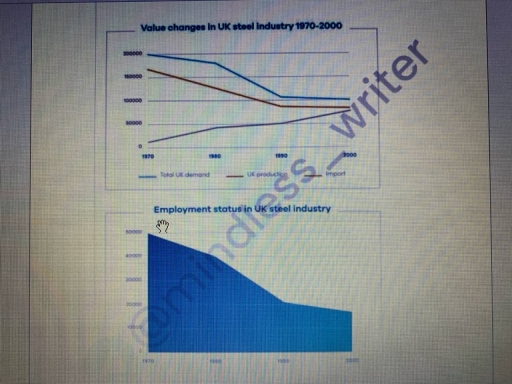
Band 8+: The graphs show the changes in the UK industry steel between 1970 and 2000. (million tonnes vs thousand). Summarize the information by selecting and reporting the main features, and make comparisons where relevant.

Image for topic: The graphs show the changes in the UK industry steel between 1970 and 2000. (million tonnes vs thousand). Summarize the information by selecting and reporting the main features, and make comparisons where relevant.
Our system will evaluate the answer based on this AI-generated description.
The image displays two visualizations: the first graph depicts value changes in the UK steel industry from 1970 to 2000 with three lines, starting in 1970 with total UK demand at 100,000 units, UK production at about 95,000 units, and import figures at 5,000 units; by 1980, total UK demand falls to around 90,000 units, UK production drops to approximately 62,000 units, and imports increase to 28,000 units; in 1990, total UK demand stabilizes at 85,000 units, UK production further decreases to 55,000 units, and imports rise to 30,000 units; by 2000, total UK demand reaches 75,000 units, UK production is around 50,000 units, and imports are at 25,000 units; the second chart illustrates employment status in the UK steel industry from 1970 with employment at 230,000, which reduces to 160,000 by 1980, declines to approximately 140,000 by 1990, showing a final decrease to 100,000 by 2000.
Given the complexity of the image, the above description may not be entirely accurate.
Note: Both the topic and the answer were created by one of our users.

The two given graphs illustrate changes in the value of the UK steel industry and employment figures from 1970 to 2000.

It is clear from the data that both total UK demand and UK production decreased moderately, whereas steel imports increased gradually over the three decades. At the same time, employment in the industry declined drastically.

Examining the first graph, the total demand in the UK was about 200,000 million tons in 1970. However, over the next 30 years, it continued to decrease, falling to just 10,000 million tons in 2000. Likewise, UK steel production dropped from over 150,000 million tons in 1970 to below 100,000 million tons by 2000. Imports, however, showed steady growth over this period. In 1970, imports were approximately 1 million tons, yet after 30 years, this figure rose to around 70,000 million tons in 2000.

Regarding the second figure, employment statistics stood at 50,000 workers in 1970. Nonetheless, by 2000, this number had fallen sharply to about 18,000.

Word Count: 163

Answers On The Same Topic:

The graphs show the changes in the UK industry steel between 1970 and 2000. (million tonnes vs thousand). Summarize the information by selecting and reporting the main features, and make comparisons where relevant.

The line graphs display data about value changes in the steel industry in the UK between 1970 and 2000, along with a comparison of employment status. In general, both graphs illustrate their amounts in million tons and thousands. At the beginning of the period, steel demand and employment levels reached a peak, while by the […]

The graphs show the changes in the UK industry steel between 1970 and 2000. (million tonnes vs thousand). Summarize the information by selecting and reporting the main features, and make comparisons where relevant.

The line graphs display the modifications in the UK steel manufacturing from 1970 to 2000. It is evident that the UK industry initially began with its highest rate, but it fell down year by year. In addition, the industry is classified into 2 groups, ‘Value changes in UK steel industry’ and ‘Employment status in UK […]

The graphs show the changes in the UK industry steel between 1970 and 2000. (million tonnes vs thousand). Summarize the information by selecting and reporting the main features, and make comparisons where relevant.

The line graphs display data about value changes of steel industry in the UK between 1970 and 2000, along with comparing employment status. In general, both graphs illustrate their amounts on million tons and thousands. At the beginning of the period, demands of steel and employment status had reached a peak, while by the end […]

See All

Other Topics:

The pie chart below shows the average household expenditures in a country in 1950 and 2010. Write a report for a university lecturer describing the information below.

The pie charts illustrate the average household expenditures in a country in 6 different categories in the years 1950 and 2010. Overall, spendings on housing experienced the biggest decline while food and transportation showed a gradual increase. Additionally, health care had the lowest costing in both years. In the year 1950, domestic expenditures in housing […]

The charts below show the percentage of workers in three sectors across four countries in 1980 and 2010 Summerise the information by selecting and reporting the main features, and make comparisons where relevant

The two bar charts illustrate the proportion of the workforce employed in three economic sectors across four countries in 1980 and 2010. Overall, industry became the largest sector in Germany, the USA and Japan by 2010, while agriculture remained dominant in China despite a marked decline. By contrast, agriculture dominated China’s workforce in 1980, although […]

The bar chart and pie chart show the amount of carbon dioxide (CO₂) emitted by three different income groups in 1990 and 2000, and the proportion of the world's population represented by each income group in 2000.

The bar chart illustrates the amount of carbon dioxide emitted into the air by different income classes from 1990 to 2000, whereas the pie chart demonstrates the proportion of population represented by high, low and middle income groups in the world in 2000. Overall, the low-income group recorded considerably lower figures, while the middle-income group […]

The charts gives the information on the location and types of dance classes people are attending

The first chart illustrates the dancing curse locations in a town of Australia, where young people attend, while the second chart gives information on types of dance lessons, including ages. Overall, the substantial figure can be seen in private studios in a class locations category, being almost half of all the location percentages. In curses […]

The charts show the percentage of volunteers by organizations in 2008-2014. Summarise the information by selecting and reporting the main features, and make comparisons where relevant.

The pie graphs compare the proportion of volunteers in various categories in 2008 and 2014. Overall , the percentage of volunteers occupied in Environmental , Sport and Health Care increased over the period , while that of Art , Educational and “Others” figures witnessed a reversed trend .Notably , Environmental organizations constituted the highest portions […]

The charts below show the trends in house prices in London, Dubai, and Hong Kong between 2008 and 2015. Summarise the information by selecting and reporting the main features, and make comparisons where relevant.

The images illustrate changes in house prices in three markets: London, Dubai, and Hong Kong. Overall, house prices in London showed a steady upward trend, despite a decline at the beginning of the period. In contrast, Dubai and Hong Kong experienced significant fluctuations. Both markets saw a sharp drop in house prices initially, but Dubai’s […]

See All
We have detected unusual activity on your device.
Please verify your identity to continue.
Note: This verification step won't sign you in. If you have a premium account, please log in to access the service as usual.
Google/Gmail Verification
Or verify using Email/Code
We've sent a verification code to:
youremail@gmail.com (Not your email?)
Enter it below to complete the verification process.
Ensure your email address is correct, your inbox is not full, and you check your spam folder. If no email arrives, consider using an alternative email.
You will need a Premium plan to perform your action!
Note: If you already have a premium account, please log in to access our services as usual.

Plans & Pricing

Our mission is to make quality education accessible for everyone.
However, to keep our hardworking team running and this service alive, we genuinely need your support!
By opting for a premium plan, not only do you sustain us in achieving the mission, but you also unlock advanced features to enrich your learning experience.

Free

For learners who aren't pressed for time

What's included on Free
100+ Cambridge IELTS Tests
Instant IELTS Writing Task 1 & 2 Evaluation (2 times/month)
Instant IELTS Speaking Part 1, 2, & 3 Evaluation (2 times/month)
Instant IELTS Writing Task 1 & 2 Essay Generator (2 times/month)
500+ Dictation & Shadowing Exercises
100+ Pronunciation Exercises
Flashcards
Other Advanced Tools

Premium

For those serious about advancing their English proficiency, and for IELTS candidates aspiring to boost their band score by 1-2 points (especially in writing & speaking) in just 30 days or less

What's included on Premium
Save Your IELTS Test Progress & Analyze Mistakes By Question Type
Save Your Own Flashcard Sets & Use Them On Any Device
Unlock All Courses, IELTS Tests, Section & Part Practice
Unlimited AI Conversations
Unlimited AI Writing Enhancement Exercises
Unlimited IELTS Writing Task 1 & 2 Evaluation
Unlimited IELTS Speaking Part 1, 2, & 3 Evaluation
Checked Answers Will Not Be Published
Unlimited IELTS Writing Task 1 & 2 Essay Generator
Unlimited IELTS Speaking Part 1, 2, & 3 Sample Generator
Unlimited Usage Of Advanced Tools & AI Features
Priority Support within 24h (12-month plan only)

Due to the nature of our service and the provided free trials, payments are non-refundable.