Our system will evaluate the answer based on this AI-generated description.
The image displays a multicolored line graph indicating the percentage of involuntary part-time workers as a percentage of total employment across multiple countries between the years 2005 and 2014. Specifically: Australia started at ~2.5% in 2005 peaked ~4% around 2011, Austria fluctuated between ~1% to ~2.5%, Belgium ranged between ~3% to ~4%, Canada from ~1.5% to over 3%, Chile ~1% initially rising up to ~7%, Czech ~1.5% peaking at ~2.5%, Denmark ~1% to ~3%, Finland from ~2.5% to ~4.5%, France ~5.5% to ~6.5%, Germany 2.5% up to 4%, Greece increased from ~4% to 9%, Hungary stable around 2%, Iceland minimal variation around 1.5%, Ireland peaked at ~6%, Israel increased from ~2% to ~3.5%, Italy from ~6.5% to ~11%, Japan ~2% to ~5%, Korea stable around ~1%, Latvia ~2% to ~4.5%, Lithuania ~1% to ~4%, Luxembourg from ~1.5% to ~3.5%, Mexico stable around 1.5%, Netherlands ~4% to ~5%, New Zealand ~1.5% to ~4%, Norway ~1.5% to ~3%, Poland ~2% to ~4%, Portugal ~2% to ~6%, Slovakia d ~3%, Slovenia ~2% to 6%, Spain sharply increased from ~4% to ~7%, Sweden ~3% to ~4%, Switzerland minimal fluctuation around ~2%, Turkey ~2% to ~3%, UK ~3% to ~4.5%, USA ~2.5% to ~4.5%, OECD average started near ~4% increasing to ~6%.
Given the complexity of the image, the above description may not be entirely accurate.
Skyrocket your IELTS band score by 1-2 points in under a month with our premium plan!
Note: Both the topic and the answer were created by one of our users.
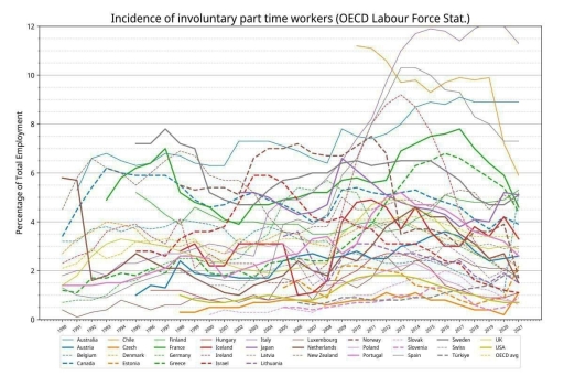
The line graph illustrates the percentage of involuntary part-time workers as a proportion of total employment across various OECD countries between 1990 and 2021.
Overall, while the incidence of involuntary part-time employment varied significantly between countries, a notable upward trend can be observed in many nations following the 2008 global financial crisis. Southern European countries such as Spain and Italy recorded the highest percentages, while Central European nations like the Czech Republic and the Netherlands consistently reported the lowest levels.
In 1990, most countries started with relatively low figures, typically under 6%. However, by 2009-2010, the rate had surged in many places, with Spain witnessing the most dramatic increase. Spain’s proportion rose sharply to exceed 11% in the early 2010s, maintaining the highest rate until 2021 despite some decline in recent years. Similarly, Italy also experienced a significant rise, peaking close to 11% during the same period.
Conversely, countries such as the Czech Republic, the Netherlands, and Switzerland maintained consistently low levels of involuntary part-time employment throughout the period, rarely surpassing 2%. The United States, although it experienced a rise post-2008, eventually saw a decline, ending below 4% in 2021.
The OECD average, represented by the bold dashed line, rose moderately after 2008, peaking at around 5-6% before slightly declining in the later years of the period.
Word Count: 217