🔥 Today Only: Save 30% on Premium — Offer Ends Soon! - Upgrade Now!
Line Graph

Band 7+: The line graph below illustrates the overall profit gained from two digital products, namely Software, and Games, over 8 years from 2011 to 2019. Summarize the information by selecting and reporting the main features, and make comparisons where relevant.

Image for topic: The line graph below illustrates the overall profit gained from two digital products, namely Software, and Games, over 8 years from 2011 to 2019. Summarize the information by selecting and reporting the main features, and make comparisons where relevant.
Our system will evaluate the answer based on this AI-generated description.
The image features a line graph with two lines representing 'Software' and 'Games' profit from 2011 to 2019; Software profit rose from about 600 in 2011, to approximately 1000 in 2013, dipped slightly in 2014 to just under 1000, up to around 1200 in 2015, a more pronounced drop to around 600 in 2016, back up to roughly 1200 in 2017, then a decline back to near 1000 in 2018, and an increase to approximately 1500 in 2019; Games profit started around 2500 in 2011, went down to a little above 2000 in 2012, increased to approximately 3000 in 2013, declined to around 2000 in 2014, saw a major increase to nearly 3500 in 2015, followed by a sharp drop to just above 1500 in 2016, another rise to about 2500 in 2017, a decrease back to near 1500 in 2018, and a spike to roughly 3000 in 2019. Data points are approximations due to lack of precise numeric labels on the y-axis.
Given the complexity of the image, the above description may not be entirely accurate.
Note: Both the topic and the answer were created by one of our users.

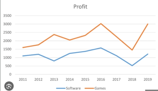
The line graph illustrates the overall profit gained in two digital products, namely Software and Games over 8 years, from 2011 until 2019.

Overall, the discrepancy between the two figures was negligible at the beginning, while it was comparably higher by the end, with the Games upholding the favorable position.

Initially, the profit made in Software accounted for just above 1000 pounds. This was followed by a gradual increase, with approximately a 100-pound difference by 2012. During the period from 2012 to 2013, the figure decreased slightly by 400 £, just before climbing back and reaching a high of 1500 pounds in 2016. For the following 2 years, the amount of income underwent a gradual decline of about 1000, before it bounced back to roughly 1250 £ in the final year.

Regarding the earnings from Software, they went up slightly from merely over 1500 to 1700 pounds in 2012, having a distinction of approximately 1500 £ from the former category after a year. Afterward, there was a fall of about 400 pounds by the year 2014, just before hitting a high of around 3000 in the next 2 years, and then Software kept a similar trend to the other category with 3000 £ at the end of the period.

Word Count: 209

Answers On The Same Topic:

The line graph below illustrates the overall profit gained from two digital products, namely Software, and Games, over 8 years from 2011 to 2019. Summarize the information by selecting and reporting the main features, and make comparisons where relevant.

The line graph gives information about profit of software and games during the period from 2011 to 2019. Overall, the highest rate were games with 3000, while the rate of software was 1500 in 2016. In the beginning of the year the rate of games were 1600 while the rate of software was 1100. Nevertheless […]

See All

Other Topics:

Here is your line graph showing trends in two categories (A and B) from 2010 to 2020. You can now describe it for your IELTS Writing Task 1.

The line chart illustrates the value of trends in two categories (A and B) over a period of 10 years, starting from 2010. It can be seen from the graph, both categories witnessed an upward trend. The highest value experienced by group A, while the lowest reported by category B. With the respect of group […]

This line graph illustrates the participation levels for five different activities at a social centre in Melbourne from 2000 to 2020.

The line graph shows the number of participants for five different activities at one cosial centre in Melbourne,Australia between 2000 and 2020. Overall, we can see from the chart that ratio of people who participate for film club and martial arts showed almost steadily growth, while the number of amateur dramatics decreased over the given […]

The charts below show the number of visitors arriving in a particular country for a short trip, and the number of residents leaving that country for a short trip, from 2009 to 2011. Summarise the information by selecting and reporting the main features, and make comparisons where relevant. Write at least 150 words.

The charts illustrate the number of visitors on a short trip to a specific country and the number of indigenes moving out of the country for a short trip starting from 2009 to 2011. Overall, the number of departing residents from the country increased significantly over the years while the number of visitors to the […]

WRITING TASK 1 You should spend about 20 minutes on this task. The line graph below shows the percentage of households with internet access in three different countries between 2005 and 2015. Summarize the information by selecting and reporting the main features, and make comparisons where relevant. Write at least 150 words.

The given line chart depicts the differnces of the percentage of household with internet access in three different countries which are Vietnam-USA and Japan throughout 10 years from 2005 to 2015. A glance at the chart reveals that the USA has the highest percentage during these 10 years however Vietnam has the lowest. Getting back […]

the chart below shows the changes in car ownership in Great Britain between 1961 and 2001

The line chart illustrates, the count of car ownership in terms of no car, 1 car and 2 or more cars in Great Britain for 1961, 1971, 1981, 1991 and 2001. Units are measured in percentage of households. In the chart, one can observe a growing pattern in terms of 2 or more cars, in […]

WRITING TASK 1 You should spend about 20 minutes on this task. The line graph below shows the percentage of households with internet access in three different countries between 2005 and 2015. Summarize the information by selecting and reporting the main features, and make comparisons where relevant. Write at least 150 words.

The graph depicts the figures for households with internet connectivity among Vietnam, the USA and Japan from the period from 2005 to 2015. Overall, it can inferred from the statistics that there was an upward trend in families’ internet access rates, with the USA being the most dominant among three countries. Furthermore, Vietnam witnessed a […]

See All
We have detected unusual activity on your device.
Please verify your identity to continue.
Note: This verification step won't sign you in. If you have a premium account, please log in to access the service as usual.
Google/Gmail Verification
Or verify using Email/Code
We've sent a verification code to:
youremail@gmail.com (Not your email?)
Enter it below to complete the verification process.
Ensure your email address is correct, your inbox is not full, and you check your spam folder. If no email arrives, consider using an alternative email.
You will need a Premium plan to perform your action!
Note: If you already have a premium account, please log in to access our services as usual.

Plans & Pricing

Our mission is to make quality education accessible for everyone.
However, to keep our hardworking team running and this service alive, we genuinely need your support!
By opting for a premium plan, not only do you sustain us in achieving the mission, but you also unlock advanced features to enrich your learning experience.

Free

For learners who aren't pressed for time

What's included on Free
100+ Cambridge IELTS Tests
Instant IELTS Writing Task 1 & 2 Evaluation (2 times/month)
Instant IELTS Speaking Part 1, 2, & 3 Evaluation (5 times/month)
Instant IELTS Writing Task 1 & 2 Essay Generator (2 times/month)
500+ Dictation & Shadowing Exercises
100+ Pronunciation Exercises
Flashcards
Other Advanced Tools

Premium

For those serious about advancing their English proficiency, and for IELTS candidates aspiring to boost their band score by 1-2 points (especially in writing & speaking) in just 30 days or less

What's included on Premium
Save Your IELTS Test Progress
Unlock All Courses & IELTS Tests
Unlimited AI Conversations
Unlimited AI Writing Enhancement Exercises
Unlimited IELTS Writing Task 1 & 2 Evaluation
Unlimited IELTS Speaking Part 1, 2, & 3 Evaluation
Checked Answers Will Not Be Published
Unlimited IELTS Writing Task 1 & 2 Essay Generator
Unlimited IELTS Speaking Part 1, 2, & 3 Sample Generator
Unlimited Usage Of Advanced Tools
Priority Support within 24h (12-month plan only)

Due to the nature of our service and the provided free trials, payments are non-refundable.
Nếu bạn là người Việt Nam và không có hoặc không muốn trả bằng credit/debit cards, bạn có thể thanh toán bằng phương thức chuyển khoản:


Chọn gói:
419,000₫ 277,000 ₫ cho gói 1 tháng (chỉ 9,233₫/ngày)
1,239,000₫ 597,000 ₫ cho gói 3 tháng (chỉ 6,633₫/ngày)
2,469,000₫ 1,027,000 ₫ cho gói 6 tháng (chỉ 5,706₫/ngày)
4,929,000₫ 1,417,000 ₫ cho gói 12 tháng (chỉ 3,936₫/ngày)


Sau khi chuyển khoản, vui lòng đợi trình duyệt tự động điều hướng bạn trở lại Engnovate và bạn sẽ ngay lập tức nhận được mã kích hoạt tài khoản premium.
Nếu có lỗi xảy ra, bạn có thể liên hệ với team thông qua một trong các phương thức: email đến helloengnovate@gmail.com hoặc nhắn tin qua facebook.com/engnovate.
Vì toàn bộ công cụ trên website đều có thể sử dụng thử miễn phí, Engnovate không hỗ trợ hoàn tiền.