🔥 Today Only: Save 30% on Premium — Offer Ends Soon! - Upgrade Now!
Line Graph

Band 5+: The line graph below shows the differences in wheat exports over three different areas.

Image for topic: The line graph below shows the differences in wheat exports over three different areas.
Our system will evaluate the answer based on this AI-generated description.
The image shows a line graph displaying wheat exports from 1985 to 1990 in millions of tonnes for Australia, Canada, and the European Community. In 1985, Australia exported around 15 million tonnes, Canada exported just over 20 million tonnes, and the European Community exported slightly below 15 million tonnes. In 1986, Australia's exports fell to about 11 million tonnes, Canada's exports increased to approximately 25 million tonnes, and the European Community's exports decreased to under 14 million tonnes. In 1987, all three saw a decline, with Australia at about 9 million tonnes, Canada at about 19 million tonnes, and the European Community at around 13 million tonnes. In 1988, Australia's exports rose to about 15 million tonnes, Canada's exports also increased to around 21 million tonnes, and the European Community's exports jumped to about 20 million tonnes. In 1989, Australia's exports declined to around 11 million tonnes, Canada's exports drastically decreased to about 15 million tonnes, and the European Community's exports rose sharply to about 24 million tonnes. In 1990, Australia's exports remained around 11 million tonnes, Canada's exports increased to approximately 19 million tonnes, and the European Community's exports decreased slightly to around 21 million tonnes.
Given the complexity of the image, the above description may not be entirely accurate.
Note: Both the topic and the answer were created by one of our users.

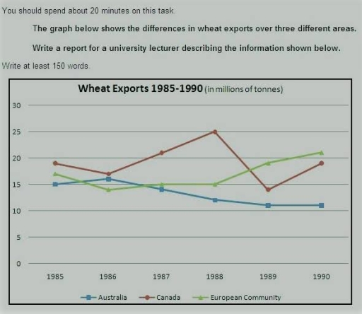
The graph below provides information about count of wheat which were exporting in Australia, Canada, European Community between 1985 and 1990 years.

The most striking information is that at the beginning-Canada exporting the biggest amount of wheat, while European Community exported litlle less than Canada. In 5 years amount of wheat exports fluctuated, however at the last point exports in European Community increased and became more than Canada. Exports in Australia stayed the same and significantly decreased.

In 1985s Canada exported around 20 millions of tonnes wheat. Australia exported 15 millions of tonnes, while European Community had amount between 15-20 millions of tonnes wheat. By 1986 exports in Canada and European Community went down, while only Australia had growth. However, from 1986 to 1988 Canada had significant increasing in export, amount of wheat export reached 25 millions of tonnes in this area. While European Community remained and reached 15 millions of tonnes in 1988.

In Australia after 1986 statistics decreased and reached over 10 millions of tonnes in last 4 years. However in Canada amount of wheat exports in 1989 rappidly went down from 25 millions of tonnes to around 15 millions of tonnes. But after 1989 it grew to around 20 millions of tonnes. While European Community had minorly increasing and reached over 20 millions of tonnes in 1990.

Word Count: 220

Answers On The Same Topic:

The line graph below shows the differences in wheat exports over three different areas.

The line graph illustrates the trends of wheat trading in different areas (Australia, Canada, European community) during 1985 and 1990. Overall, it is evident that European community and expanded their output and became top exportor.Caneda was the top contributor for a conciderable time period and they reached highest recorded sales in 1988 however they were […]

The line graph below shows the differences in wheat exports over three different areas.

In this report I am going to describe the one line graph.The graph illustrates that the export of wheat in three different contries Australia,Canada and European comunity. The export is softly same and average 10 to 25 millions of tons. from 1985 to 1990 canada is bit higher in 1988. Austrila lose thier export continuesly. […]

The line graph below shows the differences in wheat exports over three different areas.

The line graph gives information about the amount of wheat exported over three separated regions, namely Australia, Canada and European Community from 1985 to 1990. Overall, while there was a steady increase in the amount of wheat exports in European Community, the figure for Australia decreased consistently. It is obvious that the statistics for Canada […]

The line graph below shows the differences in wheat exports over three different areas.

The line graph compares stats concerning the wheat was exported in three different countries which are Australia, Canada and European Community. Overall, it is evidently clear that the export of wheat in Canada and Europe increased over the year while it decreased for Australia. In addition, Canada exported the highest wheat in 1988 whereas the […]

See All

Other Topics:

The line graph shows the average monthly spending (in dollars) on three categories - food, entertainment, and transportation - by a group of people between 2010 and 2020. Data: Food: 300 (2010), 320 (2012), 350 (2014), 370 (2016), 400 (2018), 420 (2020) Entertainment: 150 (2010), 200 (2012), 250 (2014), 300 (2016), 350 (2018), 380 (2020) Transportation: 200 (2010), 220 (2012), 240 (2014), 260 (2016), 280 (2018), 300 (2020)

The line graph delineates the average monthly expenditures, expressed in dollars, across three distinct categories: food, entertainment, and transportation, for a demographic cohort from 2010 to 2020. Overall, there was a notable increase in average monthly spending within all three categories throughout the decade. While food consistently represented the highest expenditure, entertainment experienced the most […]

The line graph shows the average monthly spending (in dollars) on three categories - food, entertainment, and transportation - by a group of people between 2010 and 2020. Data: Food: 300 (2010), 320 (2012), 350 (2014), 370 (2016), 400 (2018), 420 (2020) Entertainment: 150 (2010), 200 (2012), 250 (2014), 300 (2016), 350 (2018), 380 (2020) Transportation: 200 (2010), 220 (2012), 240 (2014), 260 (2016), 280 (2018), 300 (2020)

The line graph illustrates the average monthly expenses on three categories – food, entertainment and transportation – by a group of people between 2010 and 2020, measured in dollars. Overall, the average spending increased significantly throughout the period. Food recorded the highest monthly expenses, while entertainment, despite starting at a much lower level, showed the […]

The graph below gives information about how much people in United States and the United Kingdom spend on fuel. Summarise the information by selecting and reporting the main features and make comparisions where relevant.

The provided graph illustrates how much people in the United States and the United Kingdom spend on fuel, distinguished in three categories: poorest, middle-income, and richest. Overall, the United States’ graph experiences dramatically fall after reaching its highest percent of income spent on fuel. In contrast, the United Kingdom’s graph has a right upward trend […]

The graph below shows the population of India and China from the year 2000 to the present day with projections for growth to the year 2050. Summarise the information by selecting and reporting the main features, and make comparisons where relevant. Write at least 150 word

The graph below illustrates the population of India and China every 10 years until 2050, starting from 2000, based on approximations provided by the United Nations Population Division: Medium variant. In 2000, India’s population was recorded at 1 billion people. In the following years, the population increases dramatically, reaching an estimated 1.4 billion by 2030, […]

The line graph shows the average annual spending on cell phone, national, and internatonal fixed-line services in the US between 2001 and 2010.

The picture demonstrates expenses on cell phones per year. It includes: national, and international fixed line services in the US. The period: from 2001 to 2010. Units are measured in dollars. Groups such as Cell phone services and International fixed-line services experienced a stable state. Cell phone services rocketed from 200 dollars in 2001 to […]

The line graph shows the percentage of different age groups of cinema visitors ina a particular country from 1978 to 2008.

The 14-24 age group consistently has the highest percentage of cinema visitors, starting at around 90% in 1978, dipping slightly in 1988, peaking again around 1998-2003, and then declining a bit by 2008. The 25-34 group shows a moderate level, beginning at about 80%, dropping in 1988, then gradually increasing and stabilizing around the mid-to-high […]

See All
We have detected unusual activity on your device.
Please verify your identity to continue.
Note: This verification step won't sign you in. If you have a premium account, please log in to access the service as usual.
Google/Gmail Verification
Or verify using Email/Code
We've sent a verification code to:
youremail@gmail.com (Not your email?)
Enter it below to complete the verification process.
Ensure your email address is correct, your inbox is not full, and you check your spam folder. If no email arrives, consider using an alternative email.
You will need a Premium plan to perform your action!
Note: If you already have a premium account, please log in to access our services as usual.

Plans & Pricing

Our mission is to make quality education accessible for everyone.
However, to keep our hardworking team running and this service alive, we genuinely need your support!
By opting for a premium plan, not only do you sustain us in achieving the mission, but you also unlock advanced features to enrich your learning experience.

Free

For learners who aren't pressed for time

What's included on Free
100+ Cambridge IELTS Tests
Instant IELTS Writing Task 1 & 2 Evaluation (2 times/month)
Instant IELTS Speaking Part 1, 2, & 3 Evaluation (5 times/month)
Instant IELTS Writing Task 1 & 2 Essay Generator (2 times/month)
500+ Dictation & Shadowing Exercises
100+ Pronunciation Exercises
Flashcards
Other Advanced Tools

Premium

For those serious about advancing their English proficiency, and for IELTS candidates aspiring to boost their band score by 1-2 points (especially in writing & speaking) in just 30 days or less

What's included on Premium
Save Your IELTS Test Progress
Unlock All Courses & IELTS Tests
Unlimited AI Conversations
Unlimited AI Writing Enhancement Exercises
Unlimited IELTS Writing Task 1 & 2 Evaluation
Unlimited IELTS Speaking Part 1, 2, & 3 Evaluation
Checked Answers Will Not Be Published
Unlimited IELTS Writing Task 1 & 2 Essay Generator
Unlimited IELTS Speaking Part 1, 2, & 3 Sample Generator
Unlimited Usage Of Advanced Tools
Priority Support within 24h (12-month plan only)

Due to the nature of our service and the provided free trials, payments are non-refundable.
Nếu bạn là người Việt Nam và không có hoặc không muốn trả bằng credit/debit cards, bạn có thể thanh toán bằng phương thức chuyển khoản:


Chọn gói:
419,000₫ 277,000 ₫ cho gói 1 tháng (chỉ 9,233₫/ngày)
1,239,000₫ 597,000 ₫ cho gói 3 tháng (chỉ 6,633₫/ngày)
2,469,000₫ 1,027,000 ₫ cho gói 6 tháng (chỉ 5,706₫/ngày)
4,929,000₫ 1,417,000 ₫ cho gói 12 tháng (chỉ 3,936₫/ngày)


Sau khi chuyển khoản, vui lòng đợi trình duyệt tự động điều hướng bạn trở lại Engnovate và bạn sẽ ngay lập tức nhận được mã kích hoạt tài khoản premium.
Nếu có lỗi xảy ra, bạn có thể liên hệ với team thông qua một trong các phương thức: email đến helloengnovate@gmail.com hoặc nhắn tin qua facebook.com/engnovate.
Vì toàn bộ công cụ trên website đều có thể sử dụng thử miễn phí, Engnovate không hỗ trợ hoàn tiền.