🔥 Today Only: Save 30% on Premium — Offer Ends Soon! - Upgrade Now!
Line Graph

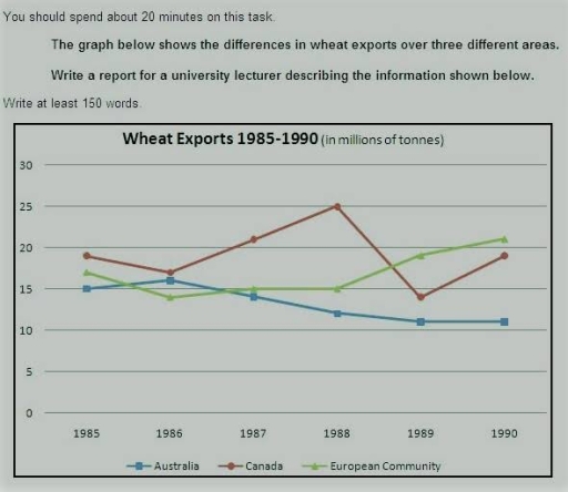
Band 5+: The line graph below shows the differences in wheat exports over three different areas.

Image for topic: The line graph below shows the differences in wheat exports over three different areas.
Our system will evaluate the answer based on this AI-generated description.
The image shows a line graph displaying wheat exports from 1985 to 1990 in millions of tonnes for Australia, Canada, and the European Community. In 1985, Australia exported around 15 million tonnes, Canada exported just over 20 million tonnes, and the European Community exported slightly below 15 million tonnes. In 1986, Australia's exports fell to about 11 million tonnes, Canada's exports increased to approximately 25 million tonnes, and the European Community's exports decreased to under 14 million tonnes. In 1987, all three saw a decline, with Australia at about 9 million tonnes, Canada at about 19 million tonnes, and the European Community at around 13 million tonnes. In 1988, Australia's exports rose to about 15 million tonnes, Canada's exports also increased to around 21 million tonnes, and the European Community's exports jumped to about 20 million tonnes. In 1989, Australia's exports declined to around 11 million tonnes, Canada's exports drastically decreased to about 15 million tonnes, and the European Community's exports rose sharply to about 24 million tonnes. In 1990, Australia's exports remained around 11 million tonnes, Canada's exports increased to approximately 19 million tonnes, and the European Community's exports decreased slightly to around 21 million tonnes.
Given the complexity of the image, the above description may not be entirely accurate.
Note: Both the topic and the answer were created by one of our users.

The line graph illustrates the trends of wheat trading in different areas (Australia, Canada, European community) during 1985 and 1990.

Overall, it is evident that European community and expanded their output and became top exportor.Caneda was the top contributor for a conciderable time period and they reached highest recorded sales in 1988 however they were unable to continue the postive tend.

In 1985, Canada was the champion exporter with exporting just below 20 million tons. While European was second place with the sales of well above 15 million tons. Australia was at the bottom with 15 million tons.Between 1985 and 1988 Canada gradually maximized their production and reach the peak of 25 million tons.However, until 1988, Europe’s and Australia’s international market got shrink.During 1988 1989 Canada lost their demand and produce went down by approximately 10 million tons. However, in next year they manage to improve and provide nearly 20 million tons.Meanwhile Europeans gradually expanded their production during 1988-1990 and reached their peak quantity ever recorded which is above 20 million tons and became top exporter. In contrast to the general upward trend, Australia declined consistently. In 1990 their contribution was just above 10 million tons.This was significantly lower compared to other two countries in 1990.

Word Count: 206

Answers On The Same Topic:

The line graph below shows the differences in wheat exports over three different areas.

The line chart below indicates the amount of wheat that has been exported in different areas such as Canada, Australia, and the European community. Overall, as the graph shows, only European community had upward trend over the period, while Australia steadily decreased. In terms of Canada, its percentages substantially fluctuated In 1985 Australia had slight […]

The line graph below shows the differences in wheat exports over three different areas.

The diagram delineate the differences in wheat exports among three different regions such as Australia, Canada and European Community during 5-year time frame starting from 1985. Overall,the three regions experienced vastly different trends.While European Community had the best results,Australia’s exports slightly decreased over period.Meanwhile,the wheat exports of Canada faced significant flactuations but remained the high […]

The line graph below shows the differences in wheat exports over three different areas.

The graph below provides information about count of wheat which were exporting in Australia, Canada, European Community between 1985 and 1990 years. The most striking information is that at the beginning-Canada exporting the biggest amount of wheat, while European Community exported litlle less than Canada. In 5 years amount of wheat exports fluctuated, however at […]

The line graph below shows the differences in wheat exports over three different areas.

In this report I am going to describe the one line graph.The graph illustrates that the export of wheat in three different contries Australia,Canada and European comunity. The export is softly same and average 10 to 25 millions of tons. from 1985 to 1990 canada is bit higher in 1988. Austrila lose thier export continuesly. […]

See All

Other Topics:

The graph below gives information about the number of jobs in four sectors economy in the US between 1960 and 2020.

The line chart illustrates the percentage of works in four different steps of the economny in the Us from 1960 and 2020. Overall, The workers in manufacturing and agriculture showed an downward trend, while retail and healthcare experienced a upward trend throghout the period. As can be seen that, The number of jobs in manufacturing […]

The graph below shows the number of visitors to three museums in London from 2000 to 2020.

The graph compares the figures for visitors to three different museums: the British Museum, the Natural History Museum, and the Science Museum from 2000 to 2020. The figures are shown in millions. Overall, all three museums experienced an upward trend in the number of visitors. This is evidence that the figures for the Natural History […]

The line graph below shows the percentage of households in Singapore owned in four different consumer items (computer, car, air conditioning, washing machine) between 1973 and 2008.

The line graph illustrates percentage of households that own electronic devices in Australia between 1973 and 2008. Overall, all figures increased over the period. However air conditioning saw small changes compared to other figures. while there was significant change in computer percentage despite its usage started later than others. Car and washing machine experienced almost […]

The graph compares employment rates in the 3 sectors of economy, in the UK, 2000-2010.

The line graph illustrates rates of employment in 3 different sectors of the economy in the UK between 2000 and 2010. Overall, proportion of people employed in the private sector showed a steady decline throughout the period. While, the figures for the public sector and self-employed people increased slightly. From 2000 to 2010, private sector […]

The line graph shows the use of solar energy in four different countries.Summarise the information by selecting and reporting the main features, and make comparisons where relevant.

The line chart depicts the consumption of solar power in the USA, Germany, Japan and China over a period of 20 years. Overall, solar power consumption increased substantially in the USA and China, although China’s growth was particularly dramatic after 2005. Japan’s use decreased gradually and Germany’s remained relatively stable. The United States was the […]

The graph shows the income of four restaurants in Cambridge in 2016. Summarize the information by selecting and reporting the main features, and make comparisons where relevant.

The graph illustrates the profits on four restaurants in Cambridge in 2016, the restaurants are The Grosvenor, The Old Hall, The Pizza House, and The Taj Mahal. The profits unit is written in 1000s of pounds. Overall, The Grosvenor got the most income in the first month, but in the end of the year the […]

See All
We have detected unusual activity on your device.
Please verify your identity to continue.
Note: This verification step won't sign you in. If you have a premium account, please log in to access the service as usual.
Google/Gmail Verification
Or verify using Email/Code
We've sent a verification code to:
youremail@gmail.com (Not your email?)
Enter it below to complete the verification process.
Ensure your email address is correct, your inbox is not full, and you check your spam folder. If no email arrives, consider using an alternative email.
You will need a Premium plan to perform your action!
Note: If you already have a premium account, please log in to access our services as usual.

Plans & Pricing

Our mission is to make quality education accessible for everyone.
However, to keep our hardworking team running and this service alive, we genuinely need your support!
By opting for a premium plan, not only do you sustain us in achieving the mission, but you also unlock advanced features to enrich your learning experience.

Free

For learners who aren't pressed for time

What's included on Free
100+ Cambridge IELTS Tests
Instant IELTS Writing Task 1 & 2 Evaluation (2 times/month)
Instant IELTS Speaking Part 1, 2, & 3 Evaluation (2 times/month)
Instant IELTS Writing Task 1 & 2 Essay Generator (2 times/month)
500+ Dictation & Shadowing Exercises
100+ Pronunciation Exercises
Flashcards
Other Advanced Tools

Premium

For those serious about advancing their English proficiency, and for IELTS candidates aspiring to boost their band score by 1-2 points (especially in writing & speaking) in just 30 days or less

What's included on Premium
Save Your IELTS Test Progress & Analyze Mistakes By Question Type
Save Your Own Flashcard Sets & Use Them On Any Device
Unlock All Courses, IELTS Tests, Section & Part Practice
Unlimited AI Conversations
Unlimited AI Writing Enhancement Exercises
Unlimited IELTS Writing Task 1 & 2 Evaluation
Unlimited IELTS Speaking Part 1, 2, & 3 Evaluation
Checked Answers Will Not Be Published
Unlimited IELTS Writing Task 1 & 2 Essay Generator
Unlimited IELTS Speaking Part 1, 2, & 3 Sample Generator
Unlimited Usage Of Advanced Tools & AI Features
Priority Support within 24h (12-month plan only)

Due to the nature of our service and the provided free trials, payments are non-refundable.
Buy activation codes in bulk and give one to each learner. A code does not expire until it is used, and each subscription only starts counting once its code is entered, so you can buy now and hand them out later.

10+ codes: 10% off 25+ codes: 15% off 50+ codes: 20% off
The codes are emailed to your payment address as soon as the payment goes through, and are also shown on the confirmation page. A tax invoice is issued automatically at checkout — select Purchasing as a business there to put your organization's name and tax ID on it.
Nếu bạn là người Việt Nam và không có hoặc không muốn trả bằng credit/debit cards, bạn có thể thanh toán bằng phương thức chuyển khoản:


Chọn gói:
419,000₫ 277,000 ₫ cho gói 1 tháng (chỉ 9,233₫/ngày)
1,239,000₫ 597,000 ₫ cho gói 3 tháng (chỉ 6,633₫/ngày)
2,469,000₫ 1,027,000 ₫ cho gói 6 tháng (chỉ 5,706₫/ngày)
4,929,000₫ 1,417,000 ₫ cho gói 12 tháng (chỉ 3,936₫/ngày)


Sau khi chuyển khoản, vui lòng đợi trình duyệt tự động điều hướng bạn trở lại Engnovate và bạn sẽ ngay lập tức nhận được mã kích hoạt tài khoản premium.
Nếu có lỗi xảy ra, bạn có thể liên hệ với team thông qua một trong các phương thức: email đến helloengnovate@gmail.com hoặc nhắn tin qua facebook.com/engnovate.
Vì toàn bộ công cụ trên website đều có thể sử dụng thử miễn phí, Engnovate không hỗ trợ hoàn tiền.