🔥 Today Only: Save 30% on Premium — Offer Ends Soon! - Upgrade Now!
Multiple Graphs

Band 4+: The line graph below shows the population size, birth rate and the death rate of England and Wales from 1700 to 2000. Summarise the information by selecting and reporting the main features and make comparisons where relevant.

Image for topic: The line graph below shows the population size, birth rate and the death rate of England and Wales from 1700 to 2000. Summarise the information by selecting and reporting the main features and make comparisons where relevant.
Our system will evaluate the answer based on this AI-generated description.
The image is a graph with two y-axes, the left one representing population size in millions, from 0 to 55 in increments of 5, and the right one representing birth and death rate per 1,000 people, from 0 to 55 in increments of 5. The x-axis represents the years 1700 to 2000 in increments of 50. There are three lines, one solid and two dotted, representing population size, birth rate, and death rate, respectively. The solid line indicates population size remains steady at 5 million from 1700 to 1750, then rises gradually to 10 million by 1800, reaches 15 million in 1850, and then increases sharply reaching 30 million by 1900, 45 million by 1950, and peak over 50 million by 2000. The dotted lines indicate birth and death rates, with the birth rate starting around 40 per 1,000 people in 1700, increasing to 45 around 1750, then declining to 35 by 1800, fluctuating between 35 and 40 until 1900, then dropping sharply to slightly above 15 in 1950 and stabilizing around 10 in 2000. The death rate starts at 35 per 1,000 people in 1700, rises to 45 in 1750, then drops steeply to slightly above 20 by 1800, fluctuates between 20 and 25 until 1900, then declines sharply to approximately 10 in 1950 and maintains a consistent 10 in 2000.
Given the complexity of the image, the above description may not be entirely accurate.
Note: Both the topic and the answer were created by one of our users.

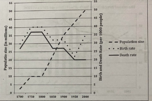
The line graph illustrates the population size and the death rate of England and Wales from 1700 to 2000.

Overall, it is evident that the number of people increased, while there was a decline in others.

The population size was about 2.5 million in 1700, which moderately increased to 10 million in 1750, as well as a stability in from 1900 to 2000. There was a significant increase of to million during the period. The number was 30 per 1000 people at the beginning of the period, while it gradually increased by 43 per 1000 people in the next 50 years followed by a stability in 1900. There was a fluctuation of nearly 7 per 1000 people between 1980 and 2000.

When it comes to death rate, the figure was around 27 per 1000 people in 1700, whereas it sharply increased to almost 3x per 1000 people in 1800. The next few decades followed by a stability in 1800. There was a decline of 17 per 1000 people from 1800 to 2000.

Word Count: 172

Answers On The Same Topic:

The line graph below shows the population size, birth rate and the death rate of England and Wales from 1700 to 2000. Summarise the information by selecting and reporting the main features and make comparisons where relevant.

The line graph below illustrates the population including birth rate and the death rate in England and Wales starting from the 18th century until the 21st century. The information is divided into 3 groups which mention the number of population size, birth rate and death rate per 1000 people. Overall, population size in both countries […]

The line graph below shows the population size, birth rate and the death rate of England and Wales from 1700 to 2000. Summarise the information by selecting and reporting the main features and make comparisons where relevant.

The line graph illustrates the population size, birth rate, and the death rate of 2 distinct countries in the UK across three centuries. Information is divided between a 50 year period. We can see a steady incline in population size from the two countries which peaked in the year 2000, showing signs of continuous growth. […]

The line graph below shows the population size, birth rate and the death rate of England and Wales from 1700 to 2000. Summarise the information by selecting and reporting the main features and make comparisons where relevant.

The given line elucidates the population rate, fertility rate, and the mortality rate of England and Wales throughout the period from 1700 to 2000. Overall, the most striking aspect shown in this figure is that the figure of population size increased, whereas there was a downward trend in the figure for fertility rate and mortality […]

The line graph below shows the population size, birth rate and the death rate of England and Wales from 1700 to 2000. Summarise the information by selecting and reporting the main features and make comparisons where relevant.

The given graph illustrates the information about population size and compares the birth rate and mortality rate in England and Wales over a 300-year period from 1700 to 2000. Overall, it is clear that the population of England and Wales showed an upward trend and reached at peak in 2000 which was 50 million while […]

The line graph below shows the population size, birth rate and the death rate of England and Wales from 1700 to 2000. Summarise the information by selecting and reporting the main features and make comparisons where relevant.

The bar illustrates population size, and death and birth rate in 1700 to 2000. Overall, it can be seen that population size experienced a dramatic increase where birth rate increased slightly despite sharp fluctuation. However, the death rate declined over the period. Look into more details, the size in 1700 stood at around 3 million; […]

See All

Other Topics:

The charts below show the percentage of electricity used by different sectors in Eastern Australia in 2007 and 2010. Summarize the information by selecting and reporting and the main features, and make comparisons where relevant.

The pie chart presents a clear insight of the percentage of electricity which was used in America in 2007 and 2010. Overall, there are eight sectors and three types of differences: proportion that stayed the same – in transport, residential, commercial, agriculture and mining spheres. Also which grew a little or dropped. Moving to the […]

Writing task 1 The graph below shows the viewership of different TV programs among three different age groups. Summarise the information by selecting and reporting the main features, and make comparisons where relevant.

The pie chart provides information about program viewership by age groups ( ages 10-15, 16-20, 21-25) in sport, cartoon, film, drama, and news. Overall, it is clear that news viewership was the most popular among adults although it accounted for the smallest share among children, while the opposite was true for sport. Notably, drama, cartoon, […]

Mixed graphs. Summarize the information by selecting key information and make comparison where relevant.

The provided pie chart illustrates information about the population of six different nationalities – Australian, British, New Zealander, Chinese, Dutch, and other – in Australia, while the table presents data about the proportion of those who live in an urban or suburban place. Overall, it is evident that individuals prefer to live in the city […]

The graph gives information about the number of yearly visits from France and North America for holiday and business. Summarise the information by selecting and reporting the main features, and make comparisons where relevant.

The given line charts compare the number of tourists annually visiting in France and North America for holiday and business. Overall, It is clear that those from France paying a visit to the United Kingdom for holiday remained unchanged during one year, alongside the increase in numbers of visitors for entrepreneurial purposes, while others from […]

The pie charts below show daily computer usage by various age groups in England in 2010 and 2015.

The pie charts demonstrate the statistics about the time English people of four age categories spent in front of computers per day in 2010 and 2015. Overall, the majority of users reduced their proportions over five years, with the exception of those aged 41-50. The latter retained the smallest fraction on the charts, whereas people […]

The charts below show how the average household budget was spent in two different years. Summarize the information by selecting and reporting the main features, and make comparisons where relevant.

The pie chart gives information about the average on people’s household spending between two differnet years. Overall, while the spending on food and clothing decreased, others such as housing, healthcare, and transprotation, and other increased from the year of 1965 to 2015. As it can be seen, the average budget on food significantly declined 20% […]

See All
We have detected unusual activity on your device.
Please verify your identity to continue.
Note: This verification step won't sign you in. If you have a premium account, please log in to access the service as usual.
Google/Gmail Verification
Or verify using Email/Code
We've sent a verification code to:
youremail@gmail.com (Not your email?)
Enter it below to complete the verification process.
Ensure your email address is correct, your inbox is not full, and you check your spam folder. If no email arrives, consider using an alternative email.
You will need a Premium plan to perform your action!
Note: If you already have a premium account, please log in to access our services as usual.

Plans & Pricing

Our mission is to make quality education accessible for everyone.
However, to keep our hardworking team running and this service alive, we genuinely need your support!
By opting for a premium plan, not only do you sustain us in achieving the mission, but you also unlock advanced features to enrich your learning experience.

Free

For learners who aren't pressed for time

What's included on Free
100+ Cambridge IELTS Tests
Instant IELTS Writing Task 1 & 2 Evaluation (2 times/month)
Instant IELTS Speaking Part 1, 2, & 3 Evaluation (5 times/month)
Instant IELTS Writing Task 1 & 2 Essay Generator (2 times/month)
500+ Dictation & Shadowing Exercises
100+ Pronunciation Exercises
Flashcards
Other Advanced Tools

Premium

For those serious about advancing their English proficiency, and for IELTS candidates aspiring to boost their band score by 1-2 points (especially in writing & speaking) in just 30 days or less

What's included on Premium
Save Your IELTS Test Progress
Unlock All Courses & IELTS Tests
Unlimited AI Conversations
Unlimited AI Writing Enhancement Exercises
Unlimited IELTS Writing Task 1 & 2 Evaluation
Unlimited IELTS Speaking Part 1, 2, & 3 Evaluation
Checked Answers Will Not Be Published
Unlimited IELTS Writing Task 1 & 2 Essay Generator
Unlimited IELTS Speaking Part 1, 2, & 3 Sample Generator
Unlimited Usage Of Advanced Tools
Priority Support within 24h (12-month plan only)

Due to the nature of our service and the provided free trials, payments are non-refundable.
Nếu bạn là người Việt Nam và không có hoặc không muốn trả bằng credit/debit cards, bạn có thể thanh toán bằng phương thức chuyển khoản:


Chọn gói:
419,000₫ 277,000 ₫ cho gói 1 tháng (chỉ 9,233₫/ngày)
1,239,000₫ 597,000 ₫ cho gói 3 tháng (chỉ 6,633₫/ngày)
2,469,000₫ 1,027,000 ₫ cho gói 6 tháng (chỉ 5,706₫/ngày)
4,929,000₫ 1,417,000 ₫ cho gói 12 tháng (chỉ 3,936₫/ngày)


Sau khi chuyển khoản, vui lòng đợi trình duyệt tự động điều hướng bạn trở lại Engnovate và bạn sẽ ngay lập tức nhận được mã kích hoạt tài khoản premium.
Nếu có lỗi xảy ra, bạn có thể liên hệ với team thông qua một trong các phương thức: email đến helloengnovate@gmail.com hoặc nhắn tin qua facebook.com/engnovate.
Vì toàn bộ công cụ trên website đều có thể sử dụng thử miễn phí, Engnovate không hỗ trợ hoàn tiền.