🔥 Today Only: Save 30% on Premium — Offer Ends Soon! - Upgrade Now!
Line Graph

Band 7+: the line graph below the projected population growth of china and india.

Image for topic: the line graph below the projected population growth of china and india.
Our system will evaluate the answer based on this AI-generated description.
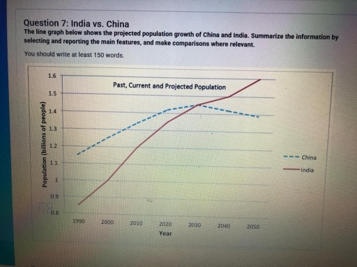
The image displays a line graph illustrating population data (billions of people) for China and India from 1990 to 2050. In 1990, China's population starts at 1.13 billion while India's is approximately 0.87 billion. By 2000, China's population reaches around 1.25 billion and India's near 1.01 billion. In 2010, China is at 1.34 billion and India at 1.17 billion. By 2020, China has a population of roughly 1.41 billion, and India has 1.32 billion. For 2030, China's projected population is 1.43 billion, and India's is 1.47 billion, marking India's population surpassing China's. In 2040, China is projected at roughly 1.44 billion and India at 1.57 billion. By 2050, China's population is expected to decline to 1.42 billion, while India's increases to 1.61 billion, maintaining India's position as more populated than China. The graph's horizontal axis represents years from 1990 to 2050, and the vertical axis indicates population in billions.
Given the complexity of the image, the above description may not be entirely accurate.
Note: Both the topic and the answer were created by one of our users.

Given line graph compares and contrasts the past, current, and projected population growth of India and China from the year 2000 to 2050.

Looking for a general perspective, the number of people in India significantly increased year by year from lowest to highest fluctuations over the entire time period. Whereas, China’s population remained stable within a nearly similar range overall.

Looking closer at the provided image, India’s population was above 0.8 in the year 1990, which was the lowest number among all years. However, in the year 2000, the population was approximately 1, and it rose steadily year by year, reaching 1.6 by the year 2050, which was the peak growth among all decades. On the other hand, China’s population was 0.8 in the initial year and increased by 0.2 in the next 5 years. Likewise, in the year 2010, it was only 1.4, although this was the peak rate in China. After that, the population remained stable at the same level for the next 4 decades.

Word Count: 167

Answers On The Same Topic:

the line graph below the projected population growth of china and india.

The graph compares the amount of population growth between China and India from 1990 to 2050. We can see that in the early 90s, China has the highest population besides India. It’s gap between India is drastically different. Though China always has more population besides India until the year of 2030, that did not show […]

the line graph below the projected population growth of china and india.

The line graph displays the total amount of humans lived in China and India and the prediction numbers of population in the future for both countries. Overall, India has a significant path with growing up pattern throughout the years, meanwhile, the total people live in China predicted to have a drop in the future. In […]

the line graph below the projected population growth of china and india.

The line graph illustrates the expected population growth of two countries, China and India. Overall, it can be seen that China’s population is predicted to decrease, while the Indian population is planned to increase by the final year, overtaking the Chinese population. To begin, in 1990, the number of inhabitants was under 1 billion in […]

the line graph below the projected population growth of china and india.

The line greaph gives information about projected population growth of Chain and India during the period from 1990 to 2050. Overall, the two countries exibited different trends over the given period, they all followed an upward trajectory, whereas the other showed a increase. However, the rates of increase significantly between them. Between 1990 and 2010, […]

See All

Other Topics:

The chart below shows the average cost of monthly contract for four different mobile phone providers in a European country from January to September 2002, measured in euro.

The line chart illustrates the average price of a mobile phone contract per month from four phone providers in a particular country in Europe throughout the period of January to September 2002. The units are measured in euros. Overall, the prices of monthly contracts increased over the given period, except for Sim TX, which was […]

The graph below shows the population figures of different types of wild birds in the United Kingdom between 1970 and 2004.

Overall , It is evidence that there is an upward trend in the number of coastal species during the period, while the figure for farmland birds shows a contrast pattern. All four species started at 100 in1970 .The coastal species’s population climbed sharply from 100 to 135 in 1986 before peaking at roughly 140 in […]

The graph gives information about the visitors to Cardiff and Dublin from 2010 to 2020. Summarise the information by selecting and reporting the main features and make comparisons where relevant. Write a minimum of 150 words

The line graph illustrates the information about the visitors to Cardiff and Dublin over a decade from 2010 to 2020. Overall, Dublin peaked at approximately 4 million visitors in the year 2011. However, it declined dramatically over the following years, reaching a record low of under 2 million visitors by the year 2020. Cardiff started […]

The line graph shows the percentage of Australians who were employed between 1976 and 2011 in four groups.

The line graph gives information about the percentage of Australians who were employed from 1976 to 2011 in groups of Men and Women. Overall, it is also clear that percentage of women always tried to rise while men dropped from the hugest figure to low. On the one hand, women’s employed percentege started the lowest […]

The graph below shows the changes in production (millions)of three products in agarment factory from 1990 to 2010. Summarize the information by selecting andreporting the main features, and make comparisons where relevant.Write at least 150 words.

The line graph illustrates the changes that occurred in the manufacture of suit, dress and coat in a garment factory between 1990 and 2010. Units are measured in millions. Overall, the production of coats experienced an upward trend across the period while suit and dress faced significant flactuations. In detail, from 1990 to 2000, the […]

The chart below shows the percentage distribution of energy sources used in a country from 1990 to 2020.

The line graph presents information about the proportion of energy generated from four main sources (coal, natural gas, nuclear power, and renewables) in one particular country over a period of three decades. Overall, coal dominated over all four main sources, while renewables was the lowest source which least generated energy before surpassing nuclear energy. Despite […]

See All
We have detected unusual activity on your device.
Please verify your identity to continue.
Note: This verification step won't sign you in. If you have a premium account, please log in to access the service as usual.
Google/Gmail Verification
Or verify using Email/Code
We've sent a verification code to:
youremail@gmail.com (Not your email?)
Enter it below to complete the verification process.
Ensure your email address is correct, your inbox is not full, and you check your spam folder. If no email arrives, consider using an alternative email.
You will need a Premium plan to perform your action!
Note: If you already have a premium account, please log in to access our services as usual.

Plans & Pricing

Our mission is to make quality education accessible for everyone.
However, to keep our hardworking team running and this service alive, we genuinely need your support!
By opting for a premium plan, not only do you sustain us in achieving the mission, but you also unlock advanced features to enrich your learning experience.

Free

For learners who aren't pressed for time

What's included on Free
100+ Cambridge IELTS Tests
Instant IELTS Writing Task 1 & 2 Evaluation (2 times/month)
Instant IELTS Speaking Part 1, 2, & 3 Evaluation (5 times/month)
Instant IELTS Writing Task 1 & 2 Essay Generator (2 times/month)
500+ Dictation & Shadowing Exercises
100+ Pronunciation Exercises
Flashcards
Other Advanced Tools

Premium

For those serious about advancing their English proficiency, and for IELTS candidates aspiring to boost their band score by 1-2 points (especially in writing & speaking) in just 30 days or less

What's included on Premium
Save Your IELTS Test Progress
Unlock All Courses & IELTS Tests
Unlimited AI Conversations
Unlimited AI Writing Enhancement Exercises
Unlimited IELTS Writing Task 1 & 2 Evaluation
Unlimited IELTS Speaking Part 1, 2, & 3 Evaluation
Checked Answers Will Not Be Published
Unlimited IELTS Writing Task 1 & 2 Essay Generator
Unlimited IELTS Speaking Part 1, 2, & 3 Sample Generator
Unlimited Usage Of Advanced Tools
Priority Support within 24h (12-month plan only)

Due to the nature of our service and the provided free trials, payments are non-refundable.
Nếu bạn là người Việt Nam và không có hoặc không muốn trả bằng credit/debit cards, bạn có thể thanh toán bằng phương thức chuyển khoản:


Chọn gói:
419,000₫ 277,000 ₫ cho gói 1 tháng (chỉ 9,233₫/ngày)
1,239,000₫ 597,000 ₫ cho gói 3 tháng (chỉ 6,633₫/ngày)
2,469,000₫ 1,027,000 ₫ cho gói 6 tháng (chỉ 5,706₫/ngày)
4,929,000₫ 1,417,000 ₫ cho gói 12 tháng (chỉ 3,936₫/ngày)


Sau khi chuyển khoản, vui lòng đợi trình duyệt tự động điều hướng bạn trở lại Engnovate và bạn sẽ ngay lập tức nhận được mã kích hoạt tài khoản premium.
Nếu có lỗi xảy ra, bạn có thể liên hệ với team thông qua một trong các phương thức: email đến helloengnovate@gmail.com hoặc nhắn tin qua facebook.com/engnovate.
Vì toàn bộ công cụ trên website đều có thể sử dụng thử miễn phí, Engnovate không hỗ trợ hoàn tiền.