🔥 Today Only: Save 30% on Premium — Offer Ends Soon! - Upgrade Now!
Line Graph

Band 5+: the line graph below the projected population growth of china and india.

Image for topic: the line graph below the projected population growth of china and india.
Our system will evaluate the answer based on this AI-generated description.
The image displays a line graph illustrating population data (billions of people) for China and India from 1990 to 2050. In 1990, China's population starts at 1.13 billion while India's is approximately 0.87 billion. By 2000, China's population reaches around 1.25 billion and India's near 1.01 billion. In 2010, China is at 1.34 billion and India at 1.17 billion. By 2020, China has a population of roughly 1.41 billion, and India has 1.32 billion. For 2030, China's projected population is 1.43 billion, and India's is 1.47 billion, marking India's population surpassing China's. In 2040, China is projected at roughly 1.44 billion and India at 1.57 billion. By 2050, China's population is expected to decline to 1.42 billion, while India's increases to 1.61 billion, maintaining India's position as more populated than China. The graph's horizontal axis represents years from 1990 to 2050, and the vertical axis indicates population in billions.
Given the complexity of the image, the above description may not be entirely accurate.
Note: Both the topic and the answer were created by one of our users.

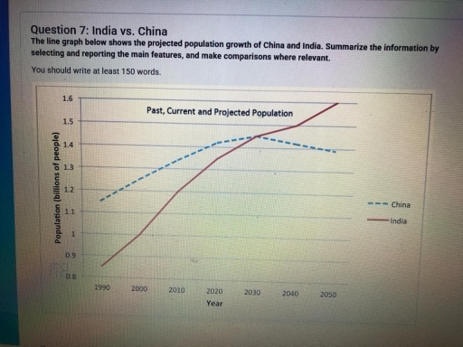
The graph compares the amount of population growth between China and India from 1990 to 2050.

We can see that in the early 90s, China has the highest population besides India. It’s gap between India is drastically different. Though China always has more population besides India until the year of 2030, that did not show that India has the least population among these 2 countries.

India has considerably increased . This number gradually rising over the years until it reached its peak in 2030. Since then, it has its highest amount of population besides China. However, China’s population slowly fell to the amount of 1.4 billion people stayed there until 2050.

In contrast, the population of India slowly continues the uprising without decreasing through the years until the climax of 1.6 billion people in 2050. India has rising steadly through the years, whereas China has gone up and down and that shows the instability of its population. It shows that people nowadays lived more in India rather than China.

Word Count: 169

Answers On The Same Topic:

the line graph below the projected population growth of china and india.

The line graph displays the total amount of humans lived in China and India and the prediction numbers of population in the future for both countries. Overall, India has a significant path with growing up pattern throughout the years, meanwhile, the total people live in China predicted to have a drop in the future. In […]

the line graph below the projected population growth of china and india.

The line graph illustrates the expected population growth of two countries, China and India. Overall, it can be seen that China’s population is predicted to decrease, while the Indian population is planned to increase by the final year, overtaking the Chinese population. To begin, in 1990, the number of inhabitants was under 1 billion in […]

the line graph below the projected population growth of china and india.

The line greaph gives information about projected population growth of Chain and India during the period from 1990 to 2050. Overall, the two countries exibited different trends over the given period, they all followed an upward trajectory, whereas the other showed a increase. However, the rates of increase significantly between them. Between 1990 and 2010, […]

the line graph below the projected population growth of china and india.

Given line graph compares and contrasts the past, current, and projected population growth of India and China from the year 2000 to 2050. Looking for a general perspective, the number of people in India significantly increased year by year from lowest to highest fluctuations over the entire time period. Whereas, China’s population remained stable within […]

See All

Other Topics:

The graph below shows the number of shops that closed and the number of new shops that opened in one country between 2011 and 2018. Summarise the information by selecting and reporting the main features, and make comparisons where relevant. Write at least 150 words.

The line graph illustrates the amount of stores that closed and the amount of new stores that opened in a country around 2011 and 2018. Overall, there was a fluctuation for the opening stores with a decreased trend. On the other hand, there was a remain steady trend with one rocket drop on one year […]

The graph below shows the population of particular coutry by age group starting in 1960 and including a forecast to 2040

The graph depicts the population of a nation in three age groups from 0 up to 65 years old between 1960 and including a forecast to 2040. Overall, the young from 0 to 14 years old a decline among 80 years, while the older groups who are over 65 years old experiencing a significant increased. […]

The graph below shows the results of a survey among online adults on their use of various social media in the USA between 2012 and 201 5.

In today’s fast – paced world, there are many various social medias. This allows them to choose that they really need. This essay is about line graph, that shows us the usage websites in the USA between 2012 and 2015. Overall, the data reveals that users in all social networks generally increased. The Facebook consistently […]

The line graph shows the percentage of spending in a European country from 1960 to 2000. Summarise the information by selecting and reporting the main features, and make comparisons where relevant.

The graph illustrates the proportion of household expenditure on food, leisure, clothing, transport, and energy in a distinct European country from 1960 to 2000. Overall, the figure for energy, clothing, leisure, and food decreased gradually, while that for transport increased consistently. Notably, the gap between several expenditure categories became much smaller by the end of […]

the graph below shows the weekdays volume of passenger activity on the toronto metro system for july 2007.

The line graph illustrates the volume of acitivity of passengers on weekdays on the Toronto Metro system for July 2007. Overall, the graph shows an unstable trend with significant fluctuation. Although the figures reached its two highest points at 8 am and 6 pm, there are considerable decreases in the number right after the rush […]

The graph below illustrates global energy demand, measured in millions of tonnes of oil equivalent, over a six-decade period.

The line graph depicts international energy consumption, expressed in millions of tonnes on an oil-equivalent basis, over 60 years, from 1970 to 2030. Over the period 1970 to 2030, oil consumption has risen considerably across all fuel types, but hydro needs are still levelling off by 2030. The most significant point is that at the […]

See All
We have detected unusual activity on your device.
Please verify your identity to continue.
Note: This verification step won't sign you in. If you have a premium account, please log in to access the service as usual.
Google/Gmail Verification
Or verify using Email/Code
We've sent a verification code to:
youremail@gmail.com (Not your email?)
Enter it below to complete the verification process.
Ensure your email address is correct, your inbox is not full, and you check your spam folder. If no email arrives, consider using an alternative email.
You will need a Premium plan to perform your action!
Note: If you already have a premium account, please log in to access our services as usual.

Plans & Pricing

Our mission is to make quality education accessible for everyone.
However, to keep our hardworking team running and this service alive, we genuinely need your support!
By opting for a premium plan, not only do you sustain us in achieving the mission, but you also unlock advanced features to enrich your learning experience.

Free

For learners who aren't pressed for time

What's included on Free
100+ Cambridge IELTS Tests
Instant IELTS Writing Task 1 & 2 Evaluation (2 times/month)
Instant IELTS Speaking Part 1, 2, & 3 Evaluation (5 times/month)
Instant IELTS Writing Task 1 & 2 Essay Generator (2 times/month)
500+ Dictation & Shadowing Exercises
100+ Pronunciation Exercises
Flashcards
Other Advanced Tools

Premium

For those serious about advancing their English proficiency, and for IELTS candidates aspiring to boost their band score by 1-2 points (especially in writing & speaking) in just 30 days or less

What's included on Premium
Save Your IELTS Test Progress
Unlock All Courses & IELTS Tests
Unlimited AI Conversations
Unlimited AI Writing Enhancement Exercises
Unlimited IELTS Writing Task 1 & 2 Evaluation
Unlimited IELTS Speaking Part 1, 2, & 3 Evaluation
Checked Answers Will Not Be Published
Unlimited IELTS Writing Task 1 & 2 Essay Generator
Unlimited IELTS Speaking Part 1, 2, & 3 Sample Generator
Unlimited Usage Of Advanced Tools
Priority Support within 24h (12-month plan only)

Due to the nature of our service and the provided free trials, payments are non-refundable.
Nếu bạn là người Việt Nam và không có hoặc không muốn trả bằng credit/debit cards, bạn có thể thanh toán bằng phương thức chuyển khoản:


Chọn gói:
419,000₫ 277,000 ₫ cho gói 1 tháng (chỉ 9,233₫/ngày)
1,239,000₫ 597,000 ₫ cho gói 3 tháng (chỉ 6,633₫/ngày)
2,469,000₫ 1,027,000 ₫ cho gói 6 tháng (chỉ 5,706₫/ngày)
4,929,000₫ 1,417,000 ₫ cho gói 12 tháng (chỉ 3,936₫/ngày)


Sau khi chuyển khoản, vui lòng đợi trình duyệt tự động điều hướng bạn trở lại Engnovate và bạn sẽ ngay lập tức nhận được mã kích hoạt tài khoản premium.
Nếu có lỗi xảy ra, bạn có thể liên hệ với team thông qua một trong các phương thức: email đến helloengnovate@gmail.com hoặc nhắn tin qua facebook.com/engnovate.
Vì toàn bộ công cụ trên website đều có thể sử dụng thử miễn phí, Engnovate không hỗ trợ hoàn tiền.