🔥 Today Only: Save 30% on Premium — Offer Ends Soon! - Upgrade Now!
Line Graph

Band 6+: The line graph shows the average number of people attending top-level football matches in three European countries from 1980 to 2004. Summarise the information by selecting and reporting the main features and make comparisons where relevant. Write at least 150 words

Image for topic: The line graph shows the average number of people attending top-level football matches in three European countries from 1980 to 2004. Summarise the information by selecting and reporting the main features and make comparisons where relevant. Write at least 150 words
Our system will evaluate the answer based on this AI-generated description.
The image contains a line graph illustrating the average attendance per top-level football match in Italy, England, and Germany from 1980 to 2004. In 1980, Italy had an attendance of 39,000, England 32,000, and Germany 25,000. By 1984, Italy's attendance slightly decreased to 38,000, England’s increased to 34,000, and Germany maintained 25,000. In 1988, Italy’s figure was 31,000, England's decreased to 30,000, and Germany's was stable at 25,000. In 1992, Italy's attendance further dropped to 29,000, England’s dipped to 21,000, while Germany's rose to 30,000. By 1996, Italy had 29,000, England slightly increased at 24,000, and Germany remained at 30,000. In 2000, Italy’s remained constant at 29,000, England increased to 33,000, and Germany stayed at 29,000. Finally, in 2004, Italy had 29,000, England rose to 35,000, while Germany experienced an increase to 33,000.
Given the complexity of the image, the above description may not be entirely accurate.
Note: Both the topic and the answer were created by one of our users.

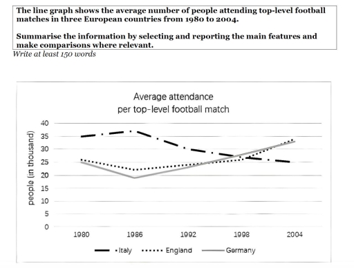
The line graph illustrates the average attendance per top-level football match by people in Italy, England, and Germany between 1980 and 2004.

Overall, Italy experienced a sharp decline over the period, while England and Germany exhibited a slight decline but ultimately became higher than Italy at the end of the period.

In 1980, around 35,000 people attended top-level football match, and by 1986, it increased slightly to roughly 37,000, making it the highest figure for attendance in the period. However, this number declined sharply to approximately 30,000 in 1992, and continued to decrease to roughly 27,000 in 1998. By 2004, this figure dropped to just around 25,000, reaching England and Germany level of attendance by 1980.

In contrast, England and Germany started at relatively similar numbers, at around 25,000 in 1980, dropped slightly to around 23,000 and 19,000 respectively in 1986. By 1992, both figures went up steadily to just around 24,000, and reached Italy number of attendance (roughly 27,000) in 1998. By 2004, they rose to just under 35,000, making in the highest figures by the end of the period.

Word Count: 181

Answers On The Same Topic:

The line graph shows the average number of people attending top-level football matches in three European countries from 1980 to 2004. Summarise the information by selecting and reporting the main features and make comparisons where relevant. Write at least 150 words

The line graph illustrates the changes in average foootbal match attendance for 3 European countries: Germany, England and Italy beetween 1980 and 2004. Overall, the most significant trend showed an Italina football, which started as the leader but ended as the least popular.In contrast,both England and Germany exprerienced a strong recovery after medium dip,finishing the […]

The line graph shows the average number of people attending top-level football matches in three European countries from 1980 to 2004. Summarise the information by selecting and reporting the main features and make comparisons where relevant. Write at least 150 words

The line graph illustrates the number of thousands of people participating in top-level footbal matches in three different European countries, namely Italy, England and Germany between 1980 and 2004. Ocerall, tge figure for England and Germany grew up noticeably while the reverse is true for Italy. Moreover, Italy stood out among other countries with consistently […]

The line graph shows the average number of people attending top-level football matches in three European countries from 1980 to 2004. Summarise the information by selecting and reporting the main features and make comparisons where relevant. Write at least 150 words

The given graph illustrates data about average numbers of attendees at high-level football matchesin three different countries for the period of 24 years, from 1980 to 2004. Overall, the number of visitors in all three countries showed fluctuating patterns. The number in Italy was dominant in the beginning but was replaced by England at the […]

The line graph shows the average number of people attending top-level football matches in three European countries from 1980 to 2004. Summarise the information by selecting and reporting the main features and make comparisons where relevant. Write at least 150 words

The char illustrates the number participants who engaged in top-level football matches in three European countries between 1980 and 2004, measured in thousand. Overall, people from England and Germany attended more matches, and this figure followed an upward trend. The reverse is true for Italy, although the number of attendances was the highest at the […]

The line graph shows the average number of people attending top-level football matches in three European countries from 1980 to 2004. Summarise the information by selecting and reporting the main features and make comparisons where relevant. Write at least 150 words

The provided graph illustrates the average attendance in top-level football matches in three European countries between 1980 and 2004. Units are measured in thousands. Overall, the number of average attendances in England and Germany increased throughout the period, whereas the reverse was true in Italy. In addition, the number of attendances in Italy dominated at […]

See All

Other Topics:

The graph below shows the number of enquiries received by the Tourist Information Office in one city over a six-month period in 2011. Summarise the information by selecting and reporting the main features, and make comparisons where relevant.

The line graph illustrates the number of inquiries received by the Tourist Information Office in a single city over six months in 2011. Overall, the number of inquiries received by two methods (‘in person’ and ‘by telephone’) generally increased throughout the period. However, the number of inquiries via letter and email declined. In-person inquiries surpassed […]

The line graph illustrates the amount of spreads consumed from 1981 to 2007, in grams

The line graph illustrates changes in the amount of three types of spreads consumption – margarine, reduced – fat reduced spreads, and butter – between 1981 and 2007. Overall, all the figures showed a downward trend over the given period. It is also clear that although the consumption of butter was the highest at first, […]

The line graph shows the change in population of 5 countries from 1800 to 2020.

The given line graph provides data regarding 5 countries’ change in population between 1800 and 2020. Overall, what stands out from the graph is that there was a significant increase in population of China ad India, whereas the population of United States, Indonesia and Brazil saw a considerable upward trend too, but they had far […]

The graph shows average annual expenditures on cell phone and residential phone services between 2001 and 2010. Summarize the information by selecting and reporting the main features, and make comparisons where relevant.

The given chart illustrates the anual money spending tendecy on services of cell phones, marked with the red line and residential phones, represented in green, from 2001 to 2010. For starters, in the first analized year it is clearly visible that the difference between residential and cell phones services si almost 500 dollers. Residential phones […]

the graph below gives information on the number of participants for different activities at one social centre.

The line graph demonstrate the information on the number of people participating in different activities at a particular social centre in two cities from 2000 to 2020. Overall, the graph reflects the participants of the people from the year 2000 to 2020, where it can be clearly visible that people are more likely to involve […]

The graph below shows the percentage of people in one country who accessed the news from four sources between 1995 and the present, with projections to 2025.

The line graph provides information about the proportion of citizens in a country who using several media such as TV, Radio, Newspaper, and Internet for accessed news between 1995 and 2020, with predictions for 2025. Units are measured in percentage. Overall, the percentage of people who used radio and newspaper generally decrease within the period, […]

See All
We have detected unusual activity on your device.
Please verify your identity to continue.
Note: This verification step won't sign you in. If you have a premium account, please log in to access the service as usual.
Google/Gmail Verification
Or verify using Email/Code
We've sent a verification code to:
youremail@gmail.com (Not your email?)
Enter it below to complete the verification process.
Ensure your email address is correct, your inbox is not full, and you check your spam folder. If no email arrives, consider using an alternative email.
You will need a Premium plan to perform your action!
Note: If you already have a premium account, please log in to access our services as usual.

Plans & Pricing

Our mission is to make quality education accessible for everyone.
However, to keep our hardworking team running and this service alive, we genuinely need your support!
By opting for a premium plan, not only do you sustain us in achieving the mission, but you also unlock advanced features to enrich your learning experience.

Free

For learners who aren't pressed for time

What's included on Free
100+ Cambridge IELTS Tests
Instant IELTS Writing Task 1 & 2 Evaluation (2 times/month)
Instant IELTS Speaking Part 1, 2, & 3 Evaluation (5 times/month)
Instant IELTS Writing Task 1 & 2 Essay Generator (2 times/month)
500+ Dictation & Shadowing Exercises
100+ Pronunciation Exercises
Flashcards
Other Advanced Tools

Premium

For those serious about advancing their English proficiency, and for IELTS candidates aspiring to boost their band score by 1-2 points (especially in writing & speaking) in just 30 days or less

What's included on Premium
Save Your IELTS Test Progress
Unlock All Courses & IELTS Tests
Unlimited AI Conversations
Unlimited AI Writing Enhancement Exercises
Unlimited IELTS Writing Task 1 & 2 Evaluation
Unlimited IELTS Speaking Part 1, 2, & 3 Evaluation
Checked Answers Will Not Be Published
Unlimited IELTS Writing Task 1 & 2 Essay Generator
Unlimited IELTS Speaking Part 1, 2, & 3 Sample Generator
Unlimited Usage Of Advanced Tools
Priority Support within 24h (12-month plan only)

Due to the nature of our service and the provided free trials, payments are non-refundable.
Nếu bạn là người Việt Nam và không có hoặc không muốn trả bằng credit/debit cards, bạn có thể thanh toán bằng phương thức chuyển khoản:


Chọn gói:
419,000₫ 277,000 ₫ cho gói 1 tháng (chỉ 9,233₫/ngày)
1,239,000₫ 597,000 ₫ cho gói 3 tháng (chỉ 6,633₫/ngày)
2,469,000₫ 1,027,000 ₫ cho gói 6 tháng (chỉ 5,706₫/ngày)
4,929,000₫ 1,417,000 ₫ cho gói 12 tháng (chỉ 3,936₫/ngày)


Sau khi chuyển khoản, vui lòng đợi trình duyệt tự động điều hướng bạn trở lại Engnovate và bạn sẽ ngay lập tức nhận được mã kích hoạt tài khoản premium.
Nếu có lỗi xảy ra, bạn có thể liên hệ với team thông qua một trong các phương thức: email đến helloengnovate@gmail.com hoặc nhắn tin qua facebook.com/engnovate.
Vì toàn bộ công cụ trên website đều có thể sử dụng thử miễn phí, Engnovate không hỗ trợ hoàn tiền.