🔥 Today Only: Save 30% on Premium — Offer Ends Soon! - Upgrade Now!
Line Graph

Band 8+: The line graph shows the number of international tourists visiting three different countries from 2000 to 2020. Summarise the information by selecting and reporting the main features, and make comparisons where relevant.

Image for topic: The line graph shows the number of international tourists visiting three different countries from 2000 to 2020. Summarise the information by selecting and reporting the main features, and make comparisons where relevant.
Our system will evaluate the answer based on this AI-generated description.
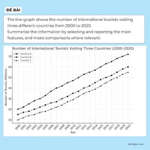
The image displays a line graph titled 'Number of International Tourists Visiting Three Countries (2000-2020)', with the number of tourists measured in millions. For Country A, the data points are: 20 (2000), 22 (2001), 24 (2002), 28 (2003), 30 (2004), 33 (2005), 37 (2006), 40 (2007), 42 (2008), 45 (2009), 48 (2010), 50 (2011), 53 (2012), 55 (2013), 57 (2014), 60 (2015), 63 (2016), 66 (2017), 68 (2018), 70 (2019), and 72 (2020). For Country B, the corresponding figures are: 15 (2000), 17 (2001), 18 (2002), 20 (2003), 22 (2004), 24 (2005), 26 (2006), 27 (2007), 30 (2008), 32 (2009), 35 (2010), 37 (2011), 40 (2012), 42 (2013), 45 (2014), 47 (2015), 50 (2016), 52 (2017), 54 (2018), 57 (2019), and 60 (2020). For Country C, the numbers are: 10 (2000), 12 (2001), 14 (2002), 15 (2003), 17 (2004), 18 (2005), 20 (2006), 22 (2007), 24 (2008), 26 (2009), 29 (2010), 31 (2011), 33 (2012), 35 (2013), 37 (2014), 39 (2015), 42 (2016), 45 (2017), 48 (2018), 52 (2019), and 55 (2020).
Given the complexity of the image, the above description may not be entirely accurate.
Note: Both the topic and the answer were created by one of our users.

The graph illustrates the number of tourists who travelled to three different countries between 2000 and 2021. Units are measured in millions.

Overall, it is clear that all of the countries show an upward trend throughout the years. International tourists dominated country A over the period. Meanwhile, country C was the least visited by international visitors.

To begin, country A was the most visited country by international tourists from the beginning until the end of the period. Moreover, the number of tourists in country A steadily increased from 20 million to above 70 million between 2000 and 2021. Similarly, country C, the least visited country, had a constant rise from 10 million to approximately 55 million.

Furthermore, country B had a similar trend to the other countries, experiencing a rise from around 15 million to 60 million over the period. At the end, country A, compared with the other countries, had a peak that was about 10 million higher. However, the number of visitors to country B and country C only had a 5 million gap.

Word Count: 176

Answers On The Same Topic:

The line graph shows the number of international tourists visiting three different countries from 2000 to 2020. Summarise the information by selecting and reporting the main features, and make comparisons where relevant.

The graph illustrates the amounts of tourists who travelled three different countries between 2000 and 2021. Units are measured in millions. Overall, it is clear that all of the countries shows an upward trend throughout the year. International tourists had dominating the country A over the period. Meanwhile, country C was the least visited by […]

The line graph shows the number of international tourists visiting three different countries from 2000 to 2020. Summarise the information by selecting and reporting the main features, and make comparisons where relevant.

The line graph illustrates the number of visitors going to three main tourist destinations over the course of 35 years since 1990. In general, there were a consistent and steady increase across 3 attractions over the surveyed time. The figure for travellers visiting place A maintained the leading position for 35 years, followed by place […]

The line graph shows the number of international tourists visiting three different countries from 2000 to 2020. Summarise the information by selecting and reporting the main features, and make comparisons where relevant.

The graph illustrates the number of international tourists visiting three countries between 2000 and 2020. Overall, there were a consistent and steady increase in all three countries throughout two decades. Country A maintained its leading position over the period, followed by country B and country C, and there was no change in their rankings over […]

See All

Other Topics:

You should spend about 20 minutes on this task The graph below shows the number of enquiries received by the Tourist Information Office in one city over a six-month period in 2011. Write at least 150 words.

The line chart illustrates how many enquiries were received by the Tourist Information Office in one city between January and June in 2011. Overall, while the number of enquiries by telephone and in person rose, that of letter or email fell over a six month period. In addition, the figure of enquiries were received in […]

The graph below shows the number of enquiries received by the Tourist Information Office in one city over a six-month period in 2011. Summarise the information by selecting and reporting the main features, and make comparisons where relevant.

The line graph illustrates the number of inquiries received by the Tourist Information Office in a single city over six months in 2011. Overall, the number of inquiries received by two methods (‘in person’ and ‘by telephone’) generally increased throughout the period. However, the number of inquiries via letter and email declined. In-person inquiries surpassed […]

The line graph illustrates the amount of spreads consumed from 1981 to 2007, in grams

The line graph illustrates changes in the amount of three types of spreads consumption – margarine, reduced – fat reduced spreads, and butter – between 1981 and 2007. Overall, all the figures showed a downward trend over the given period. It is also clear that although the consumption of butter was the highest at first, […]

The line graph shows the change in population of 5 countries from 1800 to 2020.

The given line graph provides data regarding 5 countries’ change in population between 1800 and 2020. Overall, what stands out from the graph is that there was a significant increase in population of China ad India, whereas the population of United States, Indonesia and Brazil saw a considerable upward trend too, but they had far […]

The graph shows average annual expenditures on cell phone and residential phone services between 2001 and 2010. Summarize the information by selecting and reporting the main features, and make comparisons where relevant.

The given chart illustrates the anual money spending tendecy on services of cell phones, marked with the red line and residential phones, represented in green, from 2001 to 2010. For starters, in the first analized year it is clearly visible that the difference between residential and cell phones services si almost 500 dollers. Residential phones […]

the graph below gives information on the number of participants for different activities at one social centre.

The line graph demonstrate the information on the number of people participating in different activities at a particular social centre in two cities from 2000 to 2020. Overall, the graph reflects the participants of the people from the year 2000 to 2020, where it can be clearly visible that people are more likely to involve […]

See All
We have detected unusual activity on your device.
Please verify your identity to continue.
Note: This verification step won't sign you in. If you have a premium account, please log in to access the service as usual.
Google/Gmail Verification
Or verify using Email/Code
We've sent a verification code to:
youremail@gmail.com (Not your email?)
Enter it below to complete the verification process.
Ensure your email address is correct, your inbox is not full, and you check your spam folder. If no email arrives, consider using an alternative email.
You will need a Premium plan to perform your action!
Note: If you already have a premium account, please log in to access our services as usual.

Plans & Pricing

Our mission is to make quality education accessible for everyone.
However, to keep our hardworking team running and this service alive, we genuinely need your support!
By opting for a premium plan, not only do you sustain us in achieving the mission, but you also unlock advanced features to enrich your learning experience.

Free

For learners who aren't pressed for time

What's included on Free
100+ Cambridge IELTS Tests
Instant IELTS Writing Task 1 & 2 Evaluation (2 times/month)
Instant IELTS Speaking Part 1, 2, & 3 Evaluation (5 times/month)
Instant IELTS Writing Task 1 & 2 Essay Generator (2 times/month)
500+ Dictation & Shadowing Exercises
100+ Pronunciation Exercises
Flashcards
Other Advanced Tools

Premium

For those serious about advancing their English proficiency, and for IELTS candidates aspiring to boost their band score by 1-2 points (especially in writing & speaking) in just 30 days or less

What's included on Premium
Save Your IELTS Test Progress
Unlock All Courses & IELTS Tests
Unlimited AI Conversations
Unlimited AI Writing Enhancement Exercises
Unlimited IELTS Writing Task 1 & 2 Evaluation
Unlimited IELTS Speaking Part 1, 2, & 3 Evaluation
Checked Answers Will Not Be Published
Unlimited IELTS Writing Task 1 & 2 Essay Generator
Unlimited IELTS Speaking Part 1, 2, & 3 Sample Generator
Unlimited Usage Of Advanced Tools
Priority Support within 24h (12-month plan only)

Due to the nature of our service and the provided free trials, payments are non-refundable.
Nếu bạn là người Việt Nam và không có hoặc không muốn trả bằng credit/debit cards, bạn có thể thanh toán bằng phương thức chuyển khoản:


Chọn gói:
419,000₫ 277,000 ₫ cho gói 1 tháng (chỉ 9,233₫/ngày)
1,239,000₫ 597,000 ₫ cho gói 3 tháng (chỉ 6,633₫/ngày)
2,469,000₫ 1,027,000 ₫ cho gói 6 tháng (chỉ 5,706₫/ngày)
4,929,000₫ 1,417,000 ₫ cho gói 12 tháng (chỉ 3,936₫/ngày)


Sau khi chuyển khoản, vui lòng đợi trình duyệt tự động điều hướng bạn trở lại Engnovate và bạn sẽ ngay lập tức nhận được mã kích hoạt tài khoản premium.
Nếu có lỗi xảy ra, bạn có thể liên hệ với team thông qua một trong các phương thức: email đến helloengnovate@gmail.com hoặc nhắn tin qua facebook.com/engnovate.
Vì toàn bộ công cụ trên website đều có thể sử dụng thử miễn phí, Engnovate không hỗ trợ hoàn tiền.