🔥 Today Only: Save 30% on Premium — Offer Ends Soon! - Upgrade Now!
Line Graph

Band 6+: The line graph shows the number of overseas visitors who came to the UK for different purposes between 1989 and 2009. Summarize the information by describing the main features of the charts and making comparisons where appropriate

Image for topic: The line graph shows the number of overseas visitors who came to the UK for different purposes between 1989 and 2009. Summarize the information by describing the main features of the charts and making comparisons where appropriate
Our system will evaluate the answer based on this AI-generated description.
The image presents a line graph detailing the number of overseas visitors to the UK, categorized by purpose from 1989 to 2009. In 1989, business visitors numbered approximately 4 million, holiday visitors around 6 million, and those visiting friends and relatives roughly 2 million. By 1994, business visitors remained stable near 6 million, holiday visitors peaked at nearly 9 million, and visits to friends and relatives increased to approximately 3 million. In 1999, business visits rose slightly to 7 million, holidays declined to about 8 million, while visiting friends and relatives maintained 3 million. In 2004, business visits saw a slight decline to approximately 6 million, holidays increased to 8 million, with visits to friends and relatives rising to 4 million. Finally, in 2009, business visits climbed to 9 million, holiday visits returned to around 8 million, and those visiting friends and relatives increased slightly to around 6 million.
Given the complexity of the image, the above description may not be entirely accurate.
Note: Both the topic and the answer were created by one of our users.

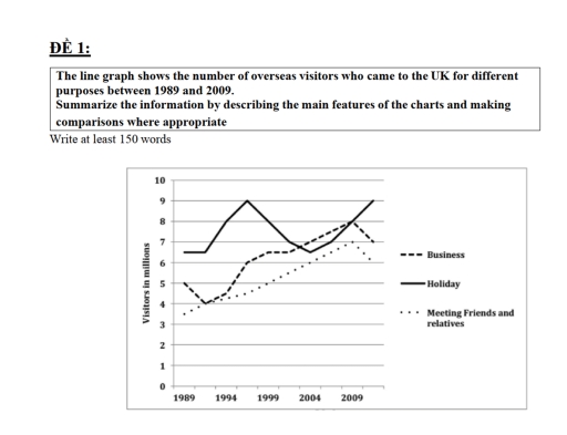
The line graph given illustrates the three purposes based on the number of foreign people who visited the UK from 1989 to 2009 at five years interval.

Looking at the illustration, it is immediately evident that holiday recorded the highest figure in most year, whereas the opposite was true for meeting friends and relatives. Additionally, most subjects surveyed show an overall upward changes – except for holiday.

In the first year, the number of holiday dominated the chart at approximately six and a half million visitors, which was roughly 1,5 million higher than business, while meeting relationships ranked last with 3,5 million.

In the year of 2004, business witnessed a significant growth and became the largest figure of that year, compared to the small changes of the others.In 2009, after some fluctuations, the graph ended with holiday and business to stay at the same place with 8 million travellers, while meeting friends and relatives ranked last at about 6 million.

Word Count: 160

Answers On The Same Topic:

The line graph shows the number of overseas visitors who came to the UK for different purposes between 1989 and 2009. Summarize the information by describing the main features of the charts and making comparisons where appropriate

The line graph illustrates the ratio of travelers who came United Kingdom from various countries from 1989 to 2009. Overall, the number of travelers who came to meet their friends and relatives was in increasing ratio whereas, the holidaymakers numbers over the period. However, business persons were few in number; later by years they increased […]

The line graph shows the number of overseas visitors who came to the UK for different purposes between 1989 and 2009. Summarize the information by describing the main features of the charts and making comparisons where appropriate

The line graph given compares three diffirent kinds of purposes based on the amount of overseas visitors visiting the Britain between 1989 and 2009, at 5-years intervals. Looking at the illustration, it is immediately evident that holiday recorded the highest figures in most years, whereas the opposite was true for meeting friends and relatives. Additionally, […]

The line graph shows the number of overseas visitors who came to the UK for different purposes between 1989 and 2009. Summarize the information by describing the main features of the charts and making comparisons where appropriate

The line chart given compare three different purposes for visiting the UK based on the number of overseas visitors between 1989 and 2009, at five-year intervals. Looking at the graph, it is clear that holidays were always the most popular reason for visiting the UK, while visiting friends and relatives was the least common. In […]

The line graph shows the number of overseas visitors who came to the UK for different purposes between 1989 and 2009. Summarize the information by describing the main features of the charts and making comparisons where appropriate

The line graph given compares three different purposes attract the number of overseas visitors who came to the UK based on millions of visitors from 1989 to 2009, at five-year intervals. Looking at the illustrations, it is immediately evident that holiday recorded the highest figure in most year, whereas, the opposite was true for meeting […]

The line graph shows the number of overseas visitors who came to the UK for different purposes between 1989 and 2009. Summarize the information by describing the main features of the charts and making comparisons where appropriate

The line chart given compares three different purposes for visiting the UK based on the number of overseas visitors from 1989 to 2009, at five-year intervals. Looking at the illustration, it is immediately evident that holidays recorded the highest figure throughout the period, whereas the opposite was true for meeting friends and relatives. Additionally, all […]

See All

Other Topics:

Percentage of first year teachers with regular teaching jobs by year of graduation

The line chart illustrates the percentage of first-year teachers with regular teaching jobs by year of graduation from 2001 to 2007 in Ontario. Overall, the data is presented every one years. Additionally, the illustartion provides information about English and French language teachers. In 2007, the percentage of first-year English language teachers accounted for the lowest […]

Task 1: The line graph shows the percentages of Australian exports with four countries.

The line chart illustrates how the proportion of Austrialin exponts changed in four different countries over a period 22 years, starting from years. were Overall, it can be seen that there were upwared trends in the China, US and India wheras the Japan was showed a downwand trend over a perciod. According to the chant, […]

The line graph provides data on the quantity of parcels delivered by two major mail service companies, FedEx and TNT, between 1920 and 2000.

The line graph illustrates how many parcels were transported by FedEx and TNT mail services companies over the 80 years between 1920 and 2000. Overall, TNT company deliveries showed a significant increase over the period shown until being more popular. Although the number of items delivered by FedEx fluctuated, this figure remained dominant for most […]

The chart below gives information about car ownership in households in the UK between 1951 and 2007.

The line graph illustrates car ownership in Britain from 1951 to 2007. Overall, almost all figures, namely, people who owned one car, two cars and, three or more cars followed an upward trend. The reverse was true for no car ownership, despite being the most common option to at the beginning of the period. As […]

Task 1: The graph below shows the average time spent by four car manufacturers to produce vehicles at their US factories.

The line graph compares the average number of hours required to manufacture vehicles in the US by four car companies – General Motor, Ford, Toyota and Honda – between 1998 and 2005. Overall, the time needed to produce cars generally declined over the period, especially for General Motor and Ford. Japanese manufacturers, Toyota and Honda, […]

The graph below shows the percentage of people by age group visiting the cinema at least once per month in one particular country between 1978 and 2008. Summarise the information by selecting and reporting the main features, and make comparisons where relevant.

The line graph illustrates the proportion of people by age bracket who visited the cinema at least once a month in a specific nation from 1978 to 2008. Overall, it is clear that there were some minor fluctuations in the rates of people of all ages going to the cinema. Additionally, young adults aged 14-24 […]

See All
We have detected unusual activity on your device.
Please verify your identity to continue.
Note: This verification step won't sign you in. If you have a premium account, please log in to access the service as usual.
Google/Gmail Verification
Or verify using Email/Code
We've sent a verification code to:
youremail@gmail.com (Not your email?)
Enter it below to complete the verification process.
Ensure your email address is correct, your inbox is not full, and you check your spam folder. If no email arrives, consider using an alternative email.
You will need a Premium plan to perform your action!
Note: If you already have a premium account, please log in to access our services as usual.

Plans & Pricing

Our mission is to make quality education accessible for everyone.
However, to keep our hardworking team running and this service alive, we genuinely need your support!
By opting for a premium plan, not only do you sustain us in achieving the mission, but you also unlock advanced features to enrich your learning experience.

Free

For learners who aren't pressed for time

What's included on Free
100+ Cambridge IELTS Tests
Instant IELTS Writing Task 1 & 2 Evaluation (2 times/month)
Instant IELTS Speaking Part 1, 2, & 3 Evaluation (5 times/month)
Instant IELTS Writing Task 1 & 2 Essay Generator (2 times/month)
500+ Dictation & Shadowing Exercises
100+ Pronunciation Exercises
Flashcards
Other Advanced Tools

Premium

For those serious about advancing their English proficiency, and for IELTS candidates aspiring to boost their band score by 1-2 points (especially in writing & speaking) in just 30 days or less

What's included on Premium
Save Your IELTS Test Progress
Unlock All Courses & IELTS Tests
Unlimited AI Conversations
Unlimited AI Writing Enhancement Exercises
Unlimited IELTS Writing Task 1 & 2 Evaluation
Unlimited IELTS Speaking Part 1, 2, & 3 Evaluation
Checked Answers Will Not Be Published
Unlimited IELTS Writing Task 1 & 2 Essay Generator
Unlimited IELTS Speaking Part 1, 2, & 3 Sample Generator
Unlimited Usage Of Advanced Tools
Priority Support within 24h (12-month plan only)

Due to the nature of our service and the provided free trials, payments are non-refundable.
Nếu bạn là người Việt Nam và không có hoặc không muốn trả bằng credit/debit cards, bạn có thể thanh toán bằng phương thức chuyển khoản:


Chọn gói:
419,000₫ 277,000 ₫ cho gói 1 tháng (chỉ 9,233₫/ngày)
1,239,000₫ 597,000 ₫ cho gói 3 tháng (chỉ 6,633₫/ngày)
2,469,000₫ 1,027,000 ₫ cho gói 6 tháng (chỉ 5,706₫/ngày)
4,929,000₫ 1,417,000 ₫ cho gói 12 tháng (chỉ 3,936₫/ngày)


Sau khi chuyển khoản, vui lòng đợi trình duyệt tự động điều hướng bạn trở lại Engnovate và bạn sẽ ngay lập tức nhận được mã kích hoạt tài khoản premium.
Nếu có lỗi xảy ra, bạn có thể liên hệ với team thông qua một trong các phương thức: email đến helloengnovate@gmail.com hoặc nhắn tin qua facebook.com/engnovate.
Vì toàn bộ công cụ trên website đều có thể sử dụng thử miễn phí, Engnovate không hỗ trợ hoàn tiền.