24 Hours Only: Get 39% OFF on Our Premium Plan - Check Out Now!
Line Graph

Band 5+: The line graph shows the percentage of people using four different modes of transport in a city from 2000 to 2020. Summarise the information by selecting and reporting the main features, and make comparisons where relevant.

Image for topic: The line graph shows the percentage of people using four different modes of transport in a city from 2000 to 2020. Summarise the information by selecting and reporting the main features, and make comparisons where relevant.
Our system will evaluate the answer based on this AI-generated description.
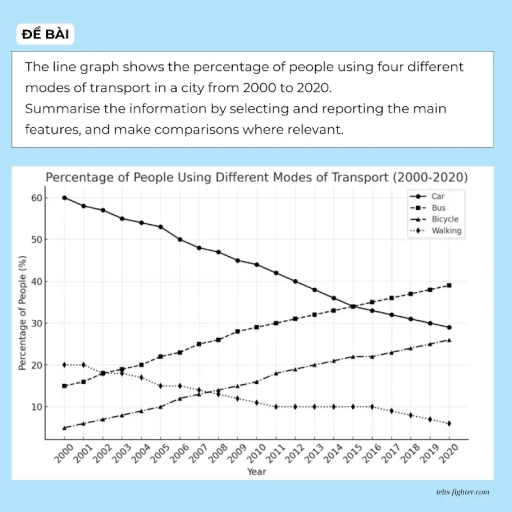
The image shows a line graph, 'Percentage of People Using Different Modes of Transport (2000-2020)', detailing usage for four modes. Car (%): 2000-60, 2001-58, 2002-57, 2003-55, 2004-54, 2005-53, 2006-50, 2007-48, 2008-47, 2009-45, 2010-43, 2011-42, 2012-40, 2013-38, 2014-36, 2015-35, 2016-33, 2017-32, 2018-31, 2019-30, 2020-29. Bus (%): 2000-15, 2001-16, 2002-18, 2003-19, 2004-21, 2005-22, 2006-23, 2007-25, 2008-26, 2009-28, 2010-29, 2011-30, 2012-32, 2013-33, 2014-34, 2015-35, 2016-36, 2017-37, 2018-38, 2019-39, 2020-39. Bicycle (%): 2000-5, 2001-6, 2002-7, 2003-8, 2004-9, 2005-10, 2006-12, 2007-14, 2008-13, 2009-15, 2010-16, 2011-18, 2012-20, 2013-21, 2014-22, 2015-23, 2016-23, 2017-24, 2018-25, 2019-26, 2020-27. Walking (%): 2000-20, 2001-20, 2002-18, 2003-15, 2004-14, 2005-14, 2006-15, 2007-13, 2008-12, 2009-11, 2010-10, 2011-10, 2012-10, 2013-10, 2014-10, 2015-10, 2016-10, 2017-9, 2018-8, 2019-7, 2020-6.
Given the complexity of the image, the above description may not be entirely accurate.
Note: Both the topic and the answer were created by one of our users.

This graph illustrates the percentage of people using different mode of transports over 20 years.

Overall, we can see a gradual decline of people using cars in term of percentages with 60 % starting from 2000 to around 30 % in the late of 2020, Similarly, with raise of other meaning of transports, walking percentages saw a a noticeable decrease with around 15 % over the whole period .While the percentage of Bus and bycles usage as are in parallel increase.

Bus usage witnessed an upward trend, as it is shown it reached 40%, as well bicycles it increased from 5% to 25%

Finally, these trends changes are a subqcuence of a certain cicrcumstances adjusments, like the raise of poplation number, infrastructure development and the new insert of means of transportation to fully cover the needs of people.

Word Count: 138

Answers On The Same Topic:

The line graph shows the percentage of people using four different modes of transport in a city from 2000 to 2020. Summarise the information by selecting and reporting the main features, and make comparisons where relevant.

The data presents information about the most usefull different kinds of transport in a city: car, bus, bicycle, walking from 2000 to 2020. Overall, all using transports got changing over the given period. A car went down gradually but stayed at leaders, while showed the most downward trend. In contrast, bus and bicycle increased steadily. […]

The line graph shows the percentage of people using four different modes of transport in a city from 2000 to 2020. Summarise the information by selecting and reporting the main features, and make comparisons where relevant.

The line graph illustrates the proportion of individuals using four different transportation: car, bus, bicycle, and walking in a city between 2000 and 2020. Overall, there were a dramatic decrease in proportion across car and walking over the two decades, while bus and bicycle experienced a growth in using percentage. Car lost its leading position […]

See All

Other Topics:

The graph shows the percentage of travel by four different types of transport in one country between 1985 and 2015.

The line graph illustrates changes in the percentage of travel by four different means of transport in one country from 1985 to 2015. Overall, while the proportion of trips by car increased dramatically, the opposite trend was observed in bus and other modes, except for rail where the figure remained unchanged. Notably, car demonstrated the […]

The graph below gives information on the numbers of participants for different activities at one social centre in Melbourne, Australian for the period 2000 to 2020. Summarise the information by selecting and reporting the main features and make comparisons where relevant

The line graph depicts changes in the number of participants for different activities at one social centre in Melbourne, Australian between 2000 and 2020. Overall, table tennis and musical performances showed a significant growth, whereas amateur dramatics declined notably. Meanwhile, film club and martial arts fluctuated modestly over the period. The film club remained the […]

The graph below compares figures for the production and consumption of energy in the US from 1950 to 2000. It also predicts figures for 2025. Summarise the information by selecting and reporting the main features, and make comaprisons where relevant. Write at least 150 words.

The line graph illustrates changes in energy production and consumption in the US from 1950 to 2000, with further projections reaching 2025. Data is measured in energy units (quadrillion BTUs). Overall, both energy production and consumption in the US have shown an upward trend over the period. However, since the mid-1950s, consumption has consistently outpaced […]

The line graph below shows inflation statistics in six countries between 1995 and 2015.

The line graph illustrates information about the changes in inflation statistics in six countries, namely Vietnam, Costa Rica, Greece, Nigeria, India, and Poland, over the period from 1995 to 2015. Overall, it is immediately apparent that Greece, India, and Costa Rica experienced significant growth throughout the period, whereas Poland showed downward trend. Meanwhile, Nigeria and […]

The graph below gives information about consumption of energy in one country between 2000 and 2020 with projections until 2050. Summarise the information by selecting and reporting the main features, and make comparisons where relevant.

The line graph shows usage levels of the consumption of energy based on different types of fuel sources in one county between 2000 and 2020, with predictions for the years 2020 and 2050. Overall, total energy consumption increased , while some of the types of fossil fuels showed different levels from the beginning to the […]

The line graph below shows the differences in wheat exports over three different areas.

The line graph illustrates the trends of wheat trading in different areas (Australia, Canada, European community) during 1985 and 1990. Overall, it is evident that European community and expanded their output and became top exportor.Caneda was the top contributor for a conciderable time period and they reached highest recorded sales in 1988 however they were […]

See All
We have detected unusual activity on your device.
Please verify your identity to continue.
Note: This verification step won't sign you in. If you have a premium account, please log in to access the service as usual.
Google/Gmail Verification
Or verify using Email/Code
We've sent a verification code to:
youremail@gmail.com (Not your email?)
Enter it below to complete the verification process.
Ensure your email address is correct, your inbox is not full, and you check your spam folder. If no email arrives, consider using an alternative email.
You will need a Premium plan to perform your action!
Note: If you already have a premium account, please log in to access our services as usual.

Plans & Pricing

Our mission is to make quality education accessible and free for everyone.
However, to keep our hardworking team running and this service alive, we genuinely need your support!
By opting for a premium plan, not only do you sustain us in achieving the mission, but you also unlock advanced features to enrich your learning experience.

Free

For learners who aren't pressed for time

What's included on Free
1000+ IELTS Tests & Samples
Instant IELTS Writing Task 1 & 2 Evaluation (2 times/month)
Instant IELTS Speaking Part 1, 2, & 3 Evaluation (5 times/month)
Instant IELTS Writing Task 1 & 2 Essay Generator (2 times/month)
500+ Dictation & Shadowing Exercises
100+ Pronunciation Exercises
Flashcards
Other Advanced Tools

Premium

For those serious about advancing their English proficiency, and for IELTS candidates aspiring to boost their band score by 1-2 points (especially in writing & speaking) in just 30 days or less

What's included on Premium
Save Your IELTS Test Progress
Unlock All Courses & Content
Unlimited AI Conversations
Unlimited AI Writing Enhancement Exercises
Unlimited IELTS Writing Task 1 & 2 Evaluation
Unlimited IELTS Speaking Part 1, 2, & 3 Evaluation
Checked Answers Will Not Be Published
Unlimited IELTS Writing Task 1 & 2 Essay Generator
Unlimited IELTS Speaking Part 1, 2, & 3 Sample Generator
Unlimited Usage Of Advanced Tools

Due to the nature of our service and the provided free trials, payments are non-refundable.
Nếu bạn là người Việt Nam và không có hoặc không muốn trả bằng credit/debit cards, bạn có thể thanh toán bằng phương thức chuyển khoản:


Chọn gói:
279,000₫ 157,000 ₫ cho gói 1 tháng (chỉ 5,233₫/ngày)
819,000₫ 397,000 ₫ cho gói 3 tháng (chỉ 4,411₫/ngày)
1,649,000₫ 667,000 ₫ cho gói 6 tháng (chỉ 3,706₫/ngày)
3,299,000₫ 857,000 ₫ cho gói 12 tháng (chỉ 2,381₫/ngày)


Sau khi chuyển khoản, vui lòng đợi trình duyệt tự động điều hướng bạn trở lại Engnovate và bạn sẽ ngay lập tức nhận được mã kích hoạt tài khoản premium.
Nếu có lỗi xảy ra, bạn có thể liên hệ với team thông qua một trong các phương thức: email đến helloengnovate@gmail.com hoặc nhắn tin qua facebook.com/engnovate.
Vì toàn bộ công cụ trên website đều có thể sử dụng thử miễn phí, Engnovate không hỗ trợ hoàn tiền.