Our system will evaluate the answer based on this AI-generated description.
The image displays a line graph with four lines representing the percentages of Australian exports to four unspecified countries from 1990 to 2012. Each line starts at different percentages in 1990, ranging approximately between 5% to 15%. Through the years, the percentages fluctuate: one line (dark blue) starts near 10% in 1990, modestly increases past 5%, and reaches around 15% in 2012; another line (green) starts just above 15% in 1990, decreases to below 10% by the mid-1990s, then slightly climbs back to around 10% by 2012; a third line (red) starting around 5% in 1990 ascends steeply after 2000, surpassing 30% by 2012; the fourth line (gold) begins near 15% in 1990, shows a stable pattern with slight growth, and ends around 20% by 2012. The x-axis marks the years at five-year intervals. The y-axis is scaled from 0 to 35% in increments of 5%.
Given the complexity of the image, the above description may not be entirely accurate.
Skyrocket your IELTS band score by 1-2 points in under a month with our premium plan!
Note: Both the topic and the answer were created by one of our users.
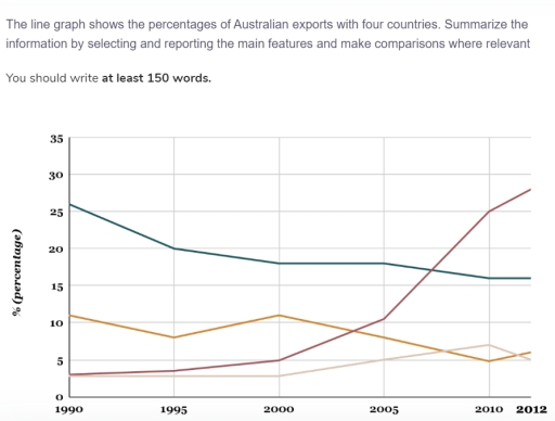
The diagram below demonstrates the amount of exports made from Australia to Japan, US, China, and India during around 20 years.
At the first glance it is clear that percentage of exports from Australia to Japan and US gradually decreased, while exports to China and India, on the contrary, slightly grew up.
Going into details, exports to Japan in 1990 amounted to about 26 percent, but in 2012 this trend showed dramatical decline, reaching the point of 16 percent. Similarly, the amount of exports to US generally decreased to almost 5 percent in the period from 1990 to 2012.
At the same time, exports to China endure overwhelming upward trend, raising from 3 percent in 1990 to 27 percent in 2012. Likewise, exports to India move upward from 3 percent in 1990 to 5 percent in 2012.
In addition, there was a considerable change in year 2000 for almost each of given countries excuding Japan. For US, trend showed sharp decrease after stable upward tendency. By contrast, China and India’s graphs progressively rose.
Word Count: 173
