🔥 Today Only: Save 30% on Premium — Offer Ends Soon! - Upgrade Now!
Line Graph

Band 7+: The number of dog and cat owners in the UK.

Image for topic: The number of dog and cat owners in the UK.
Our system will evaluate the answer based on this AI-generated description.
The image illustrates a line graph titled "The number of dog and cat owners in the UK" measured in millions from 1980 to 2015; the blue line represents dog owners, the orange line represents cat owners. In 1980, there were 7 million dog owners and 8 million cat owners; by 1985, both increased to 15 million and 17 million respectively. In 1990, dog owners slightly decreased to 14 million, while cat owners rose to 21 million. By 1995, dog owners increased to 28 million and cat owners to 32 million. In 2000, dog owners reached 35 million, while cat owners peaked at 42 million. By 2005, dog owners declined to 32 million, and cat owners slightly decreased to 44 million. In 2010, dog owners slightly increased to 39 million, while cat owners decreased to 44 million. By 2015, dog owners reached a peak of 47 million, while cat owners decreased to 39 million.
Given the complexity of the image, the above description may not be entirely accurate.
Note: Both the topic and the answer were created by one of our users.

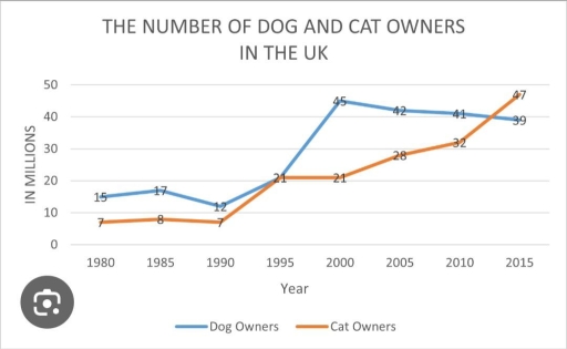
The given line graph encompasses the period spanning from 1980 to 2015, outlining the number, in millions, of dog and cat owners in the United Kingdom. Overall, it is evident that both dog and cat owners experienced an upward trend, with the latter seeing a considerable change. Notably, cat owners accounted for the highest number at the end of the period despite being the lowest figure initially.

Regarding dog owners, their number was the highest in the initial year, standing at 15 million. After a slight drop to 12 million in 1990, they witnessed a dramatic increase to 45 million in 2000; however, by 2015, the figure for them had consistently fallen to 39 million.

As for cat owners, they initially had the lowest number, starting at 7 million. Moreover, the rate for them marginally fluctuated between 1980 and 1990, after which it reached 21 million in 1995. Having remained stable at 21 million in 2000, they experienced a substantial rise, surpassing dog owners and peaking at 47 million in the final year.

Word Count: 173

Answers On The Same Topic:

The number of dog and cat owners in the UK.

The line graph illustrates the number of individuals who adopt dogs and cats in the UK. The statistics are provided in millions and contain a 35-year span from 1980 to 2015. Overall, each category increased significantly at the end of the period. Initially, the number of dog owners dominated over the number of cat owners, […]

The number of dog and cat owners in the UK.

The line graph presents information about the number of dog and cat owners in the UK between 1980 and 2015. The unit is measured in millions. Overall, the number of dog owners fluctuated over the period, showing both increases and decreases, while the figure for cat owners had a steady growth. In addition, throughout the […]

The number of dog and cat owners in the UK.

The line chart illustrates the number of pet owners, specifically dogs and cats, in the United Kingdom from 1980 to 2015. Overall, it is evident that the population of dog and cat owners has increased sharply over this time. While dog ownership was more popular at the beginning, cat ownership gained popularity at the end […]

The number of dog and cat owners in the UK.

The line chart illustrates the number of pet owners, namely dogs and cats, in the United Kingdom from 1980 to 2015. Overall, it is evident that the population of dog and cat owners has increased sharply over the entire time. While dog owners were popular at the beginning, cat owners gained popularity at the end […]

See All

Other Topics:

The graph show the different types of fast food eaten by British teenagers over a 35-year period. Summarise the information by selecting and reporting the main features, and maike comparions where relevant.

The line graph illustrates information about the changes in the different types of fast food, namely fish and chips, hamburgers, and pizza, eaten by British teenagers over the period from 1980 to 2015. Overall, it is immediately apparent that pizza experienced the most significant growth, whereas fish and chips showed a noticeable decline throughout the […]

The graph shows the quantities of goods transported in the uk between 1974 and 2002 by four different modes of transport

The line chart illustrates the quantities of goods transported using four transport modes in the United Kingdom from 1978 to 2002. Overall, all transportation forms fluctuated over the period, and roads saw the most pronounced increase in usage until the last period. The amount of goods transported by road in 1974 started at around 70 […]

Why people move to the capital city. Summarise the informations

The line chart illustrates the results of a survey which is giving the reasons that why most people are been moved to the capital of a particular country. Overall, it can be seen in the line graph that most of the time peopel concentrates on mainly three things such as employment, study and family/ friend […]

The graph below shows the value of different goods exported by France from 1990 to 2020. Summarise the information by selecting and reporting the main features, and make comparisons where relevant. Write at least 150 words.

The line graph provides information about the prices of various goods transported by France over the 30-year period between 1990 and 2020. Overall, the products that have the largest income are aicrafts and medicaments. In addition, both petrol and wine remained at the same level and have the lowest value among all goods. According to […]

The line graph illustrates the number of enquiries received by the tourist data office in particular city during six-month period in 2011.

The table illustrates the figure for enquiries collected by Tourist Information Office in only city over a six-month: January, February, March, April, May, June during in 2011. Overall, the number of inquiries that received in the office and by call increased noticeably over a six-month, while sending email decreased significantly. The number of inquiries received […]

You should spend about 20 minutes on this task. The graph below shows the percentage of money spent on advertising in five types of media in France from 2010 and projected spending to 2040. Summarise the information by selecting and reporting the main features, and make comparisons where relevant. You should write at least 150 words. Writing Task 1

The line graph illustrates how much money spent on five different kinds of advertising media in France from 2010, with projections to 2040. Overall, it is clear that the percentage of spending on newspapers, magazines, and radio will predicted to decrease in the final year. Conversely, it is probable that internet will more likely to […]

See All
We have detected unusual activity on your device.
Please verify your identity to continue.
Note: This verification step won't sign you in. If you have a premium account, please log in to access the service as usual.
Google/Gmail Verification
Or verify using Email/Code
We've sent a verification code to:
youremail@gmail.com (Not your email?)
Enter it below to complete the verification process.
Ensure your email address is correct, your inbox is not full, and you check your spam folder. If no email arrives, consider using an alternative email.
You will need a Premium plan to perform your action!
Note: If you already have a premium account, please log in to access our services as usual.

Plans & Pricing

Our mission is to make quality education accessible for everyone.
However, to keep our hardworking team running and this service alive, we genuinely need your support!
By opting for a premium plan, not only do you sustain us in achieving the mission, but you also unlock advanced features to enrich your learning experience.

Free

For learners who aren't pressed for time

What's included on Free
100+ Cambridge IELTS Tests
Instant IELTS Writing Task 1 & 2 Evaluation (2 times/month)
Instant IELTS Speaking Part 1, 2, & 3 Evaluation (5 times/month)
Instant IELTS Writing Task 1 & 2 Essay Generator (2 times/month)
500+ Dictation & Shadowing Exercises
100+ Pronunciation Exercises
Flashcards
Other Advanced Tools

Premium

For those serious about advancing their English proficiency, and for IELTS candidates aspiring to boost their band score by 1-2 points (especially in writing & speaking) in just 30 days or less

What's included on Premium
Save Your IELTS Test Progress
Unlock All Courses & IELTS Tests
Unlimited AI Conversations
Unlimited AI Writing Enhancement Exercises
Unlimited IELTS Writing Task 1 & 2 Evaluation
Unlimited IELTS Speaking Part 1, 2, & 3 Evaluation
Checked Answers Will Not Be Published
Unlimited IELTS Writing Task 1 & 2 Essay Generator
Unlimited IELTS Speaking Part 1, 2, & 3 Sample Generator
Unlimited Usage Of Advanced Tools
Priority Support within 24h (12-month plan only)

Due to the nature of our service and the provided free trials, payments are non-refundable.
Nếu bạn là người Việt Nam và không có hoặc không muốn trả bằng credit/debit cards, bạn có thể thanh toán bằng phương thức chuyển khoản:


Chọn gói:
419,000₫ 277,000 ₫ cho gói 1 tháng (chỉ 9,233₫/ngày)
1,239,000₫ 597,000 ₫ cho gói 3 tháng (chỉ 6,633₫/ngày)
2,469,000₫ 1,027,000 ₫ cho gói 6 tháng (chỉ 5,706₫/ngày)
4,929,000₫ 1,417,000 ₫ cho gói 12 tháng (chỉ 3,936₫/ngày)


Sau khi chuyển khoản, vui lòng đợi trình duyệt tự động điều hướng bạn trở lại Engnovate và bạn sẽ ngay lập tức nhận được mã kích hoạt tài khoản premium.
Nếu có lỗi xảy ra, bạn có thể liên hệ với team thông qua một trong các phương thức: email đến helloengnovate@gmail.com hoặc nhắn tin qua facebook.com/engnovate.
Vì toàn bộ công cụ trên website đều có thể sử dụng thử miễn phí, Engnovate không hỗ trợ hoàn tiền.