Our system will evaluate the answer based on this AI-generated description.
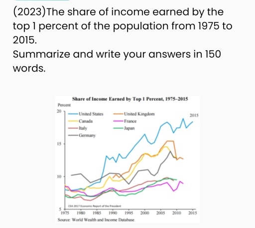
The image features a line graph displaying the share of income earned by the top 1 percent of the population in six different countries (United States, United Kingdom, Canada, France, Italy, Germany, and Japan) from 1975 to 2015. The plot lines for each country show fluctuations over the 40-year period. The United States starts just above 10% in 1975, peaks at nearly 20% around 2015. The United Kingdom begins around 5%, rising to peaks of over 15% in the early 2000s, stabilizes slightly below 15% by 2015. Canada's line starts near 8%, peaks at just under 15% by 2015. France begins slightly below 10%, increasing to approximately 10% by 2015. Italy starts under 10%, peaking slightly above 10% in the early 2000s then declines back near initial values. Germany appears to begin under 10%, reaching upwards nearer to 10% by 2015. Japan starts near 5%, increases to just above 10% around 2000, then declines to above 5% by 2015. The data points range from below 5% to nearly 20% across different countries and years.
Given the complexity of the image, the above description may not be entirely accurate.
Skyrocket your IELTS band score by 1-2 points in under a month with our premium plan!
Note: Both the topic and the answer were created by one of our users.
This diagram shows information about the contribution financial of the top 1 percent wealthiest from six distinct countries from 1975 to 2015.
Overall, it can be clearly seen that although almost all countries started at a similar degree, there was a significant variance at various levels. At the end of the period, the United States was located at the top of the list, while France reached the last position.
On the one hand, there was not a remarkable difference among countries from 1975 to 1985; however, the data of the United Kingdom was not recorded during that time. From the 90’s century, the contribution of the US, Canada, and the UK suddenly increased, especially the US always headed the list and accounted for about one-fifth of the total in 2015. Besides, the UK aligned with Canada at all times and similarly made up more than 13% in 2015.
On the other hand, even though Germany began with the highest contribution, it is variance consistent in the period of 5 years, by the range from around 8% to 12%. About the remaining countries, they started at the same degree and maintained stably for all times, finishing at about 9% in 2015.
Word Count: 200
