🔥 Today Only: Save 30% on Premium — Offer Ends Soon! - Upgrade Now!
Table

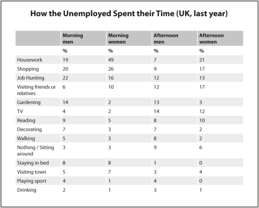
Band 7+: The table below shows how the UK unemployed spent their time last year. Summarise the information by selecting and reporting the main features, and make comparisons where relevant.

Image for topic: The table below shows how the UK unemployed spent their time last year. Summarise the information by selecting and reporting the main features, and make comparisons where relevant.
Our system will evaluate the answer based on this AI-generated description.
The image shows a chart of how unemployed individuals in the UK spent their time last year, divided into morning and afternoon activities for both men and women. Housework was the most common activity for women in the morning (49) and afternoon (21), while job hunting was the highest for men in the morning (22) and afternoon (12). Women also spent significant time visiting friends or relatives in the afternoon (17). Gardening was more common in the afternoon for both men (13) and women (3). Morning reading was slightly higher for men (9) than women (5), but the opposite was true in the afternoon with women at 10 and men at 8. Walking was more common in the afternoon for men (8) than women (2). Both men and women spent equal time staying in bed in the morning (8), but only men stayed in bed in the afternoon (1). Playing sports and drinking were the least common activities, with both being slightly higher in the afternoon for men (4).
Given the complexity of the image, the above description may not be entirely accurate.
Note: Both the topic and the answer were created by one of our users.

The table shows how men and women who were out of work last year spent their time. The information is broken down into parts of the day and fourteen different activities.

First of all, it is interesting to note that the majority of both men and women who are unemployed are engaged in productive activities in the morning with 61% of men and 91% of women either shopping, trying to secure employment or doing housework, with women being twice as likely to do the latter in the afternoon. However, figures for the afternoon show that the unemployed devote more time to leisure activities such as watching television, visiting friends or reading.

When looking at differences between genders it seems that men were more likely to be engaged with home improvement, gardening or active pursuits such as walking or taking part in sports. More sedentary activities such as staying in bed or sitting around were similar for both sexes. Twice the number of men than women spent their time drinking but this still only accounted for a very small proportion.

Overall, it appears that contrary to many stereotypical preconceptions of the unemployed both men and women do spend a proportion of each day on productive tasks with their being some interesting differences between genders.

Word Count: 213

Answers On The Same Topic:

The table below shows how the UK unemployed spent their time last year. Summarise the information by selecting and reporting the main features, and make comparisons where relevant.

The table illustrates the activities undertaken by unemployed individuals in the UK during their free time last year, divided into percentages for men and women. Overall, both men and women spent the majority of their time on home-based activities, although there were noticeable differences in how each gender allocated their time. Men were more engaged […]

The table below shows how the UK unemployed spent their time last year. Summarise the information by selecting and reporting the main features, and make comparisons where relevant.

The table presents a detailed account of how unemployed individuals in the UK allocated their time during the previous year, categorizing activities by both gender and time of day. A clear trend emerges indicating that indoor activities, particularly housework for women and job hunting for men, dominated the daily schedules of the unemployed. Conversely, recreational […]

The table below shows how the UK unemployed spent their time last year. Summarise the information by selecting and reporting the main features, and make comparisons where relevant.

The table illustrates how the unemployed population in the UK allocated their time across various activities over the past year. Notably, housework emerged as the predominant activity for women, while men predominantly engaged in job hunting. Both genders exhibited minimal participation in sports and drinking. In the morning, a significant majority of women, accounting for […]

The table below shows how the UK unemployed spent their time last year. Summarise the information by selecting and reporting the main features, and make comparisons where relevant.

The table delineates the activities undertaken by unemployed individuals in the United Kingdom over the previous year, segmented by gender and varying time slots throughout the day. Overall, the data underscores significant gender disparities in how unemployed individuals allocate their time, particularly in housework and job hunting activities. In the morning, housework emerged as the […]

The table below shows how the UK unemployed spent their time last year. Summarise the information by selecting and reporting the main features, and make comparisons where relevant.

The table shows how men and women who were out of work last year spent their time. The information is broken down into parts of the day and fourteen different activities. First of all, it is interesting to note that the majority of both men and women who are unemployed are engaged in productive activities […]

See All

Other Topics:

The line graph below shows the percentage of households with access to the Internet in three countries - Nepal, India, and Japan - between 2000 and 2020. Summarize the information by selecting and reporting the main features, and make comparisons where relevant.

The line graph shows the percentage of households with access to the Internet in Nepal, India, and Japan from 2000 to 2020. Overall, Internet access increased significantly in all three countries during the period. Japan had the highest percentage throughout, while Nepal had the lowest. However, Nepal experienced the largest relative increase. In 2000, only […]

The table provides information about household budgets in a European country from 1920 to 1980. Provide an overview of the information by identifying and describing the key details, and include comparisons where appropriate.

The given table compares the percentage of household budgets spent on six different categories in a European country over the period of 60 years, starting from 1920. Overall, while the outlay for food and clothing fell considerably, that for transportation, housing and other demands registered a general increase with housing accounted for the largest share […]

The table below shows the average weekly salaries of men and of women working in different occupations. Summarize the information by selecting and reporting the main features and make comparisons where relevant.

The provided table delineates the average weekly earnings of men and women across five occupational categories – technicians, service workers, professionals, administrative/clerical workers, and manual laborers – for the year 2015. A salient observation is that men consistently outearned women in every occupation. Notably, professionals commanded the highest weekly salaries for both genders, whereas manual […]

The table below shows the proportion of different categories of families living in poverty in Australia in 1999. Summarise the information by selecting and reporting the main features, and make comparisons when relevant.

The table illustrates the proportions of poverty rate among six types of families in Australia in 1999. Overall, living in poverty for single families was more common than that of couple ones among their groups. Looking at coupled families in detail, the amount of poverty rate among aged couple families was the least common, at […]

The table below shows the percentages of individuals under the age of 18 and over 60 in California, Utah, and Florida, as well as their average annual income and impoverished population.

The table illustrates the percentages of citizens aged under 18 and over 60 while showing the average income and the rates of population living in poverty across three nations: California, Utah, and Florida. Overall, Utah has the highest proportion for young individuals while Florida possesses the highest proportion for older individuals. In regard to the […]

The table below shows the percentages of individuals under the age of 18 and over 60 in California, Utah, and Florida, as well as their average annual income and impoverished population.

The table illustrates the percentages of citizens under 18 and over 60 years old while showing the average income and the rates of population living in poverty across 3 nations: California, Utah, Florida. Overall, Utah has the highest proportion of young individuals while Florida possesses the highest proportion of old individuals. In regard to the […]

See All
We have detected unusual activity on your device.
Please verify your identity to continue.
Note: This verification step won't sign you in. If you have a premium account, please log in to access the service as usual.
Google/Gmail Verification
Or verify using Email/Code
We've sent a verification code to:
youremail@gmail.com (Not your email?)
Enter it below to complete the verification process.
Ensure your email address is correct, your inbox is not full, and you check your spam folder. If no email arrives, consider using an alternative email.
You will need a Premium plan to perform your action!
Note: If you already have a premium account, please log in to access our services as usual.

Plans & Pricing

Our mission is to make quality education accessible for everyone.
However, to keep our hardworking team running and this service alive, we genuinely need your support!
By opting for a premium plan, not only do you sustain us in achieving the mission, but you also unlock advanced features to enrich your learning experience.

Free

For learners who aren't pressed for time

What's included on Free
100+ Cambridge IELTS Tests
Instant IELTS Writing Task 1 & 2 Evaluation (2 times/month)
Instant IELTS Speaking Part 1, 2, & 3 Evaluation (2 times/month)
Instant IELTS Writing Task 1 & 2 Essay Generator (2 times/month)
500+ Dictation & Shadowing Exercises
100+ Pronunciation Exercises
Flashcards
Other Advanced Tools

Premium

For those serious about advancing their English proficiency, and for IELTS candidates aspiring to boost their band score by 1-2 points (especially in writing & speaking) in just 30 days or less

What's included on Premium
Save Your IELTS Test Progress & Analyze Mistakes By Question Type
Save Your Own Flashcard Sets & Use Them On Any Device
Unlock All Courses, IELTS Tests, Section & Part Practice
Unlimited AI Conversations
Unlimited AI Writing Enhancement Exercises
Unlimited IELTS Writing Task 1 & 2 Evaluation
Unlimited IELTS Speaking Part 1, 2, & 3 Evaluation
Checked Answers Will Not Be Published
Unlimited IELTS Writing Task 1 & 2 Essay Generator
Unlimited IELTS Speaking Part 1, 2, & 3 Sample Generator
Unlimited Usage Of Advanced Tools & AI Features
Priority Support within 24h (12-month plan only)

Due to the nature of our service and the provided free trials, payments are non-refundable.